Crafting Emails That Convert: Design Tips for 2025
Email marketing remains a powerful tool, providing a direct connection to your audience and driving conversions. However, with overflowing inboxes and changing user expectations, simply sending an email isn't enough. Your messages need to stand out, grab attention, and inspire action. Email marketing has evolved significantly, from plain text to the visually rich, interactive experiences of today. Understanding effective email design isn't just beneficial; it's crucial for maximizing reach and ROI.
What makes an email campaign successful? It's the strategic use of design elements that resonate with your audience, enhance readability, and drive engagement. This evolution has been influenced by the rise of mobile devices, changing consumer behavior, and advancements in email technology. Effective email design isn't just about aesthetics; it's about a seamless user experience that adapts to these changes. It's a blend of art and science, combining visual appeal with strategic functionality. Mastering these principles is essential for crafting emails that truly convert, whether you're an email marketer, social media manager, sales representative, or consultant.
In this guide, we'll explore eight essential email template design tips for 2025, offering actionable strategies to elevate your email marketing. From mobile optimization to personalization, you'll learn to create visually compelling, engaging emails that deliver results.
1. Mobile-First Responsive Design
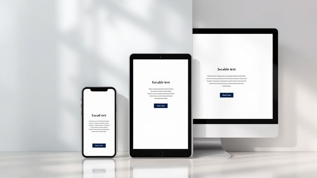
Over 60% of emails are opened on smartphones and tablets. This makes mobile-first responsive design essential for any email marketing campaign. It's no longer optional; it's a core requirement for success. This design approach ensures your emails look great and perform well on any device, maximizing engagement and conversions.
Mobile-first responsive design creates email templates that adjust to the recipient's screen. Layout, font sizes, and interactive elements dynamically change based on the device. This ensures a great viewing experience, whether on a small smartphone or a large desktop monitor. Starting with the mobile design leads to a streamlined experience that scales up effectively.
Key Features of Mobile-First Responsive Design
- Fluid Layouts: Content adapts to different screen widths.
- Single-Column Designs: Provides a simple mobile experience and can expand on larger screens.
- Responsive Images: Images scale to avoid distortion.
- Minimum Font Size: 14px body text ensures readability.
- Touch-Friendly Buttons: Large buttons (at least 44x44 pixels) are easy to tap.
Pros of Mobile-First Responsive Design
- Enhanced User Experience: A consistent and enjoyable experience across all devices.
- Increased Conversion Rates: Fewer usability issues lead to more clicks and conversions.
- Future-Proofing: Adapts to increasing mobile usage.
- Eliminates Horizontal Scrolling: Content fits the screen, improving readability.
Cons of Mobile-First Responsive Design
- Thorough Testing Required: Compatibility across email clients and devices is critical.
- Potential Design Limitations: Some complex desktop layouts may require simplification.
- Older Email Client Compatibility: Older email clients may not fully support responsive design.
Real-World Examples of Mobile-First Responsive Design
- Airbnb: Uses clean, single-column layouts in newsletters.
- Uber: Receipt emails are easily readable on any device.
- Fitbit: Activity emails scale seamlessly from phone to desktop.
Practical Implementation Tips
- Media Queries: Use media queries in your CSS to style for different screen sizes.
- Testing is Key: Test emails on various devices and clients using tools like Litmus or Email on Acid.
- Above the Fold: Place key information within the first 350-550 pixels.
- Single-Column Layout: Prioritize single-column layouts for core content.
- Larger Touch Targets: Use larger buttons and links for easy tapping on mobile.
Evolution and Popularization
The growth of mobile email spurred the need for responsive design. Industry leaders like Litmus and Campaign Monitor, along with email platforms like Mailchimp, popularized the technique. With mobile's continued growth, mobile-first responsive design is now a cornerstone of effective email marketing. By embracing this approach, you can ensure your message reaches your audience, regardless of their device.
2. Strategic Use Of Visual Hierarchy
In the crowded inbox, grabbing your audience's attention requires more than just compelling copy. It demands a strategic visual approach. This is where visual hierarchy comes into play. It’s the art of guiding the recipient's eye through your email content in order of importance.
This is achieved using design elements like size, color, contrast, spacing, and positioning. Even if someone only scans your email, a well-designed hierarchy ensures your key messages and calls-to-action (CTAs) are easily seen.

This principle works because it leverages how people naturally process information. Our eyes are drawn to larger, more contrasting elements first. By deliberately sizing elements, using whitespace strategically, and employing color contrast, you can control this flow. You can emphasize the most crucial information. Features like F-pattern or Z-pattern layouts, combined with typographic hierarchy (using headings, subheadings, and body text effectively), further enhance readability and impact.
Why Visual Hierarchy Matters
Today, attention spans are short. Visual hierarchy helps email marketers overcome this challenge. It makes messages easily digestible. It bridges the gap between a compelling message and a reader who may only have a few seconds to spare.
Pros and Cons
Here’s a quick rundown of the advantages and disadvantages of using visual hierarchy:
Pros:
- Improved Scannability: Readers quickly grasp key points.
- Increased Click-Through Rates: Prominent CTAs encourage engagement.
- Logical Organization: Enhances comprehension and user experience.
- Resilience: Remains effective even with images turned off.
Cons:
- Potential for Overwhelm: Too many competing elements create clutter.
- Balancing Act: Requires careful planning to avoid overwhelming the recipient.
- Design Expertise: Effective implementation may require advanced design skills.
Real-World Examples
Several companies utilize visual hierarchy effectively:
- Apple: Their product announcement emails masterfully use size hierarchy. New products are showcased with large, high-quality images, while supporting details appear in smaller text.
- Airbnb: Color contrast draws attention to their booking CTAs, often using a vibrant button color against a muted background.
- The New York Times Newsletter: Typographic hierarchy organizes headlines and summaries, letting readers quickly navigate the content.
Evolution and Growth
The understanding of visual hierarchy in email design has evolved alongside usability studies. Organizations like the Nielsen Norman Group have researched how people interact with digital content, including email. Their findings highlight the importance of scannability and clear visual cues for effective communication. Platforms like Really Good Emails, showcasing exemplary email design, further popularized the concept. They’ve provided practical examples for email marketers. Experts like Elliot Ross have also championed the use of visual hierarchy and shared best practices.
Tips for Implementation
Here are a few key tips to keep in mind:
- Limit CTAs: Stick to one primary CTA and a maximum of 2-3 secondary CTAs.
- Strategic Sizing: Larger elements appear more important; use size differentiation wisely.
- Whitespace: Create breathing room around important elements for clarity.
- Contrast: Ensure sufficient contrast between text and background (a 4.5:1 ratio is recommended for accessibility).
- Top-Loading Content: Place the most important information at the top, especially for mobile viewers.
By understanding and applying these principles, email marketers can create more engaging and effective email campaigns. This leads to better user experiences, ultimately driving conversions and building stronger audience relationships.
3. Concise and Compelling Copy

Capturing a reader's attention is a real challenge. Inboxes are overflowing, and people are busy. This is why concise, compelling email copy is so important. It determines whether your email gets opened, read, and acted upon. Without it, your email design is just window dressing.
Concise copy respects your subscriber's time by getting straight to the point. Compelling copy, on the other hand, makes the reader want to engage. It's the difference between an email being deleted and a click-through to your website. This combination is essential for driving conversions and building relationships.
Features of Effective Email Copy
Here's what makes email copy truly effective:
- Scannable Format: Use short paragraphs, bullet points, and white space to make information easy to digest, especially on mobile.
- Clear, Benefit-Oriented Headlines: Headlines should instantly communicate value in just 5-7 words. Focus on what the reader gains.
- Conversational Tone: A friendly, approachable tone makes your brand relatable and builds rapport.
- Action-Oriented Language: Strong verbs in your calls-to-action (CTAs) encourage readers to take the next step.
- Strategic Personalization: Using the recipient's name or other relevant details adds a personal touch.
Pros of Concise and Compelling Copy
- Increased Readability and Comprehension: Easier-to-understand messages lead to better engagement.
- Improved Engagement Rates: Clear, concise copy keeps readers interested and encourages click-throughs.
- More Actionable Emails: Direct instructions and clear CTAs facilitate desired actions.
- Stronger Brand Relationships: A personal tone fosters connection and loyalty.
Cons of Concise and Compelling Copy
- Condensing Complex Messages: Simplifying detailed information without losing crucial details can be tough.
- Requires Strong Copywriting Skills: Crafting effective copy takes practice and skill, or investment in professional copywriters.
- Not Suitable for All Communications: Some communications, like legal notices, require a formal tone and comprehensive detail.
Real-World Examples
- Slack: Their product update emails explain new features with clear benefits, concise language, and visuals.
- Warby Parker: They've built a brand around conversational and witty email copy.
- Dollar Shave Club: Known for punchy, humorous, and action-oriented copy that drives conversions.
The Evolution of Concise Copy
The rise of mobile devices and shorter attention spans have made concise copy even more critical. Influencers like Ann Handley (author of "Everybody Writes"), Joanna Wiebe of Copyhackers, and Seth Godin, with his minimalist email philosophy, have championed clear, concise communication.
Tips for Implementation
- Write Headlines That Communicate Value in 5-7 Words: Example: "Get 20% Off Your First Order!"
- Keep Body Copy Paragraphs to 2-3 Sentences Maximum: Break up long text for readability.
- Use Action Verbs in CTAs: "Shop Now," "Learn More," or "Download Today" are more effective than "Click Here."
- Incorporate Personalization When Relevant: Use the recipient's name or location for a personal touch.
- A/B Test Different Copy Approaches: Experiment to see what works best for your audience.
- Read Your Copy Aloud: This helps catch awkward phrasing.
By focusing on concise and compelling copy, you can dramatically improve your email marketing results and build stronger subscriber relationships.
4. Strategic Color Psychology

Color is more than just a visual element; it's a powerful tool for communication. In the world of email marketing, strategic color psychology plays a vital role in shaping how recipients perceive your message and, ultimately, whether they engage with your call to action. Its impact on brand recognition, engagement, and conversion rates earns it a spot on this list.
Color choices evoke emotions and create associations. A thoughtfully designed color palette can strengthen your brand identity, improve readability, and guide the reader's attention to key elements. Think about how Coca-Cola uses its iconic red. It instantly communicates the brand's energy and dynamism.
This consistent use of color reinforces brand recognition. Similarly, Slack uses purple for call-to-action (CTA) buttons against neutral backgrounds, making them highly visible and encouraging clicks. Dropbox uses its signature blue strategically to highlight key actions, guiding the user through the email's purpose.
Features of Effective Color Use in Emails
Brand-aligned color palette: Consistent colors across your marketing materials, including emails, build a strong and recognizable brand identity.
Strategic color contrasts: Contrasting colors for CTAs and important information make them stand out and encourage interaction.
Optimized readability: Prioritize readability and accessibility with effective background and text color combinations.
Content segmentation: Use color to visually separate different sections within your email, improving organization and readability.
Emotional considerations: Understand the psychological impact of colors to tailor your message effectively.
Pros of Using Color Strategically
Increased brand recognition: Consistent color use strengthens brand recall.
Improved CTA visibility and click-through rates: Strategic contrasts draw attention to important actions.
Emotional connections: Colors evoke feelings and create stronger bonds with your audience.
Enhanced visual organization: Color helps structure information and guide the reader's eye.
Cons of Using Color Strategically
Cultural variations: Color interpretations differ across cultures, requiring careful consideration for international audiences.
Accessibility issues: Poor color contrast can hinder visually impaired readers.
Rendering inconsistencies: Colors may display differently across email clients and devices.
Visual clutter: Overusing color can create a distracting visual experience.
Practical Tips for Implementing Color Psychology
Limit your palette: Use 2-3 primary colors and neutrals for a clean and professional look.
Contrast your CTAs: Make your calls to action pop with contrasting colors.
Ensure accessibility: Use a minimum 4.5:1 contrast ratio between text and background.
Test across platforms: Check color rendering in different email clients and on various devices.
Guide the reader's eye: Create visual patterns with color to direct attention.
Consider color blindness: Avoid red/green pairings for crucial elements; choose accessible alternatives.
Evolution and Popularization
The strategic use of color in design is influenced by various factors. Pantone's color forecasts impact color trends across industries. Google's Material Design color system provides a framework for visually appealing and accessible interfaces, influencing email design. Color theory experts, such as Josef Albers, have deepened our understanding of color interaction and its psychological effects.
By understanding and applying color psychology principles, you can elevate your email campaigns. This strategic approach strengthens your brand, enhances readability, and drives desired actions, making it an essential component of successful email marketing.
5. Optimized Image Usage
Images are essential for engaging email templates. They evoke emotion, showcase products, and break up text, making emails easier to read. However, effective image use requires optimization. Strategic image usage balances visual impact with technical performance, ensuring your message reaches subscribers without slow loading times or accessibility issues.
A key aspect is balancing visual appeal with email client compatibility. A striking hero image grabs attention, but large files can cause slow loading, especially on mobile devices or slower internet connections. Many email clients also block images by default, leaving blank spaces or broken icons. This is why optimizing image size and providing alternative text is critical.
Compressing images to under 200KB without significant quality loss (using tools like TinyPNG) is a good start. Always include descriptive alt text that conveys the image's purpose for screen readers and when images are blocked. This alt text acts as a placeholder, informing the subscriber what they are missing and reinforcing your message.
Responsive image techniques are also crucial. Images should adapt to different screen sizes, ensuring a consistent experience across desktops, tablets, and smartphones. This avoids stretched or distorted images. Maintaining a balanced text-to-image ratio (60:40 is often recommended) avoids deliverability issues. Image-heavy emails can trigger spam filters.
Examples of Effective Image Use
The power of optimized images can be seen in leading brands' strategies. Airbnb, for instance, uses high-quality destination photography that loads progressively, providing a visual experience without sacrificing speed. Amazon's product recommendation emails showcase properly sized product images with clear alt text, ensuring accessibility and a smooth user experience. ASOS uses lookbook-style images that render seamlessly across devices, maintaining brand consistency. These examples highlight the importance of strategic image placement and optimization. For a deeper dive into effective image strategies, check out our guide on email marketing images.
Tools and Resources for Image Optimization
The evolution of image optimization has been influenced by tools like Litmus, which provides comprehensive image testing. Experts like Kevin Mandeville have also popularized advanced techniques, sharing best practices. Resources like Really Good Emails showcase real-world examples of effective image use, providing inspiration and guidance.
Pros of Optimized Image Usage:
- Increased visual appeal and engagement
- Effective demonstration of products or concepts
- Creation of emotional connections through imagery
- Improved scannability through broken-up text
Cons of Improper Image Usage:
- Images blocked by default in many email clients
- Slow loading times due to large images
- Accessibility issues without proper alt text
- Deliverability problems with a high image-to-text ratio
Tips for Implementing Optimized Images:
- Compress images to under 200KB (tools like TinyPNG).
- Include descriptive alt text conveying the image's purpose.
- Maintain a balanced text-to-image ratio (60:40 is often recommended).
- Use background colors that match your images in case they don't load.
- Consider using CSS for simple graphics.
- Test emails with images disabled.
Optimized image usage is a vital part of email template design. It bridges visual storytelling and technical performance. When done correctly, images enhance the subscriber experience, reinforce your message, and drive better results from email marketing campaigns.
6. Personalization and Dynamic Content
In today's overflowing email inboxes, a generic message simply won't get the attention it needs. To truly resonate with your audience and encourage conversions, you need personalized experiences. This is where personalization and dynamic content become essential, shifting email marketing from a one-size-fits-all approach to a tailored communication strategy. It's a core component of successful email template design.
Personalization involves more than just including the recipient's name. It's about using data to craft highly relevant content that caters to individual interests and needs. Dynamic content blocks, powered by user data, adapt based on factors like past purchases, demographics, preferences, recent browsing behavior, and even real-time location. Imagine emails recommending products based on recent browsing or offering location-specific deals. This tailored approach significantly boosts engagement by making your communications timely and relevant.
Features of Effective Personalized Emails
Effective personalized email templates often include these features:
- Personalized Subject Lines and Greetings: The subject line is the first impression, so personalization is key to capturing attention.
- Dynamic Content Blocks: These blocks change based on user data to showcase tailored products, offers, or content.
- Behavioral Triggers: Automated emails sent based on user actions like abandoning a shopping cart or making a purchase.
- Location-Based Customization: Content adapts based on the recipient's location to provide relevant deals, events, or information.
- Personalized Product or Content Recommendations: Suggesting items based on browsing history or past purchases encourages conversions.
Weighing the Pros and Cons of Personalization
The benefits of personalization are clear:
Pros:
- Improved Engagement Rates: Personalized emails see significantly higher open rates—36% higher on average.
- Increased Conversion Rates: Relevant offers lead to more sales.
- Stronger Customer Relationships: Personalized communication builds connection and loyalty.
- Reduced Unsubscribes: Valuable, targeted content keeps recipients engaged and less likely to opt out.
However, personalization also presents challenges:
Cons:
- Data Management: Effective personalization requires robust data collection, storage, and utilization.
- Technical Complexity: Implementing dynamic content and behavioral triggers can be technically demanding.
- Privacy and Compliance: Responsible data handling and adherence to regulations like GDPR are crucial.
- Risk of Errors: Incorrect personalization can damage brand credibility.
Real-World Examples of Personalization in Action
Companies like Amazon, Spotify, and Sephora successfully use personalization. Amazon's product recommendations based on browsing history, Spotify's personalized "Year in Review," and Sephora's tailored product suggestions are prime examples. These brands leverage personalization to enhance customer engagement and drive growth. For more inspiration, check out this guide: Our guide on Dynamic Content Examples to Transform User Experience.
Tips for Implementing Personalization
Ready to get started? Here are some tips:
- Start Small: Begin with simple personalization like name and location before adding more complex elements.
- Segment Your Audience: Divide your audience into smaller groups with shared traits for more targeted personalization.
- Use Fallback Content: Have a default message ready when personalization data is unavailable.
- Test and Measure: Compare personalized emails against generic versions to track their impact.
- Data Accuracy: Ensure data accuracy before using it for personalization.
- Transparency: Be open with your audience about how you use their data.
Platforms like Salesforce Marketing Cloud, Mailchimp, and HubSpot make personalization tools accessible to businesses of all sizes. By understanding the principles of personalization and dynamic content, you can transform your email marketing from generic broadcasts into a powerful tool for building relationships and achieving your business goals.
7. Clear and Compelling CTAs
Call-to-actions (CTAs) are essential for successful email marketing campaigns. They guide recipients toward a desired action, transforming passive readers into active participants. A well-crafted CTA can significantly boost conversion rates, driving sales, registrations, downloads, and other key metrics. That's why designing clear and compelling CTAs is crucial for any email template.
CTAs are much more than simple "Click Here" links. They represent the culmination of your email's message, offering a direct path for the recipient to engage further. Think of them as strategically placed signposts directing traffic to your intended destination. Effective CTAs often feature a button-based design (instead of plain text links) for better visibility. They utilize high-contrast colors that stand out against the email's background and use action-oriented language. For example, "Get Your Free Trial" is far more compelling than "Click Here." Strategic placement within the email's flow and adequate sizing for mobile devices (at least 44x44 pixels) are also essential.
Well-designed CTAs offer numerous benefits. They demonstrably increase conversion rates by clearly communicating the intended action. Larger, button-based CTAs enhance mobile usability with finger-friendly tap targets. They also create visual focal points, drawing the reader's eye and emphasizing important actions. Furthermore, tracking CTA performance provides valuable data for monitoring specific conversion goals and measuring email campaign effectiveness.
However, some potential drawbacks exist. Too many CTAs can overwhelm recipients and lead to choice paralysis. Poor placement can make CTAs invisible or easily overlooked. Furthermore, different email clients may render buttons differently, emphasizing the need for cross-platform testing.
Real-world examples of effective CTAs include Uber's "Request a Ride" button, prominently displayed in white against a black background. Netflix uses a bright red "Continue Watching" button that stands out, encouraging users to return to their favorite shows. Airbnb strategically places "Book Now" CTAs within property recommendation emails, capitalizing on user interest and encouraging direct bookings.
The importance of compelling CTAs has grown with the rise of email marketing and mobile devices. Specialized tools like Buttons.cm have emerged to help create visually appealing email buttons. Email design experts like Justine Jordan have also championed CTA best practices, emphasizing their impact on conversion optimization. Marketing platforms like HubSpot and Mailchimp have also integrated robust CTA creation tools, recognizing their role in successful email campaigns.
Optimizing Your Email CTAs
To improve your email CTAs, consider these tips:
Use action verbs: Clearly communicate the outcome of clicking (e.g., "Download Now," "Shop the Sale," "Learn More").
Strategic placement: Position primary CTAs "above the fold" for immediate visibility.
Contrast and branding: Choose a contrasting color that aligns with your brand guidelines.
Urgency (when appropriate): Create a sense of urgency, like "Shop the sale before it ends!" when relevant.
A/B testing: Experiment with CTA copy, colors, and placement to find what works best.
Compatibility: Include both HTML buttons and fallback text links for cross-client compatibility.
You might find this guide helpful: Our guide on how to increase click-through rate. By following these best practices, you can transform your email CTAs from passive links into powerful tools that boost engagement and conversions.
8. Accessible and Inclusive Email Design
Creating beautiful emails is essential for grabbing attention, but ensuring everyone can experience that beauty is paramount. Accessible and inclusive email design means your messages can be used by all recipients, including those with visual, auditory, cognitive, or motor impairments. This isn't just about ticking boxes for compliance; it genuinely improves the email experience for everyone. It prioritizes readability, a logical structure, and compatibility with assistive technologies like screen readers. Inclusive design expands on this by considering the diverse needs of all audiences and creating experiences that are usable and enjoyable for people of all abilities.
Why is this so important? Roughly 15% of the global population lives with a disability. Ignoring their needs translates to missing out on a substantial portion of your potential audience. Furthermore, accessible design principles often enhance the email experience for everyone. For instance, good color contrast benefits users reading emails in bright sunlight on their phones, while a logical reading order makes emails easier for all subscribers to scan.
Features of Accessible Emails
Semantic HTML Structure: Using proper heading hierarchy (h1, h2, etc.) and semantic elements like
<p>,<ul>, and<li>allows screen readers to interpret and convey the content's structure effectively.Sufficient Color Contrast: Maintain a minimum contrast ratio of 4.5:1 for normal text and 3:1 for large text. This ensures readability for people with low vision.
Alternative Text for Images: All informational images need descriptive alt text so screen readers can convey meaning to visually impaired users. Decorative images should have empty alt attributes (
alt="").Keyboard Navigation: All interactive elements, such as buttons and links, must be accessible via keyboard for users who cannot use a mouse.
Readable Font Sizes and Families: Use a minimum font size of 14px and clear, easy-to-read font families to improve readability.
Logical Reading Order: The code's element order should mirror the visual reading order to prevent confusion for screen reader users.
Pros of Accessible Emails
Wider Reach: Include people with disabilities, significantly expanding your potential audience.
Enhanced User Experience: Boost readability and usability for all subscribers.
Legal Compliance: Meet accessibility requirements outlined in legislation like the Americans with Disabilities Act (ADA), Section 508, and the European Accessibility Act (EAA).
Improved Performance: Accessible emails often render better in challenging viewing conditions, such as low light or small screens.
Cons of Accessible Emails
Initial Development Time: Adding accessibility can increase initial email development time.
Limited Client Support: Some email clients may not fully support all advanced accessibility features.
Specialized Knowledge: Proper implementation requires an understanding of accessibility best practices.
Real-World Examples of Accessible Emails
Microsoft: Known for its commitment to inclusive design, Microsoft incorporates accessibility features in its email communications.
UK Government Digital Service: Sets a high bar for digital accessibility, including email communications.
Salesforce: Provides accessible email templates and advocates for accessibility best practices.
Tips for Implementing Accessible Emails
- Use a logical HTML structure with semantic elements (h1, h2, p, ul, ol, li, etc.).
- Provide descriptive alt text for all informational images.
- Ensure sufficient color contrast.
- Use patterns or text labels in addition to color to convey important information.
- Test with screen readers and keyboard navigation.
- Include a plain-text version of HTML emails.
- Consider using the
langattribute for multilingual content.
Influencers of Accessible Email Design
The growth of accessible email is largely due to:
- Web Content Accessibility Guidelines (WCAG): Internationally recognized standards for web accessibility that influence email best practices.
- Mark Robbins (Email Accessibility Advocate): A prominent voice in accessible email design.
- Email on Acid (Accessibility Checking Tools): Offers tools to test and improve email accessibility.
- Paul Airy (Email Accessibility Expert): A leading expert providing training and resources on email accessibility.
By prioritizing accessible and inclusive email design, you not only broaden your reach and fulfill legal requirements, but also show your commitment to a positive and inclusive experience for all subscribers.
8-Point Email Template Design Comparison
| Tip | 🔄 Complexity | ⚡ Resources | 📊 Outcomes | 💡 Use Cases | ⭐ Advantages |
|---|---|---|---|---|---|
| Mobile-First Responsive Design | Moderate – requires extensive cross-device testing | Design frameworks and multi-device testing tools | Optimized viewing experience and increased conversion rates | Campaigns focused on mobile users | Adaptable layouts; future-proof design |
| Strategic Use of Visual Hierarchy | Moderate-High – needs careful design balance | Skilled design expertise and guideline tools | Enhanced readability and improved click-through rates | Emails needing clear messaging and easy scanability | Organized content; effective CTA emphasis |
| Concise and Compelling Copy | Low-Moderate – centered on strong copywriting | Professional copywriting skills and A/B testing platforms | Higher engagement and clear action prompts | Promotions and updates where clarity is key | Action-oriented language; builds strong brand voice |
| Strategic Color Psychology | Moderate – demands knowledge of color theory and accessibility | Design tools and accessibility testing methods | Strong brand recognition and elevated CTA visibility | Emails that require emotional appeal and brand alignment | Visual impact; effective segmentation of content |
| Optimized Image Usage | Moderate – balancing design aesthetics with technical tweaks | Image optimization software and cross-client testing | Enhanced visual appeal with fast loading and proper scaling | Product showcases and visually-driven storytelling | Improved engagement; balanced media integration |
| Personalization and Dynamic Content | High – involves data integration and dynamic content blocks | Robust data management systems and personalization platforms | Significantly higher engagement and conversions through relevance | Targeted campaigns based on user behavior and segmentation | Tailored user experiences; reduced unsubscribe rates |
| Clear and Compelling CTAs | Low-Moderate – focuses on clear layout and button design | Design tools and mobile compatibility testing | Increased click-through and conversion rates | Action-driven, conversion-focused campaigns | Prominent, easy-to-track call-to-actions |
| Accessible and Inclusive Design | High – requires adherence to accessibility standards | Specialized testing tools and semantic coding practices | Broader audience reach with improved usability and compliance | Campaigns aiming for inclusivity and universal usability | Enhanced readability; meets legal accessibility requirements |
Level Up Your Email Game
By implementing these email template design tips—mobile responsiveness, visual hierarchy, compelling copy, strategic use of color, optimized images, personalization, and accessible design—you can create emails that not only look great but also perform exceptionally well. Focusing on these core principles will lead to increased engagement, higher click-through rates, and ultimately, more conversions.
Prioritizing these improvements will have a ripple effect, impacting several key metrics. You'll see more people opening and engaging with your emails, clicking through to your website, and ultimately, becoming customers.
Auditing and Testing Your Templates
To effectively apply these concepts, start by auditing your existing email templates. Identify areas for improvement based on the principles discussed and prioritize changes based on potential impact. A/B testing different versions of your emails is crucial for understanding what resonates best with your audience. Don't be afraid to experiment with different layouts, color schemes, and calls to action. Testing allows you to gather data and make informed decisions about what works best.
Email marketing is a constantly evolving field. Staying current with emerging trends and best practices is vital for maintaining effective campaigns. Pay attention to industry blogs, attend webinars, and engage with other email marketers to stay informed.
Future Trends in Email Marketing
Future developments like interactive emails and AMP for Email offer exciting possibilities for enhancing engagement. Continuously learning and adapting to these changes will ensure your emails remain impactful and deliver exceptional results. Imagine emails that are dynamic and engaging, offering a richer experience for your readers.
Key Takeaways:
- Prioritize mobile-first design: Ensure your emails look great on any device.
- Establish clear visual hierarchy: Guide readers' eyes to the most important information.
- Craft compelling copy: Keep it concise, engaging, and focused on the reader's benefit.
- Use color strategically: Evoke emotions and reinforce your brand identity.
- Optimize images: Compress images for fast loading times without sacrificing quality.
- Personalize content: Tailor messages to individual recipients for maximum impact.
- Design accessible emails: Ensure readability for everyone, including those with disabilities.
Want to truly elevate your email personalization game? OKZest empowers you to create dynamic, personalized images automatically, boosting engagement and driving conversions. Add personalized certificates, unique offer images, or even real-time data visualizations to your emails effortlessly. Integrate with your existing email platform and watch your metrics soar. Start creating impactful, personalized email experiences today with OKZest! Visit OKZest now!