Putting text over a background image isn't just a design trick; it's a powerful way to turn a simple picture into a message that truly connects. This simple combination grabs attention, adds instant context, and helps define your brand's voice. It's the secret sauce behind all those shareable quotes, standout social media posts, and effective ads you see everywhere.
Why Text on Background Images Is So Effective
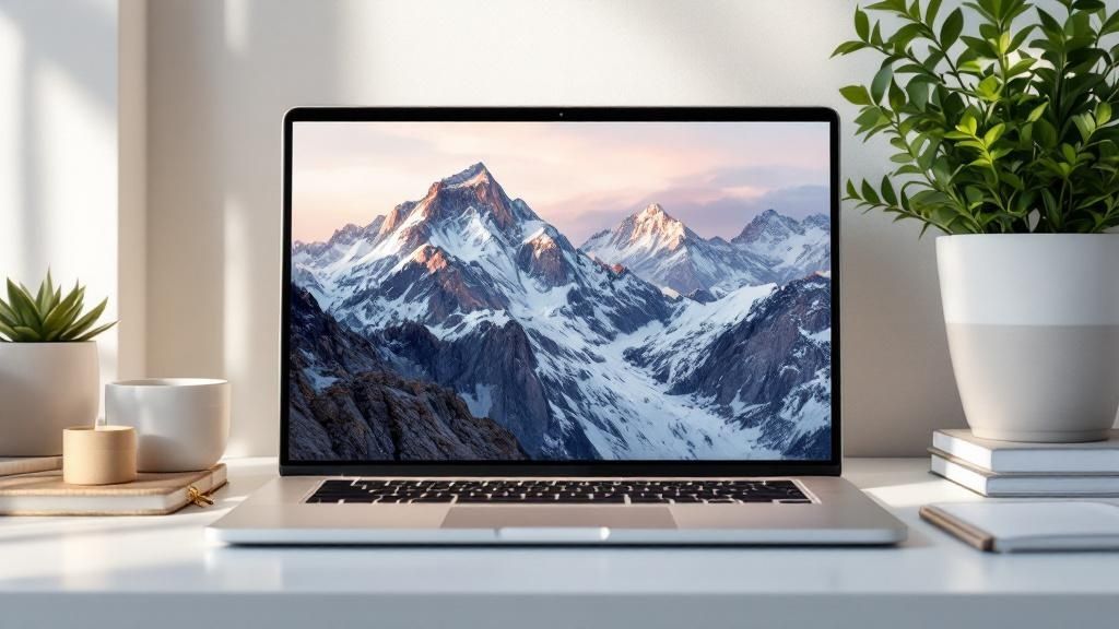
<img src="https://okzest.blob.core.windows.net/blog/a-motivational-quote-believe-you-can-and-you-re-halfway-there-layered-on-a-scenic-mountain-background.jpg" alt="A motivational quote "Believe you can and you're halfway there" layered on a scenic mountain background." width="800">
In today's fast-scrolling world, you have seconds to make an impression. Layering text over an image gives you a one-two punch: the emotional pull of a great photo combined with the clarity of a direct message. It’s what stops people mid-scroll.
This approach works because it speaks directly to how our brains are wired. We process images and text together, so the combination feels natural and incredibly efficient. For a deeper dive, it’s worth exploring some key insights into visual communication to understand just how much it influences audience engagement.
The Business Impact of Visual Storytelling
This isn't just about making things look pretty—it translates directly to business results. There's a reason the visual content market is exploding.
The global visual content market was valued at $5.2 billion in 2024 and is projected to hit nearly $19.17 billion by 2032. This isn't just a fluke. Marketers are all in, with 95.2% confirming just how critical it is to their strategies.
This massive growth points to a clear trend: brands are leaning heavily on compelling visuals to tell their stories. When you combine the right words with the right pictures, you can:
- Boost Engagement: Graphics with text are far more likely to get liked, shared, and commented on.
- Reinforce Brand Identity: A consistent style—your fonts, your colors, your images—makes your content instantly recognizable.
- Drive Action: A clear call-to-action on an inspiring image is a proven way to get clicks and drive sales.
Getting this right is a huge first step. Our guide on what is visual communication can give you even more context to sharpen your marketing efforts.
Mastering the Principles of Readability and Design
Putting text on a background image is a balancing act. Get it right, and your message sings. Get it wrong, and it’s just noise. Before you even think about what you want to say, understanding a few core design ideas is what separates a graphic that converts from one that gets completely ignored.
This isn’t just about making things look pretty. It's about psychology. A staggering 94% of users admit that their first impression of a website is based on its design. And if the text is hard to read? 38% of visitors will just leave. The goal is to create a seamless experience where your text and image work together, not against each other.
Nail the Contrast Every Time
If there’s one rule you can’t break, it’s this: contrast is king. If your text color melts into the background, your message is DOA.
Don’t just aim for "enough" contrast—aim for undeniable clarity. Your text should be effortlessly legible at a glance, without causing any eye strain for the viewer.
Here are a few of my go-to tricks for boosting contrast:
- Throw on a Color Overlay: A simple semi-transparent black or colored layer over the image can instantly calm a busy background, making lighter text pop right off the screen.
- Add a Subtle Text Shadow: A gentle drop shadow is a classic for a reason. It lifts your words off the background, giving them depth and making them readable even on a more complex photo.
- Find the "Quiet" Space: Look for natural negative space in your image—a clear patch of sky, a solid-colored wall, an out-of-focus area. These are prime real estate for your text.
Choose Your Fonts and Positioning Wisely
Your font choice is your brand's voice. A bold, sans-serif font feels modern and gets straight to the point. A script font can give off a more elegant or personal vibe. Whatever you choose, make sure its personality matches both your brand and the photo it’s sitting on. You wouldn't use a comic-book font on a serious financial report, right?
Where you place the text is just as important as how it looks. The rule of thirds is a fantastic guideline here. Instead of dead-centering everything, try placing your text along the gridlines or where they cross. This creates a more dynamic and visually interesting layout.
For anyone creating visuals for mobile apps, it's worth diving into the specific design principles for high-converting app screenshots. The small-screen environment has its own unique set of rules, and mastering them can give you a real edge.
To help you get this right every single time, I’ve put together a quick checklist. Run through this before you hit publish to make sure your text is as clear and effective as possible.
Readability Checklist for Text on Images
| Design Element | Best Practice | What to Avoid |
|---|---|---|
| Contrast | High contrast between text and background. Use overlays or shadows if needed. | Low contrast, where text color is too similar to the image's colors. |
| Font Style | Choose a legible font that matches your brand and the image's tone. | Overly decorative or thin fonts that are hard to read, especially at small sizes. |
| Font Size | Ensure text is large enough to be easily readable on all devices. | Text that is too small, forcing users to squint or zoom in. |
| Positioning | Place text in "quiet" areas of the image, away from distracting elements. | Placing text over a person's face or a critical part of the image. |
| Hierarchy | Use different font weights and sizes to guide the viewer's eye. | A flat design where all text has the same visual importance. |
| Text Volume | Keep it concise. Less is almost always more. | A "wall of text" that overwhelms the visual and the viewer. |
By keeping these simple elements in mind, you can ensure your message not only looks professional but also connects powerfully with your audience. It's all about making deliberate choices that enhance clarity and guide the viewer's eye.
How to Create Stunning Visuals with OKZest
Alright, now that you've got the core principles down, let's get our hands dirty. Making a professional-looking graphic with text on a background image shouldn't feel like you need a design degree or a clunky piece of software. With OKZest's no-code editor, the process is incredibly straightforward, letting you focus on the message instead of getting bogged down in technical settings.
It all starts with your base image. Whether you're uploading your own branded photo or grabbing one from a stock library, the trick is to find an image that has some natural "breathing room" for your text. Once you've got your image locked in, the real fun begins.
Effortless Customization and Styling
We built the OKZest editor for speed and simplicity. You can literally start typing your message right away and then tweak how it looks using controls that just make sense. No more hunting through confusing menus to get the style you're after.
You have a full suite of options ready to go:
- Font Selection: Jump into a huge library of Google Fonts to find the perfect typeface that really nails your brand’s personality.
- Color and Size Adjustments: Easily switch up the text color to make sure it stands out and resize it with a simple slider for maximum impact.
- Precise Alignment: Align your text left, right, or center with a single click. This simple step ensures your whole composition looks balanced and intentional.
This entire workflow is designed so you can pump out a high-quality visual in just a few minutes. If you're looking to take things even further, check out our guide on creating dynamic images that can be personalized at scale.
The best designs often look simple, but that simplicity comes from having powerful, easy-to-use tools. The goal is to remove friction so you can experiment freely and bring your creative ideas to life without any roadblocks.
For a clearer picture of how this works in practice, this flowchart breaks down the essential steps for achieving great readability.
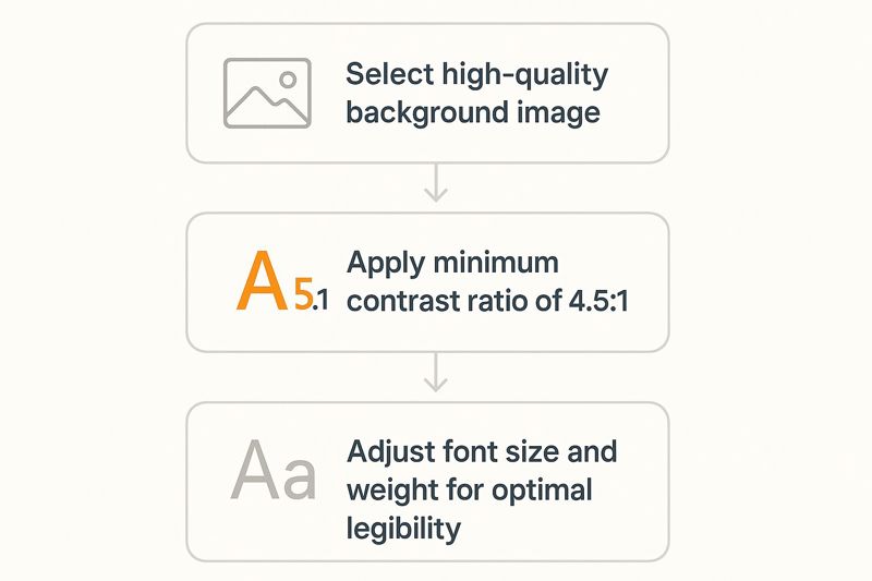
This visualizes the entire process, from picking the right image to making those final tweaks that guarantee your message is always crystal clear.
Beyond the Basics with Pro Features
Ready to make your visuals really stand out? OKZest has a few more tricks up its sleeve to add that professional polish to any design. For instance, if you're working with a particularly busy background image, applying a filter can be a total game-changer. A subtle blur or a darkening overlay can instantly make your text pop.
You can also add effects like shadows and outlines directly to your text. A soft drop shadow can lift the words right off the background, adding a sense of depth and making them readable on almost any image. It’s these small details that take a good graphic and make it a great one—and they're all right there, no code required.
Automating Visual Content with an API
The no-code editor is fantastic for crafting a few stunning graphics. But what happens when you need to create hundreds, or even thousands, of unique images? Creating them one-by-one isn't just slow—it’s completely impractical at scale.
This is exactly where programmatic image creation becomes a necessity, and it's the problem our OKZest API was built to solve.
Imagine you're running a flash sale for an e-commerce store. Instead of a single, generic graphic, you could automatically generate a unique image for every single product. Each image could feature the product's name, its discounted price, and your branded background. By programmatically adding text on a background image, you shift your marketing from a broad message to a personal conversation.
How API-Driven Image Generation Works
So, how does it all come together? At its core, an API is just a way for different software programs to talk to each other. In this case, your system sends OKZest a simple set of instructions—like a background image URL, the text you want to add, and a few styling details. In return, our API sends back a perfectly rendered, ready-to-use graphic.
The process is incredibly efficient. You can hook up your database, CRM, or just about any other data source to automatically feed the text and image variables into the API. A single script can then loop through your entire product catalog or contact list, creating all the personalized visuals you need in minutes.
This is about more than just saving time. It's about unlocking marketing capabilities that were previously too resource-intensive to even consider. With an API, you can create dynamic, data-driven visuals on the fly.
A Practical API Call Example
Let's walk through a real-world scenario. Say you’re an event organizer who wants to generate personalized welcome images for every attendee as they register. A basic API call would include a few key parameters:
backgroundImage: The URL for your branded event background.text: A dynamic field for the attendee’s name (e.g., “Welcome, Sarah!”).font: The font family you want, like 'Montserrat'.position: The exact coordinates to place the text perfectly on your design.
You set this up once, and a custom graphic is generated for every single person who signs up. Integrating text on background images has come a long way, especially with modern tools that can produce thousands of unique combinations for ads and social media.
This kind of automated workflow is a game-changer for marketers and developers alike. For a more detailed, step-by-step guide, check out our complete API integration tutorial and see how you can start building your own automated visual content engine.
Go Beyond the Basics with Advanced Styling
Putting simple text on a background is a good starting point, but if you want to create visuals that truly stand out, you'll need to dig a little deeper. OKZest’s editor and API both give you the tools to add a unique, professional finish that you just can't get from a standard template.
Fine-Tuning Your Text's Appearance
One of the quickest ways to elevate your design is with text gradients. Instead of using a single flat color for your text, you can create a smooth transition between two or more different colors. This little trick adds a surprising amount of depth and makes your message feel more dynamic and woven into the background image.
Another pro-level tweak is taking control of your multi-line text. You can adjust the exact spacing between lines of text to make sure your message is perfectly balanced and easy to read. This is a lifesaver for longer quotes or descriptions where the default spacing often feels either too cramped or way too spread out.
Making Text a Natural Part of the Image
To get your text looking like it truly belongs in the photo, start playing around with blend modes. These settings change how the pixels in your text layer interact with the pixels of the background image. Using something like an "Overlay" or "Soft Light" blend mode, for instance, can create a much more subtle and organic look, almost as if the text was painted right onto the scene.
Don't forget about watermarking. It's a simple but crucial feature for protecting your brand. You can place a semi-transparent logo or bit of text on your images to make sure your brand always gets credit, no matter where your content is shared.
Common Questions About Adding Text to Images
When you start layering text over an image, you'll quickly run into a few classic design hurdles. Getting these details right is what really separates a professional-looking graphic from one that just feels… off. Let's walk through the questions we hear all the time so you can nail your visuals.
What's the Best Text Color for a "Busy" Background?
This is probably the biggest challenge. You have a great photo, but it's full of different colors and textures, making your text get lost. The simple answer is there isn't one "best" color. Instead, your goal should always be high contrast.
White is often a go-to, but it needs a little help to stand out. A fantastic trick is to put a semi-transparent dark overlay on top of the entire image. This mutes the background just enough to make your white text pop. Another solid technique is to add a subtle drop shadow to the text itself, which gives it that clean lift from the background.
How Do I Make Sure My Text is Readable on Mobile?
This is non-negotiable. If your text looks great on a desktop but is a jumbled mess on a phone, you've lost half your audience. It all comes down to two things: simplicity and size.
- Go for Bold Fonts: Stick with a clear, bold font that stays legible even when it's shrunk down.
- Keep Text Big: Don't make people squint. Your text needs to be large enough to be understood at a quick glance on a small screen.
- Create a Safe Zone: Avoid putting text right up against the edges of the image. It's likely to get cropped on different devices, so keeping it closer to the center is always a safe bet.
The goal for mobile is effortless readability. If someone has to zoom in to read your message, the design has already failed. It needs to be clear and immediate.
Ready to create stunning visuals in minutes? With OKZest, you can add personalized text to any image with our simple no-code editor or automate the whole process with our powerful API. Start creating for free at OKZest.com.