Tick-Tock: Choosing the Right Countdown Clock Image
A countdown clock image fuels excitement and drives action. This listicle presents eight effective styles to elevate your 2025 marketing campaigns, from product launches and limited-time offers to major events. Discover which countdown clock image best suits your message and learn how OKZest can personalize these images for even greater customer engagement. We'll cover digital LED, minimalist flat design, skeuomorphic, animated, circular progress, retro, typographic, and 3D countdown styles.
1. Digital LED Style
The Digital LED style for countdown clock images provides a classic and instantly recognizable aesthetic. Mimicking the appearance of physical LED display panels, this style uses bright, segmented pixels to form numbers. These segments, arranged in the familiar seven-segment display format, evoke the look of digital clocks, electronic devices, and scoreboards. This style is especially effective for conveying a sense of urgency, precision, and technical accuracy.
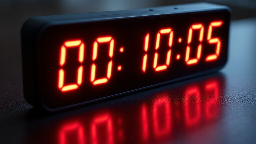
This style's core feature is the seven-segment display, where each digit is composed of seven individual segments that illuminate in different combinations. High contrast colors, typically red or green on a black background, ensure legibility. Sharp, angular typography and a clean, technical aesthetic further contribute to the distinctive look. Separating colons between time units (hours, minutes, seconds) are also a common characteristic, reinforcing the classic timer appearance.
Think of the countdown clocks used in high-stakes scenarios: Olympic event timers, NASA mission countdowns, or even airport departure/arrival boards. These applications highlight the style's effectiveness in conveying critical timing information clearly and efficiently. Even emergency notification systems often utilize this style for its immediate readability. For marketers, this translates to capturing attention and creating a sense of anticipation or urgency around a sale, product launch, or event.
Pros:
- Extreme Legibility: Even at smaller sizes, the high contrast and distinct segments make the time easy to read.
- Instant Recognition: The style is immediately recognizable as a timer or countdown.
- Low-Light Visibility: The high contrast ensures readability even in dimly lit environments.
- Precision and Accuracy: The style evokes a sense of technical precision and accuracy.
- Easy Implementation: Creating digital LED countdown timers is relatively simple in various design platforms.
Cons:
- Dated Appearance: In some contexts, the style can appear dated or retro.
- Limited Versatility: The strict structure offers limited stylistic versatility.
- Clash with Modern Aesthetics: It may not align with modern, minimalist design trends.
- Impersonal Feel: The technical aesthetic can sometimes feel impersonal or cold.
Tips for Effective Implementation:
- Use Monospace Fonts: Maintain alignment and a uniform appearance for the numbers.
- Maintain Segment Integrity: Preserve the classic rectangular segments for authenticity.
- Add a Subtle Glow: A subtle glow effect can mimic the light emitted by real LEDs.
- Consider a Bezel/Frame: A black bezel or frame can enhance realism.
- Strategic Color Use: Use red for urgency and green for positive progress.
Popularized By:
Early digital watches (Casio, Timex), military countdown sequences in films, sports scoreboards and timing systems, and NASA mission control displays have all contributed to the widespread recognition of this style.
The Digital LED style deserves its place on this list due to its unparalleled clarity and immediate association with timing and countdowns. While it may not suit every aesthetic, its effectiveness in conveying time-sensitive information makes it a powerful tool for marketers, event organizers, and anyone looking to create a sense of anticipation or urgency. For countdown clock images where clarity and instant recognition are paramount, the Digital LED style remains a strong choice.
2. Minimalist Flat Design Countdown Clock Image
Minimalist flat design is a popular choice for countdown clock images, particularly in digital marketing and web design. This approach prioritizes clean aesthetics and functionality over elaborate visuals. By stripping away unnecessary design elements and embracing simplicity, minimalist flat design countdown clocks create a modern and highly effective way to build anticipation. This style works exceptionally well for a countdown clock image because it allows the viewer to focus on the essential information: the remaining time.
How it Works:
Minimalist flat design countdown clocks rely on a few core principles:
- Clean Typography: Easy-to-read sans-serif fonts are crucial, ensuring the numbers are instantly recognizable at any size.
- White Space: Ample breathing room around the numbers and other elements prevents the design from feeling cluttered and improves readability.
- Limited Color Palette: Often monochromatic or using a small range of subtle colors, the palette reinforces the clean aesthetic and avoids distracting the viewer.
- Simplified Visuals: No drop shadows, textures, or 3D effects are used. Simple geometric shapes and dividers may be incorporated to separate elements.
- Subtle Animations (Optional): If animations are used, they are typically subtle, like color transitions to mark the change of a digit.
Examples of Successful Implementation:
Think of the sleek countdown timers often used by Apple for product launches, or the year-end wrapped campaign graphics from Spotify. Google's Material Design timers and countdown elements on modern website launch pages (like those built with Squarespace) also exemplify this style. These countdown clock images effectively build excitement while remaining visually consistent with the overall branding.
Actionable Tips for Creating a Minimalist Flat Design Countdown Clock Image:
- Font Weight Variations: Use varying font weights (bold for the numbers, lighter for labels) to create a clear visual hierarchy.
- Subtle Color Shifts: Indicate progress subtly. For example, a background color could gradually shift as the countdown progresses.
- Consistent Spacing: Maintain consistent spacing between elements for a polished and professional look.
- Simple Animations: Use subtle animations like color transitions to indicate state changes (e.g., when a second ticks by).
- Accessibility: Ensure sufficient contrast between the numbers and the background for optimal readability.
Pros:
- Modern Aesthetic: Projects a contemporary and sophisticated image.
- Cross-Platform Compatibility: Works seamlessly across various devices and screen sizes.
- High Readability: Easy to understand at a glance.
- Seamless Integration: Blends well with other flat design elements in your marketing materials.
- Fast Loading Times: Optimized for web use due to its simplicity.
Cons:
- Potential Lack of Excitement: The minimalist approach may not be suitable for events requiring high-energy visuals.
- Limited Urgency: The subtle design may not create a strong sense of urgency for time-sensitive promotions.
- Blending with UI: In some cases, the minimalist design might blend too much with other UI elements, reducing its impact.
- Reduced Emotional Impact: The restrained aesthetic may limit the emotional connection with the audience.
When and Why to Use This Approach:
This style of countdown clock image is ideal for:
- Product launches: Especially for tech products or services where a modern aesthetic is valued.
- Website launches: Creates a sense of anticipation while maintaining a clean and professional look.
- Sales and promotions: Provides clear and concise information about the duration of the offer.
- Events and webinars: Communicates essential timing details in a visually appealing way.
For email marketers, social media managers, event organizers, and other professionals, a minimalist flat design countdown clock image offers a versatile and effective tool to engage audiences and drive conversions. Its clean aesthetic, focus on readability, and cross-platform compatibility make it a valuable addition to any marketing campaign. This approach is particularly well-suited for target audiences who appreciate modern design and clear communication. The minimalist approach allows the countdown clock image to serve its purpose effectively without overwhelming the other content in your emails, social media posts, or landing pages.
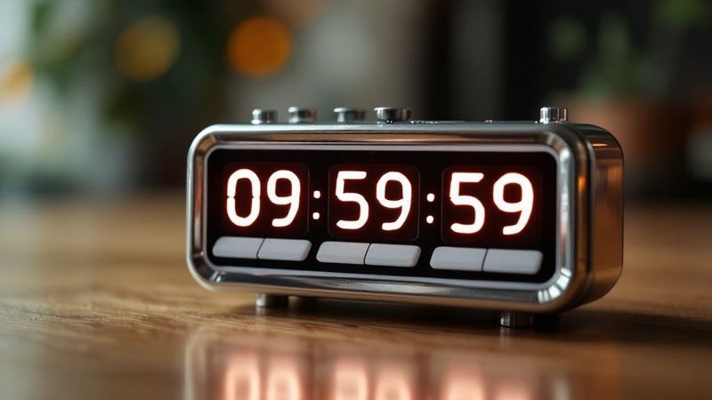
3. Skeuomorphic/Realistic
Skeuomorphic countdown clock images aim to replicate the look and feel of real-world timers. This design approach utilizes realistic textures like brushed metal, plastic, or glass, combined with detailed shadows, highlights, and even reflections to create the illusion of a physical object existing within the digital space. These countdown clock images often feature moving parts, like flipping numbers or ticking hands, further enhancing the sense of realism and mimicking mechanical or digital clocks, timers, and stopwatches we interact with daily. This style evokes a sense of familiarity and tangibility, making it instantly recognizable and potentially more engaging for certain audiences.
The strength of skeuomorphic countdown clock images lies in their ability to leverage existing mental models. Because users instantly recognize the object being represented, they intuitively understand its function and purpose. This is particularly beneficial for audiences less familiar with digital interfaces. The detailed visuals can also add depth and interest to otherwise flat digital designs, creating a more immersive and engaging experience. For example, a luxury watch brand might use a skeuomorphic countdown clock image on their website to create a sense of craftsmanship and exclusivity leading up to a new product launch. Similarly, a casino website might use a realistic roulette wheel countdown timer to build anticipation for a special promotion.
Features of Skeuomorphic Countdown Clock Images:
- Realistic textures: Metal, plastic, glass, etc.
- Detailed shadows and highlights: Creating depth and form.
- Physical mechanisms: Flipping numbers, moving hands, etc.
- Reflections and environmental lighting effects: Enhancing realism.
- Tactile elements: Buttons, switches (often implied visually).
Pros:
- Immediate recognition: Leverages familiar real-world objects.
- Visual interest: Adds depth and engagement to digital interfaces.
- Intuitive use: Especially for users unfamiliar with digital interfaces.
- Strong visual metaphors: Connects with users on an emotional level.
- Rich animations: Offers dynamic possibilities.
Cons:
- Outdated perception: Peaked in popularity around 2007-2012.
- Design intensive: Requires more time and skill.
- Performance concerns: Potentially larger file sizes and slower loading.
- Cluttered appearance: Can feel busy compared to minimalist designs.
- Scalability issues: May not adapt well to different screen sizes.
Tips for Creating Effective Skeuomorphic Countdown Clocks:
- Study real-world objects: Pay close attention to lighting and materials.
- Consistent application of gradients, shadows, and highlights: Creates a believable illusion of depth.
- Subtle animations: Ticking, bouncing, or other small movements enhance realism.
- Imperfections: Adding subtle scratches or wear can paradoxically increase realism.
- Maintain scale relationships: Ensure elements are proportionally accurate.
This approach is best suited for contexts where a sense of familiarity, craftsmanship, or traditional design is desired. While its popularity has waned in recent years in favor of flatter, minimalist design trends, it can still be effective when used strategically and thoughtfully, particularly for specific target audiences like those in the automotive industry or luxury brands. Event organizers could also leverage this style for themed events or product launches where a retro aesthetic aligns with the overall branding. For example, an email campaign promoting a vintage car show could use a skeuomorphic countdown clock image to enhance the theme and build anticipation. However, always consider the potential drawbacks related to file size and perceived datedness before incorporating this style into your countdown clock image.
4. Motion Graphics/Animated
Motion graphics countdown timers elevate the standard countdown clock image into a dynamic, engaging experience. Instead of a static image, these timers leverage animation as a core design element, incorporating moving text (kinetic typography), particle effects, fluid transitions, and other visual flourishes to emphasize the passage of time. Think less of a simple clock and more of a mini-movie counting down to your special moment. This makes them highly effective at capturing attention and building anticipation.
This approach works by creating a series of animated sequences that visually represent the countdown. Numbers might transform, dissolve, or explode into particles as the timer progresses. Background elements could shift and evolve, creating a sense of dynamic energy. Even the subtle use of easing functions – controlling the acceleration and deceleration of animations – can add a touch of polish and professionalism.
Examples of successful implementations abound:
- High-stakes broadcasts: New Year's Eve countdowns and live sporting event intros often use motion graphics timers to amplify excitement.
- Entertainment marketing: Movie trailer releases and video game launch campaigns frequently employ animated countdowns to build hype.
- Streaming platforms: Services like Netflix use a simple yet effective 3-2-1 motion graphic countdown before starting a show or movie.
Why choose an animated countdown clock image?
If your goal is to generate buzz and excitement, an animated countdown is hard to beat. It creates a memorable, shareable experience that static images simply can't replicate. The ability to incorporate branding elements and tell mini-stories within the animation offers further opportunities for engagement. Learn more about Motion Graphics/Animated for personalized countdown ideas.
Features of Motion Graphics Countdowns:
- Continuous animation and movement: The constant motion draws the eye and maintains viewer interest.
- Kinetic typography: Moving, transforming text adds a dynamic element to the countdown.
- Particle effects, trails, or glows: These visual enhancements amplify the sense of energy and excitement.
- Fluid transitions between states and numbers: Smooth transitions create a polished, professional look.
Pros:
- Highly engaging and attention-grabbing
- Communicates excitement and anticipation effectively
- Creates opportunities for branded moments and transitions
- Allows for storytelling through animation progression
- Provides clear indication of time progression
Cons:
- Resource-intensive to create and potentially to run (depending on complexity)
- May be distracting in certain contexts (e.g., a webpage with lots of other dynamic content)
- Requires specialized animation skills to execute well
- Accessibility concerns for users with motion sensitivity (consider offering a reduced-motion alternative)
- Can be difficult to implement across all platforms seamlessly
Tips for creating effective animated countdowns:
- Use easing functions: Natural-feeling movements are more visually appealing.
- Design for multiple states: Consider how the animation will look in idle, active, and completion states.
- Consider reduced motion alternatives for accessibility: Offer a static version for users who prefer it.
- Balance motion with legibility: The numbers must remain clearly readable throughout the animation.
- Use motion to direct attention to important information: Guide viewers' eyes towards key details.
Motion graphics/animated countdown clocks are particularly well-suited for marketing campaigns, event promotion, and any situation where generating excitement and anticipation is key. For target audiences like email marketers, social media managers, event organizers, and sales teams, the dynamic nature of these countdowns offers a powerful tool for grabbing attention and driving engagement. They represent a significant step up from a basic countdown clock image and can make a real impact on your audience.
5. Circular/Radial Progress
Circular/radial progress countdown clock images offer a visually engaging and intuitive way to represent the passage of time. These designs leverage the familiar concept of a pie chart, circular gauge, or clock face to display time remaining. Instead of a static image, a dynamic arc or segment grows or diminishes around the circle, providing a clear visualization of progression. This approach makes them ideal for various applications, from marketing campaigns creating a sense of urgency to event countdowns building anticipation.
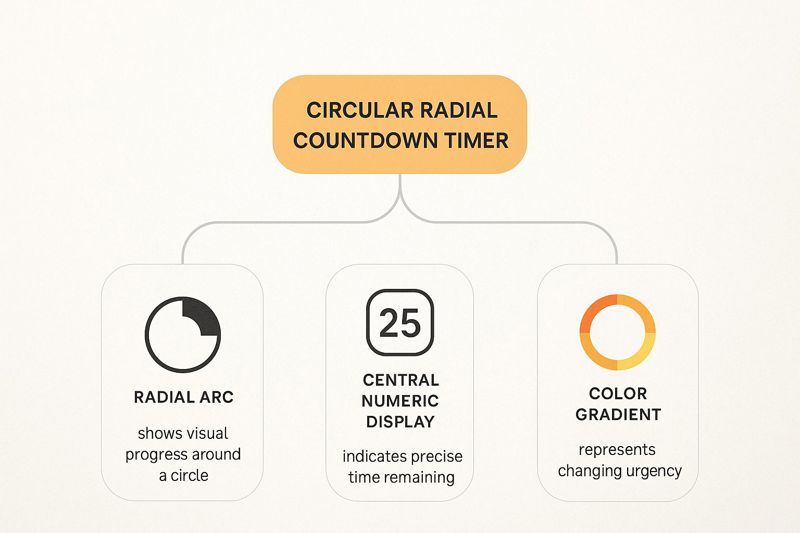
The infographic above visualizes the key elements of a circular progress countdown clock image. The central concept, "Radial Progress," branches out to showcase its core features: the circular format, the use of arcs/segments as progress indicators, and the numerical time display. Further connections highlight the benefits of using concentric circles for different time units (hours, minutes, seconds) and color gradients to enhance the visual representation of time progression. The infographic also emphasizes the importance of central numerical time display for precision and the integration of other design elements like tick marks.
This visual representation clarifies how these features contribute to the overall effectiveness of circular progress indicators, emphasizing their strengths in providing both an intuitive visual representation and precise numerical feedback. The interconnectedness of these elements highlights why circular progress is a powerful tool for communicating time-based information effectively.
Circular progress indicators shine in their ability to communicate both precise and estimated time remaining. Features like a 360-degree circular format, radial progress indicators (arcs or segments), a central numerical time display, and the option for concentric circles for different time units all contribute to this dual functionality. The use of color gradients along the arc can further enhance the visualization of time progression. Learn more about Circular/Radial Progress for a deeper dive into their applications.
Consider these examples of successful implementations: the Apple Watch activity and timer rings, fitness apps displaying workout progress, Pomodoro timer applications, and even cooking timers. These examples illustrate the versatility and effectiveness of this approach across different contexts.
Pros:
- Intuitive: Easily understood visual representation of time completion.
- Compact: Works well in limited spaces, ideal for social media graphics or email headers.
- Integrative: Can be seamlessly incorporated into logos or circular design elements.
- Scalable: Effective at both large and small sizes, perfect for both website banners and mobile app notifications.
- Dual Indication: Provides both precise (numerical) and approximate (visual) time indication.
Cons:
- Technical Complexity: Can be more challenging to implement than simple digital timers.
- Precision at a Glance: Might require a closer look for precise time reading compared to digital displays.
- Limited Space: Less room for additional information compared to linear progress bars.
- Potential Confusion: Resemblance to loading spinners or other circular indicators could cause confusion.
Tips for Implementation:
- Color Coding: Use distinct colors or thicknesses for hours, minutes, and seconds rings to enhance readability.
- Central Display: Always include a clear numerical display in the center for precise timekeeping.
- Tick Marks: Add tick marks around the circumference for better visual reference and accuracy.
- Smooth Animations: Animate transitions fluidly to maintain visual context and engagement.
- Legibility Testing: Ensure readability at smaller sizes, especially for mobile applications.
Circular/radial progress countdown clock images owe their popularity to pioneers like Nicholas Felton and to the widespread adoption in interfaces like the Apple Watch activity rings and Google Material Design progress indicators. This approach is especially effective for marketers, event organizers, and anyone needing to communicate deadlines or create a sense of urgency visually. By using this countdown clock image format, you can create visually compelling and informative content that captures attention and drives engagement.
6. Retro/Vintage
For a countdown clock image that oozes nostalgia and captures the charm of bygone eras, the retro/vintage approach is a powerful choice. This style leverages design elements from specific historical periods, transporting viewers back in time and creating a unique aesthetic that stands out in the digital landscape. Whether you're promoting a vintage-inspired brand, a period-specific event, or simply aiming for a distinctive look, a retro countdown clock image can be highly effective.
Retro/vintage countdown designs draw their inspiration from historical timepieces and typography. Imagine the clicking flip clocks of the 1960s, the vibrant neon signs of the 1980s, or the intricate mechanical timers of the Victorian era. These designs incorporate period-appropriate colors, textures, and typographic styles to evoke a sense of nostalgia. Features like era-specific typography (Art Deco, Mid-Century, etc.), aged or weathered textures, and color palettes specific to historical periods are key components of this style. Often, they incorporate visual references to analog time-keeping devices and decorative elements typical of the chosen era, further enhancing the retro feel.
Examples of successful implementation:
- The Pip-Boy interface timers in the Fallout video game series perfectly capture the retro-futuristic aesthetic of the game's setting.
- Vinyl record release countdowns often use a vintage style, playing on the format's nostalgic appeal.
- New Year's Eve events with specific decade themes (e.g., a roaring 20s party) can utilize retro countdown clock images to build excitement.
- Vintage movie theater pre-show countdowns recreate the experience of classic cinema.
- Steam-punk themed event marketing can employ intricate, clockwork-inspired countdown timers.
Why choose a retro/vintage countdown clock image?
This approach offers several advantages:
- Creates an emotional connection through nostalgia: Retro designs tap into positive memories and associations, fostering a stronger connection with the audience.
- Distinctive aesthetic: It stands out from modern, minimalist designs, capturing attention in a crowded digital space.
- Reinforces brand identity: For vintage-inspired brands, a retro countdown clock image strengthens brand consistency and resonates with the target audience.
- Rich storytelling opportunities: The chosen era can add a layer of narrative and context to the countdown.
- Thematic consistency: For period-specific events or content, a retro countdown clock image enhances the overall theme and atmosphere.
However, there are also some potential drawbacks:
- Legibility: Intricate designs and stylized typography may sacrifice some readability.
- Gimmick factor: If not well-executed, the retro aesthetic can feel forced or inauthentic.
- Limited audience appeal: Younger audiences lacking the historical context may not connect with the design.
- Complexity: Retro designs often incorporate more elements, potentially increasing design complexity.
- Clash with modern UI: The vintage style may not align with contemporary user interface expectations.
Tips for creating effective retro/vintage countdown clock images:
- Research: Thoroughly research authentic period design elements for accuracy.
- Font selection: Use appropriate fonts that genuinely reflect the chosen era, avoiding generic "old-looking" typefaces.
- Texture and aging: Apply texture and aging effects subtly and consistently to avoid an overly artificial look.
- Cultural context: Consider the cultural context of the era you're referencing to ensure respectful and accurate representation.
- Balance authenticity with usability: Strive for a balance between authentic period details and modern usability needs to ensure the countdown clock image is both visually appealing and functional.
Popularized by: Film and television period productions, the hipster culture and analog revival movement, vintage-inspired brands like Fossil watches, musicians using retro aesthetics (e.g., The White Stripes), and typography revival specialists like House Industries.
By carefully considering the pros and cons and following these tips, you can create a compelling retro/vintage countdown clock image that effectively leverages the power of nostalgia and enhances your marketing efforts. This approach offers a unique way to engage your target audience and make your countdown truly memorable. Remember, the goal is to create a countdown clock image that not only looks visually appealing but also effectively communicates the urgency and excitement of the impending event.
7. Typographic/Text-Based Countdown Clock Image
Typographic/text-based countdown clock images offer a clean and stylish approach, focusing on the art of typography to convey urgency and excitement. Instead of relying on complex graphics or animations, this method utilizes creative text arrangements, font variations, and strategic spacing to display the remaining time. This makes them highly adaptable and often faster-loading than image-heavy alternatives, contributing to a seamless user experience. For a countdown clock image that prioritizes clarity and integrates seamlessly with existing branding, a typographic approach is a strong contender.
This style leverages the power of expressive typography as the primary design element. Think carefully selected font weights, sizes, and families working together to create visual interest. Minimal graphical elements, if any, are used, putting the focus squarely on the text itself. Color and contrast are strategically employed to emphasize key information like the numbers representing days, hours, minutes, and seconds. Even text alignment and spacing become compositional tools, contributing to the overall aesthetic. Often, word-based time indicators (e.g., "Days," "Hours") are used alongside numerals, enhancing readability and adding a touch of sophistication.
Examples of successful implementation:
- Coming soon pages for design agencies and portfolios showcase creativity through font choice.
- Literary event countdowns and book launches build anticipation with elegant typography.
- Editorial and publishing websites use timers to highlight upcoming articles and releases.
- Typography conference and event marketing materials feature visually striking countdown designs.
- Minimalist product launch pages create a sense of exclusivity with clean, text-based countdowns.
When and why to use this approach:
A typographic countdown clock image is particularly effective when you want to:
- Maintain a consistent brand identity: Carefully chosen fonts can seamlessly integrate the countdown with your existing branding.
- Prioritize accessibility: Screen readers can easily interpret text-based designs, ensuring inclusivity.
- Ensure fast loading times: The minimalist nature of these countdowns contributes to optimal website performance.
- Project a modern and sophisticated aesthetic: The clean and uncluttered design can convey elegance and professionalism.
Actionable Tips for Creating Effective Typographic Countdowns:
- Font Selection is Key: Choose fonts that reflect the mood and purpose of the countdown. A playful font for a product launch might differ drastically from a more formal font for a corporate event.
- Establish Hierarchy: Create visual hierarchy through size and weight variations. Larger, bolder fonts draw attention to the most important numbers.
- Monospace for Numerals: Consider using monospace fonts for numerical elements to ensure perfect alignment, creating a clean and organized look.
- Balance & Readability: Balance expressive display fonts for titles and headers with highly readable fonts for supporting text.
- Negative Space: Use negative space intentionally as part of the composition. Proper spacing enhances readability and contributes to a more refined design.
- Responsive Design: Test readability across different screen sizes to ensure a consistent experience for all users.
Pros and Cons:
Pros:
- Highly adaptable to different brand identities through font choice.
- Typically fast-loading and technically simple to implement.
- Works well across multiple platforms and devices.
- Can be made very accessible for screen readers.
- Allows for creative expression while maintaining clarity.
Cons:
- May lack visual impact compared to more graphical approaches.
- Requires strong typography skills to execute effectively.
- Limited options for animation and interaction.
- Can become generic if not thoughtfully designed.
- Font licensing may be a consideration for commercial projects.
Learn more about Typographic/Text-Based countdown designs and how to implement text overlays on images.
This approach, popularized by practitioners of the Swiss/International typographic style, editorial and publishing design leaders, and influential typographers like Erik Spiekermann and Jessica Hische, offers a powerful way to leverage the beauty and versatility of typography for your countdown clock image. For email marketers, social media managers, event organizers, and anyone looking for a clean and effective way to generate excitement, the typographic countdown is a valuable tool.
8. 3D/Isometric
For a truly eye-catching countdown clock image, consider a 3D or isometric design. This approach leverages depth, perspective, and dimensional rendering to create countdown timers that pop off the screen and capture attention. These designs can range from photorealistic 3D objects to stylized isometric illustrations, offering a wide range of visual possibilities for your countdown clock image. Think of it as bringing your countdown to life, adding a tangible quality that flat designs simply can't match. This makes 3D/isometric countdowns particularly effective for high-impact campaigns where you want to make a lasting impression.
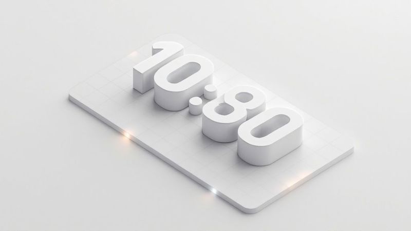
3D/isometric countdown clocks utilize features like light and shadow to enhance the dimensional appearance. Three-dimensional number forms, often rotated or uniquely oriented in space, add to the dynamic feel. Isometric grids and consistent angular presentations create a visually appealing structured feel, while materials and texturing that respond to virtual lighting add a touch of realism. This approach allows for creative spatial compositions, making your countdown clock image stand out from the crowd. Imagine a countdown timer integrated seamlessly into a 3D rendering of your new product or displayed as part of an engaging isometric cityscape. The possibilities are vast.
Pros:
- Creates visual impact and memorability: A 3D countdown clock image is far more likely to be remembered than a standard flat design.
- Allows for creative spatial compositions: Break free from the limitations of 2D and explore innovative layouts.
- Can integrate with 3D brand elements and environments: Seamlessly blend your countdown with existing 3D assets for a cohesive brand experience.
- Provides opportunities for unique transitions and animations: Imagine numbers rotating into place or subtly floating – the animation potential is immense.
Cons:
- Typically more resource-intensive to create and render: Creating 3D graphics requires specialized skills and software, potentially increasing production time and cost.
- Can be distracting if not well-executed: Poorly designed 3D can look cluttered and detract from the countdown's core function.
- May have accessibility concerns with readability: Ensure sufficient contrast and clear number forms for optimal readability.
- More complex to implement for web and mobile: 3D elements can impact website and app performance, requiring careful optimization.
Examples: Think tech product launches (Apple, Samsung), video game release marketing materials, or even architectural project timelines visualized in 3D. AR/VR applications also frequently leverage 3D countdown interfaces.
Tips for Implementation:
- Maintain consistent perspective and scale: This ensures a cohesive and professional look.
- Consider viewing angle carefully for maximum legibility: Numbers should be easily readable from the intended viewing perspective.
- Use lighting to enhance, not obscure, information: Strategic lighting adds depth but shouldn't compromise clarity.
- Implement subtle animations like rotation or floating for added dimension: Keep animations subtle and avoid overwhelming the viewer.
- Ensure the 3D elements don't compromise the primary function – displaying time: Form should follow function.
- Test rendering performance across target platforms: Optimize for smooth playback on all intended devices.
This method deserves its place on this list because it elevates the humble countdown clock image into a captivating visual experience. When used effectively, a 3D/isometric countdown can significantly enhance your marketing campaigns and create a truly memorable experience for your target audience, whether you're an email marketer, social media manager, event organizer, or part of a sales team. The added depth and visual interest can make all the difference in capturing attention and building anticipation.
Countdown Clock Image Styles Comparison
| Style/Format | Implementation Complexity 🔄 | Resource Requirements ⚡ | Expected Outcomes 📊 | Ideal Use Cases 💡 | Key Advantages ⭐ |
|---|---|---|---|---|---|
| Digital LED Style | Low to moderate; simple segment-based design | Low; basic graphics and color contrasts | High legibility, technical, precise | Technical timers, emergency systems, event countdowns | Extremely legible, instantly recognizable, good contrast |
| Minimalist Flat Design | Low; straightforward typography and layout | Low; minimal graphics, fast loading | Clean, modern aesthetics, high readability | Modern web/apps, product launches, clean UI designs | Modern look, accessible, integrates well with flat design |
| Skeuomorphic/Realistic | High; detailed textures, shadows, and animations | High; heavy graphics and animations | Visually rich, familiar, emotionally engaging | Luxury brands, thematic events, detailed app or site timers | Realistic, intuitive, strong visual metaphors |
| Motion Graphics | Very high; requires animation skills and complex transitions | High; CPU/GPU intensive and creative tools needed | Engaging, dynamic, attention-grabbing | Broadcasts, video game launches, live streaming intros | Highly engaging, dynamic, storytelling through motion |
| Circular/Radial Progress | Moderate; requires drawing arcs and animations | Moderate; vector graphics and JavaScript animations | Intuitive visual progress, compact | Fitness apps, watches, cooking timers, mindfulness apps | Visual time progress, compact, scalable, dual numeric & visual |
| Retro/Vintage | Moderate to high; era-specific typography and textures | Moderate; detailed styling and textures | Nostalgic, distinctive, emotionally connecting | Period-themed events, vintage brand campaigns, themed marketing | Emotional appeal, distinctive, rich storytelling |
| Typographic/Text-Based | Low; focused on fonts and layout | Low; minimal graphics, web fonts | Creative and clear typography-driven countdown | Editorial sites, portfolios, minimalist product launches | Highly adaptable, fast loading, accessible |
| 3D/Isometric | High; involves 3D modeling, lighting and rendering | High; requires 3D tools and powerful hardware | Visually impactful, spatial depth and unique presentation | Tech launches, gaming, AR/VR, architectural timelines | Memorable, creative spatial compositions, unique animations |
Ready to Create Stunning Countdown Clocks?
From digital LED displays to minimalist flat designs, retro aesthetics to 3D isometric visuals, we've explored eight distinct countdown clock image styles to ignite excitement and drive engagement for your upcoming campaigns. Whether you're an email marketer aiming to boost open rates, a social media manager crafting compelling stories, or an event organizer building pre-launch buzz, the right countdown clock image can significantly amplify your message. Mastering these visual techniques allows you to tailor your campaigns to specific audiences, creating a personalized experience that resonates and converts. Creating a countdown clock image is just the beginning. To maximize your campaign's impact, consider exploring various content repurposing strategies to extend the reach of your visuals across different platforms and formats. This insightful guide from Outrank, titled "Top Content Repurposing Strategies to Boost Your Reach," offers valuable tactics to amplify your visual content's effectiveness.
Remember, a well-crafted countdown clock image isn't just a visual element; it's a powerful tool for driving anticipation and ultimately achieving your marketing objectives. It's the visual representation of what's coming, building excitement and capturing attention in a world saturated with information. Ready to transform your marketing visuals and create captivating countdown experiences? Explore the power of personalized countdown images with OKZest and unlock a new level of audience engagement. OKZest empowers you to effortlessly generate and customize a wide range of countdown clock images, perfectly tailored to each campaign and audience segment.