An effective event ticket layout does far more than just grant entry—it's a powerful marketing tool that builds anticipation and reinforces your brand from the moment someone receives it. This first touchpoint can transform a simple pass into a valuable piece of your event's story, shaping an attendee's perception long before the doors even open.
Why Your Event Ticket Layout Is a Marketing Powerhouse
Let's be honest, an event ticket is no longer just a way to get past the velvet rope. This humble piece of paper (or string of pixels) has become a critical marketing asset. A well-executed event ticket layout acts as the opening act, setting the tone for your event and getting people genuinely excited.
The ticket has come a long way. Picture London's Theatre Royal back in 1732, where ticketing was as basic as it gets—you just paid at the door and hoped for a seat. It wasn't until the mid-19th century that paper tickets with intricate designs became status symbols. If you want to see just how far we've come, it's worth taking a dive into the fascinating history of live event ticketing.
Today, that evolution continues. Your ticket is a direct line to your audience, a mini-billboard that lives in their wallet or inbox. It's a chance to make a strong first impression while clearly communicating essential information.
The Modern Ticket as a Brand Ambassador
Think of your ticket as a brand ambassador. Its design, from the color palette to the typography, says a lot about your event's personality. Is it a high-energy music festival or a formal corporate conference? The layout should reflect that vibe instantly.
A great design accomplishes several key marketing goals:
- Reinforces Brand Identity: It consistently uses your logos, colors, and fonts.
- Builds Anticipation: A visually appealing ticket gets people excited and more likely to share it.
- Communicates Value: Professional design suggests a high-quality, well-organized event.
- Creates a Memorable Keepsake: Many attendees save tickets from memorable events, extending your brand's reach long after the event is over.
A ticket isn't just a transaction receipt; it's the prologue to the experience. A thoughtful event ticket layout primes your audience, telling them what to expect and assuring them they've made a great choice.
Ultimately, neglecting your ticket design is a huge missed opportunity. It’s a functional tool that can—and should—work harder for your brand. By focusing on creating a clear, attractive, and informative layout, you add significant value to the attendee experience, turning a simple entry pass into a powerful part of your marketing funnel.
The Anatomy of an Unforgettable Ticket Design
A great event ticket does more than just grant entry; it builds anticipation. It’s a delicate balancing act, blending critical information with a design that gets people genuinely excited. Think of it as a pocket-sized masterpiece of communication, where every single element has a specific job. At a glance, your ticket needs to answer the core questions: who, what, where, and when.
This isn't just about slapping details on a canvas. It's about arranging them so the human eye can process everything logically and without effort. To nail this, you need to understand the fundamental principles of visual hierarchy in graphic design, which will help guide the attendee's eye exactly where you want it to go.
Prioritizing Your Information
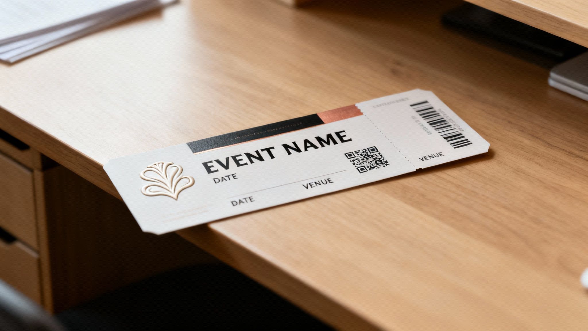
The most effective ticket layouts use size, color, and placement to create a clear informational hierarchy. The event title should be the star of the show—the most prominent element on the ticket. Right after that come the date and venue. These are the details your guest will instinctively look for first.
Secondary info, like the event time, a seat number, or the ticket type, should be smaller but still perfectly legible. Finally, the tertiary stuff—think terms and conditions or sponsor logos—can be tucked away in the least prominent areas of the design.
An exceptional ticket answers a guest's questions before they even have to ask. The layout should be so intuitive that finding the date, time, and location takes less than three seconds.
For example, a music festival ticket will probably use a bold, expressive font for the headlining band's name, making it the hero of the entire design. On the other hand, a ticket for a corporate conference would likely prioritize a clean, professional font for the event title and keynote speaker's name.
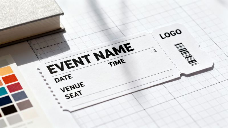
Essential Information Checklist for Your Event Ticket Layout
To make sure your ticket is both functional and complete, you need to include a few non-negotiable details. This checklist breaks down what to include and how to prioritize it for the best attendee experience.
| Information Category | Specific Details to Include | Design Tip |
|---|---|---|
| Tier 1 (Must-Have) | Event Name, Date & Time, Venue Address | Use the largest fonts and most prominent placement for these elements. |
| Tier 2 (Attendee-Specific) | Attendee Name, Seat/Section Number, Ticket Type (e.g., VIP) | Keep this information clear and grouped together for easy reference. |
| Tier 3 (Functional & Branding) | QR Code or Barcode, Your Logo, Contact/Support Info | Place the QR code on a high-contrast background for scannability. |
Running through this list ensures you haven't missed anything crucial that could cause confusion for your attendees on the day of the event.
Balancing Brand and Functionality
While clarity is king, your ticket is also a prime branding opportunity. Your logo should be clearly visible but not so large that it overpowers the critical event details. The color palette and typography you choose must align with your overall event branding to create a cohesive, memorable experience.
Think about a luxury brand's VIP event ticket. It might feature a minimalist design, be printed on premium paper stock, and even have foil accents. Here, the focus is on the brand's aesthetic to convey a feeling of exclusivity. You can get a sense of how different brands tackle this by exploring a gallery of diverse event ticket examples for some inspiration.
Striking this balance is absolutely crucial. A ticket that’s all flash but has no clear information will only cause frustration, potentially leading to attendees showing up at the wrong time or place. Conversely, a purely functional ticket that ignores branding is a missed chance to connect with your audience and build excitement. A truly great design manages to do both.
Navigating Digital and Print Ticket Specifications
Designing a ticket for a physical print run and one for a digital screen are two completely different beasts. Each medium has its own set of technical rules. If you ignore them, you could be looking at costly reprints, confused attendees, and a brand image that takes a serious hit. Getting these specs right from the very beginning is absolutely non-negotiable.
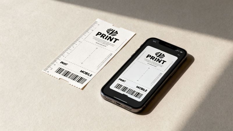
With printed tickets, it's all about precision. A single mistake in your setup file can ruin an entire batch. For digital tickets, the focus shifts to making sure your design is adaptable and accessible on dozens, if not hundreds, of different devices.
Mastering Print Ticket Design
When you send a design off to a professional printer, you need to speak their language. That means getting a handle on a few key technical terms to make sure what you see on your screen is what comes off the press.
Here’s what you need to lock down:
- Resolution: Always, always design at 300 DPI (dots per inch). Anything less will look blurry and pixelated in person, which screams unprofessional.
- Color Mode: Stick to CMYK (Cyan, Magenta, Yellow, Key/Black) for anything destined for print. If you design in RGB (which is for screens), your colors will look disappointingly dull and off when printed.
- Bleed Margins: You'll want to add a 0.125-inch (or 3mm) bleed around your entire design. This is just a little extra space for your background images or colors to extend past the trim line, guaranteeing you won't see any ugly white edges after the tickets are cut.
- Standard Size: A classic ticket size is 5.5 x 2 inches, but it's always smart to confirm the exact dimensions with your printer before you get too far into the design process.
The whole game changed when scannable codes came along. The barcode's arrival around the year 2000 completely upended traditional event ticket layouts. Gone were the days of elaborate anti-fraud patterns, replaced by a simple, standardized format that made everything more efficient. Today, the events industry drives a whopping 7.88% of all global QR code scans for everything from check-in to networking. You can find more nuggets like this in these event industry statistics from Eventgroove.
Don't think of print and digital tickets as an either/or situation. A truly great event ticket strategy creates a cohesive design language that works beautifully for both. This offers a consistent, professional brand experience no matter how an attendee gets their pass.
Optimizing for Digital and Mobile Screens
When it comes to digital tickets, your primary goal is mobile-first readability. Simple as that. Your design is going to be viewed on a massive variety of screen sizes and in all sorts of lighting conditions, so it has to be flexible and crystal clear.
Think vertically. Most people will pull up their ticket on a smartphone, so a portrait orientation (something like a 9:16 aspect ratio) is your best bet. Use high-contrast color combinations—like classic black text on a white background—to ensure the critical details are legible, even in the bright sunlight of an outdoor festival.
This is also where you can get clever with technology to make each digital ticket unique. It's a core concept you can dig into when you learn more about what is variable data printing and how it unlocks powerful personalization.
Driving Engagement with Personalized Ticket Designs
A generic event ticket is a huge wasted opportunity. Once you've nailed the essential layout, the next move is to make each ticket feel personal and exclusive. This is where you bring your design to life with personalization, turning a simple entry pass into a powerful connection point with your attendee.
When you add dynamic data right into your ticket design, every person feels seen. It’s the difference between a mass-produced flyer and a personal invitation. Think about it: getting a ticket for a conference is one thing, but getting one that welcomes you by name, confirms your specific workshop, and shows your exact seat? That feels different.
The Power of Merge Tags in Ticket Design
The secret to making this happen at scale is using merge tags (you might also see them called placeholders). These are just reserved spots in your main ticket template. You design one great-looking ticket and pop in tags like {{first_name}} or {{seat_number}}.
When you hook up your attendee list—whether it's from a spreadsheet or your CRM—a platform like OKZest automatically fills in those blanks for every single person. This process can generate hundreds or thousands of unique ticket images in minutes, each one made just for the individual.
- Attendee Name: The most basic personalization, but it’s still the most effective.
- Seating Information: Essential for concerts and theaters (e.g., Section 104, Row B, Seat 12).
- Ticket Type: Clearly mark tickets as ‘VIP,’ ‘General Admission,’ or ‘Early Bird.’
- Unique QR/Barcode: Dynamically generate a scannable code for each attendee.
- Personalized Welcome: Add a little something extra, like, "We're so excited to see you, Sarah!"
This kind of detail transforms a functional item into a keepsake. The same logic applies elsewhere in branding, like with personalized promotional products, where a small custom touch makes a big impact.
A personalized ticket shifts the attendee’s mindset from "I bought a ticket" to "This is my ticket for my experience." It’s a small change in your event ticket layout that makes a huge psychological impact.
Integrating Personalized Tickets into Email Campaigns
Creating these custom tickets is only half the job; getting them to your attendees seamlessly is where you really make an impression. By putting personalized images directly into your email campaigns, you create a 'wow' moment right in their inbox. It's surprisingly simple with tools like Klaviyo or Mailchimp.
Instead of attaching a boring, generic PDF, you embed a dynamic image URL into your email template. When the email goes out, the merge tags grab each person's data and display their unique ticket. This takes a standard confirmation email and makes it genuinely exciting and shareable. To see exactly how this works, check out our guide on using personalized images for email campaigns.
Even though we live in a digital world, the idea of a physical ticket still has a certain pull. Modern ticket designs have to work as hybrid powerhouses. While Shakespeare's Globe had different prices for different physical sections, today’s designs use personalization to create that same sense of value. With research showing that 66% of consumers only buy tickets a few times a year, a standout design is absolutely critical for grabbing their attention. This approach makes every interaction feel exclusive, building anticipation and proving your event is worth it.
Putting Your Tickets Where They Count: Marketing Integration
You’ve designed the perfect personalized ticket. That’s a huge step, but the real magic happens when you get it into your attendees' hands. A brilliant event ticket layout is only as good as its delivery, and this is where you connect your designs directly to your audience.
The best way to do this? Embed dynamic, personalized ticket images right into your communications. Forget generic attachments. When the ticket appears as a natural part of the message itself, it creates an instantly engaging and seamless experience.
This whole process is surprisingly straightforward. It boils down to merging a single design template with your attendee data to produce countless unique tickets.
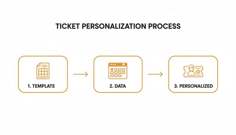
This simple flow—template, data, and personalized output—is what lets you scale your custom ticket creation from a handful of guests to thousands, all without any tedious manual work.
Automating Tickets in Your Email Campaigns
Email is still king for event communication. By using a simple merge tag from a platform like OKZest inside your email service provider (think Klaviyo or Mailchimp), you can put the entire process on autopilot. Every single person on your list gets an email with their unique ticket image, complete with their name, seat, and QR code.
For instance, a confirmation email can immediately show a vibrant ticket with {{first_name}}'s details front and center. It validates their purchase and makes the whole thing feel special. It’s a world away from a plain-text receipt or a clunky PDF attachment and turns a simple transaction into an exciting pre-event moment.
The goal is to make every touchpoint feel personal. Embedding a custom ticket image directly into an email or on a confirmation page transforms a standard communication into a memorable, shareable moment for your attendee.
Extending Personalization Beyond Email
Your personalized tickets can—and should—live beyond the inbox. Just think about the entire attendee journey and all the places where a visual confirmation would add a little something extra.
Here are a few other channels to get you started:
- Post-Purchase Landing Pages: After someone buys a ticket, don't just show them a generic "Thank You" page. Display their personalized ticket right on the screen. It’s immediate, it’s exciting, and it confirms their purchase visually.
- Direct Messaging and Chat: For VIPs or special guests, sending a personalized ticket image via WhatsApp or Instagram DM is a modern, high-touch way to confirm their spot.
- Event Apps and Portals: If you use a dedicated app or attendee portal, personalized ticket images make for fantastic header banners. They welcome users and put their entry details right where they need them.
Take Disneyland, for example. They host separately ticketed, after-hours events like "Sweethearts' Nite" to create an exclusive feel. Imagine getting a custom-themed ticket image in your confirmation message—it instantly drives home the special nature of the event and makes you feel like you're part of an exclusive club. By weaving your ticket visuals across these different channels, you build a cohesive and impressive journey for every single guest.
Common Questions About Event Ticket Layout and Design
Even with a killer design in hand, you're bound to have questions. Getting the details right can be the difference between a smooth event and a logistical headache.
Let's walk through some of the most common things that trip people up when designing event tickets.
What Is the Best Size for a Standard Event Ticket?
This is a classic question, and the honest answer is: it depends.
For printed tickets, a safe bet is 5.5 inches by 2 inches. It’s big enough for all the critical info and branding, but small enough for someone to tuck into a wallet or pocket. Think of it as the reliable workhorse for most physical events.
But when you’re designing for digital, you have to think mobile-first. A vertical layout is your best friend here. Aim for a 2:3 or 9:16 aspect ratio—this will fit beautifully on most smartphone screens, so your attendees aren't awkwardly pinching and zooming to find their QR code. Always consider the context: a high-end VIP package might warrant a larger, keepsake-style ticket, while a music festival needs something compact and easy to scan in a crowd.
How Can I Make Sure My QR Code Actually Scans?
A ticket that won't scan is a nightmare for everyone. To make sure your QR codes work flawlessly at the door, two things are absolutely critical: contrast and size.
Your code needs to stand out sharply from its background. You can't go wrong with classic black on a solid white background. Avoid placing it over busy photos, complex patterns, or dark, moody colors—all of these can confuse a scanner.
Size matters, too. For printed tickets, the QR code should be at least 1 x 1 inch (2.5 x 2.5 cm). This gives scanning devices a big enough target to read quickly. If you're using a tool to generate tickets dynamically, the QR code is usually placed in a reserved, clear area of the template, which takes a lot of the guesswork out of it.
A ticket’s most important job is to grant entry. Prioritizing QR code scannability over complex background designs is a non-negotiable part of a successful event ticket layout. It’s the one element where function must always win over form.
Can I Really Personalize Thousands of Tickets Automatically?
Absolutely. This is where modern tools really shine. The process is surprisingly straightforward: you create one master event ticket layout, and then you use simple 'merge tags' to act as placeholders for information that will change for each person, like their name, seat number, or membership ID.
From there, you just connect your data source—like a spreadsheet of attendees or an export from your CRM. The platform does the heavy lifting, automatically creating a unique, personalized ticket image for every single person on your list. This isn't just for small, bespoke events; it scales perfectly whether you're sending invites to a few dozen VIPs or generating passes for thousands of conference-goers.
Ready to create stunning, personalized tickets that engage every attendee? With OKZest, you can automate your ticket design process, integrate with your favorite email platforms, and deliver a truly unique experience. Start creating your personalized event ticket layout today.