Why Visual Countdown Clocks Captivate Us So Completely
There's a definite shift in energy when a countdown timer pops up. Suddenly, that deadline isn't just a date on the calendar anymore. It becomes a visual reminder of a shrinking window of opportunity. This isn't just some marketing trick; it actually connects with our deep-seated psychological responses. We're naturally wired to react to scarcity and a sense of urgency, and a ticking clock displays both perfectly. Think about those limited-time offers you've clicked – I bet a well-designed countdown clock image played a big part in that.
Visual countdowns also work because they take the guesswork out of calculating remaining time. We see it disappearing before our eyes. This instant feedback creates a sense of urgency that motivates action. Imagine a countdown timer for a flash sale ending in 2 hours. That visual makes the deadline real and pushes you to act faster than a simple "sale ends soon" message would.
This idea goes way beyond online marketing, too. The screenshot below, from the Wikipedia page for "Countdown," shows just how ingrained this concept is in our culture.

The screenshot highlights how countdowns are used everywhere, from rocket launches to New Year's Eve. It really solidifies their cultural importance and their power to mark big events. Countdowns, like the symbolic Doomsday Clock, are a part of human culture, used in many different contexts. Learn more about countdowns here. NASA, for example, uses countdowns constantly for rocket launches, using the "T-minus" terminology to build excitement.
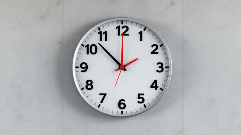
Different visual styles for your countdown also create different feelings. A sleek, digital timer might convey modernity and urgency, perfect for a new tech product launch. But a classic analog clock face, with its ticking hands, can build anticipation and a sense of nostalgia – maybe better for a vintage product promotion. The important thing is to match your visual style with your brand and who you're trying to reach.
This careful approach transforms a simple countdown clock image into a powerful tool for getting people to take action. It taps into our natural reactions to time and scarcity. By understanding this psychology, you can create countdown visuals that truly connect with your audience and get results.
Finding Your Perfect Countdown Clock Visual Style
Picking the right countdown clock image isn't a one-size-fits-all thing. The way it looks has a big impact on how people see your message and what they do next. A sleek, minimalist digital timer might be perfect for a new tech gadget, giving a sense of modern urgency. But for a luxury brand, something more ornate and vintage-inspired might feel more appropriate, hinting at timeless quality.
It's about matching the visual to the vibe you're going for.
I've found that timer duration plays a crucial role, too. Take a look at this:
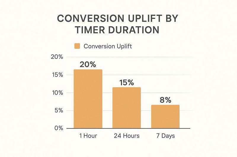
Shorter countdowns, like one hour, tend to boost conversions by about 20%. Longer ones, like seven days, see closer to an 8% uplift. That little bit of extra urgency really pushes people to act fast! If you're curious to learn more, I wrote a whole post about it: Check out our guide on countdown clock images.
Color Psychology and Countdown Clocks
Color is a powerful tool. It influences how we feel about time and deadlines. Red, for instance, screams urgency and excitement. But sometimes it can come across as a bit aggressive. Blue, however, tends to evoke trust and calm, making it a good choice for longer countdowns where you're building anticipation rather than pushing for an immediate sale. Understanding these nuances helps you fine-tune your countdown clock to get the exact reaction you want.
Typography's Influence on Urgency and Trust
The font you choose for your countdown numbers matters more than you might think. A bold, condensed font can amp up the urgency. A more classic, elegant font builds trust and credibility. Think about your brand and who you're talking to. Experimenting with different fonts is key here. I've learned so much about what works for my audience just by testing different styles.
The Impact of Spacing and Composition
Even the spacing around the numbers makes a difference. Too much space can make the whole thing look amateurish. Too little, and it's hard to read. Balance is everything. And don't forget how the countdown fits into the overall design of your website or marketing materials. A cohesive design strengthens your message and makes your brand look sharp.
To help visualize these design choices, I've put together this comparison table:
Countdown Clock Design Styles Comparison Compare different visual approaches for countdown clocks and their best use cases
| Design Style | Best For | Psychological Impact | Technical Difficulty |
|---|---|---|---|
| Minimalist Digital | Tech product launches, sales | Modern, urgent | Easy |
| Ornate Vintage | Luxury brands, special occasions | Timeless, exclusive | Medium |
| Bold & Condensed | Limited-time offers, flash sales | High urgency, attention-grabbing | Easy |
| Classic & Elegant | Brand building, long-term campaigns | Trust, credibility | Easy |
This table summarizes the key design styles and their potential impact. It's a handy guide for choosing the most effective visual approach for your countdown clock, depending on your specific goals and target audience.
Building Your Countdown Clock Visual From the Ground Up
Let's get down to the nitty-gritty: creating your countdown clock image. Whether you're a seasoned Photoshop user or prefer a more beginner-friendly tool like Canva, designing a professional countdown timer is totally achievable. This section covers everything from choosing the right dimensions to those little design touches that make your visuals really pop.
I’ve even found some free AI art generators are surprisingly useful for brainstorming design elements or creating backgrounds. I've used them myself to quickly mock up some ideas and explore different styles – give it a shot!
Dimensions and Aspect Ratios That Display Perfectly
Getting the dimensions right is essential. Think about where your countdown clock image will live – is it destined for social media, an email campaign, or your website’s landing page? Every platform has its own ideal aspect ratios.
For instance, Instagram generally prefers 1:1 or 4:5 aspect ratios for in-feed posts, while Facebook tends to favor 1.91:1. Sticking to these guidelines keeps your countdown looking crisp and prevents any awkward cropping issues. Take a look at this Canva screenshot:
Canva makes it ridiculously easy to adjust image sizes to fit specific platforms. Here, it shows how a countdown clock image would appear across various aspect ratios and formats. The goal is to avoid unexpected cropping or distortion. Picking the correct dimensions early on will definitely save you some frustration.
Organizing Your Layers for Easy Revisions
Take it from me – organize your design files. I’ve learned this the hard way. Keeping your fonts, numbers, and background elements on separate layers makes editing so much easier. Need to tweak the date or change the color scheme? No problem! It becomes a quick fix instead of a complete redesign. Personally, I find that naming layers clearly (like “Countdown Numbers” or “Background Gradient”) is a huge timesaver.
Choosing Fonts That Pop (Without Overpowering Your Message)
Font pairing can truly make or break a design. Contrasting font weights – perhaps a bold sans-serif for the numbers and a lighter serif for any supporting text – create a strong visual hierarchy. This helps guide your viewer's eye right where you want it.
Avoid using fonts that are overly decorative, especially for the numbers themselves. Readability is paramount. You want your audience to instantly grasp the remaining time without having to decipher stylized lettering.
Subtle Design Tricks for a Polished Look
Here’s where you can add some real flair. Subtle drop shadows, gradients, or a thin border can give your countdown a polished, professional feel. A little goes a long way! These small additions elevate the entire visual, taking it from DIY to polished marketing material.
For example, a subtle inner glow around the numbers can make them pop without being overly flashy. It's these little details that differentiate an amateur design from one that truly converts.
Bringing Your Static Design to Life With Motion
So, you’ve crafted this awesome static countdown clock image. Fantastic! But a static image is just that...static. A live countdown, one that actually ticks down in real-time? Now that's where the real excitement lies. It's like the difference between a photo of a crackling fireplace and actually being there, cozy and warm. This is where we inject some life into your design and turn it into a dynamic, engaging element for your audience.
There are several ways to achieve this, and you don't need a computer science degree to do it. From simple embeds to more involved CSS techniques, there’s a method for everyone, regardless of your technical skills. The best approach depends on how much customization you need and how comfortable you are tinkering with code.
Think of it like choosing between a ready-made fireplace insert and building a custom hearth from the ground up. Both give you warmth and ambiance, but the DIY route takes considerably more effort. Similarly, an embed solution provides instant gratification, while CSS offers fine-grained control over every little detail. Also, consider your website platform. Some countdown platforms integrate more seamlessly with certain website builders than others. For instance, WordPress offers plugins that make embedding a live countdown incredibly easy.
Services like OKZest offer easy embedding solutions that integrate well with many popular platforms. Plus, you can often customize these pre-built solutions, adjusting colors, fonts, and other elements to match your brand perfectly. Remember what we covered about overlaying text on an image? You can even use those techniques to further customize your countdown! You might be interested in: Overlaying Text on Image
Speaking of time, countdowns have a powerful psychological effect. The Doomsday Clock, a symbolic countdown to potential global disaster, has been adjusted 26 times since 1947, most recently to a chilling 89 seconds to midnight. It's a stark example of how countdowns are used to create a sense of urgency. Discover more insights on the Doomsday Clock
Back to your countdown clock. Before you unveil it to the world, think about the technical aspects. Is the countdown synchronized across different time zones? Will it display correctly on different devices (desktops, tablets, phones)? These seemingly minor details can make or break your campaign. Ironing out these potential wrinkles beforehand saves you headaches down the road and ensures a smooth, engaging experience for everyone. Trust me, avoiding embarrassing display glitches when your campaign goes live is always worth the extra effort.
Ensuring Flawless Performance Across All Devices
A killer countdown clock loses its punch if it takes forever to load or looks wonky on a phone. Let's make sure yours shines, regardless of the device or internet speed your audience is rocking. We'll dive into smart compression and responsive design tricks so your countdown looks sharp on everything from giant desktop monitors to tiny phone screens. I've picked up a few optimization tricks over the years, and I'm happy to share what I've learned.
Optimizing Image of Countdown Clock for Speedy Loading
Waiting for images to load is one of the biggest online frustrations. A slow countdown clock kills the urgency you’re trying to create. I've seen it firsthand, and it’s not a good look. It just makes people click away. So, let's talk compression. Picking the right image format is key. WebP usually gives you the best quality for the smallest file size. But, if you need something more universally compatible, a highly optimized JPEG or PNG can also do the trick.
To illustrate, check out this quick comparison:
Image Format Performance Comparison Compare different image formats for countdown clocks and their performance characteristics
| Format | File Size | Quality | Browser Support | Animation Support |
|---|---|---|---|---|
| WebP | Smallest | Excellent | Good | No |
| JPEG | Small | Good | Excellent | No |
| PNG | Medium | Excellent | Excellent | No |
| GIF | Large | Fair | Excellent | Yes |
This table shows you the give-and-take with each format. While GIFs handle animation, their larger file sizes can slow things down. For a static countdown clock image, WebP or a well-optimized JPEG is typically your best bet for a smooth user experience. If you're looking to animate your countdown clock, exploring different animation software might be beneficial. For beginners, I'd recommend checking out this guide on animation software for beginners.
Responsive Design for Seamless Viewing
Ever stumbled upon a website where the images were completely off on your phone? It’s a terrible experience. The same goes for your countdown clock. You need it to look good and work properly on any screen. This is where responsive design comes in.
Think of responsive design like a chameleon – it adapts. For your countdown, this means using tricks like CSS media queries to adjust the image's size and position depending on the viewer's screen. This keeps your countdown clear and visually appealing whether someone's on a desktop, tablet, or smartphone.
For instance, on a large desktop, your countdown might take center stage in the hero section. But on a smaller mobile screen, you’ll likely want to scale it down and place it higher up, so it’s immediately visible.
Pre-Loading and Caching for Instant Gratification
No one wants to stare at a blank space while waiting for images to load. Pre-loading and caching are your secret weapons here. Pre-loading tells the browser to download your countdown image as soon as the page begins loading, even before it's needed. Caching stores the image in the user's browser so that next time they visit, the countdown pops up instantly. This creates a much smoother, more engaging experience.
By focusing on performance and responsiveness, you’ll build a countdown experience that’s not just pretty, but also technically solid. Remember, a smooth user experience is key to driving conversions and making the most of your campaign.
Measuring What Actually Matters for Success
Creating a killer countdown clock image is a great start, but it's just the first step. The real work begins when you start tracking its performance and figuring out what truly connects with your audience. It's tempting to get sidetracked by vanity metrics – things like impressions or page views – that might look good on paper but don't actually lead to conversions. So, let's talk about how to measure what really drives results.
Engagement Metrics That Reveal Genuine Interest
Forget the surface-level numbers and focus on metrics that show genuine interest. Click-through rates (CTRs) on the call-to-action linked to your countdown clock are a strong indicator of how effectively it's driving action. If your CTR is low, it might be time to revisit your design or placement. Another crucial metric is time spent on page. Are people sticking around longer when they see the countdown? If so, that’s a good sign that it's grabbing their attention.
To gauge how well the countdown clock is boosting conversions, you'll want to check your website performance metrics.
A/B Testing for Countdown Clock Optimization
A/B testing is your secret weapon when it comes to optimizing your countdown clock. Play around with different visuals, placements, and timing strategies. For example, test a bright red countdown against a more subtle blue one. Or, compare a countdown prominently displayed at the top of the page with one placed within the product description.
Don’t be afraid to get specific with your tests. Small tweaks can yield surprisingly big results. One important tip: when A/B testing, only change one element at a time. This helps you pinpoint the impact of each change, prevents skewed data, and ensures reliable results.
Gathering User Feedback to Refine Your Approach
Hard data is important, but user feedback offers invaluable context. Consider adding a short survey or feedback form on pages with your countdown clock. Ask open-ended questions like "What are your thoughts on the countdown timer?" or "Did it influence your purchasing decision?"
Direct feedback can reveal hidden issues or highlight your countdown's most effective elements. You might discover, for instance, that users find the countdown distracting or that they prefer a different time format. You might find this helpful: Learn more in our article about email marketing images.
Frameworks for Continual Improvement
Building a framework for analyzing your results and acting on those insights is key for ongoing improvement. Regularly review your data, spot trends, and adjust your countdown strategy accordingly. This continuous loop of testing, gathering feedback, and refining your approach is what ultimately leads to impactful results. Think of it like gardening: consistent care and adjustments are vital for a thriving, flourishing countdown clock.
Solving Common Problems and Scaling Your Success
Building a countdown clock image is exciting, but even with careful planning, you might run into a few bumps in the road. Trust me, I've been there! From tricky time zone issues to browser compatibility headaches, unforeseen challenges always seem to pop up. So, let's dive into some practical solutions I've learned along the way—the kind of real-world advice you won't find in most tutorials.
Handling Time Zones and Daylight Saving
Time zones are a notorious countdown clock image problem. If you have a global audience, displaying the wrong time can be a real turn-off. Imagine someone in London seeing a sale ending in "1 hour" when it's actually 1 AM their time! To avoid this, using server-side scripting (like PHP or Python) to detect the user's location and adjust the countdown is key. Think of it like translating your countdown into the local time for each viewer.
Daylight Saving Time (DST) transitions can also throw a wrench into things. A sudden one-hour jump or fall in the countdown can be super confusing for your audience. Thoroughly testing your countdown during these transition periods is essential. I usually set up test cases a few weeks before and after the DST changes to ensure everything runs smoothly.
Preventing Synchronization and Technical Hiccups
Keeping your countdown synchronized across your server and the user's browser is crucial. Discrepancies can lead to frustration and missed conversions. Robust synchronization, using techniques like server timestamps and regular updates, is your best bet. Think of it like keeping two clocks in perfect harmony, ticking in unison.
Technical glitches can also derail your campaign. I've learned this the hard way! Using reliable hosting and countdown scripts from reputable providers is a must. I also recommend testing your implementation on various browsers (like Chrome, Firefox, and Safari) and devices to catch any unexpected behavior before it impacts your audience.
Advanced Strategies for Scaling Your Countdown
Once you've got the basics down, it's time to explore some more advanced strategies. Creating countdown sequences, where one countdown triggers another, can add a dynamic layer of engagement. For example, an initial countdown could lead to a special offer reveal, followed by a final countdown to purchase.
Consider switching up your countdown design for different seasons or promotions. This keeps things fresh and relevant. Integrating your countdown with your email marketing platform (like Mailchimp), CRM, and other marketing tools can transform a simple visual into a powerful conversion engine.
OKZest is a fantastic tool for creating personalized countdown clock images. It's perfect for automating the creation of multiple images, tailored to each segment of your audience, which can dramatically increase engagement and conversions.