Elevate Your Email Game
In today's overflowing inboxes, a poorly designed email is easily overlooked. Understanding email design best practices isn't a luxury; it's a necessity for connecting with your audience and driving conversions. Email marketing has evolved dramatically, from plain text messages to today's interactive, personalized experiences. It's become a powerful marketing channel for driving sales, nurturing leads, and building lasting relationships.
But what makes a modern email truly effective? It's the strategic combination of design principles, user psychology, and technical optimization, working together to deliver a seamless and engaging experience. The success of your campaigns relies on much more than just hitting "send."
This guide explores the core principles of high-performing emails, showing how strategic design choices can significantly impact your open rates, click-through rates, and ultimately, your bottom line. We'll cover key elements that contribute to a positive user experience, from the subject line to the call to action.
Eight Actionable Email Design Best Practices
By the end of this article, you'll be equipped with eight actionable email design best practices, ready to transform your email marketing strategy for 2025 and beyond. Prepare to make your emails stand out and capture your audience's attention.
1. Mobile-First Design Approach
In today's world, where mobile devices reign supreme, prioritizing the mobile experience is paramount. With over 60% of emails being opened on mobile devices, a mobile-first design approach is no longer a luxury, but a necessity for any successful email marketing strategy. This means designing for smaller screens first, such as smartphones, and then adapting the design for larger screens like desktops and tablets. This ensures your emails look great and function flawlessly for most of your audience, no matter what device they're using.
This approach is at the top of email design best practices for a simple reason: it acknowledges how people engage with email today. Ignoring mobile users risks alienating a substantial portion of your audience, ultimately impacting your campaign’s effectiveness.
Key Features of Mobile-First Email Design
Here are some core elements of mobile-first email design:
- Single-Column Layouts: These simplify scrolling and improve readability on smaller screens.
- Touch-Friendly Buttons: Buttons should be large (at least 44x44 pixels) with plenty of space around them to make tapping easy.
- Responsive Design: Emails should seamlessly adapt to different screen sizes for optimal display on any device.
- Minimalist Design: Concise content and a clear hierarchy improve readability and engagement on the go.
- Legible Font Sizes: Use a font size of at least 14px for body text to ensure comfortable reading on smaller screens.
Pros of Mobile-First
- Improved User Experience: By catering to the majority of email readers, engagement increases.
- Increased Click-Through Rates: Streamlined content and easy-to-tap buttons encourage clicks.
- Forces Content Prioritization: This design approach naturally promotes concise and impactful messaging.
- Reduces Load Times: Optimized images and cleaner code result in faster loading times, a crucial factor for mobile users.
- Future-Proofs Emails: As mobile usage continues to climb, this approach ensures your emails remain effective.
Cons of Mobile-First
- Limited Design Complexity for Desktop: While optimizing for mobile, you might need to simplify certain interactive elements that work well on desktops.
- Requires Thorough Testing: To guarantee consistency, rigorous testing across different devices and operating systems is essential.
- Challenging Transition for Desktop-First Teams: Adapting to a mobile-first mindset may require adjustments to existing design workflows.
Real-World Examples
Several major companies already leverage mobile-first effectively:
- Uber: Their ride confirmation emails use large, clear calls-to-action and minimal content, making key information readily accessible on mobile.
- Airbnb: Booking confirmations include large, easily tappable sections for managing reservations, creating a seamless mobile experience.
- Starbucks: Their rewards program emails use a clear visual hierarchy, making it easy for mobile users to quickly find key details and offers.
Tips for Implementation
Here's how to get started:
- Use a Single-Column Layout: Keep a maximum width of 600px.
- Optimize CTAs: Make sure buttons are at least 44x44 pixels with ample whitespace.
- Test Thoroughly: Test on various mobile devices and email clients like Litmus before sending.
- Leverage Preview Text: Optimize preview text to capture attention and boost open rates.
- Consider Thumb-Scrolling Patterns: Design with thumb-friendly placement of key elements in mind.
Evolution and Popularization
The mobile-first approach gained traction with the rise of smartphones. Industry leaders like Litmus (an email testing platform), Campaign Monitor, and MailChimp's responsive templates played a key role in its adoption. As mobile usage continues to dominate, this approach has become the gold standard for effective email design.
2. Personalization and Dynamic Content

Personalization and dynamic content are fundamental to effective email marketing. This strategy focuses on tailoring content to individual recipients. This tailoring is based on their behaviors, preferences, demographics, and other relevant data. Dynamic content adjusts automatically according to the viewer, creating a more relevant and engaging experience. It's a crucial element of any email best practices list. After all, personalized emails cut through the noise of generic marketing messages.
Instead of a one-size-fits-all approach, personalization lets you speak directly to individual needs. Simple personalizations include custom subject lines and greetings. More advanced techniques use dynamic content blocks that change based on user segments. This can include product recommendations based on past browsing or purchases, location-specific offers, and behavior-triggered email sequences.
Think about how Amazon recommends products based on your purchase history. Or how Spotify creates a "Discover Weekly" playlist based on your listening habits. These are excellent examples of personalization and dynamic content. Other examples include Netflix's viewing recommendations and Sephora's Beauty Insider emails with tailored product suggestions.
The advantages of personalization are clear. Studies show it can increase engagement rates by up to 300%. This boost in engagement leads to stronger customer relationships and higher conversion rates. It also helps reduce unsubscribe rates. Personalization even creates opportunities for cross-selling and upselling by suggesting related products or services. For a deeper dive, check out: Our guide on email marketing personalisation.
The growth of marketing automation platforms like Salesforce Marketing Cloud and HubSpot, alongside simpler tools like Mailchimp's merge tags, has made personalized email marketing easier to implement. Amazon's recommendation engine has further normalized personalization, showing its potential to a broad audience.
However, personalization comes with its own set of challenges. It requires strong customer data collection and careful management. Overly aggressive personalization can feel intrusive and damage customer trust. Regular testing and optimization are essential for ensuring dynamic content is effective. Significant technical implementation might be required. There's also the risk of errors if dynamic content fails to load properly.
Tips for Implementation
Start simple: Begin by personalizing subject lines and greetings with first names before implementing complex dynamic content.
Segment your audience: Create meaningful audience segments based on purchase history, engagement level, demographics, and website activity.
Fallback content: Have fallback content ready in case personalized elements don't load. This maintains a positive user experience even if there are technical issues.
Test and measure: Use A/B testing to compare personalized elements against generic versions. This helps measure the impact on key metrics.
Respect privacy: Be open about how you use customer data. Avoid personalization tactics that feel overly intrusive.
By considering these factors, you can effectively use personalization and dynamic content. This will help you build email campaigns that connect with your audience, boost conversions, and cultivate lasting customer relationships.
3. Minimalist Design With Clear Hierarchy
In today's overflowing inboxes, a clean and focused email can truly stand out. A minimalist design with a clear hierarchy isn't just about aesthetics; it's a strategic way to boost engagement. By reducing cognitive load and guiding the reader's eye to critical information, this design philosophy prioritizes clarity and ensures your message gets through.
This approach removes unnecessary elements, concentrating on essential content and a clear path to action. Key characteristics include:
Limited Color Palette: Using 2-3 colors maintains a harmonious and professional appearance.
Strategic Use of White Space: Providing space around elements improves readability and highlights key content.
Clear Typographic Hierarchy: Using different headings, subheadings, and body text with varying font sizes and weights guides the reader.
Focused Call to Action (CTA): A single, prominent CTA, or a clear prioritization if multiple CTAs are needed, minimizes confusion and drives conversions.
Purposeful Visuals: Images and icons, when used, should directly support the message and enhance understanding, avoiding clutter.
Pros of Minimalist Email Design
Improved Readability and Scannability: Readers quickly grasp the main points.
Reduced Loading Times: Fewer elements mean faster loading, benefiting mobile users.
Sophistication and Professionalism: Clean design builds trust and authority.
Cross-Device Compatibility: Adapts well to various screen sizes, ensuring a consistent experience.
Focused Attention: Directs the reader's attention to your core message and intended actions.
Cons of Minimalist Email Design
Risk of Appearing Bland: Careful execution is crucial to avoid a sterile feel.
Limited Creative Expression: May not suit brands wanting a visually rich style.
Demands Skilled Design: Creating impact with fewer elements requires strong design skills.
Not Ideal for Content-Heavy Emails: Complex information may need a more detailed layout.
Real-World Examples of Minimalist Email Design
Apple: Product announcement emails use ample white space, strong visuals, and concise text.
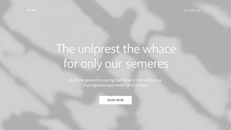
Everlane: Product showcases excel with clean photography, clear pricing, and a compelling CTA.
Dropbox: Feature announcements use focused messaging and minimal distractions.
Airbnb: Booking confirmations employ clear hierarchy for effective information presentation.
Tips for Implementing Minimalist Design
Ruthlessly Eliminate Clutter: Remove anything not directly contributing to the message.
Establish Hierarchy with Font Sizes: Use contrasting sizes (e.g., 24px headlines, 16px body).
Maintain Consistent Alignment: Left-alignment generally improves readability.
Embrace White Space: Create breathing room around elements.
Test With Heat Maps: Analyze user attention to optimize layout.
Evolution and Influences of Minimalist Email Design
Minimalist email design draws inspiration from the wider design world. Apple's marketing emails popularized the style in email marketing. Dieter Rams' ten principles of good design, emphasizing simplicity, are influential. Google's Material Design guidelines, focusing on clean aesthetics and clear hierarchy, reinforced the minimalist trend. The principles of Swiss/International Design Style also contribute to this philosophy.
By embracing minimalist design with a clear hierarchy, email marketers can cut through the noise, improve user experience, and achieve better results. This approach prioritizes effective communication and caters to today's fast-paced digital consumption.
4. Strategic Use Of CTAs (Calls To Action)
Calls to action (CTAs) are essential for successful email marketing. They are the clickable buttons or links that guide recipients toward a desired action, such as visiting a website, making a purchase, or subscribing to a newsletter. Strategic CTA design and placement are crucial for maximizing click-through rates and, ultimately, conversions. This means making CTAs highly visible, compelling, and in line with what users expect.
This best practice is vital because it directly connects email engagement with tangible results. Even the most well-designed and engaging email can fail without effective CTAs.
Key Features of Effective CTAs
High-Contrast Design: Buttons should visually pop against the surrounding content.
Action-Oriented Text: Use verbs that clearly communicate the intended action (e.g., "Get Your Free Quote," "Download Now," "Register Today"). Avoid generic phrases like "Click Here."
Strategic Placement: Consider the flow of your email and how users read it. Place primary CTAs "above the fold" whenever possible.
Optimized Sizing: Buttons should be appropriately sized for different devices, especially for mobile users tapping on their screens.
Visual Cues: Use arrows, icons, or other visuals to direct attention to the CTA.
Pros and Cons of Using CTAs
Pros:
- Directly influences conversion rates and ROI of email campaigns.
- Creates clear action paths for recipients.
- Provides measurable data for testing and optimization.
- Guides the user journey beyond the email.
- Can be A/B tested for continuous improvement.
Cons:
- Too many CTAs can be overwhelming and less effective.
- Poorly designed CTAs may not display correctly in all email clients.
- Requires balancing visual appeal with overall design.
- Effectiveness depends on how well the CTA aligns with email content and what the audience expects.
Real-World Examples
Booking.com: Uses limited-time offers with countdown timers near CTAs to create a sense of urgency.
Slack: Employs bright, distinctive buttons (often purple) with clear calls to action like "See What's New" in product updates.
Headspace: Combines "Start Meditating" CTAs with calming imagery to reinforce its message.
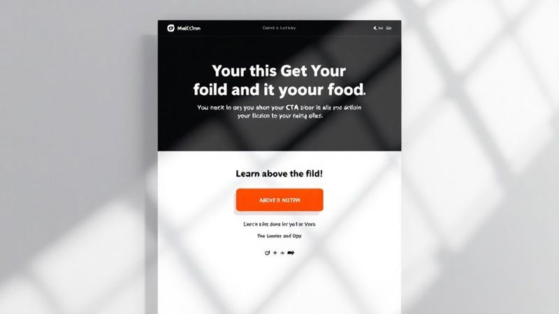
Mailchimp: Uses clear, action-oriented buttons in its own marketing emails, demonstrating best practices.
Tips For Implementation
- Use HTML buttons instead of images for better deliverability and accessibility.
- Place primary CTAs above the fold.
- Use action verbs that create urgency or state benefits clearly (e.g., "Claim Your Discount" is better than "Submit").
- Maintain enough white space around buttons to prevent accidental clicks and improve visual appeal.
- Test different colors, shapes, sizes, and wording to optimize performance.
- Consider directional cues like arrows or images of people looking at your CTA.
You might be interested in: How to Increase Click Rate in Email Marketing for further insights.
Evolution And Popularization
The strategic use of CTAs has evolved alongside email marketing. As email became more sophisticated, marketers recognized the need for clear calls to action. Platforms like Button.io (for CTA testing) and Litmus (for email testing) have helped refine CTA strategies. Marketing experts like Neil Patel and Mari Smith have also emphasized the importance of good CTA design. E-commerce platforms like Shopify, with their built-in best practices, have further broadened access to effective CTA strategies, making them a cornerstone of modern email marketing.
5. Accessible Email Design
Accessible email design isn't just a passing fad; it's a core element of building effective and inclusive email marketing campaigns. It means crafting emails that everyone can understand and use, regardless of their abilities. This includes people with visual impairments, motor limitations, and cognitive differences, as well as those using assistive technologies like screen readers. Prioritizing accessibility ensures your message reaches the widest audience, including the estimated 15% of the global population with disabilities.
This inclusive design approach focuses on several key features:
Semantic HTML Structure: Using a proper heading hierarchy (H1-H6) and other semantic HTML elements (e.g.,
<article>,<aside>,<nav>) builds a logical structure that assistive technologies can interpret. This improves navigation and understanding for users who can't rely on visual cues.Sufficient Color Contrast: Ensuring enough color contrast between text and background is vital for users with low vision. The WCAG (Web Content Accessibility Guidelines) AA standard recommends a minimum contrast ratio of 4.5:1 for normal text.
Alternative Text for Images: All images conveying information need descriptive alt text. Screen readers read this text aloud, giving context to users who can't see the image. Decorative images can use empty alt text (
alt="").Keyboard Navigation: Interactive elements, like buttons and links, should be usable with just the keyboard. This is critical for users unable to use a mouse.
Screen Reader Optimization: Clear and concise language, descriptive link text (avoid "click here"), and correct HTML structure make your content easy for screen readers to interpret.
Accessible Fonts and Text Sizing: Choose readable fonts and ensure sufficient text size for users with visual impairments.
Pros of Accessible Email Design
Wider Reach: Reaches the considerable segment of the population with disabilities.
Legal Compliance: Helps meet accessibility requirements in legislation like the ADA (Americans with Disabilities Act), AODA (Accessibility for Ontarians with Disabilities Act), and EAA (European Accessibility Act) in many regions.
Improved User Experience: Creates a more intuitive and user-friendly experience, benefiting all users.
Brand Enhancement: Shows a commitment to inclusion and diversity, positively impacting brand image.
Improved Rendering: Often leads to better email rendering across various email clients and devices.
Cons of Accessible Email Design
Development Time: Might require extra development time and testing.
Email Client Limitations: Some advanced accessibility features may not be supported by every email client.
Team Training: Calls for continuous training of team members on accessibility best practices.
Design Constraints: Could restrict certain design choices that aren't accessibility-friendly.
Real-World Examples
Microsoft: Provides accessible email templates with proper heading structure and alt text.
Salesforce: Optimizes marketing emails for semantic HTML and screen reader compatibility.
UK Government Digital Services: Follows WCAG 2.1 AA compliance in email communications.
Target: Employs suitable color contrast and descriptive links in promotional emails.
Tips for Implementing Accessible Email Design
Use Semantic HTML: Structure content logically with semantic HTML elements instead of relying only on visual layout.
Provide Alt Text: Give descriptive alt text to all informative images.
Check Color Contrast: Verify adequate contrast with tools like WebAIM's Contrast Checker.
Avoid Color-Only Communication: Don't depend solely on color to share information.
Test with Screen Readers: Use screen readers like NVDA, JAWS, or VoiceOver to understand your email from a visually impaired user's perspective.
Descriptive Link Text: Make link text clear, concise, and descriptive of the link's destination.
Include Plain-Text Versions: Offer a plain-text version of each email for users who prefer or need this format.
Key Influencers and Resources
Organizations like The Web Accessibility Initiative (WAI) have championed accessible email design. Tools like the Litmus email accessibility checker and Email on Acid accessibility tools have also made implementation easier. Advocates like Mark Robbins and Paul Airy (author of "A Type of Email") have been key in raising awareness and promoting best practices.
Accessible email design is a must-have for any email best practices list. It promotes inclusivity, enhances the user experience for all, and helps organizations comply with legal requirements. By following these guidelines, you can build emails that are both effective and accessible to everyone.
6. Optimized Preheader and Subject Line Strategy
Your email's subject line and preheader text are the first impression a recipient has of your message. They act as gatekeepers, determining whether your email gets opened or lost in the inbox. A focused strategy for both is crucial for maximizing open rates and setting the stage for a successful email campaign. This involves crafting compelling subject lines and preheader text (the preview text visible in inboxes) to grab attention, communicate value, and clearly set expectations about the email's content.
This best practice has become increasingly important due to growing email volume and shorter recipient attention spans. People are inundated with emails daily, so capturing their attention quickly is paramount. Return Path (now part of Validity) pioneered research into subject line optimization, highlighting the direct link between compelling subject lines and higher open rates. Tools like MailChimp's subject line comparison tool and Subjectline.com have further popularized the practice by simplifying testing and analysis.
Features of an Optimized Strategy
- Personalization: Include the recipient's name or other relevant data (e.g., location, past purchases) in the subject line.
- Strategic Language: Use a sense of urgency, pose questions, or make intriguing statements.
- Optimized Length: Keep subject lines concise (30-50 characters) for optimal mobile visibility.
- Complementary Preheader: Expand on the subject line and provide additional context.
- A/B Testing: Regularly test different versions to identify what resonates with your audience.
- Strategic Emoji Use: Consider using emojis (when appropriate) to enhance your brand voice and stand out.
Pros of an Optimized Strategy
- Direct Impact on Open Rates: Improves the first major hurdle in email marketing.
- Strong First Impression: Sets the right tone and entices recipients to open.
- Easy to Test and Refine: Requires less effort compared to redesigning entire emails.
- Improved Campaign ROI: Small changes can lead to big improvements in engagement.
- Enhanced Brand Consistency: Creates a recognizable brand identity in the inbox.
Cons of an Optimized Strategy
- Clickbait Risk: Overly aggressive optimization can lead to misleading subject lines.
- Inconsistent Preheader Display: Email clients display preheader text differently.
- Audience Nuances: Strategies should be tailored to specific audience demographics.
- Ongoing Testing Is Necessary: Best practices change, so regular testing is essential.
Real-World Examples
- Urgency: "Uh-oh, your prescription is expiring" (Warby Parker)
- Curiosity: "Weekly Writing Update: See how you did" (Grammarly)
- Loss Aversion: "You're missing out on points" (JetBlue)
- Brand Personality (Emojis): Brooklinen’s use of emojis creates a distinct visual identity.
Practical Tips for Implementation
- Brevity is Key: Aim for subject lines under 50 characters.
- Contextual Preheader: Provide extra context and encourage opens.
- Emotional Triggers: Use curiosity, urgency, exclusivity, or value propositions.
- Front-Load Key Information: Put the most important information at the beginning.
- Avoid Spam Triggers: Steer clear of words like "free," "cash," "winner," or excessive punctuation.
- Mobile Preview: Check how your subject lines look on mobile devices.
- Meaningful A/B Testing: Ensure statistically significant sample sizes for testing.
Optimizing your subject lines and preheader text is vital for any email marketer. It directly impacts your open rates, the most crucial email metric. Without a strong combination of the two, even the best-designed emails can go unnoticed. By understanding optimization nuances and applying these tips, you can significantly boost your email campaign performance.
7. Interactive Email Elements
Interactive email elements are transforming the inbox into a dynamic engagement platform. Emails are no longer static displays of text and images. They now host interactive components, allowing recipients to take actions, provide feedback, and explore content directly within their email client. This shift represents a significant evolution in email marketing, offering innovative ways to grab attention, improve user experience, and boost conversions.
Interactive emails can include elements like:
- Accordion sections: Expandable and collapsible content areas, ideal for FAQs or detailed product information.
- Carousels: Showcase multiple products, images, or offers in a compact and visually appealing way.
- Interactive polls, surveys, or quizzes: Gather valuable data and personalize future email communications.
- Add-to-calendar functionality: Allow recipients to seamlessly add events to their calendars.
- Hamburger menus: Improve navigation within the email.
- Hover effects and animated elements: Enhance visual appeal and draw attention to important information.
- In-email shopping carts or product selectors: Enable direct purchases without requiring users to visit a website.
These features offer several compelling advantages:
Pros of Interactive Email
- Increased engagement: Interactive elements capture attention and encourage recipients to interact more with your message.
- Novel experiences: Stand out from the competition and create a memorable impression.
- Reduced friction: Enable users to take action directly within the email, simplifying the conversion process.
- Improved data collection: Facilitate direct feedback and gather valuable insights into customer preferences.
- Progressive disclosure: Present information in a digestible format, preventing recipients from feeling overwhelmed.
However, it's important to consider the potential downsides:
Cons of Interactive Email
- Inconsistent support: Not all email clients (particularly older versions) fully support interactive elements.
- Complex coding and testing: Implementation requires more advanced development and thorough testing across various email clients.
- Fallback versions: Necessary to provide a consistent experience for users on email clients that don't support interactivity.
- Increased file size: Interactive elements can add to email size, potentially affecting loading times.
- Distraction from CTA: Overuse can divert attention away from the main call to action.
Real-world examples highlight the effectiveness of interactive email:
- Burberry: Uses interactive product showcases with tabs and carousels, allowing recipients to browse different product lines and colors within the email.
- Adidas: Implements interactive quizzes to guide customers towards products that best suit their needs.
- Litmus: Uses in-email surveys to gather user feedback and enhance their services.
- Netflix: Employs interactive rating systems within recommendation emails to gather user preferences and personalize future suggestions.
To effectively implement interactive email, consider the following tips:
Tips for Effective Implementation
- Fallback content: Always provide alternative content for email clients that lack interactive element support.
- Extensive testing: Test your interactive emails thoroughly across all major email clients.
- Consider AMP for Email: Explore Google's technology for advanced interactive capabilities in supporting clients.
- Start simple: Begin with basic interactive elements and gradually introduce more complex features.
- Progressive enhancement: Ensure the core message remains accessible, even without interactive components.
- Accessibility: Design interactive elements with accessibility guidelines in mind.
- Analytics: Track email client usage data to refine your interactive strategy.
The increasing popularity of interactive email can be attributed to innovators like Mark Robbins, advancements such as Google's AMP for Email, and the contributions of companies like Litmus, Really Good Emails, Action Rocket, and Email on Acid. These companies have demonstrated best practices and encouraged wider adoption.
Interactive email earns its spot on this list of best practices because it fundamentally changes how brands connect with their audience. By creating dynamic and engaging inbox experiences, marketers can capture attention, gather valuable data, and drive conversions more effectively. Used strategically, it's a powerful tool to significantly improve email marketing performance.
8. Visual Storytelling and Brand Consistency
Visual storytelling and brand consistency are crucial for effective email marketing. This approach uses cohesive visual elements to share your brand's story and maintain a unified identity across all email communications. It's about crafting a memorable and emotionally resonant experience for subscribers through imagery, color, typography, and layout, all while reinforcing your core brand values and messaging. It's more than just adding a logo; it's about weaving a visual narrative that resonates with your audience and strengthens your brand.
This strategy relies on several key elements:
- Consistent header/footer design and email templates
- A brand-specific color palette and typography system
- Cohesive imagery (photography, illustrations, icons)
- A visual narrative that guides readers
- Emotional storytelling through visual progression
- A distinctive voice and tone reflected in both visual and written elements
The benefits of visual storytelling are substantial. Consistent visuals build brand recognition and trust. A well-crafted visual narrative forges an emotional connection with your audience, making your emails instantly recognizable. Each communication strengthens your brand equity, and a clear visual hierarchy improves message comprehension.
Examples of Effective Visual Storytelling
Think of brands like Airbnb, whose lifestyle photography showcases real experiences. Or Headspace, whose calming color palette and distinctive illustrations create a sense of tranquility. Patagonia’s powerful imagery consistently reinforces their commitment to environmental activism, while Glossier’s minimalist aesthetic and signature pink are instantly recognizable.
Challenges of Maintaining Visual Consistency
Maintaining visual storytelling and brand consistency does present challenges. It can become repetitive without periodic refreshes, requiring a balance between consistency and novelty. It demands cross-team coordination to maintain standards and may sometimes limit creative flexibility for special campaigns. Image-heavy emails can also face deliverability issues.
Implementing Visual Storytelling in Your Emails
To successfully implement this strategy:
- Create a comprehensive style guide for email communications.
- Establish modular templates that maintain consistency while allowing flexibility.
- Use imagery featuring real people and authentic situations to build trust.
- Maintain consistent spacing, alignment, and visual rhythm.
- Balance text and visuals for optimal loading and engagement.
- Consider the emotional journey you want recipients to experience.
- Test how visuals render across different devices and email clients.
For more practical advice, check out our guide on email template design tips.
The Rise of Visual Storytelling in Email
The growth of visual storytelling can be attributed to several factors, including MailChimp's distinctive brand style, Really Good Emails' curation of brand-consistent campaigns, and the development of email design systems by companies like Salesforce and Adobe. Brand storytelling advocates like Bernadette Jiwa and Donald Miller have also championed narrative's importance. Design-forward brands like Apple, Nike, and Aesop demonstrate the power of visual storytelling in building lasting brand loyalty.
Visual storytelling and brand consistency deserve a place in any list of email best practices. They go beyond simple aesthetics, representing a strategic approach to communication that builds brand recognition, fosters emotional connection, and drives engagement and conversions.
8-Point Email Design Best Practices Comparison
| Strategy | 🔄 Complexity | ⚡ Resources | ⭐ Outcomes | 💡 Advantages |
|---|---|---|---|---|
| Mobile-First Design Approach | Medium | Moderate (mobile testing, design) | Enhanced mobile UX; increased click-through | Future-proof; clean, focused design |
| Personalization and Dynamic Content | High | High (data integration, segmentation) | Elevated engagement and conversions | Tailored messaging; improved customer relevance |
| Minimalist Design with Clear Hierarchy | Medium | Low | Improved readability and engagement | Clean UI; focused messaging |
| Strategic Use of CTAs (Calls to Action) | Medium | Low | Boosted conversions and click-through rates | Clear action paths; measurable impact |
| Accessible Email Design | High | High (extra testing, compliance) | Broader audience reach; enhanced user experience | Inclusive; legally compliant; optimized UX |
| Optimized Preheader and Subject Line Strategy | Low | Low | Increased open rates | Quick wins; cost-effective testing |
| Interactive Email Elements | High | High (advanced coding and testing) | Greater interactivity and engagement | Novel interactions; progressive disclosure |
| Visual Storytelling and Brand Consistency | Medium | Medium (design assets development) | Strong brand recognition and emotional connection | Cohesive visual narrative; trust building |
Wrapping Up: Email Design Excellence
Creating exceptional emails goes beyond simply sending messages; it's about crafting engaging experiences for your recipients. By adopting email design best practices, from mobile-first design and personalization to strategic calls to action (CTAs) and interactive elements, you can transform your email marketing. Remember, consistency, user-centricity, and a commitment to continuous improvement are essential for long-term success.
Understanding your audience is paramount. Strategic segmentation allows you to tailor your message to resonate with individual needs and preferences. A minimalist design, combined with a clear visual hierarchy, ensures your key message is delivered quickly and effectively. Furthermore, accessibility guarantees your email reaches everyone, regardless of their abilities.
Optimizing your preheader and subject line is vital for capturing attention in overflowing inboxes. Visual storytelling, when paired with consistent branding, strengthens your connection with your audience.
Tracking and Testing for Continuous Improvement
As you implement these strategies, diligent tracking of your results is key. A/B testing various design elements, subject lines, and content variations provides data-driven insights that help refine your approach. Don't hesitate to experiment and iterate to discover what works best for your audience.
The email landscape is dynamic. Staying informed about emerging trends, such as AMP for Email and the growing importance of dark mode compatibility, will keep your emails looking fresh and modern.
Key Takeaways for Email Design Success
- Prioritize mobile: Design with the mobile user in mind from the outset.
- Personalize the experience: Tailor content to individual recipients whenever feasible.
- Keep it clean and clear: Use a minimalist design with a clear visual hierarchy.
- Guide recipients with clear CTAs: Include compelling calls to action to drive conversions.
- Ensure accessibility: Design emails accessible to all users, including those with disabilities.
- Optimize for the inbox: Write compelling preheaders and subject lines to boost open rates.
- Enhance engagement: Incorporate interactive elements for a more dynamic user experience.
- Maintain brand consistency: Employ consistent visuals and messaging to reinforce your brand.
Elevate Your Email Personalization with OKZest
Want to take your email personalization to the next level? OKZest helps automate the creation of personalized images for your email campaigns. This adds a powerful layer of individualization, capturing attention and boosting engagement. From personalized certificates and dynamic offer visuals to custom product recommendations, OKZest seamlessly integrates with your existing email platform. This makes it easy to deliver the right message to the right person at the right time. Stop sending generic emails and start creating impactful connections. Start your free trial today!