Using graphics in your emails isn't just about making them look good—it's a strategic move to grab attention and get your message across in a flash. Think about it: well-designed visuals can stop a subscriber mid-scroll, boost your click-through rates, and make your brand instantly recognizable in a sea of subject lines. They're the fastest way to communicate value before a single word is even read.
Why Graphics in Emails Are a Game Changer
Let's get past the idea that visuals are just email decorations. The human brain is wired to process images way faster than text. That simple biological fact is the secret sauce behind modern email marketing. A paragraph of text takes work to get through, but a powerful image can communicate emotion, value, and brand identity in a split second.
This is exactly why strategic graphics in emails are no longer a "nice-to-have." They're a core part of any high-performing campaign. Good graphics act like signposts, guiding your reader’s eye toward your call-to-action and breaking up walls of text into something people actually want to read.
Boosting Engagement and Recall
A text-only email is forgettable. It's just more words in a day full of them. But an email with compelling visuals creates a memorable experience. People are far more likely to remember your message—and your brand—when it's paired with a strong image. That builds brand equity over time, making every email you send in the future that much more effective.
The benefits are clear and easy to measure:
- Increased Click-Through Rates (CTR): A great-looking button or a clickable hero image is just more tempting than a plain text link. It naturally draws more clicks and sends more traffic right where you want it.
- Faster Communication: Why write 500 words to explain a complex idea when a simple infographic can do it in seconds? Respect your subscribers' time, and they'll pay more attention.
- Stronger Brand Identity: When you consistently use your brand's colors, logo, and image style, you build a recognizable and trustworthy presence in the inbox.
Meeting Modern Subscriber Expectations
Let's be honest, subscribers today expect a rich experience. They get it on social media, they get it on websites, and they expect it in their inbox. A plain-text email can feel dated or low-effort, which isn't the impression you want to give. By using high-quality graphics, you're signaling that your brand is modern, professional, and cares about delivering a great experience.
The shift is undeniable: mastering email graphics is not just a design choice—it's a core driver of marketing success. From static images to animated GIFs and personalized visuals, the right graphic can transform a passive reader into an active, engaged customer.
This has also opened the door to more sophisticated tactics. For example, marketers are now exploring how dynamic images can create personalized experiences for every single recipient, turning a mass email into something that feels like a one-on-one conversation. At the end of the day, embracing graphics is about speaking your audience’s visual language.
Choosing the Right Graphic for Your Email
Picking the perfect visual for your email is a bit like choosing the right tool for a job. You wouldn't use a hammer for a screw, right? In the same way, the graphic format you select has to match your campaign's goal. Each type has unique strengths that can either make your message shine or hold it back.
Not all graphics in emails are built the same. Getting a handle on the differences between static images, animated GIFs, and dynamic personalized visuals is the first step toward creating more effective campaigns. Let’s break down your options so you can nail the choice every single time.
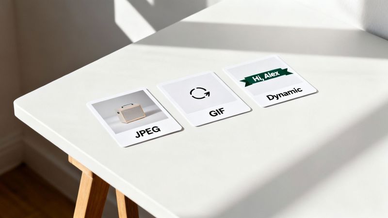
Static Images: The Reliable Workhorses
Static images are the backbone of most email designs. These are your everyday JPEGs and PNGs, and they’re fantastic at getting information across cleanly and efficiently. Think of them as the crisp, high-resolution photos you’d see in a magazine.
A JPEG is your best bet for photographs and complex images with millions of colors. Its compression magic is great at keeping file sizes small, which is a huge deal for making sure your emails load quickly. A hero image of a new product or a lifestyle shot of it in action? That’s a perfect job for a JPEG.
On the flip side, a PNG is what you need when you require a transparent background. Use a PNG for your company logo, icons, or any graphic that needs to sit on a colored background without that clunky white box around it. PNG files are often a little larger, but their transparency support is non-negotiable for a polished, professional look.
Key Takeaway: Use JPEGs for photos to keep file sizes down. Choose PNGs when you need a transparent background for logos or icons to achieve a clean, integrated look.
Animated GIFs: Adding Motion and Life
When a static image just doesn't cut it, an animated GIF can be an incredibly powerful tool. A GIF is really just a series of images looped together to create a short, silent animation. This format is brilliant for grabbing attention and quickly showing off a simple process or feature.
Consider using an animated GIF to:
- Showcase a Product Feature: Animate a quick clip showing how a new software feature works or how a physical product transforms.
- Create Visual Interest: A subtle animation in your email header or call-to-action button can pull the subscriber's eye right where you want it.
- Add Personality: A fun, on-brand GIF can inject some emotion and personality into your campaigns, making your brand feel more relatable and memorable.
Just be sure to use them wisely. Throwing in too many GIFs or making them overly distracting can pull focus from your main message. The best animated GIFs enhance the content without completely taking it over.
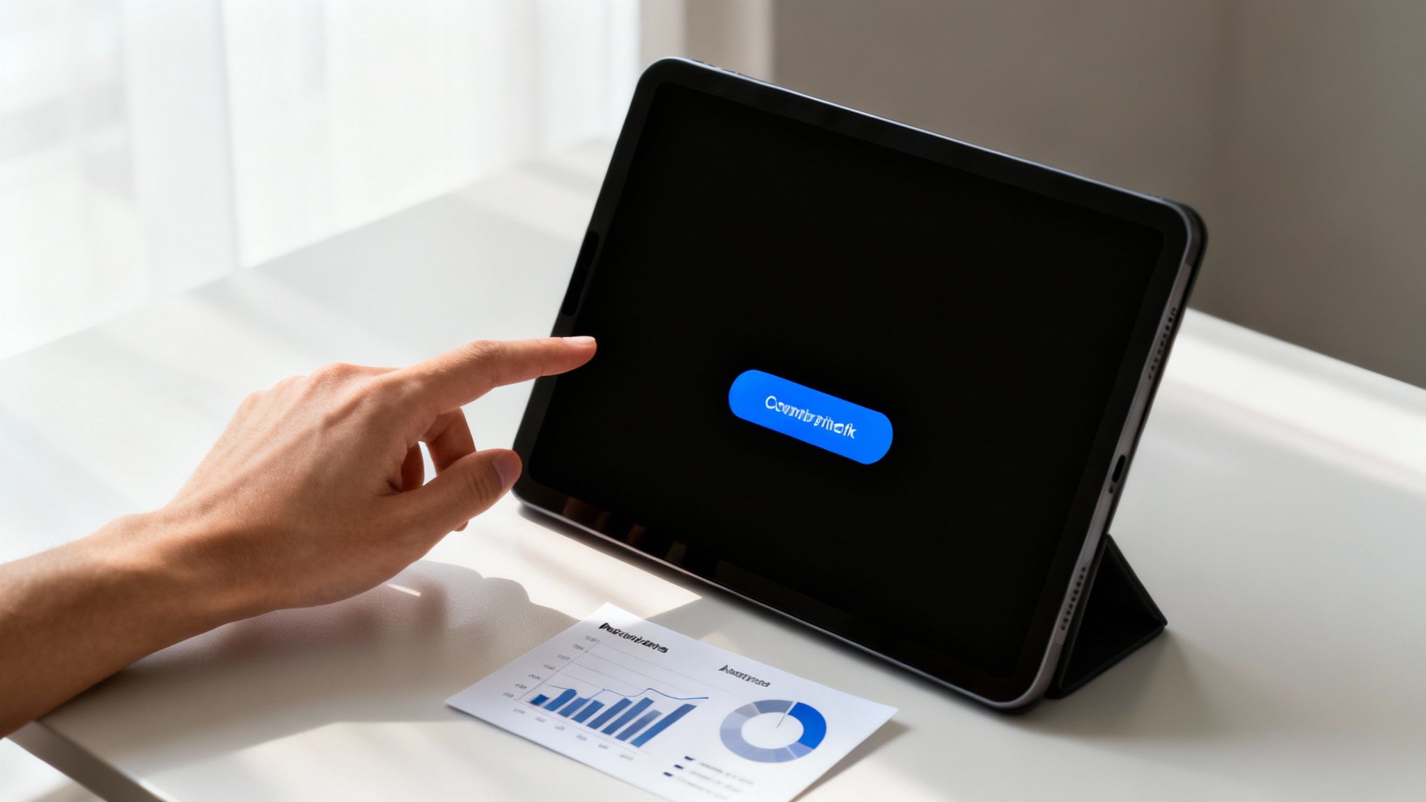
Dynamic Images: The Future of Personalization
This is where email graphics get really exciting. We’re moving beyond one-size-fits-all visuals. Dynamic images crank personalization up to a whole new level by creating a unique graphic for every single subscriber. Imagine sending an event reminder where the ticket in the email has the recipient's actual name printed right on it.
This is where tools like OKZest come in. Instead of just merging a name into a line of text, you can merge it directly into an image. This simple switch turns a generic mass email into something that feels like a genuine one-to-one conversation.
Here are a few powerful examples:
- Personalized Welcome Banners: Greet new subscribers with a welcome image featuring their name.
- Unique Coupon Codes: Display a unique discount code directly on a promotional graphic.
- Progress Reports: Show a customer their progress toward a loyalty reward in a personalized chart.
This approach makes each subscriber feel seen and valued, which can dramatically boost engagement and build a much stronger connection to your brand. By choosing the right graphic—from a simple JPEG to a fully dynamic image—you control the narrative and create a more impactful experience.
A Quick Comparison of Email Graphic Formats
To make your decision even easier, here's a quick reference table. Use it to decide which graphic type best fits your email campaign's objective and technical needs.
| Graphic Type | Best For | Pros | Cons |
|---|---|---|---|
| JPEG | Photographs, complex images, hero banners | Small file sizes, universal support | No transparency, lossy compression |
| PNG | Logos, icons, graphics requiring transparency | Supports transparency, lossless quality | Larger file sizes than JPEGs |
| Animated GIF | Showcasing features, grabbing attention, adding personality | Attention-grabbing, widely supported | Limited color palette, can be distracting |
| Dynamic Image | Hyper-personalization, unique offers, event tickets | Creates 1:1 feel, boosts engagement | Requires a specialized tool (like OKZest) |
Ultimately, the best graphic is the one that serves your message and delights your reader. Don't be afraid to mix and match these formats to see what resonates most with your audience.
Mastering the Technical Side of Email Graphics
Making your graphics look great is only half the job. The real trick is making sure they perform flawlessly once they land in someone's inbox. If you get the technical details wrong, your beautiful images can slow down load times, break on different devices, or even get your email flagged as spam.
Think of it like shipping a package. A massive, heavy box (a large image file) takes forever to arrive and might annoy the recipient. The goal is to make that package as light as possible without breaking what's inside, ensuring a quick, smooth delivery every time.
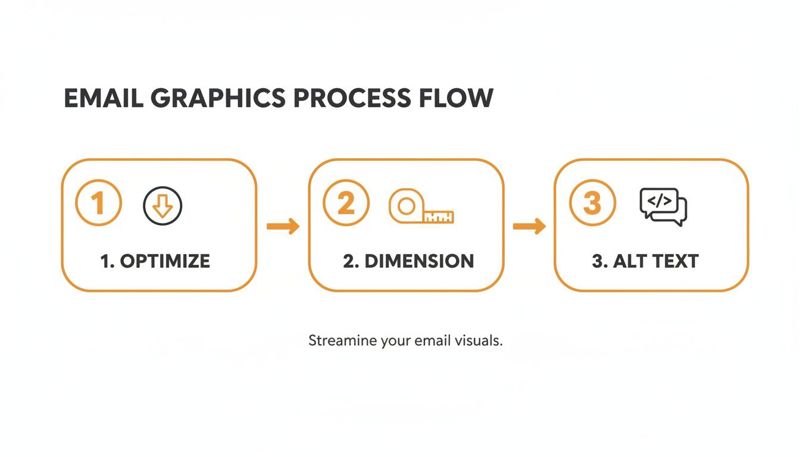
Optimizing File Size and Quality
Huge image files are the number one killer of a good email experience. People are busy, and an email that takes ages to load is an email that gets deleted. You need to find that perfect balance between sharp visuals and a small file size.
Here’s how to do it:
- Compress Every Image: Before you even think about uploading a graphic, run it through an image compression tool. There are plenty of free online options that can shrink file sizes by 50-70% without any noticeable drop in quality.
- Choose the Right Format: Like we covered earlier, JPEGs are your go-to for photos, while PNGs are perfect for graphics that need a transparent background. Starting with the right format is the first step to smart compression.
- Resize Before You Upload: Don’t just drop a giant 4000-pixel image into your email editor and scale it down. Resize your graphics to the exact dimensions they’ll be displayed at first. This slashes the file size right from the start.
A great rule of thumb is to keep the total weight of all images in an email under 1MB. This helps everything load quickly, even for people on spotty mobile connections, and it's much better for your deliverability.
Getting Dimensions and Responsiveness Right
An image that looks perfect on your big desktop monitor can easily become a squished, unreadable mess on a phone. This is where responsive design is non-negotiable. Your graphics have to adapt to any screen, big or small.
And this isn't just a minor detail—it's critical. A staggering 53% of emails are now opened on mobile devices. If your email isn't optimized for mobile, it’s likely to be deleted in under three seconds, and some data shows as many as 15% of users will unsubscribe on the spot.
For most email layouts, a width of 600-640 pixels is a safe bet for full-width images, as it looks good in almost every email client. But true responsiveness is all about the code. Make sure your email template uses fluid widths (look for CSS like width: 100% and max-width: 600px) for images. This lets them scale down gracefully on smaller screens, ensuring your visuals always look sharp. If you want to go deeper on this, it's worth exploring the classic HTML vs. Text Emails debate to see how graphics fit into the broader picture.
The Critical Role of Alt Text
So, what happens when an email client blocks images by default? Or when a subscriber is using a screen reader to access their inbox? This is where alt text (alternative text) becomes your best friend. It’s a short, written description that appears when the image itself can’t.
Alt text does two incredibly important things:
- Accessibility: It describes the image for visually impaired subscribers using screen readers, making your emails inclusive for everyone.
- Context Fallback: For users who have image blocking turned on, the alt text gives them a reason to click "display images" and see your full message.
Never, ever skip the alt text. A missing description just leaves a big, empty box in your email. Instead of a lazy description like "image," write something that actually describes the visual, like "A red sneaker with white laces on a bright yellow background." It’s a simple step that makes your emails more accessible, reinforces your message, and protects you from technical glitches.
Getting these fundamentals right also sets you up for more advanced tactics, like the real-time generation of email images for deep personalization.
How to Personalize Graphics for Each Subscriber
Static images and GIFs are great, but the real magic happens when your email graphics feel like they were made for one person. Imagine an email that doesn't just say a subscriber’s name but shows it, beautifully woven into a custom graphic. That's the idea behind dynamic image personalization, and it’s what turns a mass email blast into a genuine one-to-one conversation.
Think of it like a mail merge, but for images. Instead of just pulling text data like {{first_name}} into a sentence, you're embedding that same data directly onto a master image template. The result? A unique, hyper-relevant graphic generated in real-time for every single person on your list.
Understanding the Dynamic Image Workflow
Creating personalized graphics in emails for thousands of subscribers might sound complicated, but with the right tool, it's surprisingly simple. Platforms like OKZest are designed for this exact purpose, bridging the gap between your subscriber data and a visual template without needing to write a single line of code.
The whole process boils down to three straightforward stages:
Create a Master Template: First, you design a single master graphic. This could be anything—an event ticket, a welcome banner, a coupon. You'll then mark specific areas on this image as "layers" where the personalized text or other images will go.
Connect Your Data: Next, you tell the tool which data points to pull into each layer. For instance, the "Name" layer on your event ticket would be linked to the
{{first_name}}merge tag from your email service provider.Generate a Dynamic URL: The platform gives you a single, special image URL. You just copy and paste this URL into your email template where you'd normally put an image. When a subscriber opens the email, their email client requests the image from that URL, and the tool instantly whips up the personalized version just for them.
It's completely automated. You set it up once, and it works flawlessly for an entire list, whether you have a hundred subscribers or a million.
This process is the foundation for creating effective personalized images. But before you can get fancy, you have to nail the basics.
As this shows, the fundamentals—optimization, correct dimensions, and accessible alt text—are non-negotiable. They ensure a flawless user experience for everyone, which is the whole point.
Real-World Examples of Personalized Graphics
The real power of this technique comes to life when you see what it can do. This isn't just about sticking a name on a banner; it's about delivering genuinely useful information in a way that grabs attention instantly.
Let's look at a few places where dynamic graphics can make a huge difference:
For Event Organizers: Ditch the generic "You're Registered!" email. Instead, send a personalized ticket graphic that includes the attendee's name, a unique QR code for check-in, and even their specific session details. It looks incredibly professional and is genuinely helpful.
For E-commerce Brands: Go way beyond text-based discounts. Create a graphic that slaps a unique, one-time-use coupon code right onto an image of the product it's for. Seeing "SARA15" on a banner is far more exciting than digging it out of a line of text.
For Coaches and Consultants: Send clients personalized progress reports. A dynamic graphic could visualize their milestones, show their "member since" date, or celebrate a recent win. It's a small touch that makes them feel seen and valued.
This level of detail makes subscribers feel like individuals, not just another entry in a database. It shows you’re paying attention and helps build a much stronger, more loyal relationship.
How to Get Started with a Tool Like OKZest
The good news is you don't need to be a developer to pull this off. With a no-code tool like OKZest, you can design your dynamic image templates using a simple drag-and-drop interface, making the whole process feel natural.
The platform lets you add layers for text and images, which can then be linked to data from any email platform. It's incredibly intuitive. You can dive deeper into the nuts and bolts by reading about image URL personalization for email and seeing how it hooks into the tools you already use.
Best of all, it just works. The image URL you generate is universally compatible, playing nice with pretty much any Email Service Provider (ESP) you can think of—from Mailchimp and Klaviyo to Instantly and beyond. You just copy the link, paste it where you’d put an image, and you’re done. It's a seamless way to add powerful personalization to your campaigns without having to change your email provider or blow up your existing workflows.
Measuring the True Impact of Your Visuals
A beautiful email is one thing, but an email that drives results is another. While compelling graphics in emails look great, their real value comes from the data. To prove your visual strategy is working, you have to move beyond gut feelings and look at the hard numbers. This is how you connect creative effort to actual business goals.
Think of your email metrics as a diagnostic tool. Without them, you’re just guessing. By tracking the right key performance indicators (KPIs), you can see exactly how your visuals influence subscriber behavior. This lets you fine-tune your approach and get better results over time.
Pinpointing Your Key Performance Indicators
To really understand what your graphics are doing, you need to track metrics that show engagement and action. Open rates are a starting point, but they don’t tell you the whole story. The real gold is in what happens after someone opens your email.
Start by focusing on these essential KPIs:
- Click-Through Rate (CTR): This is the percentage of people who clicked on a link in your email. It’s one of the best indicators that your visuals and call-to-action were strong enough to make someone act.
- Conversion Rate: This tracks how many people completed a goal after clicking through—like making a purchase, signing up for a webinar, or downloading a guide. It's the ultimate measure of whether your email did its job.
- Return on Investment (ROI): This ties your campaign back to revenue. By calculating the profit generated from an email campaign against its cost, you can show the direct financial upside of your visual strategy.
The data backs this up. Research shows emails with images get an average 4.84% CTR, a huge leap from the 1.6% CTR for text-only messages. If you want to dig deeper into the numbers, you can discover more insights about email marketing ROI statistics on designmodo.com.
Running Effective A/B Tests
The best way to get undeniable proof of what works is through A/B testing, sometimes called split testing. You simply create two versions of an email—a version "A" (your control) and a version "B" (your variation)—and send each to a small slice of your audience to see which one performs better.
A/B testing takes the guesswork out of your strategy. It lets you make decisions based on real subscriber behavior, not just what you think they'll like.
For instance, you could design tests to answer specific questions about your graphics:
- Static Image vs. Animated GIF: Does a simple animation in your hero section get more clicks than a static product photo?
- Generic Banner vs. Personalized Graphic: Does a dynamic banner from OKZest with the subscriber's name outperform a standard, one-size-fits-all image?
- Product Shot vs. Lifestyle Image: Do your subscribers respond better to a clean product photo or an image showing the product being used in a real-world setting?
Just remember to change only one thing at a time. If you test a new image and a new headline, you won't know which one was responsible for the difference in performance.
Interpreting Results to Drive Smarter Decisions
Once your A/B test is done, the data will show a clear winner. But your job isn’t over. The final step is to figure out what the results mean and apply those learnings to future campaigns.
If the animated GIF massively boosted your CTR, that's a sign to use more subtle animations in upcoming promotions. If the personalized graphic from OKZest drove more conversions, that's a powerful signal to make personalization a core part of your strategy. This cycle of testing, learning, and improving is what separates the good email marketers from the great ones.
Got Questions About Email Graphics? We've Got Answers.
When you start digging into email graphics, a few common questions always seem to pop up. Even seasoned marketers can get tripped up by deliverability warnings, accessibility rules, or technical quirks that aren't immediately obvious. This section is here to clear the air.
We're going to tackle these persistent hurdles head-on, giving you straightforward, practical answers. The goal is to wipe out any uncertainty so you can build your visual strategy with confidence, making sure your campaigns look great and perform brilliantly.
Will Too Many Graphics Land Me in the Spam Folder?
In a word, yes. Relying too heavily on images is a classic red flag for spam filters. Email providers get suspicious when they see an email with tons of images and very little text—it’s a tactic spammers often use to hide sketchy links. Think of it like a balanced meal; you need a good mix of ingredients.
A solid rule of thumb is to aim for a balance of roughly 60% text to 40% images. This ratio signals to inbox providers that you’re sending real content, not just a flashy ad. It also means your main message still gets through, even if a recipient has images turned off.
Whatever you do, never send an email that is just one big image. Many email clients, like Outlook, block images by default. If your whole message is a single graphic, those recipients will see a big, empty white box. It’s a surefire way to look unprofessional and lose subscribers.
To play it safe, always make sure your core message and call to action are in plain text. And for every single graphic you include, add descriptive alt text as a crucial backup. This one-two punch helps your email get delivered and understood.
How Do I Make Sure My Email Graphics Are Accessible?
Making your graphics accessible isn’t just about ticking a compliance box—it's about creating a good experience for everyone on your list. The single most important thing you can do is use descriptive alt text for every meaningful image. This is the text that screen readers announce to visually impaired users.
Your alt text should be a clear, concise description of the image's content and, just as importantly, its function. If an image is a button that reads "Shop Now," the alt text should be "Shop Now," not something generic like "button." For an infographic, the alt text should summarize its main takeaway.
Beyond alt text, keep these other points in mind:
- Color Contrast: Check that the text within your images has enough contrast against its background. If it's hard to read for you, it’s likely impossible for someone with a visual impairment.
- Don't Trap Key Info in Images: Whenever you can, use live HTML text for important details instead of embedding it into a graphic. This ensures everyone can read your message, images loaded or not.
These small steps open up your emails to a much wider audience and even help those who just happen to have their images turned off.
What's the Best File Format for Email Graphics?
Picking the right file format is a constant juggle between image quality, cool features (like animation), and file size. There's no single "best" format for everything; it really depends on the type of graphic you're working with.
Here’s a quick guide to the big three:
- JPG (or JPEG): This is your workhorse for photographs and any complex images with lots of colors or gradients. JPGs have fantastic compression, letting you shrink file sizes way down without a noticeable hit to quality. Perfect for hero images, product photos, and lifestyle shots.
- PNG: The superpower of a PNG is its ability to handle transparency. Use this for logos, icons, or any graphic you need to place on a colored background without that ugly white box around it. They also keep sharp lines and text crisp, making them great for simpler graphics.
- GIF: If you want simple, looping animation, GIF is your answer. They are supported everywhere, making them a super reliable way to add a bit of motion. Use them to highlight a product feature, draw the eye to your CTA, or just inject some personality.
No matter which format you land on, the most critical final step is to always compress the image before you upload it. This guarantees your graphics in emails load fast and don't leave your subscribers staring at a blank screen.
Can I Just Embed a Video Directly in My Email?
Sadly, no. While it sounds like a great idea, embedding a playable video directly into an email is a recipe for disappointment. Support for it across major email clients like Gmail, Outlook, and Yahoo Mail is practically nonexistent. For the vast majority of your audience, it just won't work.
The universally accepted best practice is to fake it. The most effective way is to use a high-quality screenshot from your video, overlay a "play" button icon on it, and link the entire image to the video's real home on a platform like YouTube, Vimeo, or your own website.
If you want something a bit more eye-catching, try using an animated GIF that shows a short, silent clip from the video. Like the static image, this GIF should link out to the full version. This approach grabs more attention than a still image but still works perfectly for every single recipient, giving you the appeal of video without any of the technical headaches.
Ready to move beyond static visuals and create truly engaging, one-to-one experiences? With OKZest, you can automate the creation of personalized images for every subscriber, turning your emails into powerful conversations that drive real results.
Start Creating Personalized Graphics for Free with OKZest