You’ve probably sent a campaign that looked polished, matched the brand, and said all the right things, then watched people ignore it.
The problem usually isn’t effort. It’s sameness. Your subscriber sees the same hero image as everyone else. Your webinar attendee gets the same reminder as someone in a different city. Your coaching client receives a generic thank-you graphic that could have gone to anybody.
That gap is where personalized content automation becomes useful. Not as a buzzword. As a practical way to turn one message into many relevant versions without asking your team to design every asset by hand.
For many non-technical teams, the easiest way to understand it is this: think of it as merge tags for images. If you already know how FirstName works in email copy, you already understand the basic logic. The difference is that the personalized field appears inside the visual itself.
Why Your Audience Ignores Generic Content
Generic content fails unnoticed.
It doesn’t always trigger complaints. It just gets skimmed, skipped, or forgotten. A newsletter goes out with a clean design, but nobody feels like it was made for them. A course completion email includes a nice banner, but the banner doesn’t mention the student’s name or course. A sales follow-up includes a brochure image, but it looks mass-produced.
People notice relevance first
When someone opens an email or lands on a page, they make a fast judgment. Is this for me, or is this for everyone?
If the answer feels like “everyone,” attention drops. That’s true for marketers, coaches, event organizers, and agencies alike. The message may still be accurate, but it doesn’t feel personal enough to earn a second look.
Visuals matter here more than many teams expect. People often process the image before they read the body copy. If the image is generic, the whole message can feel generic.
The primary blocker isn’t interest. It’s implementation
A lot of teams assume personalization means a complex stack, custom data pipelines, and developer support they don’t have.
That assumption is one reason adoption stays lower than the interest level suggests. According to OmniFunnel Marketing’s coverage of AI-powered landing page personalization, only 31% of marketers use personalization on landing pages, even though the value is widely understood. The same source points to setup barriers for small teams and non-technical users, especially when data unification gets complicated.
Generic campaigns usually don’t fail because the idea was bad. They fail because the audience couldn’t see themselves in the message.
That’s why no-code visual personalization matters. It gives smaller teams a way to personalize without rebuilding their tech stack.
What changes when images become dynamic
Instead of designing 500 versions of a certificate, banner, or social image, you create one template and let the system populate the right fields.
A few examples:
- For email marketers: A newsletter banner can show a customer’s first name, plan type, or location.
- For coaches: A welcome graphic can include the client’s name and program start date.
- For event organizers: A certificate can pull attendee data directly from a registration list.
- For sales teams: A follow-up image can reference the prospect’s company or offer details.
That shift matters because it moves personalization from “too hard to do consistently” to “possible with a repeatable workflow.”
Understanding Personalized Content Automation
The simplest way to think about personalized content automation is this: it’s merge tags for images.
You already use merge tags in text. An email platform swaps FirstName with “Maya” or “James” when the message sends. Visual personalization works the same way, except the dynamic field appears inside an image, banner, certificate, social card, or website graphic.
Here’s the mental model that makes it click.

The data layer
The personalized values originate here.
Sometimes the source is simple. A spreadsheet with columns like FirstName, City, CourseName, or AppointmentDate is enough. In other setups, the data may come from a CRM, form tool, database, or live API.
Typical fields include:
- Basic identity fields: name, company, role, event ticket type
- Behavioral fields: abandoned cart status, last product viewed, signup stage
- Live fields: weather, inventory status, appointment slot, pricing tier
If a value is missing, good systems use a fallback. That means the image still renders with a default value instead of breaking.
The template layer
This is the design your audience sees.
You create one visual template with fixed brand elements such as logo, colors, font, and layout. Then you add placeholders where personalized values should appear. For example:
- “Well done,
FirstName” - “Your seat is confirmed for
EventName” - “Special offer for
Citycustomers” - “Your
CourseNamecertificate”
This approach is what makes personalized content automation scalable. One design can become hundreds or thousands of unique images.
The delivery layer
The finished image appears here.
It could be:
- inside an email from Mailchimp or Klaviyo
- on a landing page
- in a chatbot flow
- in a WhatsApp message
- in a social media DM
- in a certificate download page
The delivery method doesn’t change the underlying logic. Data fills the template, then the image is displayed in the right channel.
Practical rule: If your team can already manage merge tags in email copy, you’re much closer to visual personalization than you think.
How the pieces work together
A simple example makes this easier.
Say you’re running a workshop for consultants.
Your registration form collects:
- first name
- workshop date
- session type
Your template includes:
- a branded header
- a line that says “See you on
WorkshopDate” - a badge that says
SessionType
Your delivery channel is:
- a confirmation email
At send time, each attendee gets the same layout but different content. One person sees “See you on April 18” with “VIP Session.” Another sees a different date and a standard session label. Same design system. Different output.
Where people get confused
Most confusion comes from mixing up content creation with content variation.
You are not designing every image from scratch. You are designing a flexible template once, then allowing data to create the variations.
That’s the key shift. Personalized content automation isn’t endless design work. It’s a repeatable production system for relevant visuals.
How Automation Drives Engagement and Revenue
Personalization gets attention because it feels relevant. Automation matters because it makes that relevance repeatable.
Without automation, many teams personalize a few high-value messages and leave everything else generic. They don’t lack ideas. They lack time, design capacity, and a workflow that can handle variation without becoming a bottleneck.
The business case is already clear
The broad marketing trend is moving in one direction. According to AMRA & Elma’s 2025 marketing automation statistics, 65% of marketers report that marketing automation has significantly increased personalization capabilities.
That matters because better personalization isn’t just about making campaigns look nicer. In the same source, 75% of email revenue stems from triggered personalized campaigns rather than generic blasts. It also reports that companies using this kind of personalization generate 40% more revenue than slower-moving competitors.
Those numbers explain why marketing managers keep revisiting this topic. Personalized content automation stops being a creative extra and starts looking like a revenue system.
Why visual personalization helps so much
Copy personalization is useful, but images often do more of the emotional work.
A first name in the body text is easy to miss. A first name on a banner, certificate, offer card, or event graphic is hard to miss. The image signals relevance before the reader decides whether to keep scrolling.
That visual cue can help in several ways:
- It slows the skim: People pause when the graphic appears specific to them.
- It improves message clarity: A personalized image can summarize the offer, event, or achievement in one glance.
- It reinforces intent: Triggered campaigns feel timely when the visual matches the action that caused the send.
Revenue follows from relevance
If you’re presenting this internally, don’t frame personalization as “making assets more creative.” Frame it as improving performance in the moments that already matter.
Use cases with clear revenue impact include:
| Business situation | Generic version | Personalized version |
|---|---|---|
| Cart recovery | One banner for all users | Image references the shopper’s context or offer |
| Webinar reminder | One standard event graphic | Graphic reflects the attendee’s details |
| Sales follow-up | Standard one-sheet image | Visual customized to account or offer context |
| Onboarding email | Generic welcome banner | Banner reflects customer identity or next step |
The logic is simple. When the image reflects the recipient’s context, the message feels less like a broadcast and more like a direct interaction.
Efficiency matters too
There’s another reason teams adopt automated personalization. It reduces the manual work needed to keep campaigns feeling personal.
Instead of asking a designer to produce many versions of the same asset, the team can build one template and let the data drive output. That changes the economics of personalization. You can use it more often because you’re not rebuilding creative every time.
When a team automates relevance, they stop choosing between scale and personal touch.
That’s the significant shift. Personalized content automation helps teams keep the speed of mass communication without sending content that looks mass-produced.
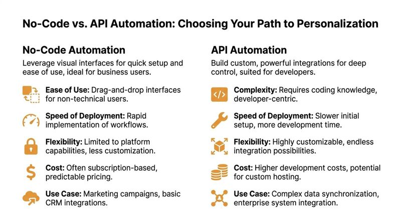
Choosing Your Path No-Code vs API Automation
Many teams don’t need to start by asking, “What’s the most advanced setup possible?” The better question is, “What can our team run reliably?”
For personalized content automation, there are two common paths. No-code tools and API-based automation. Both can produce dynamic, personalized visuals. The right choice depends on your team, not on which option sounds more technical.
What no-code looks like
No-code tools give marketers a visual builder, template controls, and integrations that don’t require engineering work for everyday use.
That usually means you can:
- upload a design
- map data fields
- define fallback text
- generate image URLs or snippets
- place those images inside campaigns
This path fits teams that need to launch quickly and avoid developer dependency. If you want a deeper grounding in how these tools work, this overview of no-code development is a useful primer.
What API automation looks like
API-based automation gives developers more control over how data is fetched, how images are rendered, and how content is delivered across systems.
This matters when you need to personalize at high scale or react to live information such as inventory levels, weather, or pricing. According to Digital Applied’s discussion of AI content personalization architectures, high-scale systems can decouple the decision layer from the serving layer and achieve sub-50ms personalization latency. The same source says this setup enables real-time data pulls into templates and can improve open-to-click rates by 20-30% in benchmarks.
That kind of architecture is usually relevant for enterprise teams, product-led companies, or agencies with developer resources.
Side-by-side comparison
| Criteria | No-Code Solution (e.g., OKZest Platform) | API-Based Solution (e.g., OKZest API) |
|---|---|---|
| Best for | Marketers, coaches, event organizers, small agencies | Product teams, enterprise marketing ops, technical agencies |
| Setup speed | Faster to launch for common workflows | Slower at the start because developers need to build connections |
| Learning curve | Lower. Works well for people already familiar with email tools | Higher. Requires API knowledge and implementation planning |
| Customization | Strong for standard use cases such as email banners, certificates, and DMs | Better for custom triggers, app workflows, and deep system integration |
| Data sources | Often supports spreadsheets, forms, CRMs, and basic live fields | Better for complex databases, internal systems, and custom business logic |
| Maintenance | Easier for marketing teams to manage day to day | More flexible, but usually needs technical oversight |
| Scale | Good for many business use cases | Better for very high-volume or highly dynamic environments |
A practical way to choose
If your team says any of these, start with no-code:
- “We need something live this month.”
- “Marketing owns the workflow.”
- “We don’t have spare developer time.”
- “Our personalization logic is straightforward.”
If your team says these, consider an API path:
- “We need to pull live data at send time.”
- “The image needs to react to product or account data.”
- “We already have developers building campaign infrastructure.”
- “We need this embedded in a larger platform or internal app.”
Start where friction is lowest
A lot of teams overbuy complexity.
If your first use case is a personalized welcome image or event certificate, no-code is often enough. One factual example in this category is OKZest, which offers both no-code and API options for creating personalized images, supports fallback values, and works with email platforms through merge tags and HTML snippets.
Don’t choose the path with the most features. Choose the path your team will use every week.
That’s usually the smarter decision. Reliability beats theoretical flexibility.
Sample Workflows for High-Impact Channels
Once the idea clicks, the next question is usually, “What do I build first?”
The easiest answer is to start with channels where the image already does a lot of the communication. Email, certificates, and direct messaging are strong candidates because the visual can carry the personalized detail without forcing the reader to parse a long paragraph.
According to Aprimo’s explanation of AI agents in content personalization, consistent personalization across email, social, and web has shown a 32% uplift in engagement, and dynamic template automation can cut production time by 80% while driving 15-25% conversion lifts. That’s why these workflows are worth operationalizing, not just testing once.
For a useful no-code integration pattern, especially if you connect apps without writing code, this walkthrough on Zapier image automation is a practical reference.
Email newsletter banner workflow
This is one of the simplest starting points.
A marketing manager already has:
- an email platform
- a contact list
- a regular newsletter slot
Instead of using one static header image, the team creates a banner template with placeholders such as FirstName, PlanType, or City.
Example setup
Image concept:
A branded newsletter banner that says “FirstName, your April picks are ready”
Data needed:
FirstNamePreferredCategoryor campaign segment- optional fallback such as “there”
How it runs:
- The contact list holds the personalization fields.
- The image tool generates a unique image URL for each recipient.
- The email platform inserts that image using merge tags.
- Each subscriber sees a version adapted to their data.
This works well because it doesn’t require changing the full email structure. You keep the same campaign workflow and swap the generic banner for a dynamic one.
A strong first project keeps the copy simple and personalizes the visual. That lowers risk and makes testing easier.
Event certificate workflow
Event organizers often have a painful manual task hiding in plain sight. Certificates.
The classic process is slow. Export names. Open a design file. Duplicate pages. Edit each attendee. Export again. Send manually. If there are mistakes, repeat the cycle.
Dynamic image templates remove most of that repetition.
Example setup
Image concept: A completion certificate with the attendee’s name, event title, and date
Data needed:
FirstNameLastNameEventNameCompletionDate
How it runs:
- Registration or attendance data feeds a spreadsheet or CRM.
- The certificate template contains placeholders for attendee details.
- The system generates one image per attendee.
- The organizer sends the certificate by email or provides it on a personalized web page.
This workflow is especially useful for coaches, course creators, and conference teams because the certificate itself is the product moment. It should feel personal.
Social media DM workflow
Direct messages on platforms like X or WhatsApp feel personal by default. That makes generic visuals stand out in the wrong way.
An adapted image can make outreach, follow-up, or community engagement feel more individual without requiring custom design for every recipient.
Example setup
Image concept: A custom thank-you card that includes the recipient’s name and a short contextual message
Data needed:
FirstNameCampaignNameor offer type- optional
Handleor segment label
How it runs:
- The outreach list is stored in a spreadsheet, CRM, or bot tool.
- The image template produces a unique visual for each contact.
- The message flow sends the personalized image through the DM channel.
- Replies are handled normally by the team or chatbot.
This approach suits influencer marketers, community managers, and sales teams because it preserves scale while still looking handcrafted.
Website or landing page image workflow
This version is useful when different users arrive with different intent.
A person coming from a webinar ad shouldn’t necessarily see the same image as someone returning from an email campaign. If your website can identify a segment, source, or user state, the visual can reflect that context.
A simple setup might swap:
- headline text in the image
- offer wording
- event city
- deal expiry text
The template stays on-brand. The visual changes based on who arrives.
The common pattern behind all of them
Even though these channels feel different, the workflow structure is nearly identical:
| Step | What happens |
|---|---|
| Collect | You gather the fields needed for personalization |
| Design | You create one template with placeholders |
| Connect | You link the template to the data source |
| Deliver | You place the personalized image in the right channel |
| Fallback | You define default values so missing data doesn’t break the asset |
That repeatable pattern is what makes personalized content automation practical for non-technical teams. Once you build one workflow, the next use case gets much easier.
Tracking the KPIs That Matter
Personalization only becomes a repeatable budget line when you can show what changed.
That means moving beyond “people seemed to like it” and tracking a short list of metrics tied to response, conversion, and team efficiency. You don’t need a huge dashboard at the start. You need the right one.
Measure response first
Start with the metric closest to the personalized asset itself.
If you changed the image, ask whether people interacted differently with the message that contained it.
Useful engagement KPIs include:
- Click-through rate: Did more people click after you replaced the generic image?
- Open-to-click relationship: If opens stayed similar but clicks improved, the visual may have helped move attention deeper into the message.
- Reply rate for outreach messages: Helpful for sales teams and DM-based campaigns.
- On-page interaction: For website images, look at scroll behavior or next-step clicks.
If you need a practical baseline for email measurement, this guide to email campaign analytics is a good place to sharpen how you read campaign performance.
Then measure conversion
Engagement matters, but conversion is what gets internal support.
Tie the personalized image to the next meaningful action:
- registration completed
- purchase started
- demo booked
- certificate downloaded
- donation made
- form submitted
You’re looking for uplift versus the generic version, not a vanity screenshot from one good send.
A simple reporting table works well:
| KPI | Why it matters | How to compare |
|---|---|---|
| CTR | Shows if the asset earned more attention | Personalized image vs generic image |
| Conversion rate | Shows if clicks turned into business outcomes | Same audience type, same offer, different creative approach |
| Reply or response rate | Useful for direct outreach | Personalized visual sequence vs standard follow-up |
| Production time | Shows operational value | Time to produce one campaign before and after automation |
Don’t ignore efficiency KPIs
A lot of teams under-report the operational win.
If your designer used to make many versions by hand and now works from a single dynamic template, that’s a measurable change. It affects speed, cost, and campaign capacity.
Track things like:
- time spent producing asset variations
- number of manual design edits per campaign
- turnaround time from idea to send
- number of channels supported by one template
These numbers matter because they show that personalized content automation doesn’t only improve audience response. It also changes how the team works.
The strongest ROI story combines two outcomes. Better campaign performance and less production friction.
Match reporting to your sector
Different teams should watch different signals.
A nonprofit, for example, may care less about product clicks and more about donor response patterns, recency, and message relevance. In that setting, a resource like AI-powered nonprofit donor analytics is useful because it shows how analytics can support more relevant outreach decisions, not just prettier dashboards.
A coach may care most about booked calls. An event organizer may focus on registrations and certificate delivery. A sales manager may value replies and meeting rates.
The KPI framework stays the same. The business outcome changes.
Activating Your First Personalized Campaign
The easiest way to get stuck is to overdesign the first project.
You don’t need a full personalization program to start. You need one campaign where a personalized image clearly improves the experience. A welcome email, event confirmation, certificate, or follow-up DM is enough.
A simple three-step checklist
Pick one moment that already matters Choose a message people already open or act on. Welcome emails, reminders, certificates, and post-demo follow-ups are good candidates.
Prepare the minimum data Start with a small set of fields.
FirstNameplus one contextual field is often enough. Keep fallback values ready so missing data doesn’t create awkward blanks.Build one reusable template Create the image once, place dynamic fields where they’ll be noticed, and send a test to yourself before expanding.
Keep the first version narrow
Don’t try to personalize every element at once.
A first-name banner, a named certificate, or a city-specific event image is usually a better starting point than a fully dynamic, multi-conditional campaign. You want a workflow your team can repeat without stress.
Once that first campaign works, the rest gets easier. The team understands the data requirements, the template logic, and the delivery method. At that point, personalized content automation stops feeling technical and starts feeling operational.
If you want a practical way to build personalized images without designing each variation manually, OKZest is one option to explore. It supports no-code and API workflows, uses the merge-tags-for-images approach, and works with email, websites, certificates, social DMs, and other channels where customized visuals can make campaigns feel more personal.