When we talk about email campaign analytics, we're talking about the nuts and bolts of your email marketing performance—tracking, measuring, and figuring out what’s actually working. Metrics like open rates and click-through rates are more than just numbers; they’re the data that tells you what your audience cares about, helping you fine-tune your approach for much better results.
Why Email Analytics Are Your Marketing Compass
Ever tried to navigate a ship across the ocean without a compass, a map, or even the stars to guide you? You might be moving, but you have no clue if you're heading toward your destination or just sailing in circles. Running an email campaign without paying attention to your analytics is pretty much the same thing.
Every single email you send is a chance to learn something new. Each open, click, unsubscribe, or conversion is a breadcrumb your audience leaves behind, telling you a story. Email campaign analytics are the tools that help you translate that story into smart decisions. Without them, you’re marketing in the dark, just guessing and hoping for the best.
From Data Points to Strategic Direction
Analytics are what turn vague hopes into solid proof. You stop thinking, "I hope people like this email," and start saying, "I know this email's call-to-action drove a 15% increase in demo sign-ups." That shift is huge. It turns marketing from a gut-feeling art form into an evidence-driven science.
And in today's world, that data-backed approach is non-negotiable. With over 347 billion emails flying around every single day, the inbox is a seriously crowded place. To really make your analytics work for you, you have to understand the foundation of effective email marketing practices that generate the data in the first place. The numbers don't just show you what happened; they show you why and give you a roadmap for how to crush it next time.
By mastering analytics, you build a repeatable process for success. You stop launching campaigns with your fingers crossed and start engineering predictable outcomes that drive real revenue.
The Unmatched Value of Email
Let's be clear: email marketing continues to be a powerhouse. On average, it brings in an incredible $42 for every $1 spent. That kind of ROI isn’t an accident. It’s the direct result of marketers who obsessively track their performance and use that data to improve.
So why are analytics the key to unlocking all that value?
- Audience Understanding: Your analytics tell you which content people love, what subject lines make them click, and which offers get them to act.
- Strategic Segmentation: By seeing how different groups react, you can start sending them messages that are far more relevant. We've got a whole guide on email segmentation best practices if you want to dive deeper.
- Performance Optimization: Data shines a spotlight on your weaknesses, like a low click-through rate, so you can test solutions and fix what's broken.
In a nutshell, your email campaign analytics are your strategic compass. They guide every decision you make and ensure your efforts are always steering your business toward growth.
Decoding Your Campaign's Core Story Metrics

To really get a handle on email campaign analytics, you need to learn its language. The key metrics aren't just sterile numbers on a dashboard; they're the words that tell a story about what your audience is doing. Let’s break down these core numbers in a way that actually makes sense, moving past the jargon to see what they're truly revealing.
Think of your email campaign as a conversation. The metrics are how you listen to the replies. A high open rate? That's someone leaning in, curious to hear more. A click is them asking a follow-up question. Getting this narrative right is the first step to crafting emails that people genuinely want to read.
The All-Important Open Rate
The Open Rate is simply the percentage of people who opened your email. It’s the first hurdle, and it’s a big one. If they don't open it, nothing else matters. This number is a direct report card on your subject line's appeal, your brand's reputation, and even the timing of your send.
A healthy open rate means your first impression landed. You cut through the noise of a crowded inbox. A weak one, on the other hand, is a red flag telling you that your invitation needs work. Is your subject line bland? Does your audience even recognize your brand? The open rate is where you start finding answers.
Key Insight: Your Open Rate isn't a measure of your content's success. It measures the success of your invitation to see the content.
Just how crowded is that inbox? Projections show there will be around 4.83 billion active email users by 2025, a number expected to hit 5.61 billion by 2030. Daily email traffic is set to jump from 392 billion to a staggering 523 billion in that same timeframe. To see how markets like India and Nigeria are driving this trend, you can check out the complete email usage report. Grabbing attention has never been more critical.
Measuring Intent with Click-Through Rate
Once they're in, the Click-Through Rate (CTR) takes over. This metric tracks the percentage of recipients who clicked on at least one link inside your email. Your CTR tells you if your message truly resonated.
It answers the big question: was your content compelling enough to make someone do something? A high CTR shows that your copy, visuals, and call-to-action (CTA) all worked together. You didn't just get their attention; you held their interest. But a low CTR, especially after a great open rate, points to a disconnect. Your subject line wrote a check that your content couldn't cash.
The Bottom Line: Conversion Rate
While opens and clicks tell you about engagement, the Conversion Rate is what usually matters most to the business. This is the percentage of people who, after clicking your email, went on to complete the goal you set. This could be anything from making a purchase to signing up for a webinar.
Your conversion rate is the ultimate test of your campaign's effectiveness. It tells you if your email didn't just entertain but actually persuaded someone to take that final, valuable step. This is the metric that connects your email marketing directly to real business outcomes and demonstrates a clear ROI.
Understanding Health with Bounce Rate
Finally, the Bounce Rate is a vital sign for your email list's health. It measures the percentage of emails that couldn't be delivered at all. Bounces generally come in two types:
- Hard Bounces: These are permanent failures, usually because the email address is fake, misspelled, or no longer exists. You need to remove these from your list immediately to protect your sender reputation.
- Soft Bounces: These are temporary problems, like a recipient's inbox being full or their server being down for a moment. Most email platforms will try resending these a few times.
Keeping a close eye on your bounce rate is just good list hygiene. If it gets too high, it can seriously damage your sender reputation, which means more of your future emails will end up in the spam folder.
Essential Email Campaign Metrics at a Glance
For a quick recap, here are the foundational metrics in a nutshell. Think of this table as your go-to reference for diagnosing campaign performance.
| Metric | What It Measures | What It Indicates |
|---|---|---|
| Open Rate | % of recipients who opened the email. | The effectiveness of your subject line and sender trust. |
| Click-Through Rate (CTR) | % of recipients who clicked a link. | The relevance and persuasiveness of your email content and CTA. |
| Conversion Rate | % of recipients who completed a goal. | The campaign's ability to drive a specific business outcome. |
| Bounce Rate | % of emails that failed to deliver. | The health and quality of your subscriber list. |
Understanding these four pillars is the first step toward moving beyond simply sending emails and toward building a powerful, data-driven communication strategy.
Advanced Analytics for Deeper Audience Insights

So you've got the hang of the core metrics. Now it's time to go a level deeper. Advanced email campaign analytics are what separate the good from the great, shifting you from just reporting what happened to truly understanding why it happened. These are the numbers that give you nuanced insights into your content's performance and how your audience is changing over time.
Think of it this way: your basic metrics are like looking at your car's speedometer and fuel gauge. They're essential, but they don't tell the whole story. Advanced metrics are the full diagnostic report from your mechanic—engine performance, tire pressure, the works. They show you the hidden details that drive everything, letting you fine-tune your strategy for real impact.
Measuring Content Engagement with CTOR
One of the most revealing advanced metrics you can track is the Click-to-Open Rate (CTOR). Your standard Click-Through Rate (CTR) measures clicks against everyone you sent the email to. CTOR, on the other hand, measures clicks against the number of people who actually opened the email. It's a subtle but powerful difference that tells a much clearer story about your content's quality.
Why does this matter so much? A low CTR might just mean you had a weak subject line that nobody opened. But a low CTOR, even with a great open rate, points to a totally different issue. It means your subject line did its job, but the email content itself—the copy, the offer, the call-to-action—failed to connect.
CTOR effectively isolates your content's performance from your subject line's performance. It answers the crucial question: "Of the people interested enough to open my email, how many found the content compelling enough to click?"
By looking at your CTOR, you know exactly where to put your energy. If it’s low, stop fussing with subject lines and start improving your email copy, layout, and offers.
Visualizing Clicks with Email Heatmaps
To dig even deeper into click behavior, email heatmaps are your best friend. They give you a visual map of exactly where people are clicking inside your email. Instead of just knowing that people clicked, you see precisely which links, buttons, or even images grabbed their attention.
Heatmaps provide an intuitive, at-a-glance understanding of how your email's design is performing. They show you the "hot spots" with lots of interaction and the "cold spots" that are being completely ignored.
This kind of visual feedback is invaluable. For example, a heatmap might reveal that a CTA button buried at the bottom of a long email gets almost no action. A simple fix, like moving that button higher up, could dramatically boost your engagement and conversions.
Tracking Audience Health and Growth
Beyond how a single campaign performs, you need to monitor the overall health of your email program. This is where two other metrics come into play: List Growth Rate and Unsubscribe Rate.
- List Growth Rate: This is a simple measure of how quickly your email list is expanding. A healthy, positive growth rate tells you that your acquisition efforts are paying off and your brand is still attracting new people.
- Unsubscribe Rate: This tracks the percentage of people who opt out after getting an email. A few unsubscribes are perfectly normal, but a sudden spike is a red flag. It could mean you're sending too many emails, the content isn't relevant, or your audience is just getting fatigued.
Watching these two metrics together gives you the full picture. A high growth rate is fantastic, but not if it comes with a high unsubscribe rate—that’s a sign you’re attracting the wrong people.
Finally, take this analysis a step further by segmenting your audience. You might find that one group loves your weekly newsletter, while another only wants monthly updates. These are the kinds of insights that build a truly personal and effective email strategy. And remember, these metrics exist within a wider ecosystem of crucial marketing performance metrics that, when viewed together, give you a complete view of your campaign's true impact.
Optimizing Your Emails for the Mobile-First World
Let's be blunt: if you're ignoring mobile readers, you're actively sabotaging your email campaigns. Your subscribers live on their phones, and a quick look at your email campaign analytics will prove it. A clunky, hard-to-read email on a small screen isn't just an inconvenience—it’s an invitation for an instant delete.
Think about your own phone habits. When an email forces you to pinch, zoom, and squint just to figure out what it's saying, what's your next move? You probably hit the trash icon without a second thought. Your audience is no different. A seamless mobile experience isn't a "nice-to-have" feature anymore; it's a fundamental requirement for success.
The data paints a crystal-clear picture of this reality. Mobile has become the main place people check their email, with mobile clients now accounting for 41.6% of all email opens globally. In fact, a staggering 85% of users now check their inboxes on their phones.
This shift has huge implications for anyone sending emails. A study found that 42.3% of users will delete an email if it isn’t optimized for mobile. You can dive deeper into these trends and more by exploring the latest compelling email statistics.
Crafting for the Small Screen
So, how do you adapt? It starts by rethinking your design and content from the ground up, with a focus on making everything effortless for someone scrolling with their thumb.
Here’s where to focus your energy:
- Punchy Subject Lines: Mobile screens chop off long subject lines. Keep them short and to the point so the good stuff is visible at a glance.
- Single-Column Layouts: What looks great on a big desktop screen becomes a jumbled mess on a phone. A single-column design is clean, simple, and easy to scroll through.
- Large, Tappable Buttons: Tiny text links are a nightmare to tap accurately with a finger. Use big, bold call-to-action (CTA) buttons with plenty of space around them to prevent frustrating mis-taps.
- Optimized Images: Huge, uncompressed images can take ages to load over a mobile connection, killing user interest before they even see your message. Compress your images so they load fast without looking grainy.
From Frustration to Engagement
Let’s make this real. Picture the "before" email: a wide, three-column layout crammed with tiny text, small hyperlinked phrases, and a massive image at the top that takes forever to load. On a phone, it's a disaster. The user has to scroll sideways, zoom in to read anything, and fumbles to tap the right link. The result? They give up and trash it.
Now, imagine the "after" version. It’s a clean, single column with a large, readable font. The most important message is right at the top, followed by a big, bright CTA button that practically begs to be tapped. The images are crisp but load instantly. This experience is smooth and intuitive, guiding the user exactly where you want them to go.
The Takeaway: Mobile optimization is a direct investment in your ROI. Campaigns using mobile-responsive designs see an average 15% increase in unique mobile clicks. It's not just about looking good; it's about making your emails work where your audience actually reads them.
By putting mobile first, you protect your sender reputation, boost your engagement metrics, and give your message a real chance to connect. Anything less is just leaving money on the table.
Turning Your Analytics Into Actionable Improvements

Collecting data is just the first step. The real magic happens when you use that data to make smarter decisions. Your email campaign analytics dashboard isn’t just a report card—it's a treasure map pointing you directly toward better results. The goal is to turn those numbers into a repeatable process for improving every campaign you send.
Think of yourself as a detective. Each metric is a clue. A low open rate isn't just a bad number; it’s a clue that your subject line failed to spark curiosity. Poor click-throughs? That’s your sign that the email’s content or call-to-action missed the mark. Your job is to follow these clues and solve the case of the underperforming campaign.
Demystifying A/B Testing for Incremental Gains
Your most powerful tool for improvement is A/B testing, sometimes called split testing. It’s essentially the scientific method applied to email marketing. Instead of just guessing what works, you test your ideas on a small part of your audience and let the data tell you which version is the winner before sending it to everyone else.
The concept is beautifully simple. You create two versions of your email (Variant A and Variant B), but you only change one element between them. This is critical—if you change more than one thing at a time, you'll never know which change actually made the difference.
An A/B test removes guesswork from your strategy. It’s the difference between saying, "I think this subject line is better," and proving, "This subject line gets 15% more opens."
So, what can you test? Almost anything. But it’s always best to start with the elements that will have the biggest impact on your key metrics.
Building Your Testing Roadmap
A structured approach to A/B testing is what leads to significant, compounding improvements over time. Rather than testing random ideas, you should connect your tests directly to the problems your analytics have already uncovered.
Here’s a practical way to think about it:
Scenario 1: Your Open Rates Are Low The data shows that people just aren't opening your emails. This points straight to your subject line, sender name, or the preview text.
- Your Hypothesis: "Using a question in the subject line will create more curiosity and increase opens."
- Your A/B Test:
- Variant A (Control): "New Features to Boost Your Productivity"
- Variant B (Test): "Ready to Boost Your Productivity?"
- What to Measure: The open rate for each variant.
Scenario 2: Your Click-Through Rates Are Poor People are opening your emails, but they aren't clicking on anything inside. The problem is somewhere in your email's content, design, or call-to-action (CTA).
- Your Hypothesis: "A brighter, more action-oriented CTA button will attract more clicks."
- Your A/B Test:
- Variant A (Control): A blue button with the text "Learn More."
- Variant B (Test): A bright orange button with the text "See It In Action."
- What to Measure: The click-through rate (or even better, the CTOR) for each variant. For a deeper dive, check out our guide on how to increase your click rate in email marketing.
Leveraging Segmentation for Hyper-Relevance
Beyond A/B testing, your analytics can power an even more sophisticated strategy: segmentation. This is where you divide your audience into smaller, more focused groups based on their behavior or demographics and send them highly relevant content.
Your analytics dashboard is full of segmentation opportunities. You can easily create segments based on:
- Purchase History: Send special offers on products related to what they've bought before.
- Engagement Level: Reward your most active subscribers with exclusive content, or run a re-engagement campaign for those who haven't opened an email in a while.
- Geographic Location: Promote local events or sales relevant only to subscribers in a specific city or region.
When you tailor your message to what you know a specific segment cares about, your emails feel less like mass marketing and more like a personal conversation. This is how you build stronger relationships and drive dramatically better results across all your key metrics.
Your Repeatable Email Analytics Workflow
Ever tried to assemble furniture without the instructions? You might get a wobbly table in the end, but the process is messy, frustrating, and inefficient. Analyzing your email data without a consistent process is exactly the same.
A repeatable workflow turns email campaign analytics from a reactive chore into a proactive system for growth. This is what separates the pros from the amateurs—using data to drive every decision and achieve predictable results. The key is creating a simple, structured loop you can apply to every single campaign. You don't need fancy software; a basic spreadsheet can work wonders as a reporting dashboard to track trends over time.
Step 1: Set Clear Goals Before Sending
Before your finger even hovers over the "send" button, stop and ask: what does success actually look like for this campaign?
Are you aiming for a specific number of webinar sign-ups? A certain amount of revenue? Or maybe just a high click-to-open rate to see if a new topic resonates? Setting a clear, measurable goal gives your analytics context. It's the difference between staring aimlessly at numbers and knowing exactly what you're looking for.
Step 2: Monitor Performance in Real Time
In the first 24-48 hours after an email goes out, keep a close watch on your key metrics. This isn’t about deep analysis just yet; it's about spotting immediate red flags.
A sudden spike in your bounce rate or an alarmingly low open rate could point to a technical glitch or a major mismatch with your audience's expectations. Early monitoring allows you to react fast if something is broken. For instance, if opens are in the gutter, you might check for deliverability issues. This quick check gives your campaign the best possible chance to succeed.
Step 3: Conduct a Thorough Post-Campaign Review
A few days after your send, once the initial wave of engagement has settled, it’s time for a deeper dive. Go back to the goals you set in Step 1 and stack them up against the actual results. Did you hit your target? If not, where did things drop off?
This is where you can see the real power of A/B testing, like in the flow chart below.
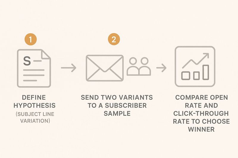
As the infographic shows, a simple test on something like a subject line can give you crystal-clear, actionable data to improve open rates for the rest of your audience. This systematic approach takes the guesswork out of the equation and helps you build a library of proven tactics.
Your post-campaign review isn't just about what happened; it's about understanding why it happened. Connect the dots between different metrics to uncover the full story of your campaign's performance.
Step 4: Document Learnings and Automate Success
This last step is the most important one. You need to document what you found. What did you learn from this campaign? Did a certain call-to-action work surprisingly well? Did one segment respond way better than another? Jot these insights down in your central reporting dashboard.
This simple act of documentation creates a knowledge base that makes every future campaign smarter than the last. You stop repeating the same mistakes and start building on your wins.
For even greater efficiency, think about how these learnings can fuel your strategy. Reading up on email marketing automation best practices is a great next step. This complete workflow ensures you are always moving forward, turning insights into action and action into better results.
Got Questions About Email Analytics? We’ve Got Answers.
Diving into email analytics can feel a bit like learning a new language. It’s normal to have questions, and getting them answered is the first step to turning all that data into something you can actually use. Let's tackle a few of the most common questions we hear from marketers.
How Often Should I Be Checking My Email Analytics?
This is a great question, and the answer changes depending on the campaign's age. For any new email, keep a close eye on your key metrics—like opens and clicks—for the first 48 hours. This is prime time for spotting any major delivery problems or seeing if your subject line totally missed the mark.
Once that initial flurry of activity dies down, give it about 3-5 days before you do a full-blown analysis. By then, you'll have a much clearer picture of how the campaign really performed. For the big-picture stuff, like list growth and unsubscribe rates, a monthly or quarterly check-in is perfect for guiding your long-term strategy.
What’s a Good Open Rate for an Email Campaign?
Honestly, there's no single magic number. A "good" open rate depends heavily on your industry, how you built your list, and what kind of email you sent. That said, a solid benchmark to shoot for is somewhere in the 20-30% range.
If your numbers are dipping way below that, it's a huge red flag. Time to look at your subject lines, sender reputation, or whether your list needs a good cleaning. On the flip side, if you're consistently hitting above 30%, give yourself a pat on the back—you’ve got a seriously engaged audience.
My Open Rate Is High but My Click Rate Is Low. What Gives?
Ah, the classic "all look, no touch" problem. This is incredibly common. It means your subject line did its job perfectly—it got people to open the email. But once they were inside, the content didn't convince them to take the next step. The metric that really highlights this gap is the Click-to-Open Rate (CTOR).
To fix this, you need to shift your focus from the subject line to the email's body. Try these fixes:
- Sharpen Your Message: Is your main point crystal clear within a few seconds? If not, simplify it.
- Beef Up Your CTA: Your call-to-action (CTA) should be impossible to miss. Make it big, bright, and use action-oriented words.
- Check for a Mismatch: Does the email deliver on the promise your subject line made? A disconnect here is a major cause of low clicks.
Should I Really Delete Subscribers Who Never Open My Emails?
Yes, absolutely. It can feel counterintuitive to shrink your list on purpose, but "list hygiene" is a non-negotiable part of smart email marketing. Regularly clearing out contacts who haven't opened an email in, say, six months, is a game-changer.
Why? It dramatically improves your sender reputation, which tells services like Gmail and Outlook that you're a legitimate sender. The result is better deliverability for the people who actually want your emails. Plus, it cleans up your metrics and can even lower your monthly bill with your email provider.
Before you hit delete, try sending one last "re-engagement" campaign. A great offer might be all it takes to win some of them back.
Ready to make every email feel personal and boost your engagement? OKZest helps you automatically create and add unique, personalized images to every email you send. Stand out in the inbox and turn your analytics into conversions. Create your first personalized image for free at OKZest.