Most LinkedIn outreach fails before the prospect reads the first line. Profiles with professional photos get 21 times more views, 9 times more connection requests, and 36 times more messages on LinkedIn, according to Salesso’s roundup of LinkedIn profile picture statistics. That should reframe how people think about outbound. Visuals aren't decoration. They're often the first filter.
That same source notes that personalized outreach can generate 2.5 times higher response rates than generic messages. In practice, that makes personalized images for linkedin outreach one of the most underused levers in B2B prospecting. Many organizations still obsess over copy tweaks while sending messages that look identical to every other pitch in the inbox.
The tactic works. The hard part is using it without making campaigns look gimmicky, breaking at scale, or tripping platform restrictions. That's where most tutorials stop too early. True advantage comes from building a repeatable system: clean image design, reliable data handling, safe rollout, and measurement tied to meetings and pipeline, not vanity metrics.
Why Personalized Images Cut Through the Noise
LinkedIn is crowded with text. Connection notes, DMs, follow-ups, comments, pitch slaps. Most of it blends together because it follows the same visual pattern. A personalized image breaks that pattern immediately.
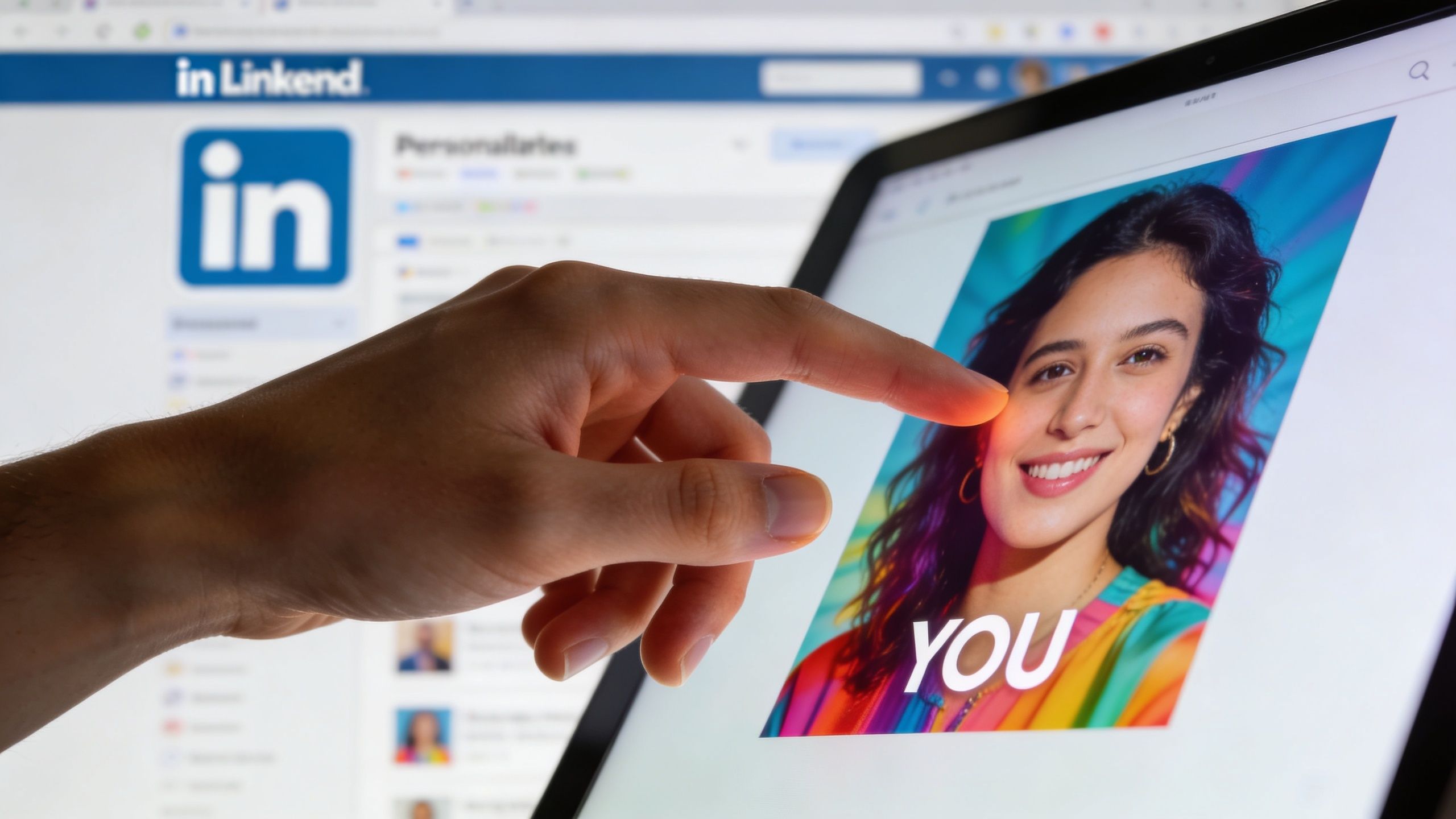
A prospect doesn't need to read your entire message to decide whether it feels relevant. They scan. They notice their name, company logo, job title, or profile photo inside an image and make a fast judgment: this was made for me, or it wasn't.
Visual relevance beats more copy
The strongest argument for using images in outreach isn't novelty. It's attention. The visual layer gives you a pattern interrupt before your copy has to do all the work.
On LinkedIn, that matters because first impressions are heavily visual. The same Salesso source reports that 74% of first impressions are based solely on profile pictures, and that helps explain why visual personalization works so well in direct outreach when done with restraint. If you want a broader view of where this fits in a social selling strategy, this overview of the benefits of LinkedIn marketing is a useful companion read.
A good personalized image does three things at once:
- Signals effort by showing the message wasn't blasted to everyone.
- Creates immediate context with recognizable cues such as company branding or role-specific wording.
- Reduces friction because the prospect can understand relevance before reading a full paragraph.
Why this feels more human
The common objection is that personalized images sound like a hack. They can be, if the execution is lazy. A fake laptop mockup with someone's name pasted on it doesn't build trust. It looks automated because it is.
What works is visual personalization that reflects real context. That might be a simple banner with the prospect's company logo and a line related to their role. It might be a clean graphic referencing a recent job change. It might be a personalized thumbnail that supports the message rather than replacing it.
Practical rule: The image should confirm relevance, not carry the whole pitch.
The gain isn't just visibility. It's tone. Personalized images for linkedin outreach make digital prospecting feel less like list processing and more like direct communication. That's why they tend to outperform generic templates.
For teams exploring the tactic for the first time, this overview of personalized images gives a clear foundation for how image variables work in campaigns.
What doesn't work
Some teams overcorrect and build visuals that feel invasive. Pulling too many personal details into one image can backfire. So can overdesigned creatives that look like ads instead of messages.
Avoid these mistakes:
- Too much personalization such as stacking name, face, company logo, recent post, and job title into one asset.
- Stock-photo polish that feels more like a display ad than one-to-one outreach.
- Weak connection to the message where the image looks customized but the copy underneath is generic.
The best outreach images don't scream for attention. They earn it through their impact.
Designing Outreach Images for Maximum Impact
A personalized image can help or hurt. The difference is usually design discipline, not creative flair. Most poor-performing assets fail because they're cluttered, hard to read on mobile, or overloaded with dynamic fields.
Keep the layout simple
Your image needs to survive a quick glance on desktop and an even quicker glance on mobile. That means one focal point, one clear message, and only a few dynamic elements.
Use dynamic content selectively:
- First name works well when it's large and clearly tied to the main message.
- Company name or logo adds business context without feeling too personal.
- Job title can work if it sharpens relevance.
- Profile photo is effective in some campaigns, but it can also feel intrusive if the rest of the design is too aggressive.
A clean composition beats a clever one. If your recipient needs to decode the image, it's already lost.
Use technical specs that reduce breakage
The design isn't only about aesthetics. It's also about rendering reliably across messaging and email environments. A lot of campaigns underperform because the image file is too heavy, dimensions are awkward, or text becomes unreadable on smaller screens.
The specs below are a practical reference point drawn from common outreach constraints and personalization workflow guidance.
| Attribute | Recommendation | Reasoning |
|---|---|---|
| Canvas size | 1200 x 628 px | This size is commonly used for clean horizontal layouts and is specifically referenced in personalization workflow guidance for dependable rendering. |
| File size | Keep under 1MB | Lighter files are less likely to create loading or rendering issues in message and email workflows. |
| Alternative lightweight target | Keep under 500KB when possible | Smaller assets are easier to deliver consistently, especially in scaled campaigns. |
| Personalization depth | Use no more than 3 dynamic elements | Too many dynamic fields can make the image feel creepy or visually chaotic. |
| File format styling | Support RGBA transparency when needed | Useful when layering logos or profile cutouts cleanly over a background. |
| Text hierarchy | One headline, one support line | Recipients should understand the point in a glance. |
| Font choice | Use a bold, legible sans serif | Thin fonts collapse on mobile and inside compressed previews. |
| Logo handling | Use one company logo only | Multiple logos create clutter and dilute the visual focus. |
| Contrast | High contrast text over quiet backgrounds | Message previews are fast. Low-contrast design gets skipped. |
| Fallback design | Make the image still work without missing fields | Every personalized asset needs a safe default if data is incomplete. |
For a deeper reference on dimensions and layout choices, this guide to LinkedIn graphic sizes is worth bookmarking.
Design for the message, not for the portfolio
Outreach images aren't brand campaigns. They don't need visual complexity. They need clarity.
A strong format usually looks like this:
- A short headline tied to the recipient.
- A subtle brand cue such as your logo or sender name.
- One relevant visual element, such as their company logo.
- Enough whitespace that the asset still feels personal and professional.
If the image looks like an ad, prospects treat it like an ad.
Three design choices that usually improve response quality
- Use authentic visuals: Real screenshots, recognizable logos, and plain layouts usually feel more credible than glossy illustrations.
- Write like a human: “Spotted your new role at Acme” is stronger than “Accelerating synergies for Acme growth leaders.”
- Match the image to the CTA: If the ask is a short conversation, the image should support that. Don't pair a soft CTA with an overly promotional visual.
The goal isn't to impress a designer. It's to make relevance obvious in seconds.
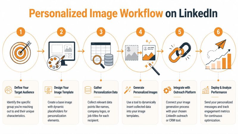
The Core Workflow of Image Personalization
The workflow matters more than the software. Teams that get good results treat image personalization like a small production system, not a one-off creative task. Data goes in. Rules shape the output. Clean assets come out. Then those assets get attached to the right message at the right time.
According to Bearconnect’s guide to personalized LinkedIn outreach, the human brain processes visuals 60,000 times faster than text. The same source says combining visuals with recipient-specific data can lift performance from a 15% to 25% manual baseline to over 45% for connection acceptance and 30% for reply rates. That only happens when the workflow is tight.
Start with the data you can trust
Most personalization projects break at the data layer. Teams assume every lead record will have a clean first name, current company, valid logo, recent signal, and correct role. It won't.
Build from the fields you can trust consistently:
- Stable fields: first name, company name, role
- Semi-stable fields: company logo, headshot, location
- Signal-based fields: recent post, job change, funding news, event attendance
If a signal isn't available for enough prospects, don't make it central to the design. Use it as a bonus layer for selected segments.
Build one reusable template, not fifty custom images
The base design should include a mix of static and dynamic layers. Static layers are your brand colors, background, sender name, or fixed headline structure. Dynamic layers are the merge tags that change per prospect.
Common merge tags look like this:
{{FirstName}}{{CompanyName}}{{JobTitle}}{{CompanyLogo}}{{RecentSignal}}
That gives you one design that can produce hundreds or thousands of variations without redesigning each image.
Field rule: If a merge tag can be empty, the layout must still look intentional without it.
Render the image only after fallback logic is set
Often, many teams rush. They connect a data sheet to a template, hit generate, and only then discover blank name fields, distorted logos, or awkward text wrapping.
A safer order looks like this:
- Clean the source data.
- Define fallback values for every dynamic field.
- Preview edge cases.
- Generate a small batch.
- Review on desktop and mobile.
- Roll into the campaign.
That sequence matters because the image is often the first thing the prospect sees. Broken personalization doesn't just waste effort. It lowers trust.
Delivery is part of the workflow
Once the image is rendered, it has to be inserted into the outreach tool in a way that preserves the visual impact. In some setups that means using a hosted image URL. In others it means embedding the asset through an HTML snippet or attaching it through a compatible messaging or email workflow.
The operational question isn't “Can we create the image?” It's “Can we create, deliver, and track it without manual cleanup?”
A dependable workflow usually connects four parts:
| Workflow stage | What happens | Common failure point |
|---|---|---|
| Data input | Prospect fields are pulled from CSV, CRM, API, or scraper | Missing or inconsistent values |
| Template logic | Merge tags are mapped into a design | Text overflow and visual clutter |
| Rendering | Unique image is generated for each prospect | Broken assets from bad data |
| Distribution | Image is inserted into outreach sequence | Delivery method strips or mishandles the visual |
The simplest operating model
A practical model is this: pick one segment, one message angle, one template, and one fallback strategy. Run that before building a larger library.
That keeps the creative variable under control. It also shows whether the image is improving the conversation or just adding production work.
Implementation With No-Code and API Workflows
Teams often fall into one of two camps. They either want a no-code setup that a marketer can run without engineering help, or they want API-based control so images can be generated inside their existing stack. Both approaches can work. The wrong choice is usually the one that ignores missing data and operational maintenance.
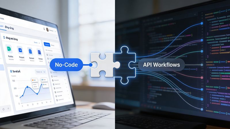
The no-code route
A no-code setup is the better fit when a sales or marketing team needs to move quickly and doesn't want image generation tied to a development sprint. The workflow is usually straightforward:
- Create a base template.
- Add merge-tag style fields for names, logos, or roles.
- Connect a spreadsheet, CRM export, or automation platform.
- Generate hosted images.
- insert the image into the outreach sequence.
A tool like OKZest’s no-code image automation approach provides a solution. It lets teams build templates with dynamic and static fields, apply fallback values when personalization data is missing, and use the output across email, social messaging, or web placements. That's useful when marketers need “merge tags for images” rather than a custom rendering pipeline.
No-code has clear advantages:
- Faster testing: Marketing can launch without waiting for code changes.
- Lower maintenance: Template edits don't require redeploying an app.
- Better handoff: Designers and operators can collaborate in the same workflow.
The trade-off is control. If you need custom rendering logic, deep event-driven generation, or tightly integrated analytics, no-code can feel limiting.
The API route
API workflows make sense when personalization is tied to your product data, CRM events, or internal enrichment systems. A developer can trigger image generation the moment a lead enters a sequence, changes lifecycle stage, or hits a specific segment rule.
Conceptually, the request looks like this:
const payload = {
  template: "linkedin-outreach-banner",
  data: {
    firstName: "Avery",
    companyName: "Northstar",
    companyLogo: "https://example.com/logo.png",
    fallbackHeadline: "Quick idea for your team"
  }
};

// Send payload to your image generation endpoint
// Receive a hosted image URL
// Insert that URL into the outreach workflow
Or in cURL form:
curl -X POST "https://api.example.com/render-image" \
  -H "Content-Type: application/json" \
  -d '{
    "template":"linkedin-outreach-banner",
    "data":{
      "firstName":"Avery",
      "companyName":"Northstar",
      "companyLogo":"https://example.com/logo.png"
    }
  }'
The exact endpoint and authentication method depend on the service you use, but the pattern stays the same: send structured data, receive an image URL, pass it into your campaign.
Fallbacks are not optional
The most important implementation detail isn't the rendering call. It's fallback handling. Every dynamic field needs a default value or a display rule.
Use fallback logic like this:
- Missing first name: Replace with a neutral headline such as “Quick idea for your team”
- Missing company logo: Swap to a generic branded placeholder
- Missing signal: Remove the signal block entirely instead of showing empty space
- Long company name: Set max width or auto-resize rules before generation
Broken personalization is worse than no personalization because it advertises automation without care.
Which setup should you choose
A quick decision framework helps:
| Team situation | Better fit | Why |
|---|---|---|
| Small sales team running campaigns manually | No-code | Faster setup and easier editing |
| Agency managing many client variants | No-code with strong template controls | Easier template duplication and approvals |
| Product-led team with internal systems | API | Better for event-based generation |
| Engineering-heavy growth team | API | More control over logic and attribution |
| Mixed team with limited technical support | Start no-code, move to API later | Lower operational friction |
The best implementation path is the one your team can maintain every week, not the one that looks most impressive in a demo.
Scaling Safely and Measuring True ROI
The biggest mistake in personalized outreach isn't weak copy. It's scaling a tactic that works in small batches without changing how it operates under load. Personalized images can improve acceptance, but they can also increase risk if the campaign starts behaving like automation at scale.
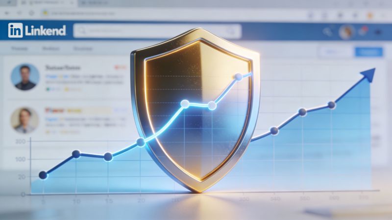
The Abyssale article on personalized and clickable images in LinkedIn cold messages notes that personalized images can boost acceptance rates to 35% to 50%, but also warns that accounts using automated image personalization can see 27% higher restriction rates. The same source says built-in randomization and API fallbacks can reduce pattern detection by 40%. This is the critical operating constraint. Better performance means nothing if the account gets limited.
What safe scaling actually looks like
Safe scaling is less about volume and more about pattern control. LinkedIn doesn't need to know your intent. It only needs to observe repetitive behavior.
Risk usually rises when teams do some combination of the following:
- Send the same message structure repeatedly
- Use the same visual layout with minimal variation
- Trigger campaigns from weakly segmented lists
- Ignore missing data and send broken images anyway
- Compress all activity into obvious machine-like timing
A safer system introduces variation in sensible places:
- Segment-level creative variation: Change headlines or imagery by audience
- Timing variation: Don't fire every sequence on a rigid rhythm
- Fallback variation: Use neutral defaults so bad records don't produce strange outputs
- Offer variation: Match CTA intensity to prospect warmth
Restriction prevention is an operations problem
The common understanding treats account safety as a tool setting. It isn't. It's an operational discipline.
Use this checklist before increasing campaign volume:
- Audit the list quality so the image and message properly fit the recipient.
- Review rendered samples from multiple edge cases, especially missing fields.
- Stagger campaign expansion instead of ramping multiple variables at once.
- Watch reply quality, not just acceptance.
- Pause on anomaly signals such as sudden drops in acceptance or unusual delivery behavior.
A campaign that scales safely usually feels boring behind the scenes. Clean lists, plain images, sensible pacing, and disciplined testing beat aggressive automation.
Measure the image as part of a revenue path
Outreach efforts frequently stop at opens, clicks, or acceptance. That's not enough. The image is only valuable if it helps move a prospect to conversation, meeting, qualified pipeline, or closed revenue.
A more useful measurement model has four layers:
| Layer | What to track | Why it matters |
|---|---|---|
| Attention | Image load, view, click if applicable | Confirms the asset is being seen |
| Conversation | Reply, positive reply, meeting intent | Shows whether relevance translated into response |
| Commercial outcome | Meetings booked, qualified opportunities | Connects the tactic to sales progress |
| Revenue attribution | Pipeline created, deal influence | Tells you if the effort is financially worth continuing |
Practical ROI tracking framework
If you're running personalized images across LinkedIn plus email follow-ups, use a campaign structure that makes attribution possible:
- Unique campaign IDs: Assign a campaign name to each segment and creative angle.
- Image-level tags: Track which template variant was shown.
- Message-level tags: Differentiate the copy version from the image version.
- Meeting source capture: Ask sales reps to log which sequence generated the conversation.
- Pipeline review: Compare personalized-image campaigns against text-only controls over time.
Understanding that image performance can be misleading is essential. A flashy visual may increase curiosity but reduce message quality if the copy gets weaker. The right question isn't “Did the image get attention?” It's “Did the image improve the economics of the outreach sequence?”
What experienced teams do differently
Experienced operators don't treat every prospect the same. They reserve heavier personalization for higher-value accounts, warm signals, or segments where visual proof matters. They also accept that some campaigns should stay text-first.
Use images when:
- The prospect needs quick context
- Visual relevance will clarify the pitch
- You have enough clean data to personalize without errors
Skip images when:
- The list is poorly enriched
- The audience is highly sensitive to over-personalization
- The message already depends on a nuanced text argument
The tactic is powerful. It isn't universal.
Sample Outreach Templates and Final Thoughts
Templates help, but they only work if the image and copy support the same angle. A generic message attached to a customized image creates tension. The prospect notices the effort in one place and the laziness in another.
Cold outreach after a trigger event
Image concept: A simple banner with the prospect's first name, company logo, and a short line referencing a role change or company milestone.
Message:
Hi {{FirstName}}, noticed the recent change at {{CompanyName}}.
I put together a quick visual because this usually changes how teams handle outreach and follow-up. If improving response quality is on your plate right now, happy to send over the exact approach.
The image works because it grounds the outreach in a real signal. The copy stays short and doesn't force the pitch too early.
Post-connection follow-up
Image concept: A clean thank-you graphic with the prospect's name and company, plus a subtle visual related to the problem you solve.
Message:
Thanks for connecting, {{FirstName}}.
I made a quick personalized visual for {{CompanyName}} because it's often easier to show the idea than describe it in a long message. If it's useful, I can send the workflow behind it.
This is a good place for softer personalization. You're not trying to overwhelm them. You're trying to earn the second message.
Keep the first follow-up low pressure. The image should open the loop, not close the sale.
Event or webinar invitation
Image concept: An event card with the prospect's name, company logo, and event branding.
Message:
Hi {{FirstName}}, sharing this because the topic looks relevant to what your team is working on at {{CompanyName}}.
I personalized the invite so it doesn't get lost in your inbox. If you want the details, I'll send them over.
This format works well when the image acts as the invite itself. It gives the outreach a reason to exist beyond “just checking in.”
Account-based outreach to multiple stakeholders
Image concept: A role-specific image variation for each stakeholder inside the same account, using the same layout but different supporting lines.
Message:
Hi {{FirstName}}, reaching out with a personalized visual because teams in {{DepartmentOrRole}} usually evaluate this differently.
I kept it brief. If the angle is off, I can send the version better suited to your side of the business.
Signal-based personalization starts to matter. JoinValley’s article on maintaining personalization while automating LinkedIn outreach reports that teams can maintain 30% to 45% response rates at scale, compared with a 15% to 25% manual benchmark, and cites a campaign to 2782 connections that achieved a 33% acceptance rate and 17% response rate with deep personalization.
The lesson isn't that every campaign needs a custom image. It's that thoughtful visual personalization can scale if the system behind it is disciplined.
Personalized images for linkedin outreach work best when teams stop treating them like a gimmick. Use them to sharpen relevance, not fake intimacy. Keep the design simple. Build fallback logic before launch. Scale with restraint. Track outcomes that matter to revenue, not just reactions.
If you want to test this without building a custom system from scratch, OKZest provides no-code and API options for generating personalized images with fallback values, hosted delivery, and workflows that fit email, direct messaging, and broader outreach campaigns.