Before we jump into the nitty-gritty of LinkedIn image sizes, it's worth taking a step back. Understanding why social media marketing is important for your business provides the context for why getting these details right matters so much. After all, your visuals are a massive part of a winning strategy.
Your Quick Reference for LinkedIn Image Sizes
Getting your LinkedIn image sizes spot-on is non-negotiable for making a solid first impression. We’ve all seen it: the awkwardly cropped headshot, the blurry banner, or the pixelated post image. It just looks unprofessional and can chip away at your brand’s credibility before you even get a chance to say anything.
Think of this section as your go-to cheat sheet for all the essential image specs on LinkedIn. I’ve put everything into a simple table so you can quickly find the exact dimensions you need without digging through long articles. Whether you're sprucing up your personal profile or launching a new company page, this is the perfect place for a last-minute check before you hit upload.
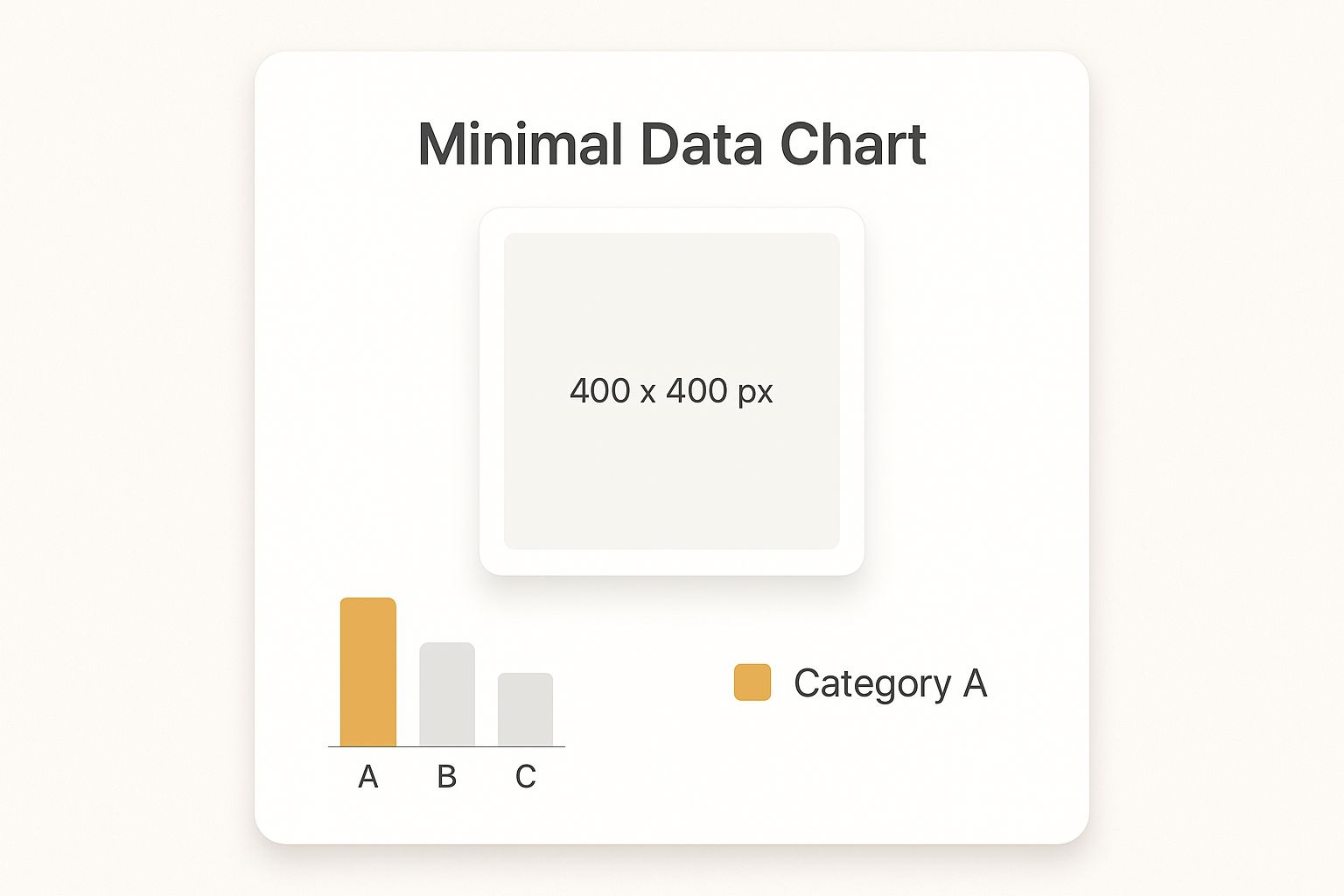
As the image shows, even a seemingly simple profile photo has specific requirements. The classic 400 x 400 pixel square format ensures your picture is crisp and centered, whether someone is viewing your profile on a desktop or their phone.
Over the years, LinkedIn has fine-tuned its recommendations to optimize how profiles and pages look across all devices. Here's a quick rundown of the most common ones:
- Personal Profile Picture: 400 x 400 pixels
- Personal Cover Image: 1584 x 396 pixels
- Company Page Logo: 300 x 300 pixels
- Company Page Banner: 1128 x 191 pixels
- Shared Link Image: 1200 x 627 pixels
LinkedIn Image Sizes Quick Reference Chart
Here’s a summary of the most common LinkedIn image specs in one easy-to-read table. Bookmark this page so you can find what you need in a pinch.
| Image Type | Recommended Dimensions (Pixels) | Aspect Ratio | Max File Size |
|---|---|---|---|
| Personal Profile Picture | 400 x 400 | 1:1 | 8 MB |
| Personal Cover Image | 1584 x 396 | 4:1 | 8 MB |
| Company Page Logo | 300 x 300 | 1:1 | 8 MB |
| Company Page Banner | 1128 x 191 | 5.9:1 | 8 MB |
| Shared Post Image | 1200 x 627 | 1.91:1 | 5 MB |
| Carousel Post Image | 1080 x 1080 | 1:1 | 10 MB per card |
| Video Post (Square) | 1920 x 1920 | 1:1 | 5 GB |
| Document Post Cover | 1200 x 1500 | 4:5 | 2 MB |
Keep in mind that while these are the officially recommended dimensions, the platform is always evolving. Sticking to these guidelines is the surest way to present a polished and professional image every time you post.
Designing Your Personal Profile Images
Think of your personal LinkedIn profile as your digital business card. The images you choose are the very first thing people see, so getting them right is non-negotiable. It’s about more than just hitting the technical specs; your profile picture and background banner are your chance to make a powerful first impression.
Your profile picture is your virtual handshake. The sweet spot for size is 400 x 400 pixels, which keeps your face sharp and clear on any device. You'll want a high-quality headshot where you come across as both confident and approachable. A simple, clean background is always a good bet—it keeps the focus where it belongs: on you.
Composing the Perfect Profile Picture
A truly great profile photo does more than just show what you look like. It communicates your professional brand and personality.
- Clarity is Key: Use a high-resolution image to avoid any fuzziness or pixelation.
- Keep it Professional: Your photo should feel right for your industry. A graphic designer might go for something more creative, while a financial advisor would likely stick with a more traditional headshot.
- Center Your Face: LinkedIn will crop your photo into a circle. Make sure your face is right in the middle so nothing important gets awkwardly cut off.
That 400 x 400 pixel dimension isn't random. It’s designed to look crisp and clear everywhere, which is crucial since over 57% of LinkedIn users browse on mobile. A blurry photo on a small screen is a bad look.
The screenshot below shows exactly how a profile picture and banner work together on a live profile.
As you can see, the circular photo sits directly over the banner, so making sure the two images complement each other visually is a must.
Maximizing Your Background Banner
Your background banner is prime real estate. At 1584 x 396 pixels, it’s a huge canvas for personal branding. Please, don’t leave it as the default blue graphic.
This is your space to show off what you do. You could highlight a key accomplishment, display your company's tagline, or even add a subtle call-to-action with your website or professional contact info. For marketers, automating visual elements like banners can be a game-changer. If you want to dive deeper into that, check out our guide on creating a marketing automation strategy to transform business results.
Building Your Company Page Visual Identity
Think of your LinkedIn Company Page as your brand's digital headquarters. It's where you establish credibility, find top-tier talent, and build relationships with potential clients. The visuals you pick are massively important for shaping perception, which makes getting the LinkedIn graphic sizes right a critical piece of the puzzle.
Your company logo is the most tireless visual ambassador for your brand. It pops up everywhere—in search results, on your employees' profiles, and right next to every single update you post. For the best clarity, your logo needs to be uploaded as a 300 x 300 pixel image. I've found that a clean, high-resolution PNG with a transparent background almost always works best, making sure your logo looks sharp no matter where LinkedIn places it.
Your cover image, also known as the company banner, is a much larger and more strategic canvas. This is your chance to tell a bigger story about your brand's personality and mission.
Optimizing Your Company Banner and Life Tab
The company banner dimension is 1128 x 191 pixels. This wide, rectangular space is perfect for showing off your company culture, announcing a new product, or highlighting a key marketing message. Since it’s the very first thing visitors lay eyes on, it absolutely must align with your brand's look and feel.
Pro Tip: Your company logo will cover up a part of the banner on the left side. Always design your banner with this "safe zone" in mind. Keep any important text or focal points away from that bottom-left corner so they don't get hidden.
If your company uses the "Life" tab to give a behind-the-scenes look at your culture and attract new hires, there are a couple more image specs you'll need to know.
- Life Tab Main Image: This is the big hero image at the top. It should be 1128 x 376 pixels, giving you plenty of room for a fantastic photo of your team or office space.
- Life Tab Custom Modules: These are the smaller, supporting images. They need to be 502 x 282 pixels and are ideal for showcasing company values, recent events, or employee stories.
All these graphics should work in harmony to create a cohesive and welcoming experience for anyone visiting your page. It’s a lot like designing a great website—visual consistency builds trust. This same idea applies everywhere you market your brand, which you can see when you explore the power of custom email images and how they reinforce your identity.
Creating Posts That Stop the Scroll
On a busy professional feed, your visuals are what make people slam on the brakes mid-scroll. Getting your LinkedIn graphic sizes right for posts is the first step to capturing that split-second of attention and getting people to actually engage with your content.
The gold standard for shared images and link previews is 1200 x 627 pixels. This dimension fits a perfect 1.91:1 aspect ratio, which LinkedIn’s layout is built to favor. When you use this size, your image displays cleanly across both desktop and mobile without any weird, unprofessional cropping, giving you maximum visual impact. In fact, we see posts using the 1200 x 627 pixel size generate around 20% more clicks and shares, simply because the algorithm rewards content that fits its display perfectly. You can dive deeper into how sizing affects engagement with this in-depth analysis of social media image specs.
Exploring Other High-Performing Formats
While 1200 x 627 pixels is the go-to for link shares, a couple of other formats perform exceptionally well in the feed, especially when you're posting an image directly.
Square Images (1080 x 1080 pixels): With a 1:1 aspect ratio, square images are a powerhouse. They command a significant amount of vertical space in the mobile feed, which helps push other content out of view and keeps eyeballs locked on your post.
Vertical Images (1080 x 1350 pixels): Even more dominant on mobile devices, the 4:5 aspect ratio is fantastic for infographics, detailed photos, or any graphic with text overlays. It simply gives you more canvas to work with.
No matter which format you choose, the real goal is to make your visual compelling.
A great graphic does more than just fill space—it tells a story, reinforces your brand, and guides the viewer's eye. High-quality photography, clear text overlays, and consistent branding elements are the building blocks of a post that truly stops the scroll.
For instance, a marketing agency might use a 1080 x 1350 vertical graphic to show off a mini case study with key metrics. A consultant, on the other hand, could use a 1080 x 1080 square image with a bold quote to build their thought leadership. It's all about matching the right format to your message and your audience.
A Guide to LinkedIn Ad and Video Specs
Once you move beyond organic posts, you’ll find that paid campaigns and video content have their own set of rules. Getting the LinkedIn graphic sizes right for your ads is absolutely critical if you want to see a good return on your investment. Precision is the name of the game here—it ensures your budget is well-spent on crisp, professional visuals that stop the scroll and drive action.
For a standard Sponsored Content single-image ad, you’ll want to stick to 1200 x 627 pixels. This is a classic 1.91:1 aspect ratio that looks perfect in the feed without any weird, awkward cropping. Carousel Ads, however, are a different story. They shine when you use square 1080 x 1080 pixel images for each card, which gives users a clean, consistent experience as they swipe through your content.
Optimizing Video and Ad Formats
Video ads give you a lot more creative freedom, but they come with a few more technical hurdles. Thankfully, LinkedIn supports a variety of aspect ratios, so you can tailor your video for anything from a cinematic feel to a mobile-first vertical view.
- Supported Ratios: You can work with landscape (16:9), square (1:1), and vertical formats (4:5 or 9:16).
- File Size & Duration: Your video file can be up to 5 GB. It can run anywhere from 3 seconds to 30 minutes, but let's be honest—shorter, punchier videos almost always perform better.
- Format: Stick with MP4. It's the universally accepted format and your safest bet.
Quick tip: A huge number of people watch videos on mute. Always burn in captions or use clear on-screen text so your message gets across, sound or no sound.
Document Ads have a quirky requirement for their cover image: it needs a vertical 4:5 aspect ratio to display properly. And for those campaigns that land directly in a member's inbox, like Message Ads, you'll be using a much smaller 300 x 250 pixel banner. Even at this tiny size, clear branding is key. It follows the same principle we see in the power of dynamic images in email marketing, where every single pixel has a job to do.
A Few Common Questions About LinkedIn Graphics
When you're trying to get your LinkedIn graphics just right, a few questions always seem to pop up. It's totally normal. Getting the small details sorted is what makes the difference between a profile that looks sharp and one that feels a bit off.
So, what happens if you just upload an image and hope for the best? If the dimensions are wrong, LinkedIn will do its best to make it fit by cropping or stretching it. The result is often… not great. You might end up with a pixelated mess, an awkwardly framed photo, or your most important text getting cut off entirely. This can make your brand look less than professional.
Which File Type Should I Use: JPG or PNG?
This is probably the most common question I hear. The answer isn't "one is always better," but rather, it depends on what's in your image.
- Go with JPG for photos and other complex images that have lots of colors and gradients, like a picture of your team. JPGs handle this complexity well and keep the file size manageable, so your page loads quickly.
- Choose PNG for graphics that need crisp, clean lines. This is your best bet for logos, text-heavy images, or anything requiring a transparent background. PNG files keep every detail sharp without any fuzzy compression artifacts.
Think of it this way: saving a logo as a JPG can make it look blurry around the edges, while saving a photo as a PNG might create a needlessly large file that slows everything down. A small choice, but it has a big impact on quality.
Ready to create stunning, personalized visuals for your LinkedIn posts, DMs, and outreach campaigns? OKZest helps you automate image creation with merge tags, making every graphic unique to the viewer. Check out our no-code and API solutions at https://okzest.com.