In a world of constant pings from social media and messaging apps, email still holds its ground as a powerhouse for digital strategy. Why? Because it just works. Sending emails in HTML isn't just a technical task; it's a core skill for anyone looking to build a brand, connect with an audience, and drive real results.
Sure, plain text emails have their place. But HTML unlocks a world of creative and strategic opportunities that are essential for grabbing attention in a crowded inbox.
Why HTML Emails Still Dominate the Inbox
Let's look at the numbers. Email’s reach is massive. Since HTML emails first appeared back in the mid-1990s, they’ve become the standard for businesses everywhere. There are over 4.83 billion email users worldwide, sending a staggering 392 billion emails every single day.
With that kind of volume, standing out is everything. This is where HTML shines. Its ability to weave in images, smart formatting, and consistent branding is a major reason why email marketing boasts an incredible average return of $36 for every $1 spent. If you want to dive deeper, Porch Group Media's 2023 report has even more stats that show just how powerful email continues to be.
The Practical Advantage of HTML
Think about the last email that really caught your eye. Was it a wall of black-and-white text, or did it use visuals and a clean layout to guide you through the message? My bet is on the latter.
HTML gives you a huge practical advantage:
- Brand Consistency: You can use your brand’s specific colors, logos, and fonts. This creates a smooth and professional experience that connects your website to your customer's inbox.
- Visual Storytelling: A picture really is worth a thousand words. You can show off new products, introduce your team, or use graphics to make complex ideas easy to understand.
- Clear Calls-to-Action (CTAs): A big, brightly colored button that says "Shop Now" is always going to get more clicks than a simple blue hyperlink. It’s just human nature.
Real-World Scenarios
The impact of HTML emails is obvious when you look at how businesses use them every day. An e-commerce store can send out a flash sale announcement with beautiful product photos and a direct "Shop Now" button. A B2B company can send a professional newsletter with a clear layout that directs readers to their latest case study or blog post.
In my experience, the moment a client switches from plain text to a well-designed HTML newsletter, their engagement metrics jump almost immediately. People are far more likely to scan, click, and actually remember a message that’s visually organized and appealing.
Ultimately, mastering how to send emails in HTML gives you complete control over the user experience. It lets you create messages that aren't just informative but also memorable and persuasive. This guide will walk you through exactly how to do it right.
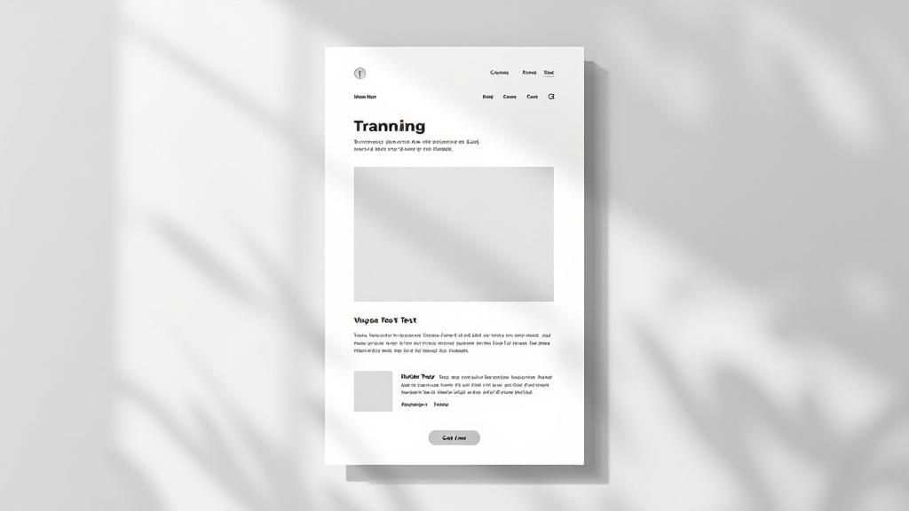
Building Your First Responsive HTML Email
If you're coming from modern web development, your first attempt at building an HTML email can be a humbling experience. All those fancy tools you love—Flexbox, Grid, maybe some slick JavaScript animations? You have to forget about them here. In fact, using them is a surefire way to have your email look completely broken in half your audience's inboxes.
The world of email code is stuck in the past for a reason: consistency. We have to build for the lowest common denominator, which often means an old version of Outlook. That’s why we lean on the tried-and-true (if a bit clunky) methods: <table> elements for layout and inline CSS for every single style. It feels wrong, but it works.
The Foundational Structure
Every solid HTML email starts with a nest of tables. Seriously. Think of it like building with LEGOs. You have a main wrapper table that holds everything together and sets a maximum width, usually around 600px. This stops your content from stretching unreadably wide on a big desktop monitor.
Inside that main wrapper, you'll stack more tables for each distinct content block—one for your header, another for the body copy, and a final one for the footer. This keeps everything contained, predictable, and much easier to troubleshoot when something inevitably goes wrong.
Here’s a bare-bones skeleton to show you what I mean:
<!DOCTYPE html>
<html>
<head>
  <title>Your Email Title</title>
</head>
<body style="margin: 0; padding: 0; background-color: #f6f6f6;">
  <!-- Main Wrapper Table -->
  <table width="100%" border="0" cellpadding="0" cellspacing="0" bgcolor="#f6f6f6">
    <tr>
      <td>
        <!-- Centered Content Table -->
        <table width="600" border="0" cellpadding="0" cellspacing="0" align="center" style="background-color: #ffffff;">
          <!-- Header Section -->
          <tr>
            <td style="padding: 20px;">
              Your Header Content
            </td>
          </tr>
          <!-- Body Section -->
          <tr>
            <td style="padding: 20px;">
              Your Main Body Content
            </td>
          </tr>
          <!-- Footer Section -->
          <tr>
            <td style="padding: 20px; background-color: #eeeeee;">
              Your Footer Content
            </td>
          </tr>
        </table>
      </td>
    </tr>
  </table>
</body>
</html>
This simple structure gives you a clean, 600-pixel-wide email body that sits nicely in the middle of a light gray background. It's a professional standard for a reason.
Why Inline CSS is Non-Negotiable
One of the most frustrating parts of sending emails in HTML is how email clients handle CSS. Many big players, especially Gmail, will simply strip out any styles you place in the <head> or <style> tags. The only method that consistently survives is applying styles directly to the HTML elements with the style attribute.
Yes, this means your beautiful, clean HTML will become a mess of style declarations. It's not pretty, but it’s absolutely critical for making sure your email doesn’t fall apart. This is the single most common mistake beginners make.
Doing this by hand is a massive pain. Most developers use an "inliner" tool that automatically moves all the CSS from a <style> block into inline styles right before the email is sent. For your first build, though, I recommend doing it manually. It really helps you understand the mechanics of what makes email code tick.
Once you’re comfortable with the basics, using pre-built structures can save you a ton of time and prevent common rendering headaches. A great way to see these principles in action is to check out some effective business email templates. Starting from a proven foundation is always a smart move.
Designing Emails That People Actually Read

Writing clean, functional code is the bedrock of sending emails in HTML, but it's only half the story. To create an email that someone actually opens, reads, and acts on, you have to start thinking like a designer. The real goal isn't just to deliver information—it's to create an experience that guides your reader’s eye and makes your message effortless to consume.
This design-first approach is more important than ever. We're all fighting for attention in a crowded inbox, and research shows that consumers spend an average of just 10 seconds reading a brand's email. That’s a tiny window to make an impact.
With 99% of people checking their email daily, often while multitasking, your design has to be clear and compelling from the very first glance.
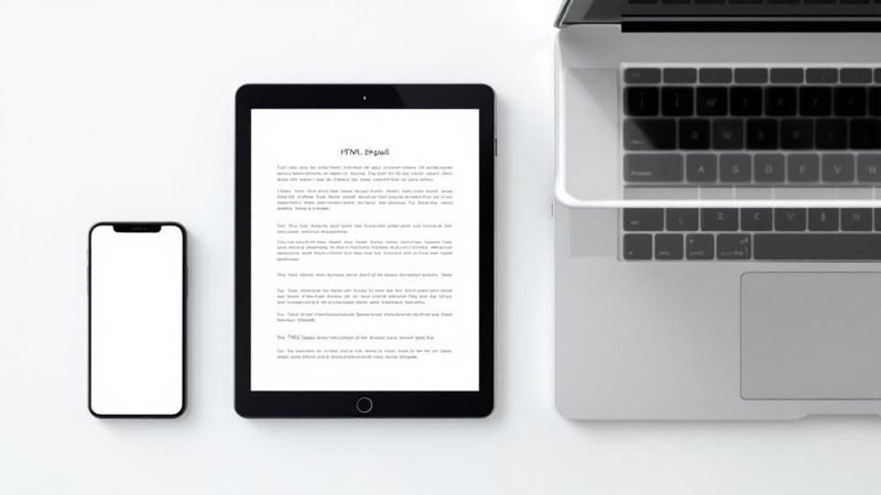
Embrace Mobile-First Design
It's no secret that most emails are opened on a phone, so designing for a small screen first is non-negotiable. This means prioritizing simplicity and readability above everything else. A single-column layout is your best friend here, as it stacks content neatly and avoids that frustrating horizontal scroll.
Think about the real-world user experience on a phone:
- Large, Legible Fonts: I always recommend a minimum font size of 16px for body text. This ensures it’s readable without anyone needing to pinch and zoom.
- Ample Whitespace: Give your content room to breathe. Generous spacing between paragraphs and around images prevents the layout from feeling cramped and overwhelming.
- Thumb-Friendly CTAs: Your call-to-action buttons need to be big enough to tap easily. A good rule of thumb is at least 44x44 pixels. Make them pop with a bold, contrasting color.
A common mistake I see is designers trying to cram a desktop website experience into an email. Instead, think of your email as a focused pathway to one key action. What's the single most important thing you want the reader to do? Design the entire email around that goal.
Guide the Reader's Eye
Visual hierarchy is just a fancy term for arranging elements to show their order of importance. A strong hierarchy tells the user what to look at first, second, and third. You can pull this off with a few simple techniques. Use a bold, large headline to grab attention, followed by slightly smaller subheadings, and then your main body copy.
Images are fantastic for breaking up text and adding visual interest, but they must be optimized. Large image files can make your email painfully slow to load, and a slow email is a deleted email. Always compress your images before uploading them to shrink their file size without a noticeable drop in quality.
Ultimately, a well-designed email is a well-performing email. To really get the most out of your campaigns, it's vital to also understand how to boost email marketing conversion rates. This involves connecting great design with smart automation, a topic we explore further in our guide to building an effective email marketing automation strategy.
Tackling Email Client Quirks and Testing
You’ve built a beautiful HTML email. It looks perfect. But here comes the hard part: making sure it actually looks perfect everywhere it’s opened. Welcome to the wild, unpredictable world of email client inconsistencies.
An email that renders flawlessly in Apple Mail might completely fall apart in Outlook. What works in Gmail’s web client could break on the mobile app. This isn't a bug in your code—it's just the reality of email development. Each client has its own rendering engine with its own set of rules. Some, like older versions of Microsoft Outlook, infamously use the Microsoft Word rendering engine, which is notorious for ignoring common CSS and breaking modern layouts.
Why Your Code Breaks
The root of the problem is a frustrating lack of a universal standard. While web browsers have made huge strides in working together, email clients still operate in their own little silos. This fragmentation is precisely why old-school, battle-tested techniques like table-based layouts and inline CSS are still the gold standard for reliable emails.
You'll run into all sorts of fun issues, but here are the most common culprits:
- CSS Support Gaps: Don't even think about modern properties like Flexbox or Grid. Even basic
backgroundimage attributes can be a gamble in major clients. - Image Blocking: Many clients block images by default. Your email must make sense and be readable even if none of the visuals load.
- Font Rendering: Using custom web fonts is risky. To ensure your text looks consistent for everyone, it’s much safer to stick to web-safe fonts like Arial, Helvetica, and Georgia.
This infographic really drives home why testing across different platforms is non-negotiable.
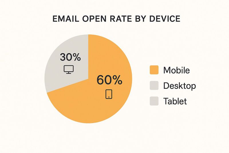
Mobile is king, with a massive 60% of all opens. Your email has to be flawless on small screens. But you can't ignore the 30% on desktop, which is often dominated by tricky clients like Outlook.
A Glimpse into HTML & CSS Support
The differences between clients can be stark. What works perfectly in one might be completely ignored in another. This table gives you a simplified overview of what you can generally expect.
HTML & CSS Support in Major Email Clients
A simplified overview of how different email clients handle common HTML and CSS properties, helping developers prioritize their coding and testing efforts.
| Feature | Gmail Support | Apple Mail Support | Outlook (Desktop) Support | Best Practice Tip |
|---|---|---|---|---|
| Flexbox/Grid | No | Yes | No | Avoid completely. Use <table> layouts for structure. |
| Background Images | Good | Excellent | Partial (VML needed) | Use a solid background color as a fallback. |
| Custom Web Fonts | Yes (with @font-face) |
Yes | No | Stick to web-safe fonts or have good fallbacks. |
| Animated GIFs | Yes | Yes | No (shows first frame) | Ensure the first frame is a compelling static image. |
This is just a snapshot. The real world is far more complex, especially when you factor in different versions and devices. The key takeaway? Never assume. Always test.
Your Playbook for Pre-Send Testing
There’s no way you can manually check your email on every client and device. That's where email testing platforms become your best friend. Tools like Litmus and Email on Acid are indispensable for anyone serious about email.
These services take your HTML and generate screenshots showing you exactly how it will look across dozens of popular email clients. You can instantly spot and fix issues—like a misaligned CTA button in Outlook 2016 or a hero image that disappears in the Yahoo Mail app—before you hit send.
Never assume your email will render correctly just because it looks good in your browser. Pre-send testing isn't a "nice-to-have." It's an absolute necessity that saves you from sending a broken campaign to thousands of subscribers.
The success of your HTML emails is directly tied to how they perform on the most dominant clients. Gmail leads the pack with 1.8 billion active users, but the combined audience of Apple Mail, Outlook, and others is massive. To get a better sense of the market, you can review the full 2025 email statistics report. A rigorous testing workflow is the only way to ensure your hard work pays off, delivering a professional experience to every single subscriber.
Getting Your Email into the Inbox with an ESP
You’ve poured time and effort into coding, designing, and testing your HTML email. It looks incredible. But what’s the next step? How do you actually get it from your code editor into thousands of inboxes? This is where the most crucial part of sending emails in HTML begins: using an Email Service Provider (ESP).
Trying to send a mass email blast from a personal account like Gmail or Outlook is a one-way ticket to failure. Internet Service Providers (ISPs) have sharp, sophisticated systems designed to sniff out and block bulk mailings from personal addresses. They see it as a massive red flag for spam. Your beautifully crafted message will almost certainly land directly in the junk folder, never to be seen by your audience.
Why You Need an Email Service Provider
An ESP like Mailchimp, SendGrid, or Klaviyo is a platform built from the ground up for sending emails at scale. These services have spent years building solid reputations with ISPs, which makes them "trusted senders." Using an ESP is non-negotiable for maintaining a good sender reputation and ensuring your emails actually get delivered.
Think of an ESP as the professional postal service for your digital messages. It handles the complex logistics of delivery, reputation management, and compliance, freeing you up to focus on creating great content.
Beyond just sending, ESPs are packed with tools you can't live without:
- List Management: Easily import, segment, and manage your subscriber lists.
- HTML Import: They offer simple ways to bring in your custom code, often with a "Paste in Code" feature.
- Performance Analytics: Track open rates, click-through rates, and other key metrics to see what’s resonating.
- Compliance: They automatically handle unsubscribe requests and other legal necessities.
From Code to Campaign
The process of getting your HTML into an ESP is usually quite simple. Most platforms have a campaign builder where you can opt to use a custom code editor. From there, it's a matter of copying your entire HTML file and pasting it directly into the provided space.
Once your code is imported, the ESP will typically show you a preview. This is a handy final check, but it should never be a substitute for the rigorous, multi-client testing you've already completed. After that, you just select your subscriber list, schedule your campaign, and you’re good to go.
One of the best reasons to use an ESP is for their A/B testing capabilities. You can easily test different subject lines or calls-to-action on a small segment of your list to see which performs better before sending the winner to everyone. It’s a data-driven way to constantly improve your results.
Of course, sending the email is only half the battle. Making sure it actually lands in the inbox is a discipline all its own. For a deeper look, check out our guide on how to improve email deliverability to maximize your reach.
Common Questions About Sending HTML Emails
Once you start getting your hands dirty with HTML email, you'll quickly find that a few common questions always seem to surface. It's one thing to get the theory behind table layouts and inline CSS, but it’s another thing entirely to troubleshoot the practical issues that pop up right before you hit "send."
Let's walk through some of the most frequent hurdles I see developers and marketers run into and get you some clear answers.
What’s the Deal with Email Size?
This is a big one. Is there a size limit for HTML emails? While there isn't a single hard-and-fast rule across all email providers, there's one number you absolutely need to know: 102KB.
Gmail, the biggest player in the inbox game, will "clip" any email that's larger than 102KB. Your subscribers won't see your full masterpiece. Instead, they’ll get that dreaded "[Message clipped] View entire message" link, which is a killer for engagement. My advice? Always, always aim to keep your final HTML file size under this threshold.
Do I Really Need a Plain-Text Version?
Another frequent question is whether you need to bother with a plain-text version alongside your beautiful HTML email. The answer is a hard yes.
This is called a multipart alternative (MIME) message, and it's non-negotiable for a few reasons. First, it's a huge factor for deliverability. Spam filters are often suspicious of HTML-only emails. Second, it's an accessibility win, ensuring your message gets through to people using screen readers or those who simply have HTML rendering turned off in their client. It’s a simple step that covers all your bases.
What About Attachments and Automation?
People often ask about adding attachments to their marketing emails. While you can technically do it, it’s generally a bad idea. Attachments are a major red flag for spam filters and can balloon your email's file size, putting you at risk of getting clipped.
A much smarter approach is to host the file on your own website or a service like Dropbox and just link to it. Use a nice, clear call-to-action button. This keeps your email light and gives you the added bonus of being able to track who actually clicks to download it.
Thinking about the user experience first is the golden rule here. Is that attachment truly necessary, or would a simple link be faster, safer, and more convenient for your recipient? Nine times out of ten, the link wins.
Of course, once you're sending emails to more than a handful of people, doing it all manually is out of the question. Automation becomes your best friend. For anyone looking to scale their efforts, it’s worth checking out guides on how to send email automatically. This is where you can unlock powerful triggered campaigns and truly personalized outreach without the manual labor.
Are Animated GIFs Safe to Use?
Finally, let's talk about GIFs. Can you use them? Absolutely! They're widely supported in most modern email clients, including Apple Mail and Gmail, and they can be a fantastic way to add a bit of life to your emails.
The one major "gotcha" is older versions of Microsoft Outlook (specifically 2007-2016). These clients will only show the very first frame of your GIF, and it won't be animated. So, always design your GIF so that the first frame works as a standalone static image that gets the core message across.
Ready to take your email personalization to the next level? With OKZest, you can automatically generate unique, eye-catching images for every single person on your list. Imagine sending emails where each recipient sees their name, company, or a custom offer embedded directly into a beautiful graphic. This is the power of merge tags for images. Increase your engagement and stand out in the inbox by visiting https://okzest.com to start for free.