Want to send emails that actually get noticed? Moving beyond basic text is the first step. By using HTML for structure and CSS for styling, you can craft everything from beautiful, on-brand newsletters to interactive buttons that people can't wait to click. It’s how you transform a simple message into a powerful, visual experience.
Why HTML Email Still Dominates the Inbox

Before we jump into the code, let’s talk about why this is a skill worth learning. Whether you're a marketer, developer, or business owner, understanding how to send emails with HTML is a game-changer. Sure, plain text emails have their place, but they just can't create the kind of immersive brand experience that drives real results.
HTML is what turned email from a simple memo system into a rich, dynamic medium. Since the early 2000s, it has been the standard for professional communication, and for good reason. It's the engine behind modern email marketing, a channel that delivers an almost unbelievable return on investment—averaging about $36 for every $1 spent. If you're curious about the numbers, you can dig deeper into email's financial impact in this comprehensive statistics report.
To put their capabilities into perspective, here's a quick rundown of how HTML emails stack up against their plain text counterparts.
Plain Text Email vs HTML Email at a Glance
This table breaks down the core differences, showing just how much more you can do with HTML.
| Feature | Plain Text Email | HTML Email |
|---|---|---|
| Visuals & Branding | No images, logos, or custom colors. | Full support for images, GIFs, and brand colors. |
| Layout & Structure | Single column of plain text. | Multi-column layouts, custom spacing, and structure. |
| Calls-to-Action (CTAs) | Plain text links only (e.g., https://...). | Stylized, clickable buttons that stand out. |
| Typography | Limited to the recipient's default font. | Control over fonts, sizes, and styles. |
| Tracking & Analytics | Basic open tracking is often unreliable. | Robust tracking for opens, clicks, and engagement. |
| Interactivity | None. | Can include interactive elements like carousels or forms. |
As you can see, the difference is night and day. HTML gives you the tools to create a polished, professional, and far more effective communication channel.
Go Beyond Basic Messaging
With custom HTML, you're no longer stuck with the generic editor in Gmail or Outlook. You get to control the layout, typography, and colors to perfectly match your brand's identity. This kind of consistency is what builds brand recognition and, more importantly, trust with your audience.
I like to think of it this way: a plain text email is like a phone call. It gets the job done. An HTML email, on the other hand, is like a face-to-face meeting where you can use visuals and body language to really drive your message home.
This visual storytelling is crucial for:
- Driving Engagement: You can use images, GIFs, and eye-catching buttons to guide users toward an action.
- Boosting Conversions: Design compelling calls-to-action (CTAs) that are impossible to miss and easy to tap, especially on mobile.
- Showcasing Professionalism: A sharp, well-designed email shows your brand is credible and pays attention to the details.
Key Takeaway: Sending emails with HTML isn't just about making things look pretty; it’s a strategic move that directly impacts user engagement and your campaign’s bottom line. It turns your email from a simple notification into a hard-working marketing asset.
By learning the ropes of HTML for email, you gain total control over your messaging. You can ensure every email you send is a powerful extension of your brand that delivers real, measurable results.
Crafting Your First HTML Email Template

Jumping into your first HTML email can feel like a huge step, but it's much simpler than you might think once you grasp the core ideas. My first piece of advice? Forget everything you know about modern web development. Email exists in its own little world where old-school techniques are king for one simple reason: reliability.
The real challenge isn't just building an email; it's building one that looks great across dozens of different email clients. We're talking everything from the latest Apple Mail to the notoriously fussy Microsoft Outlook. This is where we learn to love HTML tables for creating solid, dependable layouts.
The Bedrock of Your Email Structure
At its core, an HTML email is just a web page—but a very specific kind. It always starts with a DOCTYPE to tell the email client what it's looking at, followed by the familiar <html>, <head>, and <body> tags.
Here's the essential boilerplate I use for every single email I build:
<!DOCTYPE html>
<html lang="en">
<head>
    <meta charset="UTF-8">
    <meta name="viewport" content="width=device-width, initial-scale=1.0">
    <title>Your Email Subject</title>
</head>
<body>
    <!-- Your email content goes here -->
</body>
</html>
This simple structure gives your email the foundation it needs to render properly. That <meta name="viewport"...> tag is especially crucial for making your email look good on mobile devices, which we'll get into more when we talk about responsive design.
Pro Tip: While most inboxes don't show the content of the
<title>tag, some web-based clients use it for the browser tab's text when the email is opened. It's a small detail, but it adds a nice touch of professionalism.
Why Tables Are Your Best Friend
On the modern web, using <table> for layout is a big no-no. But in the world of email? It's the gold standard. Email clients have wildly different levels of support for modern CSS like Flexbox or Grid, but all of them understand how to render a basic table. This is the single most effective trick to keep your design from falling apart.
Think of your email as a set of nested boxes. The main container is a table, and inside that, you use table rows (<tr>) and table cells (<td>) to build your structure. For a simple single-column layout, you might just have one big table holding everything.
Here’s a great visual of how a basic HTML table is put together, which is exactly how we'll build our email layouts.
You can see how the <table>, <tr>, and <td> elements work together to create a grid. This is precisely the logic we'll use to ensure our email looks consistent everywhere.
Styling with Inline CSS
Just as we lean on tables for layout, we have to lean on inline CSS for styling. Many email clients, most famously Gmail, will strip out any CSS they find in <style> blocks or linked stylesheets. To make sure your styles actually show up, you have to put them directly inside the HTML tags using the style attribute.
It feels a bit messy, but this is non-negotiable for consistent results.
- DON'T DO THIS (in the
<head>):<style> .my-button { background-color: #007bff; } </style> - DO THIS (directly on the element):
<a href="#" style="background-color: #007bff; color: #ffffff; padding: 10px 20px;">Click Me</a>
Yes, it makes the code look bulkier, but its reliability is what matters. This is the only way to guarantee your brand's colors, fonts, and spacing will render exactly as you intended.
To get some practical ideas, I highly recommend checking out these effective lead nurturing email examples. Seeing how others have successfully structured their content within these technical constraints can spark fantastic ideas for your own campaigns. Once you master these foundational techniques, you'll be on your way to sending emails that look amazing everywhere.
Achieving Responsive Design for Any Device
It’s one thing to get your HTML email looking sharp on a desktop. It's a whole other ball game to make sure it doesn't fall apart on a smartphone. With most emails now being opened on mobile devices, responsive design has gone from a "nice-to-have" to an absolute must for any campaign to succeed.
The entire game is built on one core idea: fluidity. Instead of locking ourselves into fixed pixel widths that look clunky or simply break on smaller screens, we need to build layouts that can adapt. Gracefully. This means our tables and images have to be flexible from the ground up.
Building with Fluid Tables and Flexible Images
So, how do we make things fluid? We start with the main container table. By setting its width to 100% and adding a max-width property, we get the best of both worlds. The table will always fill the available screen space, but it won't stretch to an unreadable width on massive displays. We usually cap this around 600px—it’s pretty much the industry standard for good reason.
For images, the trick is to set the width attribute to 100% and the height to auto right in your HTML. This simple tweak forces them to scale down proportionally to fit inside their container. No more giant images blowing up your layout on mobile.
Here’s what that basic structure looks like in practice:

|
Leveraging Media Queries for Mobile Layouts
While a fluid foundation is a great start, media queries are where the real magic happens. These are little snippets of CSS that apply specific styles only when certain conditions are met, like the screen width dipping below a set size. This is exactly how we can take a handsome two-column desktop layout and neatly stack it into a single, scrollable column on a phone.
You’ll want to place your media queries inside a <style> tag within the <head> of your HTML document.
Crucial Tip: Unlike your other styles, which really should be inlined, the CSS inside media queries must live in the
<head>. Major email clients like Gmail fully support this, giving us powerful control over the mobile layout that just isn't possible with inline styles alone.
Here’s a real-world example of a media query targeting screens smaller than 600px:
.responsive-table { width: 100% !important; }: This forces tables to take up the full screen width on smaller devices..responsive-cell { display: block !important; width: 100% !important; }: This is the key to stacking. It turns table cells into block-level elements, making them stack vertically instead of sitting side-by-side.
This approach is non-negotiable when sending emails with HTML, because where your audience reads your email massively influences how they act. The data is pretty clear: Apple Mail holds a dominant 55.64% market share, with Gmail following at 31.16%. Even more telling, a staggering 85% of emails are first read on smartphones.
This trend is especially true for younger demographics, as you can see in these insightful email marketing statistics.
These numbers aren't just trivia; they're a mandate. We have to test our responsive designs across the most popular clients to ensure a flawless experience for the vast majority of our readers. If you're not designing with a mobile-first mindset, you’re losing a huge chunk of your audience before they even get to your call-to-action.
Testing and Troubleshooting Like a Pro
An email that looks perfect on your screen can easily fall apart in a subscriber's inbox. I've learned this the hard way over the years. This is the simple, sometimes harsh, reality of HTML email development, and it’s why the testing and troubleshooting phase is absolutely critical.
Never assume your work is done just because it looks good in one client.
The inbox is a famously fragmented landscape. Each email client—from desktop versions of Outlook to the Gmail app on Android—has its own unique rendering engine with its own set of rules and quirks. What works flawlessly in Apple Mail might look like a jumbled mess in Outlook. This is exactly why a comprehensive testing strategy is non-negotiable if you're serious about your email campaigns.
Go All-In With Professional Testing Platforms
For those who need pixel-perfect results every time, professional testing tools are worth every penny. Services like Litmus or Email on Acid let you preview your HTML email across dozens of real email clients and devices in just a few minutes.
These platforms automate what would otherwise be a painstaking process of manual testing. They generate screenshots of your email as it appears in various inboxes, immediately highlighting rendering issues you would almost certainly miss. They can pinpoint broken layouts, unsupported CSS, and even check your links and image accessibility.
When building out your process, it's helpful to apply general software testing best practices to ensure you're covering all your bases.
A Practical Manual Testing Checklist
If a dedicated testing suite isn't in the budget right now, don't worry. You can still catch most major issues with a focused manual approach. Just create a few free accounts and test your email on these key platforms, which cover the vast majority of the market:
- Gmail (Web & Mobile): Keep an eye out for content clipping. Gmail loves to hide the end of your message if it exceeds 102KB.
- Outlook (Desktop): This one is often the most problematic. Look for broken layouts, as Outlook for Windows stubbornly uses Microsoft Word's rendering engine, which has terrible support for modern CSS.
- Apple Mail (iOS & macOS): Generally has the best support for web standards, but it's still essential to test. It's one of the most popular clients out there.
Even with beautifully designed HTML, you're still fighting for attention. The average open rate across all industries hovers around a mere 21%. This really underscores how vital a polished, error-free email is to stand out.
Common HTML Email Rendering Issues and Fixes
Email rendering can feel like a dark art, but most issues come down to a few common culprits. I've put together this table to help you quickly diagnose and solve the problems you're most likely to encounter.
| Email Client | Common Issue | Recommended Solution |
|---|---|---|
| Outlook (Windows) | Layouts breaking, images with extra padding, poor CSS support. | Use tables for layout. Add display:block; to images. Use inline CSS for critical styles. |
| Gmail | Clipping emails over 102KB, ignoring <style> in the <body>. |
Keep your HTML file size under 102KB. Place all CSS within a <style> tag in the <head>. |
| Yahoo! Mail | Ignoring media queries on some mobile views. |
Ensure media queries are placed in the <head> and use !important declarations sparingly to override styles. |
| Apple Mail | Generally good, but can have issues with dark mode. | Add dark mode-specific media queries (@media (prefers-color-scheme: dark)) to control colors. |
| Mobile Clients (General) | Unresponsive design not adapting to small screens. | Use fluid tables (width="100%"), flexible images (max-width:100%), and media queries for breakpoints. |
Troubleshooting is an iterative process. Test, identify the issue, apply a fix, and test again. Over time, you'll start to anticipate how different clients will behave, making the whole process much smoother.
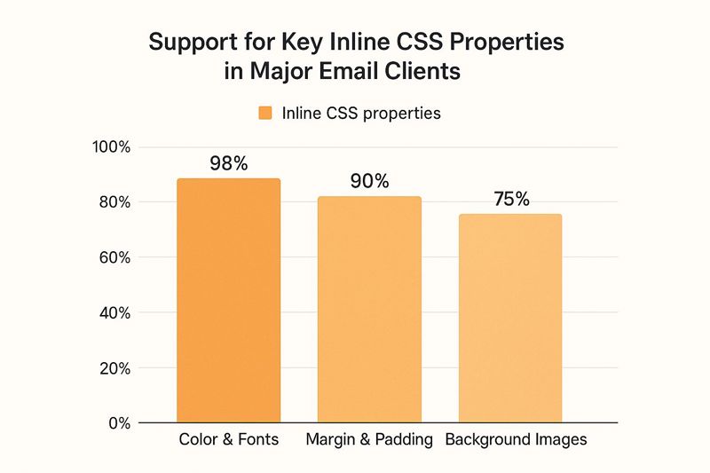
Understanding which CSS properties are well-supported can save you a world of headaches. For instance, basic styling like colors and fonts are almost universally supported, but more advanced features like background images can be less reliable. For designs with complex imagery, you’ll need to commit to more rigorous testing. For more on this, you can explore our guide on mastering email marketing images to get some fresh ideas.
Ensuring Delivery and Avoiding the Spam Folder
You've built a beautiful, responsive HTML email. That's a huge win, but all that effort goes down the drain if it never actually reaches your audience's inbox. The last, and arguably most critical, piece of the puzzle is deliverability. This is where we navigate the murky waters of sender reputation, email authentication, and spam filters to make sure your message lands where it belongs.
First things first, how are you sending this email? While you could technically send it from a personal client like Gmail or Outlook, that's not a scalable or reliable approach for any real campaign. For anything more than a handful of emails, you absolutely need a dedicated Email Service Provider (ESP) like Mailchimp or a transactional service like SendGrid. These platforms are built from the ground up for high-volume sending and give you the essential tools to manage deliverability that personal clients just don't have.
Protecting Your Sender Reputation
Think of your sender reputation as a credit score for your email address. Internet Service Providers (ISPs) look at this score to decide if they should deliver your email, dump it in the spam folder, or just block it outright. A bad reputation, often caused by high bounce rates or people marking your emails as spam, can completely sabotage your efforts.
This is where the technical stuff comes in. Authentication protocols like SPF (Sender Policy Framework) and DKIM (DomainKeys Identified Mail) are non-negotiable. They work like a digital signature, proving to the receiving email servers that you are who you say you are and not some spammer in disguise. Most ESPs will walk you through setting these up, and it's one of the single most effective things you can do to build trust with ISPs.
For a deeper look at the technical side, check out our guide on how to improve email deliverability with these best practices.
Content and Engagement Best Practices
Beyond the technical setup, the content of your email plays a massive role in whether you dodge the spam filters. The inbox is a battlefield. With the average person getting over 80 emails a day and nearly half of them being spam, you have to be smart.
To stand out for the right reasons, keep these content guidelines in mind:
- Balance Your Text and Images: Emails that are just one giant image are a huge red flag for spam filters. Always make sure you have a healthy amount of live text to go with your visuals.
- Keep Your Code Clean: Messy, broken HTML can trigger spam filters. Keep your code well-structured and semantic.
- Don't Sound "Spammy": It might seem obvious, but avoid shouting in all caps, using a dozen exclamation points, or relying on cliché trigger words about money and urgency.
To make sure your meticulously crafted HTML emails don't go to waste, it's a good idea to perform a regular email marketing audit. This helps you spot problems and optimize for better results. This 8-point email marketing audit checklist is a great resource to keep your strategy sharp.
At the end of the day, deliverability comes down to sending valuable content that people actually want. High engagement rates—opens, clicks, and replies—are the strongest possible signals to ISPs that your emails are welcome. When you combine a reputable ESP, proper authentication, and thoughtful content, you're not just sending an email; you're ensuring it gets seen.
Common Questions About Sending HTML Emails
Once you start building HTML emails, you'll quickly run into a few common roadblocks. It's just the nature of the beast. Think of this as your go-to guide for answering those nagging questions that pop up when you're trying to get things just right in the inbox.
Can I Use Modern CSS Like Flexbox or Grid?
I wish I could say yes, but the short answer is a hard no. While we all love using modern tools like Flexbox and Grid for web development, they have notoriously spotty support across the major email clients. It's a frustrating reality, but the rendering engines in platforms like Outlook and even parts of Gmail are years behind and just can't handle them reliably.
To make sure your email actually looks the way you designed it for everyone, you have to lean on older, more dependable techniques. That means going back to basics with HTML tables for layout and inline CSS for styling. It might feel like a major step backward, but trust me, it's the battle-tested, industry-standard way to achieve consistent results across every inbox.
Why Are My Images Not Showing Up?
Ah, the classic "disappearing image" problem. This one usually comes down to a couple of simple culprits.
First, always, always double-check that you're using absolute URLs for your images. That means the full path, like https://your-site.com/image.jpg, not a relative one like /image.jpg. Your image needs to live on a public web server so the email client can find and display it.
Second, remember that many email clients, especially Outlook, block images by default for security. Your subscribers will have to manually click a "Download Pictures" button. This is exactly why descriptive alt text is so critical. It tells people what the image is about even if it’s blocked and makes your message more accessible. A good alt tag can even help you increase email open rates by making your email look more professional from the get-go.
Should I Use an Email Builder or Code by Hand?
This really comes down to what you're trying to achieve, your technical skills, and how much time you have. There's no single right answer.
Email builders are a fantastic choice for marketers and business owners. They let you create beautiful, responsive emails in minutes without needing to write a single line of code, and they handle all the tricky cross-client compatibility issues for you.
Hand-coding, on the other hand, gives a developer total creative freedom. It's also an essential skill for debugging the weird rendering bugs that even the best builders can sometimes create.
In my experience, a hybrid approach often works best. You can hand-code a solid, reusable template and then use a simple editor to drop in new content for each campaign. It gives you the best of both worlds: control and efficiency.
Ready to create emails that truly stand out? With OKZest, you can automatically add personalized images to every email, making each recipient feel like an individual. It’s as simple as using a merge tag, but the impact on engagement is huge. Discover how to add dynamic, personalized images to your next campaign with OKZest.