When you hear "visual branding," what's the first thing that comes to mind? For most people, it's a logo. But that’s just the tip of the iceberg.
Visual branding is the entire collection of visual elements—your logo, colors, fonts, and imagery—working together to tell your company's story in an instant. It’s the cohesive look and feel that communicates who you are without saying a word.
Understanding Visual Branding Beyond the Logo
Thinking your logo is your visual brand is a common mistake. A logo is absolutely critical, but it’s only one piece of a much bigger puzzle.
A better way to think about it is like a person's personal style. A cool pair of sneakers doesn't define their whole look, right? It’s the combination of the shirt, jeans, jacket, and accessories that creates a complete, expressive outfit. That outfit tells you something about them before they even speak.
Visual branding is your company's "outfit." It’s the sum of all its visible parts, working in harmony to create a distinct and instantly recognizable presence. This unified system ensures that every time someone interacts with your brand—whether on your website, social media, or in an email—the experience feels consistent and familiar.
The Power of a First Impression
Here’s a wild statistic: people form an opinion about a brand within 0.05 seconds of seeing it. And visuals are responsible for more than half of that snap judgment. That’s not a lot of time to make your case.
This blink-of-an-eye evaluation means your visual branding does the heavy lifting long before anyone reads a single word you've written. It sets the tone, manages expectations, and starts building a relationship from the very first glance.
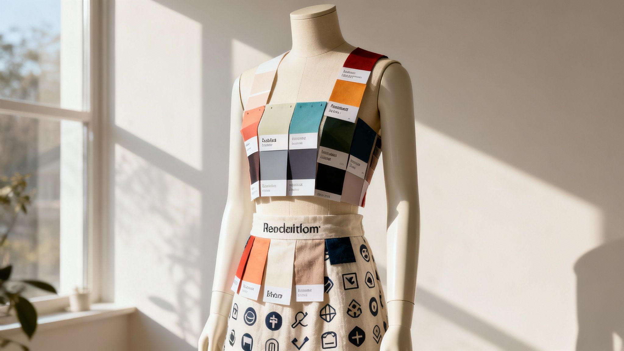
To get a feel for the core components that make up a strong visual identity, here's a quick breakdown of what goes into your brand's "outfit."
The Core Pillars of Visual Branding at a Glance
| Component | Primary Role in Branding | Example Application |
|---|---|---|
| Logo | The primary identifier; a memorable symbol of your brand. | Apple's iconic bitten apple logo on all its products. |
| Color Palette | Evokes emotion and creates mood. | Tiffany & Co.'s signature robin's-egg blue, which signals luxury and exclusivity. |
| Typography | Conveys personality—from modern and clean to classic and elegant. | Mailchimp's friendly, rounded font that feels approachable and easy to use. |
| Imagery & Photography | Shows your brand in action and connects with your audience's lifestyle. | Nike's use of dynamic, athletic photos that inspire movement and determination. |
| Graphic Elements | Icons, patterns, and shapes that create a unique visual language. | The playful, abstract shapes and illustrations used by Dropbox. |
Each of these pillars works together to build a consistent and powerful visual story for your audience.
More Than Just Looking Good
At the end of the day, a strong visual brand is a strategic business tool. This isn't about making things "pretty" just for the sake of it; it's about intentional design that gets results.
"Visual branding is the silent ambassador of your brand. It’s the intentional, strategic use of imagery, color, typography, and other visual elements to shape perception and create an emotional connection."
Every visual choice you make sends a message. It can communicate:
- Professionalism and Trust: A clean, consistent design signals reliability.
- Brand Personality: Bright colors might feel energetic, while a minimalist look can imply sophistication.
- Market Position: Your visuals can instantly set you apart from competitors, positioning you as a premium, budget-friendly, or innovative choice.
These elements are all part of a bigger strategy called visual communication, a topic we dive into deeper in our guide on visual communication. Once you grasp what visual branding truly is, you can start building an identity that doesn't just look great—it works for your business.
How Cohesive Visuals Build Trust and Drive Growth
Understanding the pieces of visual branding is one thing, but the real magic happens when you see how they work together to get real business results. A cohesive visual strategy isn't just about making things look pretty; it's a core driver of customer trust, brand recognition, and, ultimately, your bottom line.
When every visual element you put out there speaks the same language, it builds a powerful, unspoken promise that you’re reliable and professional.
Think about it like this: if you walked into a store where the signs, employee uniforms, and packaging all had completely different logos and colors, you’d probably feel a bit of chaos. You might even wonder if the place is legitimate. The exact same thing happens online. Inconsistent visuals create a sense of unease, making potential customers less likely to trust you with their business.
On the flip side, a unified look signals that you’re professional and you care about the details. It shows your audience that you’ve thought about their experience from start to finish, which builds confidence and makes them feel secure choosing you.
The Psychology of Instant Recognition
Our brains are hardwired to spot patterns. We process images and familiar shapes in a split second, long before we even get around to reading the words. This is exactly why you can spot the McDonald's golden arches from a mile away or know a Tiffany & Co. box just by its iconic shade of blue.
That’s visual branding doing its job.
When your visual identity is consistent across your website, social media, and emails, you're training your audience to recognize you instantly. This familiarity is incredibly powerful:
- It Makes Decisions Easier: When a customer sees your familiar branding, they don't have to stop and figure out who you are all over again. They know what to expect, which saves them mental energy and makes it easier to choose you over a competitor.
- It Creates an Emotional Shortcut: Consistent visuals instantly bring back the memories and good feelings from past experiences with your brand. That emotional connection is what turns a one-time buyer into a loyal fan.
- It Boosts Perceived Value: A brand that looks polished and put-together is automatically seen as more valuable. This allows you to stand out in a crowded market and often command higher prices.
Apple is the master of this. The clean, minimalist design of their products is perfectly echoed in their website, retail stores, and even their packaging. This absolute consistency creates an immersive brand world that feels premium, innovative, and deeply trustworthy.
From Consistent Branding to Measurable Growth
The link between a strong visual identity and business success isn't just a theory—it directly hits your bottom line. When customers trust you and recognize you at a glance, they’re more likely to buy from you, stick around, and tell their friends about you. This kicks off a powerful cycle of growth.
A strong visual identity acts as a constant, silent reassurance to your customers. It tells them, "You're in the right place. We are who we say we are." This foundation of trust is where real brand loyalty begins.
The data backs this up, too. Companies that keep their branding consistent across all their platforms see a real impact on their revenue. Reports show that a consistent visual brand can lead to revenue growth between 10-20%.
If you'd like to discover more insights about visual branding's impact on business growth, it’s worth a read. This isn’t a minor tweak; it's a major boost driven by the simple act of presenting a unified front. A cohesive visual strategy is an investment that pays for itself in customer loyalty and profitability.
The Essential Elements of a Strong Visual Identity
A powerful visual brand is never an accident. It's carefully constructed from a handful of core building blocks. Think of them like ingredients in a recipe—each has its own purpose, but when you combine them correctly, you create something cohesive and memorable. Getting a handle on these components is the first step to building a visual identity that truly connects with people.
These aren't just aesthetic choices; they are fundamental business decisions. Every element works together to communicate your brand's personality, what you stand for, and where you fit in the market. To really get this right, it's about more than just a logo; it's about creating a powerful brand identity from the ground up.
This infographic gives you a quick look at how the core elements—logos, colors, fonts, and icons—all come together.
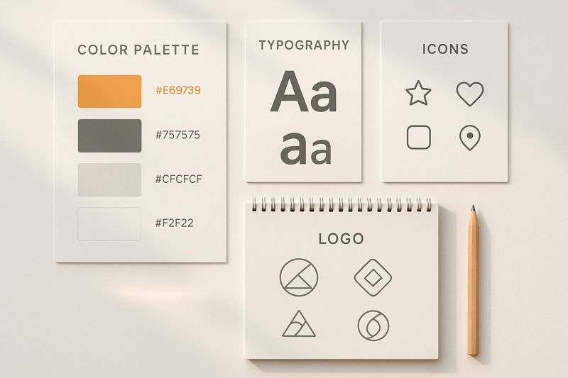
You can see how each piece is part of a larger, interconnected system, all arranged to tell a single, unified story about your brand.
Your Logo: The Cornerstone of Recognition
Your logo is the most concentrated version of your brand. It’s the visual handshake, the face of your company that shows up everywhere from your website to your social media profiles. A great logo is simple, easy to remember, and versatile enough to look good whether it's tiny on a favicon or huge on a billboard.
It’s the main symbol people will connect with every experience they have with your business. While it's just one piece of the puzzle, it's the most visible one, making it the anchor for your entire visual system.
Color Palette: The Emotional Trigger
Color is a powerful communicator that works on a subconscious level. The palette you choose does more than just make things look pretty; it triggers specific feelings and sets the mood for your brand. In fact, research shows that color can boost brand recognition by up to 80%.
- Warm Colors (Reds, Oranges, Yellows): These often bring to mind feelings of energy, passion, and happiness. Think of how McDonald's and Coca-Cola use red to create a sense of excitement.
- Cool Colors (Blues, Greens, Purples): These tend to feel calm, trustworthy, and professional. It’s no surprise that tech and finance companies like Meta and Chase Bank lean on blue to signal reliability.
- Neutrals (Black, White, Grays): These can signal sophistication, simplicity, and modernity. Apple's minimalist use of black, white, and gray reinforces its identity as a sleek, premium brand.
Your color palette is one of your best tools for shaping how people see you, so pick colors that line up with the emotions you want your audience to feel.
Your brand's color palette is its emotional language. It's the silent storyteller that influences how people feel about you before they read a single word. Choose it wisely, and it will speak volumes.
Typography: The Voice of Your Brand
If color sets the mood, typography gives your brand its voice. The fonts you select can instantly tell people who you are. Are you modern and bold, or traditional and elegant? Your typography tells that story immediately.
Consider the difference between a strong, sans-serif font like Helvetica and a classic, serif font like Times New Roman. The first feels clean and current, while the second feels more established and formal. That distinction is a big deal.
Key Typography Considerations:
- Readability: Above all else, your fonts have to be easy to read on all devices and at any size.
- Hierarchy: Use different font weights and sizes for headlines, subheadings, and body text to guide the reader’s eye and create a clear structure.
- Personality: Pick fonts that actually reflect your brand’s character. A playful startup isn’t going to use the same font as a hundred-year-old law firm.
- Consistency: Stick to just two or three fonts across all your materials. This keeps things looking consistent and professional.
Imagery and Graphic Elements: The Narrative
Finally, the photos, illustrations, and icons you use are what bring your brand to life. This is where you get to show your brand in action, connect with your audience on a human level, and build a unique visual world.
- Photography: Do you use bright, candid photos of real people, or sleek, professional product shots? Your choice sets a completely different tone.
- Illustrations: Custom illustrations can inject a personality that photos just can't. They can be fun, technical, or artistic.
- Icons and Shapes: Simple icons and recurring graphic elements (like patterns or lines) help tie everything together into one cohesive visual language.
These elements are especially important for social media, where you need strong visuals to stop the scroll. Using consistent, branded imagery makes your content instantly recognizable. For anyone looking to make this easier, using high-quality social media graphics templates can ensure every single post fits perfectly with your visual identity.
Learning from Brands That Mastered Visuals
Theory is one thing, but the real lessons in visual branding come from seeing it in the wild. Some of the world's most recognizable companies didn't just build empires on their products—they did it with a powerful, unforgettable visual language. By looking at how they pull it off, we can move from abstract ideas to a practical game plan.
What you'll notice is that a great visual identity is never an accident. It's the result of deliberate choices, executed with relentless consistency over time, all designed to create a specific feeling and earn a permanent spot in our minds.
Let’s dive into two very different examples: a legacy giant and a modern disruptor.
The Timeless Power of Coca-Cola
Coca-Cola is the undisputed heavyweight champion of enduring visual branding. For more than a century, its identity has been anchored by two elements you could spot from a mile away: the vibrant Coca-Cola Red and that elegant, flowing Spencerian script font. These aren't just design flourishes; they're strategic assets that built a global icon.
That specific shade of red is instantly recognizable. It’s designed to trigger feelings of happiness, energy, and excitement, and it pops on any store shelf. When you pair it with the custom script, which feels both classic and personal, you get a visual hit of nostalgia and genuine connection.
Coca-Cola's visual strategy is built on a simple yet profound principle: unwavering consistency. By never straying from its core visual assets, the brand has made itself a permanent fixture in global culture, proving that a disciplined approach creates lasting recognition.
Think about it—advertising styles have come and gone, but that red and that script have remained untouched. This dedication ensures that whether you see a billboard in Tokyo or a can in Toronto, the message is the same. It’s a powerful lesson in how sticking to your visual roots builds an unbreakable bond with generations of customers.
Spotify’s Dynamic Digital Identity
Now, let's flip the script. While Coca-Cola built a legacy on consistency, Spotify shows us how to build a visual brand for a modern, digital-first world. Its identity is vibrant, flexible, and feels completely at home on a screen. The brand is famous for its bold use of color gradients and a clean, duo-tone photography style.
Spotify doesn’t have just one signature color. Instead, it uses a flexible system of bright, saturated gradients that feel energetic and alive—a perfect reflection of the diverse world of music and podcasts on its platform.
Their visual strategy also nails a few other key elements:
- Clean Iconography: The app uses simple, universally understood icons that make it incredibly intuitive to navigate.
- Bold Typography: A clean, sans-serif font keeps everything readable and gives the brand a modern, approachable voice.
- Data-Driven Visuals: The annual "Spotify Wrapped" campaign is pure genius. It turns personal listening data into shareable, visually stunning graphics that perfectly match the brand’s aesthetic.
Spotify proves that a modern visual identity can be fluid and expressive while still being instantly recognizable. It connects with a younger audience because it speaks their visual language—one that is colorful, clean, and made for sharing. To see how these principles are applied in practice, you can explore a collection of agency projects that bring modern brands to life.
The financial payoff for getting this right is staggering. The top 5,000 global brands recently topped a collective valuation of $13 trillion. Unsurprisingly, visually dominant tech firms like Apple ($516.6 billion) and Microsoft ($340.4 billion) are leading the pack. It just goes to show the immense value that a powerful, consistent visual branding strategy can create.
Building Your Visual Branding Strategy Step by Step

A powerful visual brand never happens by accident. It's the result of a deliberate, thoughtful process—translating your company’s soul into a visual language people can instantly connect with.
Think of it like building a house. You wouldn't just start hammering nails and hope for the best; you'd need a detailed blueprint. This guide is your blueprint, a step-by-step roadmap to building a visual strategy that’s authentic, consistent, and actually works.
Following this process ensures your visual identity is more than just pretty decoration. It becomes a genuine tool for connection.
Step 1: Define Your Brand’s Foundation
Before you even think about colors or fonts, you have to get crystal clear on the "why" behind your brand. A strong visual identity is built on a solid foundation of purpose, personality, and a deep understanding of who you're talking to. Honestly, this is the most important part of the entire process.
Start by asking these fundamental questions:
- What is our purpose? Go beyond just what you sell. Why does your company exist? What real problem are you solving?
- What is our personality? If your brand were a person, what three words would describe it? Are you playful and energetic, or are you more sophisticated and reliable?
- Who is our ideal customer? Get specific here. What do they value? What are their pain points and aspirations? Your visuals need to click with them, not just with you.
The answers to these questions will give every future visual choice a purpose. For instance, a brand aiming to feel "grounded and reliable" will naturally gravitate toward a completely different color palette than one that wants to be "bold and innovative."
Step 2: Create a Mood Board
With your foundation set, it’s time to turn those abstract ideas into a visual direction. A mood board is simply a collection of images, colors, textures, and fonts that capture the look and feel you're going for. It’s your creative sandbox—a place to play and experiment before making any final commitments.
Gather inspiration from places like Pinterest, design blogs, or even photos you snap yourself. The goal is to find visual examples that vibe with the brand personality you just defined. This process helps get everyone on your team on the same page, creating a shared vision for the brand's aesthetic.
A mood board acts as a visual compass. It keeps every design choice honest, making sure you stay true to the emotional direction you've set and preventing your creative efforts from drifting off course.
Step 3: Select Your Core Visual Elements
Now we get to the fun part: making concrete decisions about the building blocks of your visual identity. Using your mood board as a guide, you'll select the key elements that will show up everywhere your brand does.
This process involves:
- Choosing a Color Palette: Pick a primary color, a few secondary colors to support it, and one or two accent colors for pop. Each one should align with the emotions you want your brand to evoke.
- Selecting Typography: Choose a primary font for headlines and a secondary font for body text. Make sure they’re easy to read and reflect your brand's personality.
- Developing a Logo: Your logo should be simple, memorable, and work everywhere—from a tiny favicon to a giant billboard.
- Defining Imagery Style: Decide on the style of photography or illustration you’ll use. Will it be bright and candid, or more professional and minimalist?
This is also where you can get a serious edge with modern tools. Today, a staggering 86% of companies are either using or planning to use AI in their marketing. As you can find on explodingtopics.com, AI-powered tools are completely changing how brands create personalized visual content and run campaigns more efficiently.
Step 4: Document Everything in a Brand Style Guide
This final step is absolutely critical. You must document all of your decisions in a brand style guide. This document becomes the single source of truth for your visual brand, ensuring everyone represents it correctly and consistently. It's the rulebook that anyone—from your internal marketing team to a freelance designer—can follow.
Your style guide should clearly outline:
- Logo Usage: Rules for clear space, minimum size, and examples of what not to do.
- Color Palette: The exact color codes (HEX, RGB, CMYK) for every single brand color.
- Typography: The specific fonts, sizes, and weights for all headings and body copy.
- Imagery Guidelines: Examples of on-brand photography, icons, and illustrations.
Creating and enforcing a style guide is the secret to maintaining a strong, recognizable brand over the long haul. It transforms your visual assets from a random collection into a cohesive, strategic system. With this in place, you can even explore how to automate your designs, ensuring every single image you produce follows your guidelines perfectly while saving a ton of time.
Got Questions About Visual Branding? We've Got Answers.
As you start to move from theory to practice, it's totally normal for a few questions to pop up. This last section is all about tackling the common hurdles and "what-ifs" people run into when they're building their visual brand. Think of it as a quick chat to clear up any confusion and get you ready to move forward with confidence.
These are the things that reinforce the big ideas we've talked about, helping you skip the common mistakes and make smarter choices for your brand's look and feel.
How Is Visual Branding Different From Brand Identity?
This is a big one, but the difference is actually pretty simple.
Brand identity is your brand’s soul. It’s the whole package: your mission, your core values, your personality, and the voice you use. Brand identity answers the big, foundational questions like, "Who are we?" and "What do we stand for?"
Visual branding, on the other hand, is the body. It’s the tangible, visible stuff people can actually see and touch that brings that soul to life. If your identity is the strategy, your visuals are the execution.
For example, if your brand identity is "playful and innovative," your visual branding would probably involve bright colors, a clean and modern font, and maybe some fun illustrations. You have to know who you are (identity) before you can decide what to wear (visuals).
How Often Should a Business Update Its Visuals?
There’s no magic number here, but a good rule of thumb is to take a hard look at your visual branding every 3-5 years. You just want to make sure it doesn't feel stale or dated. A full-blown overhaul, or a rebrand, is a major project that's usually saved for huge business changes, like a merger or a big pivot into a new market.
What’s more common is a refresh. This is more like a touch-up. You might refine the logo a bit, tweak the color palette, or switch out a secondary font. The goal is to evolve thoughtfully, not just change things for the sake of it. You want to stay current without losing the recognition you've worked so hard to build.
The most powerful principle in visual branding isn't a single element like a logo or a color; it's the unwavering commitment to consistency. An average design used consistently across every touchpoint is far more effective than a brilliant one used erratically.
Can a Small Business Afford Professional Visual Branding?
Yes, absolutely. Professional branding isn't an all-or-nothing expense; it's a scalable investment. While a big design agency might be out of reach, there are fantastic options for just about every budget.
You can find talented freelance designers on platforms like Upwork or Fiverr who do great work. Plus, design tools like Canva have made it incredibly easy for businesses to create professional-looking assets themselves.
Honestly, the most important investment isn't always money—it's the time you spend nailing down your strategy. A clear plan ensures every design choice, whether it costs five dollars or five thousand, is focused, intentional, and actually works.
What Is the Single Most Important Part of Visual Branding?
If you only remember one thing from this whole guide, make it this: the single most important part of visual branding is consistency.
It’s not your logo. It’s not your color scheme. It’s the disciplined, relentless application of all your visual elements across every single place a customer interacts with you.
When your website, social media, emails, and packaging all speak the same visual language, you create an experience that feels seamless and deeply professional. Consistency is what builds brand recognition and, ultimately, lasting trust.
Ready to make every customer interaction a visually consistent and personalized experience? With OKZest, you can automatically create stunning, personalized images for your email campaigns, websites, and chatbots. Turn every message into an opportunity to connect on a deeper level.
Explore how you can increase engagement and build stronger relationships at https://okzest.com.