Trying to boost your website's conversion rates without first understanding why people are leaving is like trying to fix a leaky pipe with a blindfold on. You might patch a spot here or there, but you’ll never stop the flood. Real, sustainable growth comes from a data-driven diagnosis of user behavior, not random guesswork.
Before you even think about A/B testing or redesigning your homepage, you have to become a detective.
Building Your Foundation for Higher Conversions
The goal is to move past surface-level metrics like traffic and dig into what your users are actually doing. You need to find the leaks in your conversion funnel—the exact spots where potential customers lose interest, get confused, and bounce.
Here’s where to start looking:
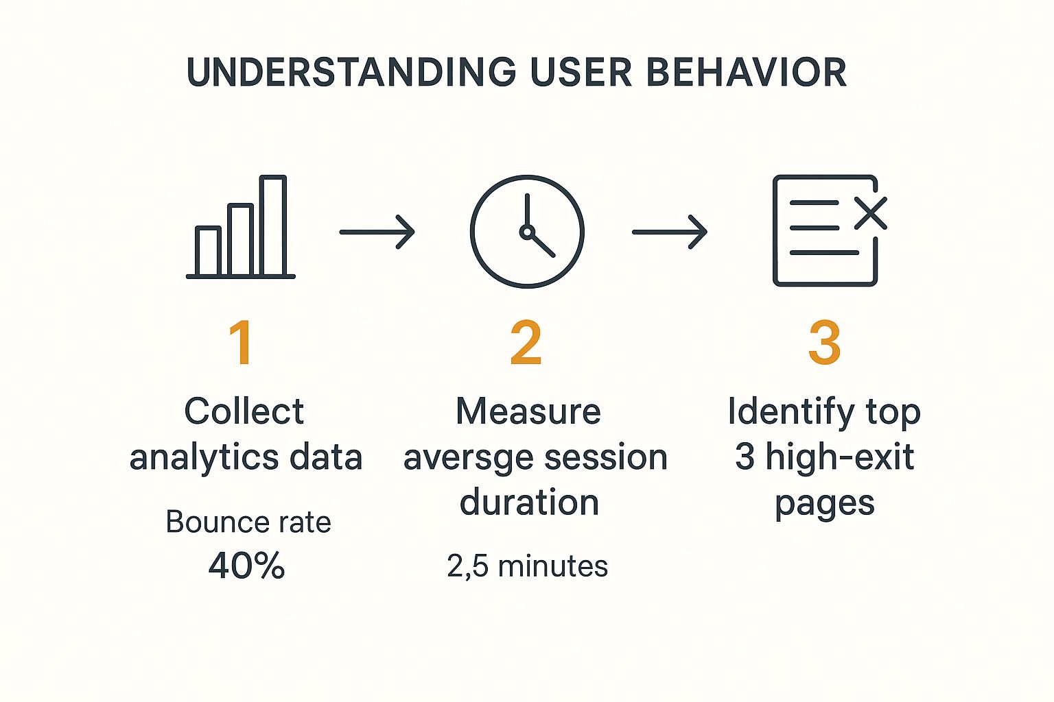
- Analyze User Behavior Flows: Use a tool like Google Analytics to see the paths people take. Are they hopping from the homepage to a product page and then vanishing? Do they get stuck on your pricing page? These paths tell a story.
- Identify High-Exit Pages: Pinpoint the pages where the most people decide they've seen enough. A high exit rate on a blog post is one thing, but on your checkout page? That’s a five-alarm fire.
- Set Clear Conversion Goals: A "conversion" isn't always a sale. It could be a newsletter signup, a demo request, or a resource download. You need to define what success looks like for every important page on your site.
Diagnosing Your Conversion Funnel Leaks
Every single website has leaks. It might be a confusing navigation menu, a call-to-action button buried below the fold, or a clunky mobile checkout process that makes people want to throw their phones.
Your job is to find these friction points. This requires a deep dive into your analytics, but it also means ensuring your brand message is clear and consistent. A strong brand builds trust the second someone lands on your site. You can learn more about this in our guide on the fundamentals of effective branding for your website.
The most impactful conversion improvements often come from fixing the most obvious problems. Don't hunt for complex solutions until you've addressed the basics: clarity, simplicity, and a clear path for the user to take.
This initial audit focuses your attention on bounce rates, how long people stick around, and which pages are pushing them away.
This data gives you a solid starting point, highlighting which pages are underperforming and need immediate attention. For a deeper look at the foundational principles, exploring additional insights on how to improve website conversion rates can add valuable context to your strategy.
To get started, here's a simple checklist to guide your initial analysis and uncover some low-hanging fruit.
Key Areas for Your Initial Conversion Audit
Use this checklist to analyze core website elements and find immediate opportunities for conversion improvements.
| Audit Area | What to Look For | Potential Impact |
|---|---|---|
| Homepage Clarity | Is your value proposition obvious within 3 seconds? Is the primary CTA clear? | High |
| Navigation & Site Structure | Can users easily find key pages (products, pricing, contact)? Is it intuitive? | High |
| Call-to-Action (CTA) Buttons | Are they visible, compelling, and consistent across the site? | Medium-High |
| Page Load Speed | Do pages load in under 3 seconds? Check both desktop and mobile. | High |
| Mobile Experience | Is the site easy to use on a smartphone? Is the checkout process simple? | High |
| Forms (Contact, Lead Gen) | Are they too long? Are there unnecessary fields causing friction? | Medium |
This audit isn't about finding every single flaw; it's about identifying the most critical roadblocks that are costing you conversions right now.
Setting Realistic Benchmarks
It’s crucial to keep your expectations grounded. The global average e-commerce conversion rate is projected to be around 2.7% in 2025. Well-established retailers might hit the 3-4% range, but new stores often start out closer to 2-2.5%.
These numbers are climbing thanks to better mobile experiences and AI-powered personalization. Understanding where the industry stands helps you set achievable goals and measure your progress without getting discouraged.
Optimizing Website Speed and User Experience

So, you’ve mapped out your user journeys and found the leaks. Now what? It’s time to fix two of the most notorious conversion killers out there: a painfully slow website and a confusing user experience (UX).
Nothing makes a potential customer hit the 'back' button faster than a page that crawls or a menu that feels like a riddle. Getting the technical basics right is often the first real step to boosting conversions. A clunky site screams that you don't value their time, but a fast, intuitive one builds trust from the first click.
The Critical Need for Speed
Every single second counts. Seriously. The link between page speed and conversions isn't just some marketing theory—it’s a hard fact that directly hits your bank account. Slow sites don't just test patience; they actively lose you sales.
The numbers are staggering. Research has shown that a page loading in just one second can have conversion rates 2.5 times higher than one that takes a sluggish five seconds. This isn't just an e-commerce thing, either. It holds true for B2B, SaaS, you name it. Speed is a universal expectation. You can read more on the impact of site speed if you're curious.
Here are a few quick wins to get your site moving faster:
- Compress Your Images: Giant, unoptimized image files are the usual suspects. Use a compression tool to shrink them down without turning them into a pixelated mess.
- Leverage Browser Caching: This tells a visitor's browser to save parts of your site (like logos and stylesheets). The next time they visit, the page loads almost instantly because the files are already on their device.
- Minimize Code: It’s time for some digital spring cleaning. Tidying up your HTML, CSS, and JavaScript by removing extra spaces, comments, and characters can make a surprising difference in load times.
Designing an Intuitive User Experience
Once your site is fast, you need to make it easy. A great user experience is all about helping visitors find what they want and do what they came to do, without having to think too hard about it.
Your goal is to create a path of least resistance from the landing page to the conversion. Every confusing element, unnecessary step, or poorly worded button is a roadblock on that path.
Let's start by refining the core elements of your user interface.
Simplify Navigation and Structure
Your website's navigation should be totally predictable. If someone lands on your homepage, can they find your pricing or product pages in a few seconds? If not, you have a problem.
Stick to clear, simple language for your menu items. Now is not the time to get clever with industry jargon. A "sticky" navigation bar—the kind that stays at the top of the screen as users scroll—is another simple but powerful tweak. It keeps key links within reach at all times, which cuts down on frustration and helps people stay oriented.
Crafting Compelling CTAs and Value Propositions

Once your site is running smoothly, it's time to sharpen your message. This is where the real magic happens. Your call-to-action (CTA) and value proposition are the make-or-break moments where a visitor decides to stick around or head for the exit. A fuzzy message here is a guaranteed way to lose a potential customer.
Think of your value proposition as the direct answer to your visitor's unspoken question: "What’s in it for me, and why should I pick you over everyone else?" This needs to be crystal clear, right up front. If they can't figure it out in seconds, they're gone.
What Makes a Value Proposition Stick
A powerful value proposition isn’t just a slick tagline; it's a clear, concise promise. It needs to zero in on a customer's biggest headache and position your product as the perfect cure. Ambiguity is your worst enemy.
To nail it, focus on these three things:
- Clarity: Be brutally simple. What is your product? Who's it for? How does it make their life better? No jargon, no fluff.
- Specific Benefit: Vague promises fall flat. Don't just say you save time. Say you "cut report generation time by 50%." Numbers and tangible outcomes are way more convincing.
- Differentiation: What’s your secret sauce? Is it your insane customer support, a feature no one else has, or a better pricing model? Whatever it is, put a spotlight on it.
For example, a value prop like "Automated image personalization for email marketers" is infinitely better than "Better marketing solutions." It's specific, it knows its audience, and it solves a real problem.
A great value proposition makes the decision to convert feel like the most logical next step. It removes doubt and replaces it with confidence that you have the exact solution they've been searching for.
Engineering a Call-to-Action That Converts
Your CTA button is the final doorway to conversion. Let's be honest, generic words like "Submit" or "Click Here" are just lazy. They feel like work and don't give the user anything to look forward to. A great CTA, on the other hand, motivates action because it tells people exactly what awesome thing is about to happen.
A CTA button that actually works has three key ingredients:
- It's Action-Oriented: Kick things off with a strong verb that gets people moving. Think "Get," "Start," "Build," or "Join."
- It Highlights a Benefit: Instead of "Download," which sounds like a chore, try "Get My Free Guide." One is a task; the other is a reward.
- It Creates Urgency (When Appropriate): Phrases like "Claim Your Spot Now" or "Get 30% Off Today Only" can give hesitant users the little nudge they need. Just don't overdo it, or you'll sound spammy.
Think about the psychology behind "Sign Up" versus "Start My Free Trial." The second option feels safer, promising instant value with no strings attached. This tiny language shift can have a massive impact on your conversion rates by framing the action as a low-risk, high-reward opportunity for the user.
Using Data-Driven A/B Testing for Real Growth

So, you've optimized your site speed and tightened up your messaging. Fantastic. The next crucial move is to stop guessing what works and start measuring it. This is where A/B testing comes into play, but I'm not talking about aimless tinkering. I mean a structured, data-driven approach that creates real, measurable growth—not just statistical noise.
The basic idea is simple enough. You create two versions of a webpage (let's call them 'A' and 'B'), show them to different groups of your audience, and see which one performs better for a specific goal. But truly successful A/B testing is so much more than just changing a button color on a whim. It all starts with a strong, data-backed hypothesis.
Forming a Test-Worthy Hypothesis
A solid hypothesis isn't a random shot in the dark; it's an educated prediction rooted in the user behavior data you've already collected.
Let's say your analytics show a massive drop-off on your pricing page. A good hypothesis might sound something like this: "By changing the headline from 'Our Plans' to 'Find a Plan That Fits Your Budget,' we can clarify the page's value, reduce the bounce rate, and see a 10% increase in clicks on the 'Start Trial' button."
See how powerful that is? It's not just a vague idea. It clearly states:
- The Change: A specific headline tweak.
- The Rationale: It's based on a real problem (user confusion) and aims to clarify value.
- The Metric: A specific, measurable goal (a 10% lift in trial clicks).
This framework turns wishful thinking into a testable experiment. It’s a core principle of any smart marketing strategy and is absolutely fundamental when you dig into what is data-driven marketing and how it shifts your focus from assumptions to hard evidence.
Prioritizing Your Tests for Maximum Impact
You could probably come up with a hundred things to test on your site, but your time and traffic are finite resources. That's why smart prioritization is essential for anyone serious about improving their website conversion rates. You have to focus on the changes with the highest potential for a big win.
Don't waste weeks testing a tiny font change in your footer. Start with high-traffic, high-impact pages like your homepage, key product pages, or the checkout process. A small win on a page seen by thousands is worth far more than a huge win on a page seen by ten.
Here’s a simple framework I use for deciding what to tackle first:
| Element to Test | Why It Matters | Potential Impact |
|---|---|---|
| Headline & Value Prop | It's the first thing visitors see. It either grabs them or they're gone. | High |
| Hero Image or Video | A powerful visual can communicate your value proposition instantly. | High |
| Call-to-Action (CTA) Text | Small tweaks in wording can have a dramatic effect on user psychology and clicks. | Medium-High |
| Page Layout & Flow | The order you present information can either guide users to convert or confuse them. | High |
| Form Fields | Removing even one unnecessary field can give your form completions a serious boost. | Medium |
By methodically testing these high-impact elements based on solid hypotheses, you create a powerful cycle of continuous improvement. Every test—whether it "wins" or "loses"—gives you priceless insight into your audience's behavior, lighting the way for your next experiment and driving real, sustainable growth.
Personalize the User Journey to Boost Engagement
A one-size-fits-all website just doesn't cut it anymore. It feels cold, disconnected, and frankly, a bit lazy. Your customers now expect experiences that feel like they were made just for them, and if you don't deliver, your conversion rates will suffer. Personalization isn't some high-tech luxury reserved for massive corporations; it's a core strategy for building trust and gently guiding people toward a sale.
The whole idea is to make every visitor feel seen and understood. Instead of hitting everyone with the same generic homepage, you can use dynamic content that adapts on the fly. This is easier than it sounds. It could be as simple as changing a hero image based on someone's location or showing a different offer to a returning visitor versus a first-timer.
Moving Beyond Generic Messaging
Imagine this: a new visitor from a chilly part of the country lands on your homepage in December and sees a bold feature on winter coats. At the same time, a returning customer who was just browsing summer dresses gets a curated look at new arrivals in that exact category.
That's personalization in action. It immediately sends the message, "We get you," which is a huge step in building the kind of rapport that leads to a conversion. Your website stops being a static brochure and becomes a smart, responsive sales assistant, making every interaction feel relevant and genuinely helpful.
By tailoring content, you reduce the mental effort a user needs to find what they're looking for. A personalized experience removes friction and makes the path to conversion feel like a natural, logical next step for the visitor.
And you don't need a huge team of developers to get started. There are plenty of fantastic website personalization tools out there that can help you pull this off, even with limited resources. These platforms let you set up rules and triggers to customize the user experience without having to write a single line of complex code.
Implementing Smart Recommendations
One of the most powerful ways to personalize is with intelligent product recommendations. You've seen it on major e-commerce sites—those "Frequently Bought Together" or "Inspired by Your Browsing History" sections. This is an absolute game-changer for anyone asking how to improve website conversion rates.
This tactic works so well because it's genuinely useful. When done right, you're helping customers discover products they might have missed otherwise, which can boost both the odds of a sale and your average order value.
Here are a few ways you can put this into practice:
- Behavior-Based Suggestions: If someone is looking at high-end cameras, show them compatible lenses and camera bags, not budget tripods. Keep it relevant.
- Post-Purchase Follow-Ups: After a customer makes a purchase, send follow-up emails that feature personalized images of related items, planting the seed for their next buy.
- Shopping Cart Abandonment: Remind people about the items they left behind with dynamic content that actually shows them the specific products in their cart.
By creating these small, one-to-one connections at different points, you start building a real relationship. You're no longer just a faceless website; you become a trusted resource that understands what they need, turning casual browsers into loyal, high-converting customers.
Got questions about getting started with conversion rate optimization (CRO)? You're not alone. It can feel like a huge mountain to climb, but it really just comes down to one thing: understanding your users and methodically clearing the path for them.
Let’s tackle some of the most common questions that pop up when people first dive in.
What’s a Good Website Conversion Rate, Anyway?
This is the million-dollar question, and honestly, the answer is: it depends. You’ll see stats floating around citing an average between 2% to 5%, but that number is all over the place depending on your industry, where your traffic is coming from, and what you’re even counting as a "conversion."
Think about it—an e-commerce shop selling high-ticket luxury items will naturally have a different conversion rate than a blog offering a free PDF download.
Instead of getting hung up on a generic number, focus on your own starting point. Your real goal is to beat your past performance. Consistent, small wins against your own data are what truly matter.
How Long Until I Actually See Results?
The timeline for seeing a real impact can vary quite a bit. A simple A/B test on a page that gets a ton of traffic—say, tweaking the text on your main call-to-action button—could give you a clear winner in just a couple of weeks.
But for bigger projects, like a complete overhaul of your checkout flow, you might be looking at a few months to get it right, roll it out, and measure the results properly.
The real secret is to stop thinking of CRO as a one-and-done project. It’s a continuous loop. The consistent testing and tweaking you do will build on each other, creating this amazing momentum that drives real, long-term growth.
What Are the Best CRO Tools If I’m on a Tight Budget?
You absolutely do not need a massive budget to start making meaningful improvements. There are some incredibly powerful tools out there with free or very affordable plans that give you everything you need to start understanding how to improve website conversion rates.
- For the Hard Numbers: Google Analytics is the undisputed king, and it’s completely free. It's the foundation for figuring out what your users are doing, which pages are making them leave, and tracking your goals.
- To See What Users See: Tools like Hotjar or Microsoft Clarity are game-changers. Their free plans often include heatmaps and session recordings, which let you literally watch where people are getting stuck or confused.
- For A/B Testing: Google Optimize is on its way out, but there are great alternatives. Check out platforms like Optimizely or VWO; they usually have starter plans perfect for small businesses just wanting to run some basic tests.
Which Changes Actually Move the Needle the Most?
Every website has its own quirks, but over the years, I've seen a few areas that consistently deliver the biggest wins. If you want to see an impact fast, start by focusing on the elements that hit users right at their decision-making moment.
Put these at the top of your test list:
- Your Headline & Value Prop: This is your first shot. You have seconds to convince someone they’re in the right place.
- The Call-to-Action (CTA): The wording, color, and placement of your main button can have a shocking effect on clicks.
- Your Hero Image or Video: A powerful visual can sell your story way faster than a paragraph of text.
- Page Load Speed: This isn't just a tech issue; it's a conversion killer. Every second of delay costs you money.
By hitting these core elements first, you’re putting your energy where it’s most likely to produce a real, noticeable lift right away.
Ready to take your personalization to the next level? OKZest helps you automatically create and embed unique, personalized images in your emails and on your website. Make every customer feel seen and boost your engagement. Start creating for free at okzest.com.