So, you're driving traffic to your landing page, but the sign-ups and sales just aren't rolling in. It's a frustratingly common problem. The hard truth is that many landing pages fail because they break a fundamental promise made in an ad, offer a weak value proposition, or present a confusing call-to-action.
These three mistakes are almost always the culprits behind low conversion rates.
Why Your Landing Page Fails to Convert
Getting visitors to your page is only half the battle; the real challenge is persuading them to actually do something. When a landing page falls flat, it's rarely because of one single, glaring issue. Instead, it's usually a combination of subtle but critical disconnects that create friction and doubt for the user.
Most underperforming pages I've seen suffer from one of three core problems. Once you learn to spot them, you can start building landing pages that convert reliably.
The Problem of Message Mismatch
The most common failure point I see is a message mismatch. This happens when the promise you make in your ad doesn't line up with what people see on the landing page. For example, if your Google Ad promises a "50% Off First-Time Customer Discount," that exact offer needs to be front and center the moment someone lands on your page.
If a user clicks expecting a discount and instead finds a generic product page, you've broken their trust. That disconnect causes confusion and an instant bounce. The visitor feels misled, and you lose a potential customer in seconds. The key is creating a seamless journey where the ad and the page are speaking the same language.
A Weak or Unclear Value Proposition
Your value proposition is the core reason someone should choose you over anyone else. It must immediately answer the visitor's silent question: "What's in it for me?" A weak value proposition fails to communicate the tangible benefits of your offer clearly and concisely.
So many pages list features but completely forget to explain how those features solve a problem or improve the user's life. Instead of saying, "Our software has an AI-powered dashboard," try this: "Save 10 hours a week with our AI-powered dashboard that automates your reporting." One is a feature; the other is a benefit-driven solution.
Your landing page has to communicate its value within the first five seconds. If a visitor has to search for the reason to stay, you've already lost them. That initial impression is make-or-break.
A Confusing Call-to-Action (CTA)
Finally, a confusing or hesitant Call-to-Action (CTA) can paralyze visitors. Your goal is to make the next step completely obvious and effortless. Vague button text like "Submit" or "Click Here" lacks urgency and specificity, leaving people unsure of what to do.
Instead, use action-oriented language that describes the outcome. "Get Your Free Ebook," "Start My 14-Day Trial," or "Claim My Discount" are all specific, compelling, and crystal clear. The visitor knows exactly what will happen when they click.
A great landing page gets these fundamentals right. To give you a quick reference, here’s a breakdown of the essential components every successful page needs.
Key Elements of a High-Converting Landing Page
| Element | Purpose | Best Practice Example |
|---|---|---|
| Compelling Headline | Grab attention and communicate the primary benefit instantly. | "Create Professional Invoices in 60 Seconds." |
| Clear Value Proposition | Explain what you offer and why it's valuable. | A concise subheading and a few bullet points highlighting key benefits. |
| Engaging Visuals | Show the product/service in action or evoke an emotional response. | A high-quality product photo or a short video demo. |
| Social Proof | Build trust with testimonials, reviews, or logos of known clients. | "Trusted by over 10,000 small businesses." |
| Strong Call-to-Action (CTA) | Guide the user to the next step with clear, action-oriented language. | A brightly colored button with text like "Start Your Free Trial Now." |
Getting these elements right is a huge step forward. Analyzing them is the first part of a broader strategy, and for more hands-on advice, check out our guide on 9 proven conversion optimization techniques.
It also helps to know where you stand. Landing page conversion rates vary widely by industry, with the overall average sitting around 6.6%. However, sectors like catering can reach as high as 18.2%, while lead generation forms average 11.9%. Understanding these benchmarks can help you set realistic goals for your own pages. You can discover more insights about landing page conversion rates on SeedProd.com.
Writing Copy That Persuades and Sells

A killer design might get people to stick around for a few seconds, but it's the words on the page that convince them to act. Your copy is the engine of your landing page, doing all the heavy lifting of persuasion. Generic, feature-first language just doesn't connect. To build landing pages that convert, you have to write with real empathy for your audience's problems.
The goal here is simple: stop describing what your product is and start articulating what it does for your visitor. This pivot from features to benefits is the absolute cornerstone of compelling landing page copy.
Crafting Headlines That Stop the Scroll
You've got about three seconds. That's it. Your headline is the first—and often the only—thing a visitor reads, and it has to earn you their attention for the next thirty seconds. The best headlines don't just announce your product; they hook into a visitor's biggest headache or their most desired outcome.
Imagine you're selling a project management tool. A headline like "Our Advanced Project Management Platform" is a total snoozefest. It's all about you.
A much stronger angle? "Finish Projects On Time, Every Time, Without the Chaos." Now you're talking their language. You're speaking directly to their frustration and offering a clear, desirable future.
To nail this, make sure your headline is:
- Benefit-Oriented: What’s in it for them? Lead with that.
- Ultra-Specific: Vague promises get vague results. Be concrete.
- Clear and Concise: If they have to re-read it, you've already lost.
This first hook is your most valuable piece of real estate. Get it right, and you've earned the right to say more.
Articulating Your Unique Value Proposition
Okay, your headline got them to pause. Now what? Your subheading and opening lines need to immediately deliver on that promise by spelling out your unique value proposition (UVP). This is where you make the benefits of your offer impossible to ignore. Don't make people dig around to figure out why they should choose you.
A classic mistake is to bury your value in a dense wall of text. Nobody has time for that. Use short sentences and punchy bullet points to make your key selling points easy to scan. The trick is to translate every feature into a tangible benefit.
For example, an email marketing agency could lay it out like this:
- Save 15+ Hours Weekly: We handle everything from writing to scheduling so you can get back to your business.
- Increase Your Open Rates: Our proven subject line strategies get your emails seen and actually clicked.
- Generate More Revenue: We build automated funnels that turn subscribers into loyal customers.
This structure gets right to the point. It communicates value instantly and makes it dead simple for a busy visitor to understand the core advantages of working with you.
Nailing the Call-to-Action
Your Call-to-Action (CTA) is the final, make-or-break moment. This is where you ask for the conversion. The best CTAs aren't just buttons; they're clear, compelling invitations that squash any last-minute hesitation.
Vague button copy like "Submit" or "Continue" is a conversion killer. Your CTA text has to be specific and action-oriented, making it perfectly clear what happens next.
A great CTA creates a sense of momentum and confidence. The user shouldn't have to guess what happens next. The button text should complete the sentence, "I want to..."
For instance, "I want to... Get My Free Marketing Plan." Or, "I want to... Start My 14-Day Free Trial." It’s a simple framework that ensures your CTA aligns perfectly with what the user is thinking.
The design is just as critical. Use a contrasting color that makes the button pop off the page. This visual cue acts like a magnet, drawing the eye and guiding the user to the exact spot you want them to click. It’s this blend of persuasive language and smart design that turns a passive visitor into your next lead or customer.
Designing for a Seamless User Experience
Great design is about more than just looking good. It's the invisible hand that builds instant trust and clears a path straight to the "yes." It guides your visitor's attention, making the choice to convert feel like the most obvious, natural next step. The second someone feels confused or has to search for what to do next, you've lost them.
To build landing pages that convert, you have to think like a designer who is obsessed with the user's journey. Every single element—from the layout to the font—needs to have one job: make the conversion as simple and intuitive as possible.
Guiding the Eye with Visual Hierarchy
Visual hierarchy is simply the art of arranging things on a page to show what’s most important. A well-designed page doesn't throw everything at the visitor at once. Instead, it leads their eye on a curated tour, starting with the headline and ending right at your call-to-action.
You can pull this off with a few simple tricks. Make your headline the biggest, boldest thing on the page. Follow it up with a slightly smaller subheading that adds a bit more context. Your CTA button needs to pop—give it a high-contrast color that practically begs to be clicked.
Just as crucial is the smart use of white space, which is just the empty area around your content. When you cram too many elements together, you create visual noise and anxiety. Giving your content room to breathe makes it far easier to read and helps your key messages hit home.
A landing page without a clear visual hierarchy is like a conversation where everyone is shouting. It’s a mess. Your job is to create a calm, focused dialogue that guides the user effortlessly toward your CTA.
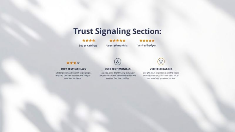
Building Trust with Social Proof
Before anyone gives you their email or credit card number, they have to trust you. Social proof is the fastest way to build that credibility. It’s the digital version of a friend's recommendation, showing new visitors that other people have already gotten value from what you offer.
Try placing these trust signals right near your CTA to squash any last-minute doubts:
- Customer Testimonials: Short, powerful quotes that highlight a specific benefit. Adding a headshot makes them feel much more authentic.
- Client Logos: If you've worked with well-known companies, show off their logos. It's instant credibility by association.
- Industry Badges or Awards: These are third-party endorsements that prove you know what you're doing.
- Case Studies: A quick summary or a link to a full case study can show the real-world results you've delivered.
Consistent branding is another huge piece of the trust puzzle. For a deeper dive, check out our article on the essentials of branding for your website.
Embracing Mobile-First Design
These days, a huge chunk of your traffic is coming from phones. If your landing page is a nightmare on a small screen, you're basically slamming the door in your customers' faces. Mobile-first design isn't just about shrinking things down; it's about completely rethinking the experience for a touch-based world.
That means big, tappable buttons, forms that are easy to fill out with your thumbs, and short, punchy copy. Every piece of the page should feel smooth and intuitive on a phone. The difference is massive; businesses with truly mobile-first landing pages see much higher success rates. For ad campaigns, this kind of optimization can push conversion rates as high as 55%, leaving the typical 2-5% in the dust. You can read the full research about how optimization affects ad conversions on Analytify.io.
Using Personalization to Boost Engagement
A one-size-fits-all landing page just doesn't cut it anymore. If you want to build high-converting landing pages, you have to stop shouting the same message at everyone and start having a more personal, one-on-one conversation. This is exactly where personalization comes in, turning a static page into a dynamic experience that speaks directly to each visitor.
This isn't about guesswork. It means tailoring your content based on what you already know about someone—like the specific ad they clicked, their location, or how they've interacted with your brand before. It’s all about creating that "aha" moment that makes the visitor feel seen and understood.
Moving Beyond Static Content
The engine behind any great personalized experience is dynamic content. It allows different parts of your landing page—think headlines, images, and even your call-to-action buttons—to change automatically based on who is looking at them.
For instance, let’s say a visitor lands on your page from a LinkedIn ad targeting SaaS founders. A dynamic landing page could instantly change its headline to read, "The Project Management Tool Built for SaaS Founders." That direct message match is so much more effective than a generic greeting. It immediately tells them they're in the right place.
Personalization isn't just a trendy feature; it’s a fundamental shift in how we should think about conversions. When a landing page speaks directly to a visitor's context, it removes friction and builds an immediate connection, making the decision to convert feel natural and easy.
The Power of Personalized Images
While text is crucial, the element that often makes the biggest first impression is your hero image. This is where a tool like OKZest can be a total game-changer, letting you create personalized images that resonate with each visitor on a whole new level.
Imagine a B2B scenario. A prospect from a company you're targeting visits your landing page and sees their own company's logo seamlessly embedded into your hero image. That single, hyper-relevant visual instantly grabs their attention and shows you've done your homework.
Here’s a perfect example of how OKZest can dynamically insert a company logo right into a landing page image, creating a powerful, individualized experience.
This level of detail shows the visitor that your solution is directly relevant to their business, which can dramatically increase engagement from the very first second. You can learn more about what personalization in marketing truly means in our in-depth guide.
Practical Personalization Scenarios
The possibilities for personalization are nearly endless. The trick is to think about the different segments of your audience and what information you can use to make their journey feel more relevant.
Here are a few common scenarios where dynamic content can make a huge difference:
- Source-Based Personalization: Change the headline and copy based on where the user came from (Google Ads, Facebook, LinkedIn, etc.). This keeps your messaging consistent from the ad click all the way to conversion.
- Geolocation Targeting: Adjust your offers, currency, or even language based on the visitor's location. A real estate company could show property listings from the visitor's city, making the page feel local and familiar.
- Behavioral Retargeting: If a visitor previously checked out a specific product, feature that exact product in the hero section when they return. It reminds them of their interest and shortens their path to purchase.
Static vs. Personalized Landing Page Elements
Let's break down how personalization elevates the core components of a landing page. Instead of a generic approach, you create a tailored experience that guides the user more effectively toward your goal.
| Landing Page Element | Standard Approach (Static) | Enhanced Approach (Personalized) | Potential Impact |
|---|---|---|---|
| Headline | "The Best Project Management Tool" | "The Best PM Tool for SaaS Founders" | Higher relevance, lower bounce rate |
| Hero Image | Generic stock photo or product screenshot | Image featuring the visitor's company logo | Grabs attention, builds instant connection |
| Call-to-Action (CTA) | "Sign Up for a Free Trial" | "Start Your Free SaaS Trial" | Increased click-through rate |
| Social Proof | General customer logos | Logos of companies in the visitor's industry | Builds trust and relatability |
| Offers/Promotions | "Get 15% Off Your First Order" | "Get 15% Off Your London Order" | Boosts conversion with local relevance |
As you can see, personalization isn't just about changing a name. It's a strategic approach to making every element on your page work harder to connect with the individual visitor.
This data-driven approach is proven to work. Statistics show that personalized calls-to-action can boost conversions by a staggering 202%, and dynamic landing pages convert 25.2% of mobile users. Even though bounce rates can still be high, businesses that use interactive and engaging elements on their pages see much better results.
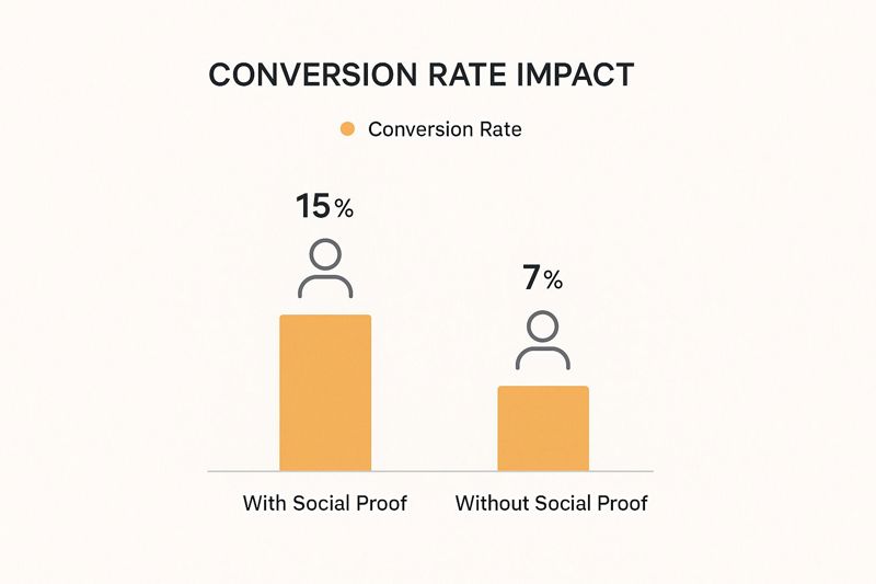
And don't forget the impact of trust-building elements like social proof. The difference in conversion rates between pages that include social proof and those that don’t is night and day. By combining personalization with trust signals, you create a powerful one-two punch that turns a generic landing page into a conversion machine.
How to Test and Optimize for Better Results
Here’s a hard truth: launching your landing page isn't the finish line. It's the starting gun. I’ve seen countless marketers build a beautiful page, hit publish, and then wonder why the leads aren’t pouring in. The most successful ones know that creating landing pages that convert is a game of continuous improvement, driven by data—not guesswork.
This whole process is called Conversion Rate Optimization (CRO). It’s the nitty-gritty work of systematically testing and tweaking your page to get more visitors to take the action you want. We're talking about small, informed changes that can stack up to create massive gains in leads and sales over time.
Starting with A/B Testing
The absolute cornerstone of good CRO is A/B testing, or split testing as some call it. It’s a beautifully simple concept: you create two versions of your page (an A and a B), show each version to a different slice of your audience, and see which one performs better. It’s a clean, scientific way to prove that a specific change actually made a difference.
The classic rookie mistake? Testing way too many things at once. If you change the headline, the CTA button color, and the main image all in one go, you’ll have no clue which change was responsible for the results. It muddies the water completely.
The golden rule of A/B testing is to test one variable at a time. This disciplined approach is the only way to get clean results and actionable conclusions. You can't optimize what you can't accurately measure.
So, where do you start? Focus on the big levers—the elements with the highest potential to move the needle on your conversion goal.
- The Headline: This is your first impression, so make it count. Try pitting a benefit-driven headline against one that agitates a common pain point.
- The Call-to-Action (CTA): Experiment with the text on your button. Does "Get My Free Guide" work better than "Download Now"? Test the color and placement, too.
- The Hero Image: Should you show off your product, or would an image of a happy customer using it be more compelling? This is also a perfect place to test personalized images from a tool like OKZest against your generic stock photos.
- Form Length: It's the age-old debate. Does a short form with just an email field get more sign-ups? Or does a longer form that asks for more info bring in higher-quality leads? Test it and find out.
Once you have a winner, implement it and start your next test. This creates a powerful feedback loop of constant improvement.
Going Beyond Clicks with User Behavior Tools
A/B testing is fantastic for telling you what is happening, but it doesn't always explain why. To really get inside your visitors' heads, you need to add a few more tools to your kit. These give you the qualitative insights that raw numbers just can't provide.
Heatmaps are brilliant. They create a visual overlay on your page showing you exactly where people click, how far they scroll, and where they move their mouse. You might discover that dozens of people are clicking on an image that isn't even a link—a clear sign of user confusion you'd never spot in your analytics.
Session recordings are even better. Think of them as anonymous recordings of real user visits. You can literally watch people navigate your page, seeing exactly where they hesitate, where they get stuck, or what they ignore completely. It’s like looking over their shoulder, and the insights are invaluable.
Creating a Culture of Optimization
Ultimately, building high-converting landing pages is about adopting a mindset of relentless testing and learning. Never treat your page as a finished product. It’s a living experiment that can always be improved.
When you combine the hard data from A/B tests with the rich behavioral insights from heatmaps and session recordings, you start making much smarter decisions. You'll stop making changes based on a gut feeling and start making data-driven optimizations that produce real results. And if you're looking to take this mindset site-wide, there are plenty of strategies to improve website conversion rates across the board.
Frequently Asked Questions
When you're deep in the weeds of landing page optimization, a lot of questions tend to pop up. Getting straight answers is the only way to build a strategy that actually works. Let's tackle a few of the most common ones I hear from marketers.
My goal here is to cut through the noise and give you some practical advice you can use right away. No fluff, just what you need to move forward with confidence.
How Many Landing Pages Should I Have?
This is a classic question, but there's no magic number. It’s all about your strategy. What we do know is that there's a strong link between the number of landing pages you have and how many leads you get. In fact, companies that maintain 31 to 40 landing pages have been shown to generate a whopping seven times more leads than those with just one or two.
Instead of aiming for a specific number, think about it this way: create a unique landing page for every single campaign, ad group, or traffic source. This creates what we call "message match"—making sure the promise you made in your ad is the first thing a visitor sees on the page. It builds instant trust. So, focus on creating relevant experiences for each audience segment, not just hitting a quota.
What Is a Good Conversion Rate for a Landing Page?
Ah, the million-dollar question. A "good" conversion rate is completely relative. It can swing wildly depending on your industry, what you're offering, and where your traffic is coming from. While the general average you might see online is around 6.6%, that figure can be incredibly misleading. For instance, the catering industry can see rates as high as 18.2%, while B2B tech might be much lower.
A much better way to think about it is to benchmark against yourself. If you're currently converting at 2%, a "good" next step is pushing for 3% or 4%. Aim for steady, incremental improvements instead of chasing some universal, mythical standard.
Sure, the top-tier, obsessively optimized pages can hit 10% or more, but that's the result of deep audience knowledge and relentless testing.
Should I Include Navigation on My Landing Page?
For most lead generation pages, the answer is a hard no. The whole point of a landing page is to get a visitor to do one specific thing. A navigation menu is just a list of escape routes. It offers a dozen ways for someone to get distracted and wander away from your call-to-action.
By removing the main site navigation, you keep the user’s attention laser-focused on your offer. This simple change can give your conversion rates a serious boost. Of course, there are exceptions. If you're selling a complex, high-ticket service, you might test including a link to your pricing page, but always do it carefully.
How Long Should My Landing Page Be?
The right length for your page comes down to two things: how complex your offer is and how much your visitor already knows about you.
- Simple, low-commitment offers (like signing up for a newsletter) work best with short, punchy pages. Just get straight to the point.
- Complex or expensive services need more runway. A longer page gives you the space to answer every question, overcome objections, and build enough trust to get the conversion.
Some A/B tests have actually shown that longer landing pages can bring in more conversions. Why? Because they give you more room to tell a compelling story, showcase benefits, and stack up social proof. The rule of thumb is simple: your page should be exactly as long as it needs to be to persuade someone—and not a word longer.
Ready to turn your static pages into dynamic conversion machines? With OKZest, you can automatically generate unique, personalized images for every single visitor. Grab their attention, boost engagement, and make a powerful first impression. See how it works at https://okzest.com.