Witnessing Data in Action: The Power of Real-Time Visualization
Real-time data visualization transforms raw data into actionable insights, enabling quicker reactions and better decisions. This list explores ten powerful examples across diverse fields, illustrating how real-time visualization provides immediate feedback, improves operational efficiency, and enhances situational awareness. From tracking social media trends to monitoring complex industrial systems, discover how this technology offers a competitive edge.
1. Twitter Real-Time Dashboard
A Twitter Real-Time Dashboard is a powerful tool that provides a live, dynamic view of Twitter activity. It aggregates and visualizes data streams from the Twitter API, transforming raw tweets into actionable insights. This allows users to monitor conversations, track trends, analyze sentiment, and understand the geographic distribution of tweets related to specific keywords, hashtags, or users, all in real-time. This immediacy makes it an invaluable resource for understanding public opinion and reacting quickly to evolving situations.
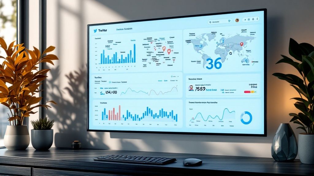
The dashboard typically incorporates various visualization components, offering a multi-faceted perspective on the data. Heat maps illustrate tweet density by location, allowing you to see where conversations are most concentrated. Dynamic word clouds showcase trending terms, providing a quick overview of the dominant themes. Real-time counters display the volume of tweets, indicating the intensity of the discussion. Sentiment analysis gauges offer a visual representation of the overall positive, negative, or neutral sentiment expressed in the tweets. Auto-refreshing timeline visualizations chart the flow of conversation over time, highlighting peaks and lulls in activity.
Examples of successful implementation:
- Twitter's own analytics dashboard: Provides basic analytics for users to track their own tweet performance.
- Brandwatch Consumer Research platform: A sophisticated tool offering in-depth social listening and analytics.
- Sprout Social's real-time monitoring tools: Facilitates social media management, including real-time engagement and monitoring.
- TweetDeck's column-based monitoring: Allows users to create customized columns to track specific keywords, hashtags, or users.
Tips for effective utilization:
- Focus on specific keywords or hashtags: Refine your search to capture the most relevant data for your needs. Broad searches can become overwhelming and dilute valuable insights.
- Use color coding to quickly identify sentiment shifts: Visual cues like color gradients can instantly highlight changes in public opinion.
- Combine with historical data for context: Real-time data is most powerful when viewed in the context of past trends. This allows you to identify deviations and understand the bigger picture.
- Set up alerts for unusual spikes in activity: Be notified immediately of sudden changes in conversation volume, indicating potential viral events or emerging crises.
Pros:
- Immediate insight into public sentiment: Understand how people feel about a topic or brand in real-time.
- Ability to detect emerging trends quickly: Identify trending topics and hashtags as they gain traction.
- Visual representation of conversation spread: See where conversations are happening geographically.
- Useful for crisis management and brand monitoring: Quickly identify and respond to negative sentiment or emerging crises.
Cons:
- Can be overwhelming with high data volumes: Filtering and focusing on specific metrics are crucial for manageable analysis.
- Sentiment analysis may lack nuance: Automated sentiment analysis can misinterpret complex language or sarcasm.
- Requires continuous API access: Maintaining a stable connection to the Twitter API is essential for uninterrupted data flow.
- May miss context in automated processing: Automated analysis may not capture the full context of a conversation.
Why this deserves a place on the list:
The Twitter Real-Time Dashboard stands out due to its ability to provide immediate, actionable insights from the vast and dynamic world of Twitter. For email marketers, this can inform campaign timing and messaging. Marketing agencies can use it to understand client perception and track campaign performance. Social media managers can monitor brand mentions and engage with their audience in real-time. Event organizers can gauge audience reaction and adjust strategies accordingly. Consultants and coaches can stay informed about industry trends and client needs. Sales teams can identify potential leads and tailor their outreach. Influencer marketers can track campaign effectiveness and identify new influencers. Real estate agents can monitor local conversations and identify community concerns. Recruiters can track industry discussions and identify potential candidates. The versatility and real-time nature of this tool make it an indispensable asset for anyone seeking to understand and leverage the power of social media.
2. Financial Market Ticker Dashboards
Financial market ticker dashboards are dynamic, real-time visualizations designed to track the ever-shifting landscape of financial markets. They consolidate and display a wealth of information, including stock prices, market indices, currency exchange rates, and other crucial financial metrics. These dashboards go beyond static numbers, employing visual cues such as sparklines, candlestick charts, and color-coded indicators to provide a clear, immediate understanding of market movements as they occur. This allows for faster comprehension of complex data and enables informed decision-making.
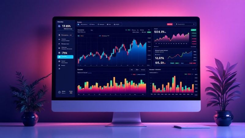
These dashboards are packed with features specifically designed for market analysis. Candlestick charts visually represent price fluctuations over time, while heat maps offer a quick overview of sector performance. Real-time price updates are displayed on ticker tapes, and volume indicators coupled with trading signals provide further context for market activity. Many platforms also include automated alerts, notifying users of significant price movements or other pre-defined triggers. For a deeper dive on how these dashboards integrate various data sources, you can learn more about Financial Market Ticker Dashboards.
The benefits for various professionals are numerous. For financial advisors, these dashboards offer a comprehensive market overview at a glance, enabling them to quickly assess client portfolios and make informed recommendations. Similarly, sales teams in finance-related industries can use this real-time data to understand market trends and tailor their sales pitches accordingly. Even for those outside of direct financial roles, such as consultants and coaches advising businesses, understanding market dynamics can be crucial for strategic planning.
However, there are also potential downsides. The sheer volume of information presented can lead to information overload, potentially hindering decision-making rather than aiding it. The processing power required to handle multiple real-time data feeds can be substantial, and the data subscriptions themselves are often expensive. Furthermore, the immediacy of the data can encourage impulsive trading decisions, especially for less experienced users.
Examples of popular financial market ticker dashboards include Bloomberg Terminal's market monitoring features, TradingView's real-time charting platform, Interactive Brokers' Trader Workstation, and Yahoo Finance Live Charts. These platforms offer varying levels of customization and features, catering to different user needs and expertise.
To effectively utilize these powerful tools, consider the following tips: Customize dashboards to focus on relevant sectors or securities, reducing noise and enhancing clarity. Maintain consistent color coding (e.g., green for upward trends, red for downward trends) for easy interpretation. Incorporate volume indicators to gain a more comprehensive understanding of market activity, and design layouts that minimize eye movement for critical information. These dashboards deserve a place on this list because they represent a powerful application of real-time data visualization, transforming raw data into actionable insights. They are essential tools for anyone needing to monitor and react to the dynamic world of financial markets, from seasoned traders to financial advisors and business strategists.
3. Public Transportation Tracking Maps
Public transportation tracking maps provide a dynamic, real-time view of bus, train, subway, and other transit vehicle locations. These interactive maps typically overlay vehicle positions on a city map, offering estimated arrival times and highlighting service disruptions. This empowers passengers to make informed decisions, optimizing their commutes and minimizing wait times. By leveraging GPS data from transit vehicles, these systems offer a powerful tool for both riders and transit authorities.
These maps utilize GPS-based vehicle position tracking to pinpoint the location of each vehicle. Color-coded route lines clearly distinguish different lines and their directions. Sophisticated algorithms calculate estimated times of arrival (ETAs) at various stops and stations. Furthermore, these systems can display service disruption indicators, such as delays or cancellations, allowing passengers to adjust their plans accordingly. Users can also navigate the map through zoom and pan functionalities, focusing on specific areas of interest.
Examples of successful implementation:
- Transit App: Offers comprehensive real-time transit information for numerous cities worldwide.
- Citymapper: Provides multi-modal transit mapping, integrating various transportation options.
- New York MTA's Real-Time Subway Map: Shows the live location of subway trains within the New York City subway system.
- London's TfL Go app: Delivers real-time information for London's extensive public transportation network.
Tips for effective implementation:
- Design for mobile-first: Prioritize a seamless mobile experience, as many users will access these maps on their smartphones.
- Ensure accessibility: Adhere to accessibility guidelines for visually impaired users, incorporating features like screen reader compatibility and alternative text for images.
- Include alerts: Offer audible or vibration alerts for approaching vehicles, enhancing the user experience.
- Data freshness: Clearly indicate the last time the data was updated to ensure transparency and reliability.
Pros:
- Improves passenger journey planning and reduces uncertainty.
- Reduces perceived wait times by providing real-time information.
- Allows transit authorities to identify service gaps and optimize routes.
- Enhances public perception of transit reliability and efficiency.
Cons:
- Accuracy depends on the quality and consistency of GPS data.
- May raise privacy concerns for operators regarding location tracking.
- Can be resource-intensive for transit agencies to implement and maintain.
- May not always account for last-minute route changes or unexpected delays.
When and why to use this approach:
Real-time public transportation tracking maps are invaluable for anyone involved in urban mobility. For individuals, they streamline commutes and reduce travel-related stress. For businesses reliant on timely deliveries or field operations, these maps can optimize logistics and improve efficiency. City planners and transit authorities can leverage this data to analyze ridership patterns, identify bottlenecks, and improve overall service delivery. This visualization method is particularly effective when dealing with complex and dynamic systems, providing a clear and concise overview of real-time operations. This makes public transportation tracking maps a deserving addition to any list of impactful real-time data visualization examples. This approach is particularly relevant for email marketers, marketing agencies, social media managers, and event organizers targeting urban audiences, as it provides a tangible example of how real-time data can enhance daily life and improve urban experiences. For sales teams, consultants, and coaches working with transportation or logistics companies, understanding this technology is crucial for identifying potential solutions and opportunities.
4. Network Operations Center (NOC) Dashboards
Network Operations Center (NOC) dashboards are comprehensive visual displays designed to provide real-time monitoring of IT infrastructure health, performance, and security. They act as a central hub for visualizing critical metrics, enabling IT teams to maintain system reliability and swiftly identify and address emerging issues. These dashboards typically present data on server status, network traffic flow, error rates, security incidents, and various other key performance indicators (KPIs). By consolidating this information into an easily digestible visual format, NOC dashboards empower teams to make informed decisions and take proactive measures to prevent outages and optimize system performance.

NOC dashboards achieve real-time visualization through constant data feeds from various sources within the IT infrastructure. These feeds are processed and aggregated to populate the dashboard with up-to-the-minute information, often using dynamic charts, graphs, and gauges. Features like network topology maps illustrate data flow, traffic volume visualizations pinpoint bottlenecks, and resource utilization gauges (CPU, memory, storage) highlight potential capacity issues. Error and exception counters provide immediate visibility into system stability, while automated alerting systems with visual indicators flag critical incidents requiring immediate attention. Security incident mapping allows for quick identification and containment of breaches.
Examples of Successful Implementation: Several industry-leading solutions exemplify the power of NOC dashboards. Cisco Network Operations Center, IBM's Netcool Operations Insight, SolarWinds Network Performance Monitor, and Datadog's unified monitoring platform are prime examples of how these tools can be leveraged for comprehensive IT infrastructure monitoring.
Why Use NOC Dashboards?
NOC dashboards are invaluable for organizations heavily reliant on their IT infrastructure. They are particularly useful when:
- Proactive Problem Identification is Crucial: Real-time visualization allows teams to anticipate and address issues before they escalate into major incidents.
- Minimizing Downtime is a Priority: Reduced mean time to resolution (MTTR) is a direct benefit of having a centralized view of system health and performance.
- Complex Systems Need Oversight: NOC dashboards offer a holistic view of intricate IT environments, making it easier to manage and understand interdependencies.
- Identifying Patterns and Correlations is Necessary: Analyzing historical data within the dashboard can reveal underlying patterns and correlations across systems, leading to proactive optimizations.
Pros:
- Enables proactive problem identification
- Reduces mean time to resolution (MTTR) for incidents
- Provides a holistic view of complex systems
- Helps identify patterns and correlations across systems
Cons:
- Can be expensive to implement and maintain
- Requires careful planning to avoid alert fatigue
- May create a false sense of security if poorly designed
- Needs regular updates as infrastructure changes
Actionable Tips for Implementation:
- At-a-glance Principle: Design the dashboard so the most critical metrics are immediately visible.
- Severity-Based Color Coding: Use a consistent color scheme to indicate the severity of alerts and incidents (e.g., red for critical, yellow for warning, green for normal).
- Design for Large Displays and Mobile Accessibility: Optimize the dashboard layout for large screens in the NOC, but ensure it's also accessible and functional on mobile devices for on-the-go monitoring.
- Historical Context: Incorporate historical data visualization to provide context for current metrics and aid in anomaly detection.
Popularized By: The adoption and refinement of NOC dashboards have been driven by major tech companies like Google and Amazon, IT monitoring vendors such as Splunk and New Relic, enterprise IT departments in Fortune 500 companies, and telecommunications providers.
This item deserves its place on the list of real-time data visualization examples because it represents a powerful application of this technology for mission-critical operations. By providing a comprehensive, real-time view of IT infrastructure, NOC dashboards empower organizations to maintain high availability, optimize performance, and strengthen security.
5. Weather Radar Visualization
Weather radar visualization transforms complex meteorological data into dynamic, color-coded maps that provide a real-time view of weather conditions. These visualizations go beyond simple temperature readings and offer a comprehensive understanding of precipitation, storm systems, wind patterns, and other crucial atmospheric phenomena. By combining data from multiple sources – including Doppler radar, satellite imagery, and ground-based sensors – these displays paint a continuously updating picture of the weather, offering invaluable insights for a wide range of users. Learn more about Weather Radar Visualization
How It Works:
At the heart of weather radar visualization is Doppler radar, which emits radio waves to detect precipitation and measure its intensity and movement. This data is then processed and displayed on a map, using color coding to represent different precipitation levels, from light drizzle to heavy downpours. Sophisticated systems incorporate additional data layers, such as satellite imagery for cloud cover and ground sensor readings for temperature and wind, to create a more complete and nuanced picture. The visualizations often feature animations, showing the movement of storm systems and other weather patterns over time.
Features and Benefits:
Weather radar visualizations offer a rich set of features designed to enhance understanding and utility:
- Doppler radar imagery with precipitation intensity: Provides clear visual representation of rainfall, snowfall, and other precipitation types.
- Storm tracking with predictive paths: Tracks the movement of storms and projects their likely future path, crucial for early warning systems.
- Lightning strike mapping: Pinpoints lightning strikes in real-time, enhancing safety awareness.
- Wind speed and direction indicators: Visualizes wind patterns, offering crucial information for aviation, marine activities, and other outdoor pursuits.
- Temperature gradient overlays: Shows temperature variations across a region, helping viewers understand broader weather patterns.
- Time-lapse capabilities showing system movement: Allows users to review the evolution of weather systems, facilitating analysis and prediction.
Pros:
- Enables precise storm tracking and warning: Provides crucial information for public safety and emergency preparedness.
- Helps viewers understand complex weather patterns visually: Simplifies complex data into an easily digestible format.
- Supports emergency management decision-making: Equips emergency responders with real-time data for efficient resource allocation.
- Combines multiple data sources in a single view: Offers a comprehensive overview of weather conditions.
Cons:
- Can be misinterpreted without proper meteorological knowledge: Requires some understanding of weather principles for accurate interpretation.
- Radar limitations like beam blockage can create data gaps: Obstacles like mountains can interfere with radar signals, leading to incomplete data in certain areas.
- Processing latency means data is slightly delayed: While near real-time, there is a slight delay between data acquisition and display.
- May exaggerate visual impact of some weather events: The use of color scales can sometimes make weather events appear more intense than they are on the ground.
Examples of Successful Implementation:
- The Weather Channel's radar maps
- AccuWeather's MinuteCast visualization
- National Weather Service radar displays
- RadarScope professional weather radar app
Tips for Effective Use:
- Use consistent color scales across different weather properties for easy comparison.
- Include a clear timestamp of data freshness so viewers know how current the information is.
- Provide layer toggles for different types of data, allowing users to customize their view.
- Design with colorblind accessibility in mind, ensuring that color choices are distinguishable for all users.
Why It Deserves Its Place on the List:
Weather radar visualization stands out as a prime example of real-time data visualization because it takes complex, dynamic data and transforms it into a readily understandable and actionable format. Its impact on public safety, emergency management, and everyday decision-making is undeniable, making it a vital tool for a wide range of audiences, from individual consumers to professional meteorologists. For marketers, especially those in event planning or outdoor-related industries, understanding and leveraging weather radar visualizations can be crucial for adapting strategies and ensuring successful outcomes. For example, an event organizer can utilize real-time radar to make informed decisions about event logistics, while a social media manager for a travel company can incorporate current weather visualizations into their content to inform and engage their audience.
6. Sports Analytics Real-Time Dashboards
Sports analytics real-time dashboards are transforming how we watch, analyze, and understand sports. These interactive visualizations bring live game data to life, displaying everything from player movements and shot charts to win probability graphs that shift with every play. By combining traditional statistics with spatial tracking, biometrics, and historical context, these dashboards unlock a deeper level of insight into game dynamics as they unfold, making them a powerful tool for everyone from coaches and broadcasters to casual fans.
How They Work:
These dashboards ingest a multitude of data streams in real-time. This includes data from sensors tracking player and ball/puck movement, optical tracking systems capturing player positioning, and game event data (e.g., passes, shots, fouls). Sophisticated algorithms process this information to generate visualizations, calculate real-time performance metrics, and provide predictive insights, such as win probability. The dashboards then present this information in an accessible and engaging way, often featuring interactive elements that allow users to explore the data further.
Features and Benefits:
- Shot charts and heat maps of player positioning: Visualize player tendencies and identify areas of strength and weakness.
- Real-time performance metrics compared to averages: Track player performance against their own benchmarks and league averages.
- Win probability graphs that update with each play: Add a dynamic layer of excitement and context to the viewing experience.
- Player tracking (speed, distance covered, zones): Quantify player effort and tactical positioning.
- Ball/puck movement visualization: Analyze passing patterns and possession dominance.
Pros:
- Enhanced viewer understanding: Makes complex game dynamics more accessible to a wider audience.
- Actionable insights for coaches: Provides real-time feedback to inform in-game strategy and player adjustments.
- New storytelling opportunities for broadcasters: Enhances commentary and analysis with compelling visuals.
- Pattern identification: Uncovers trends and insights not obvious from basic statistics.
Cons:
- Computationally intensive: Processing and visualizing large datasets in real-time requires significant computing power.
- Potential oversimplification: Complex game situations can sometimes be reduced to simplified metrics.
- Infrastructure requirements: Requires specialized sensor and tracking infrastructure in venues.
- Data consistency: Some metrics might be proprietary or inconsistent across different platforms.
Examples of Successful Implementation:
- NBA's CourtOptix (powered by Microsoft Azure): Provides advanced tracking and analytics during NBA games.
- MLB Statcast visualization system: Tracks every pitch and batted ball, providing in-depth analysis of player performance.
- NFL Next Gen Stats dashboard: Offers insights into player speed, acceleration, and other physical metrics.
- FIFA match analysis tools (used during World Cup broadcasts): Showcase player positioning and tactical movements.
Tips for Effective Use:
- Balance analytical depth with visual clarity: Avoid overwhelming viewers with too much information.
- Use animation sparingly: Animations can enhance understanding but overuse can be distracting.
- Provide context with historical benchmarks: Comparing real-time data to historical averages adds valuable perspective.
- Design for both casual fans and advanced analysts: Cater to different levels of understanding and interest.
Why It Deserves Its Place on the List:
Real-time sports analytics dashboards represent a significant advancement in data visualization. They offer a compelling blend of entertainment and information, bridging the gap between complex data and accessible insights. This approach has revolutionized sports broadcasting, coaching, and fan engagement, demonstrating the power of real-time data to transform how we experience and understand the world around us. For marketers, understanding how this technology engages audiences and delivers insights can inform strategies for leveraging real-time data in other sectors, such as event management, social media analytics, and sales performance tracking. This makes it a valuable example for anyone interested in harnessing the power of real-time data visualization.
Popularized By: ESPN and other sports networks, sports analytics companies like Second Spectrum, major sports leagues (NBA, NFL, MLB, NHL), and data journalist pioneers like Kirk Goldsberry.
7. E-commerce Analytics Dashboards
E-commerce analytics dashboards provide a real-time window into the performance of your online store. They aggregate and visualize key metrics, offering immediate insights into customer behavior, sales trends, and operational efficiency. By leveraging the power of real-time data, these dashboards empower online retailers to make informed decisions on the fly, optimize their operations, and react swiftly to changing market dynamics. This makes them a critical tool for anyone serious about succeeding in the competitive e-commerce landscape.
How They Work:
These dashboards connect directly to your e-commerce platform and other data sources, constantly collecting and processing information. They then display this data in an easily digestible format, using charts, graphs, and other visual elements to highlight important trends and patterns. Think of it as a live control center for your online store, providing a constant pulse on its health and activity.
Features and Benefits:
E-commerce analytics dashboards offer a wide range of features designed to provide a comprehensive view of your online store's performance:
- Live visitor count and geographic distribution: See how many people are currently browsing your store and where they're located.
- Real-time sales ticker and revenue tracking: Monitor sales as they happen and track revenue in real-time.
- Shopping cart abandonment monitoring: Identify and address potential checkout issues.
- Product performance heat maps: Visualize which products are performing well and which are lagging.
- Conversion funnel visualization: Understand the steps customers take towards purchase and identify drop-off points.
- User journey mapping: Track individual customer journeys to gain insights into their behavior.
These features translate into tangible benefits, including the ability to:
- Enable immediate response to shopping trends: Capitalize on emerging trends by adjusting pricing, promotions, or inventory levels in real time.
- Identify and resolve checkout issues in real-time: Reduce cart abandonment rates by addressing technical glitches or usability problems as they arise.
- Support dynamic pricing and inventory decisions: Optimize pricing strategies and inventory management based on real-time demand.
- Provide immediate feedback on marketing campaigns: Assess the effectiveness of marketing campaigns and make adjustments as needed.
Examples of Successful Implementation:
- Shopify's real-time analytics dashboard: Provides built-in real-time reporting on sales, orders, and online store visitors.
- Adobe Analytics for e-commerce: Offers advanced real-time segmentation and analysis capabilities for larger businesses.
- Google Analytics 4 real-time reports: Provides free access to real-time data on website traffic and user behavior.
- Amazon Seller Central dashboard: Offers real-time sales data, inventory tracking, and performance metrics for sellers on Amazon.
Pros and Cons:
Pros:
- Enables immediate response to shopping trends
- Helps identify and resolve checkout issues in real-time
- Supports dynamic pricing and inventory decisions
- Provides immediate feedback on marketing campaigns
Cons:
- Can lead to reactive rather than strategic decisions if not used carefully.
- May require significant investment in analytics infrastructure for advanced functionalities.
- Privacy concerns with detailed customer tracking must be addressed responsibly.
- Requires careful interpretation alongside historical context for accurate insights.
Actionable Tips:
- Focus on actionable metrics rather than vanity metrics: Prioritize metrics that can directly inform decision-making.
- Set up alerts for unusual patterns or threshold breaches: Be notified of significant changes in key metrics.
- Compare current data with historical trends for context: Avoid making hasty decisions based on short-term fluctuations.
- Segment data by customer type, device, and traffic source: Gain deeper insights into customer behavior and personalize your strategies.
When and Why to Use This Approach:
Real-time e-commerce analytics dashboards are essential for any online business that wants to stay competitive and agile. They are particularly valuable for businesses that:
- Run time-sensitive promotions or flash sales.
- Need to monitor inventory levels closely.
- Want to quickly identify and address website performance issues.
- Are focused on optimizing the customer journey and conversion rates.
Popularized By:
The use of real-time e-commerce analytics has been popularized by major e-commerce platforms like Amazon and Alibaba, analytics providers such as Mixpanel and Amplitude, digital marketing agencies specializing in e-commerce, and conversion optimization experts like Peep Laja. Their influence has made these tools increasingly accessible and essential for businesses of all sizes.
8. Power Grid Monitoring Visualizations
Power grid monitoring visualizations represent a crucial application of real-time data visualization, offering sophisticated visual interfaces that display the live status of electrical power systems. These systems encompass generation, transmission, distribution, and consumption patterns, providing grid operators with the insights they need to maintain system stability, respond effectively to outages, and manage energy resources efficiently. The sheer complexity and critical nature of these systems makes real-time visualization not just beneficial, but essential.
These visualizations typically work by collecting data from numerous sensors and monitoring devices deployed across the power grid. This data, which includes voltage levels, current flows, frequency, load, and the status of individual components, is then aggregated and processed in real-time. Sophisticated software platforms translate this data stream into dynamic, interactive visualizations, enabling operators to grasp the overall grid status at a glance and drill down into specific areas for detailed analysis.
Features of Power Grid Monitoring Visualizations often include:
- Geographic network diagrams showing power flow: These diagrams provide a spatial overview of the grid, highlighting power flow directions and magnitudes between different nodes.
- Load balancing visualizations across regions: These displays help operators understand load distribution and identify potential imbalances that could lead to instability.
- Frequency and voltage stability monitoring: Real-time tracking of these critical parameters is crucial for maintaining grid stability and preventing blackouts.
- Renewable energy contribution dashboards: As renewable energy sources become increasingly integrated into power grids, these dashboards provide visibility into their contribution and help manage their intermittent nature.
- Outage mapping and restoration tracking: During outages, these visualizations pinpoint affected areas and track the progress of restoration efforts.
- Weather overlay for predicting demand changes: Integrating weather data allows operators to anticipate demand fluctuations based on temperature and other meteorological factors.
Pros:
- Enables rapid response to grid instabilities: Real-time visualization allows operators to identify and address emerging issues quickly, minimizing the impact of disruptions.
- Supports integration of intermittent renewable sources: Visualizing renewable energy generation and forecasting helps manage their variability and maximize their utilization.
- Helps prevent cascading failures through early warning: By identifying potential problems early, operators can take preventative measures to avoid widespread outages.
- Improves operational efficiency and resource allocation: Data-driven insights enable better decision-making regarding resource allocation and grid management.
Cons:
- Extremely complex systems requiring specialized knowledge: Developing and maintaining these systems requires significant technical expertise.
- Critical infrastructure security concerns: These systems are vulnerable to cyberattacks, requiring robust security measures.
- Requires redundant monitoring systems: To ensure reliability, redundant systems are necessary, adding to the cost and complexity.
- High cost of implementation and maintenance: These systems involve significant upfront investment and ongoing maintenance costs.
Examples of Successful Implementation:
- ERCOT's grid visualization tools in Texas
- California ISO's renewable energy tracking dashboard
- National Grid's power management systems in the UK
- GE Grid Solutions' monitoring platforms
Tips for Effective Implementation:
- Design with a clear hierarchy of alerts and information: Prioritize critical information and use clear visual cues to highlight potential problems.
- Incorporate predictive elements for demand forecasting: Integrate forecasting models to anticipate demand changes and optimize resource allocation.
- Ensure visualization works in emergency lighting conditions: The system should remain functional even during power outages.
- Implement consistent color coding for system status: Use a standardized color scheme to represent different system states, making it easy for operators to interpret the information quickly.
Why Power Grid Monitoring Visualizations Deserve a Place on this List:
For industries reliant on stable power supply, from manufacturing to healthcare, real-time grid monitoring is no longer a luxury but a necessity. This visualization method provides essential insights for managing complex energy infrastructure, improving reliability, and integrating renewable energy sources. It's a powerful example of how real-time data can be transformed into actionable intelligence, directly impacting efficiency, safety, and sustainability. This makes it invaluable for a diverse audience, including government energy departments, utilities, and industrial automation companies, demonstrating its broad applicability and importance in the modern world. While the cost and complexity can be significant, the potential benefits in terms of preventing blackouts and optimizing resource allocation make it a worthwhile investment.
9. Air Traffic Control Visualization Systems
Air Traffic Control (ATC) visualization systems are mission-critical platforms that provide air traffic controllers with a real-time, comprehensive view of the airspace they manage. These systems ingest and synthesize a complex array of data sources, including radar feeds, flight plans, weather information, and airspace restrictions, transforming them into dynamic, interactive displays. This allows controllers to maintain safe separation between aircraft, optimize traffic flow, and manage the complexities of modern air travel. The importance of real-time data in this context cannot be overstated; even seconds of delay can have significant consequences. This sophisticated visualization is crucial for preventing collisions, minimizing delays, and ensuring the smooth and safe operation of air traffic worldwide.
These systems typically feature both 2D and 3D representations of the airspace. Aircraft are represented by icons displaying identifying information and their current position, altitude, and speed. Predicted flight paths, visualized as vectors extending from the aircraft icons, allow controllers to anticipate potential conflicts. Sophisticated algorithms constantly analyze aircraft trajectories, highlighting potential conflicts with visual and auditory alerts. Weather information, such as storm cells and wind patterns, is overlaid onto the airspace view, enabling controllers to make informed decisions about routing aircraft around hazardous conditions. Altitude separation is visualized through distinct layers or color-coding, further enhancing the controller's situational awareness. Furthermore, ground movement tracking at airports is often integrated into the system, providing a complete picture of aircraft activity from gate to gate.
Features:
- 3D and 2D radar displays of aircraft positions
- Flight path prediction vectors
- Conflict detection highlighting
- Weather system integration
- Altitude separation visualization
- Ground movement tracking at airports
Pros:
- Enables safe management of complex airspace
- Reduces controller workload through intuitive displays
- Supports increased traffic capacity through better visualization
- Integrates multiple data sources in a coherent display
Cons:
- Extremely high reliability requirements
- Significant training needed for proper interpretation
- High cost of development and certification
- Cannot fully replace human judgment in critical situations
Examples of Successful Implementation:
- FAA's NextGen ATC visualization systems (NextGen is a long-term modernization program)
- Eurocontrol's Maastricht Upper Area Control Centre displays
- NATS' air traffic management system in the UK
- Raytheon's Standard Terminal Automation Replacement System (STARS)
Tips for Effective Implementation:
- Design for maximum clarity with minimal controller interaction: The interface must be intuitive and easy to navigate, minimizing the cognitive load on controllers.
- Ensure consistent performance under peak traffic conditions: System performance must remain reliable even during periods of high air traffic density.
- Implement careful use of color and sound for alerts: Alerts must be clear and distinguishable without being overwhelming.
- Balance automation with human decision-making requirements: While automation can assist controllers, the system should ultimately support, not replace, human judgment.
Why this deserves a place on the list: ATC visualization systems exemplify the power of real-time data visualization in a high-stakes environment. They demonstrate how complex data can be transformed into actionable insights, enabling critical decision-making and enhancing safety and efficiency. This approach is not just about displaying data; it's about creating a dynamic, interactive representation of a complex system, allowing human operators to understand and manage it effectively. This same principle of translating complex data into a digestible and actionable format applies to many other fields, making ATC a powerful example of real-time visualization done right.
Popularized By:
- National air navigation service providers
- Raytheon
- Thales, and other aerospace companies
- Federal Aviation Administration (FAA)
- International Civil Aviation Organization (ICAO)
While specific websites for these individual systems are not readily available due to security and operational sensitivities, information about the FAA's NextGen program can be found on the FAA website (faa.gov). Searching for "NextGen Air Traffic Control" will provide more details about this modernization effort.
10. Industrial IoT Dashboards
Industrial IoT (IIoT) dashboards provide a powerful window into the real-time operations of industrial equipment, manufacturing processes, and connected sensors within factories and production facilities. They leverage the interconnected nature of Industry 4.0 to gather and visualize data, transforming raw sensor readings into actionable insights. These interactive visualizations empower operations teams to monitor production efficiency, predict maintenance needs, and optimize industrial processes, driving significant improvements in productivity, safety, and profitability. Learn more about Industrial IoT Dashboards at okzest.com/api.
How They Work:
IIoT dashboards aggregate data from a network of sensors embedded within machinery, production lines, and environmental monitors. This data, which can include metrics like temperature, pressure, vibration, energy consumption, and production output, is transmitted wirelessly or through wired connections to a central platform. The platform processes this information and displays it on the dashboard in user-friendly formats like graphs, charts, gauges, and maps. This real-time visibility allows for immediate responses to changing conditions and proactive interventions.
Features and Benefits:
IIoT dashboards offer a rich set of features that provide granular control and oversight of industrial operations:
- Machine Status Monitoring: Visual indicators clearly display the operational status of individual machines and entire production lines, allowing for quick identification of issues.
- Production Line Throughput Visualization: Track production rates, bottlenecks, and downtime in real-time to optimize workflow and maximize output.
- Quality Control Metrics: Real-time access to quality metrics allows for immediate corrective action, reducing waste and improving product quality.
- Energy Consumption Patterns: Monitor energy usage across the facility to identify areas for optimization and reduce operational costs.
- Predictive Maintenance Alerts: By analyzing historical and real-time data, the dashboards can predict potential equipment failures and trigger maintenance alerts, preventing costly downtime.
- Sensor Readings: Direct visualization of temperature, pressure, vibration, and other sensor data provides detailed insights into equipment performance.
These features translate into tangible benefits, including enabling condition-based maintenance (instead of relying on less efficient scheduled maintenance), providing early warning of potential equipment failures, supporting the optimization of production processes, and creating digital twins of physical systems for in-depth analysis and simulation.
Examples of Successful Implementations:
Leading industrial companies are leveraging IIoT dashboards to transform their operations:
- Siemens MindSphere IoT operating system visualizations: Provides a comprehensive platform for connecting and analyzing industrial data, enabling powerful visualizations and applications.
- GE Digital's Predix platform dashboards: Offers real-time insights into industrial assets, enabling predictive maintenance and performance optimization.
- Rockwell Automation's FactoryTalk analytics: Provides a suite of tools for data collection, analysis, and visualization, empowering informed decision-making on the factory floor.
- PTC ThingWorx Industrial IoT platform: Enables the rapid development and deployment of industrial IoT applications, including custom dashboards tailored to specific needs. Smart factory implementations by companies like Tesla and BMW further showcase the transformative power of IIoT dashboards.
Pros and Cons:
While IIoT dashboards offer significant advantages, it's important to consider the potential challenges:
Pros:
- Enables condition-based maintenance
- Provides early warning of potential equipment failures
- Supports optimization of production processes
- Creates digital twins for analysis
Cons:
- Requires significant sensor infrastructure investment
- May face connectivity challenges in industrial environments
- Security concerns with connected industrial systems
- Can generate overwhelming amounts of data
Actionable Tips for Implementation:
- Design for industrial environments: Ensure dashboards are viewable from a distance with high contrast and clear visuals.
- Implement role-based views: Tailor dashboards to the specific needs of different stakeholders, from operators to management.
- Include historical trends alongside real-time data: Provide context and enable deeper analysis by displaying historical data alongside current readings.
- Build in anomaly detection with clear visual indicators: Automatically detect unusual patterns and alert operators to potential problems.
When and Why to Use IIoT Dashboards:
IIoT dashboards are invaluable for any organization seeking to improve efficiency, optimize production processes, and reduce downtime in industrial settings. They are particularly beneficial for:
- Email Marketers/Marketing Agencies: Track campaign performance and analyze data in real-time for optimized outreach. (Analogy: Monitor the "production line" of email campaigns.)
- Social Media Managers/Event Organizers: Monitor event engagement, social media mentions, and audience sentiment to make real-time adjustments and optimize future events. (Analogy: Manage the flow of information and interaction like a production line.)
- Consultants and Coaches/Sales Teams/Recruiters: Track key metrics related to client acquisition, sales performance, and recruitment efforts to identify bottlenecks and improve strategies. (Analogy: Optimize the "pipeline" of client acquisition and talent recruitment.)
- Real Estate Agents: Monitor market trends, property performance, and lead generation activities to make data-driven decisions. (Analogy: Manage a portfolio of properties like a production line of investment opportunities.)
By providing real-time visibility and actionable insights, IIoT dashboards empower organizations to achieve operational excellence in the era of Industry 4.0.
Real-Time Data Visualization: 10-Point Comparison
| Visualization Type | Implementation Complexity (🔄) | Resource Requirements (⚡) | Expected Outcomes (📊) | Ideal Use Cases (💡) | Key Advantages (⭐) |
|---|---|---|---|---|---|
| Twitter Real-Time Dashboard | Moderate – Continuous API and dynamic refresh | Medium – Streaming APIs and server capacity | Immediate sentiment and trend insights | Social monitoring and crisis management | Quick public opinion and trend detection |
| Financial Market Ticker Dashboards | High – Multiple real-time feeds and complex charting | High – Processing power and premium data subscriptions | Split-second market updates and pattern visualization | Real-time trading and market analysis | Comprehensive market overview with rapid decision cues |
| Public Transportation Tracking Maps | Moderate – Integration of GPS and mapping APIs | Medium – Reliable GPS signals and map data | Live vehicle positions and estimated arrival times | Urban transit planning and passenger information | Enhanced trip planning with transparent transit tracking |
| Network Operations Center (NOC) Dashboards | High – Complex IT integration and system interdependencies | High – Multiple system inputs and monitoring tools | Proactive infrastructure monitoring and alerts | IT infrastructure management and downtime reduction | Holistic view with rapid incident detection |
| Weather Radar Visualization | Moderate to High – Sensor integration and multi-source data | High – Radar, satellite, and ground sensor inputs | Dynamic weather tracking and storm system visualization | Meteorological monitoring and emergency management | Comprehensive weather insights with precise storm tracking |
| Sports Analytics Real-Time Dashboards | High – Combines spatial tracking and complex analytics | High – Sensor integration, data processing, and real-time feeds | Live game performance and probability assessments | Live broadcasting and coaching analysis | Enhanced game understanding with actionable performance data |
| E-commerce Analytics Dashboards | Moderate – Integrates sales, traffic, and behavior metrics | Medium – Analytics infrastructure and real-time tracking mechanisms | Instant insight into store performance and trends | Online retail optimization and conversion improvement | Quick response to consumer trends and operational issues |
| Power Grid Monitoring Visualizations | Very High – Specialized design with redundancy and security | High – Robust, secure, and redundant monitoring systems | Fast detection of grid instabilities and outages | Utility management and emergency response | Prevents cascading failures and optimizes resource allocation |
| Air Traffic Control Visualization Systems | Extremely High – Certified, mission-critical systems | Very High – Highly reliable, secure, and redundant infrastructure | Safe airspace management with conflict resolution | Air traffic control and flight safety | Enhanced safety and efficient traffic management |
| Industrial IoT Dashboards | High – Integration of diverse sensor networks and legacy systems | High – Extensive sensor networks and reliable connectivity | Real-time production and equipment condition monitoring | Smart factory operations and predictive maintenance | Boosts efficiency and proactive equipment failure prevention |
The Future is Now: Real-Time Visualization and Beyond
From tracking website traffic spikes to monitoring global power grids, the examples explored in this article demonstrate the transformative power of real-time data visualization across diverse industries. We've seen how these dynamic displays empower us to understand complex information at a glance, identify trends as they emerge, and react swiftly to changing conditions. The key takeaway is clear: real-time visualization isn't just a technological advancement, it's a fundamental shift in how we process information and make decisions. Mastering these approaches allows businesses to optimize operations, enhance customer experiences, and gain a significant competitive edge. For businesses seeking to leverage the power of real-time data, Business Intelligence (BI) tools offer a way to transform raw data into actionable insights, enabling data-driven decisions and a competitive edge. This resource from Compare BI Tools: Top 10 Picks for 2025 from Pickalternative can help you explore the options available.
As technology continues to evolve, the potential of real-time visualization is boundless. Imagine personalized marketing campaigns that adapt to individual customer behavior in real-time, or predictive analytics that forecast market trends with unprecedented accuracy. By embracing these tools and strategies, we unlock new levels of understanding and gain the power to shape a more informed and responsive future.
Ready to harness the power of real-time data in your own visual content? OKZest empowers you to create personalized images based on live data, engaging your audience in dynamic and compelling ways across websites, emails, and social media. Explore OKZest's no-code and API solutions and discover how you can transform real-time insights into captivating visuals.