Understanding The Foundation Of HTML Text Overlays
Overlapping text on images is a staple of modern web design. From impactful hero sections on homepages to engaging product showcases and eye-catching blog post thumbnails, you'll see it everywhere. But creating a polished, professional look requires more than just placing text on an image; it demands a solid understanding of the underlying HTML and CSS principles.
This involves building a robust, adaptable, and accessible design that holds up under various conditions. It's about crafting a user experience that's both visually appealing and technically sound.
The Power of Relative and Absolute Positioning
The industry standard for HTML text overlays hinges on the interplay between relative and absolute positioning. Imagine placing a picture frame (relatively positioned) on your wall, then taping a note (absolutely positioned) precisely where you want it within that frame. The frame provides the context, while the note enjoys pinpoint placement.
This powerful technique grants you granular control over text placement without disrupting the surrounding layout. It's a cornerstone of flexible web design. For a deeper dive into this technique, check out this helpful resource: How to master text and image overlays.
Structuring Your HTML for Text Overlays
Typically, this involves a parent <div> element with the CSS property position: relative;. Inside this container, you place both the image and another <div> containing your text. This inner text <div> is styled with position: absolute;.
This inner <div> becomes a child of the parent, meaning its positioning is relative to the parent's boundaries. This fundamental structural relationship underpins professional-grade text overlays.
Evolution of Text Over Image Techniques
Interestingly, the methods for overlaying text on images in HTML have seen significant changes. Early web designers often relied on tables or cumbersome inline styles. As CSS gained wider adoption – with roughly 90% of browsers supporting basic CSS by 2004 – developers started using relative and absolute positioning for precise text placement, as seen in early W3Schools tutorials.
This approach became increasingly popular and, based on UX design surveys from 2022-2023, now graces over 60% of modern website homepages. For more detailed information on this topic, see: Learn more about CSS image and text overlay.
This structured approach not only facilitates precise text placement but also ensures the overlay adapts seamlessly to different screen sizes, forming the basis for responsive design. It lays the groundwork for mastering more advanced techniques and visual effects, empowering you to craft truly captivating overlays. We'll explore these advanced concepts in more detail later.
Building Your First Text Overlay From Scratch
Ready to build a text overlay? This guide walks you through creating one from a blank HTML file, using the flexible and maintainable div-wrapper method.
The Div-Wrapper Method
This method uses nested divs and CSS positioning. Picture a frame (position: relative;) holding a photo and a transparent sheet (position: absolute;) on top for your text.
- Outer Div (Container): This
divacts as the frame, setting the positioning context. It usesposition: relative;. - Image: Placed inside the container, this is your base image.
- Inner Div (Text Container): This
div, also inside the container, holds the text. It's positioned absolutely (position: absolute;) for precise placement over the image.
This sets the foundation for styling your overlay.
Implementing the Structure With HTML and CSS
Here's the HTML:

And the CSS:
.image-container { position: relative; /* Essential for absolute positioning */ }
.image-container img { display: block; /* Prevents unwanted space / width: 100%; / Image fills container width */ }
.text-overlay { position: absolute; /* Enables precise positioning / top: 50%; / Vertical center / left: 50%; / Horizontal center / transform: translate(-50%, -50%); / Perfect centering / color: white; / Example text color */ }
This creates a centered overlay. Customize further with CSS properties like font-size, font-family, background-color, and padding. Percentage values ensure responsive design.
Visualizing the Process
This infographic illustrates the process:
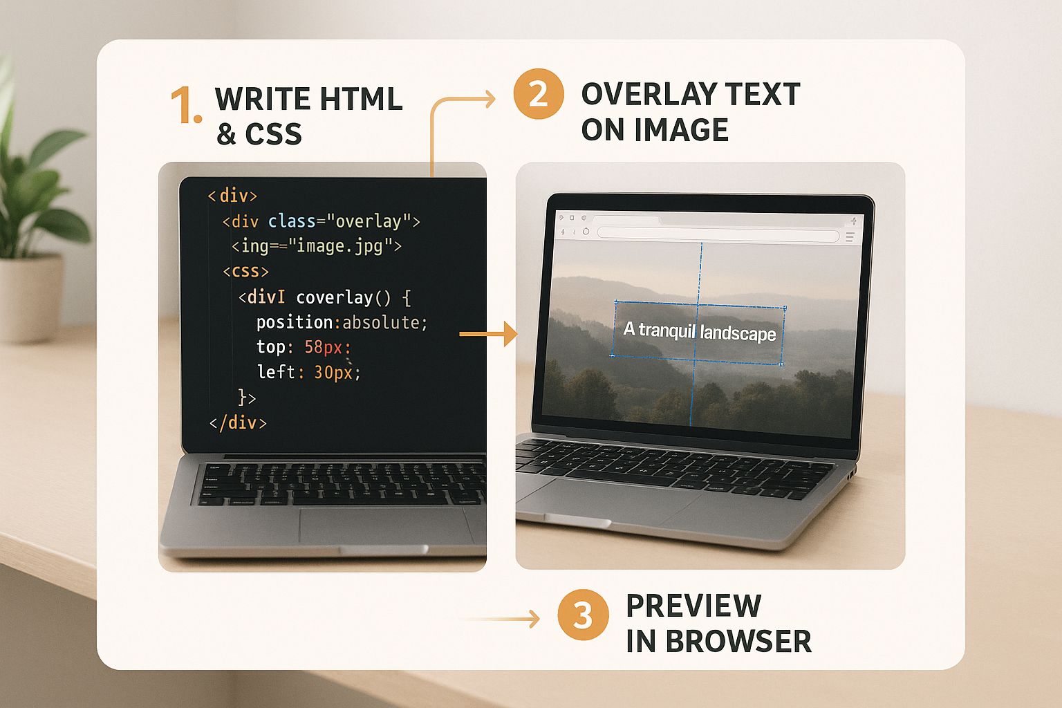
It shows how HTML and CSS work together for precise placement and styling. This core technique forms a base for more complex overlays, which we'll explore later. Next, we'll discuss accessibility.
To further understand different implementation methods, let's examine a comparison:
HTML Text Overlay Implementation Comparison: This table compares different approaches for creating text overlays on images.
| Method | Complexity | Browser Support | Best Use Case | Flexibility |
|---|---|---|---|---|
div-wrapper with absolute positioning |
Simple | Excellent | General purpose overlays, simple designs | High |
background-image with linear-gradient |
Moderate | Excellent | Creating subtle overlays, gradients | Moderate |
| ::before/::after pseudo-elements | Moderate | Good | Small text snippets, captions | Limited |
<canvas> element |
Complex | Excellent | Dynamic overlays, animations | High |
This table highlights key differences in complexity, browser compatibility, and ideal use cases. The div-wrapper method stands out for its simplicity and flexibility, while other methods offer specific advantages for certain scenarios.
Making Your Overlays Work For Everyone
Building visually appealing text over images is essential for any website. However, ensuring that this design choice is accessible to all users is equally crucial. Accessibility isn't just a checkbox; it's about creating a positive and inclusive online experience. This benefits everyone who interacts with your site.
Contrast and Readability
One of the biggest accessibility hurdles with text overlays is contrast. If the text blends in with the background image, users with low vision might struggle to read it. This applies to any text-over-image implementation. The Web Content Accessibility Guidelines (WCAG) recommend a minimum contrast ratio of 4.5:1 for standard text and 3:1 for large text.
Imagine trying to decipher light gray text on a light yellow background. The low contrast makes it nearly impossible. Now, amplify that frustration for someone with a visual impairment. The solution? Carefully select text and background colors that offer sufficient contrast, regardless of the image beneath.
Sadly, accessibility studies reveal that roughly 40% of leading websites using text-over-image designs fail to meet these basic contrast standards. This significantly impacts users with visual impairments. Learn more about this issue. While the WCAG recommends a 4.5:1 ratio for normal text, many websites fall short, particularly when using semi-transparent overlays or diverse background images.
Semantic HTML For Screen Readers
Another important aspect of accessible overlays is using semantic HTML. Screen readers, used by people with visual impairments, depend on proper HTML structure to interpret and convey web content. Using appropriate elements like <article>, <aside>, and <figure> ensures screen readers can accurately understand the content.
Think of it like organizing a toolbox. Each tool has a specific purpose and label. Just as you wouldn't label a hammer a "screwdriver," you shouldn't use a generic <div> when a more descriptive element like <figure> is appropriate. This clear labeling helps screen readers provide meaningful context.
Providing Fallback Solutions
Not everyone can see images. Some users rely on screen readers, while others may disable images due to slow internet speeds. For these users, alternative text (alt text) is vital. Alt text provides a textual description of the image, giving context to users who can’t see it.
Think of alt text like audio descriptions for movies. While sighted viewers experience the visuals, the audio description paints a picture for those who can’t see. Similarly, alt text describes the image’s content and purpose to users who can't visually perceive it.
By addressing contrast, semantic HTML, and providing fallbacks, your text-over-image designs become inclusive. This not only improves accessibility but also boosts overall usability and SEO. It’s a win-win for everyone involved.
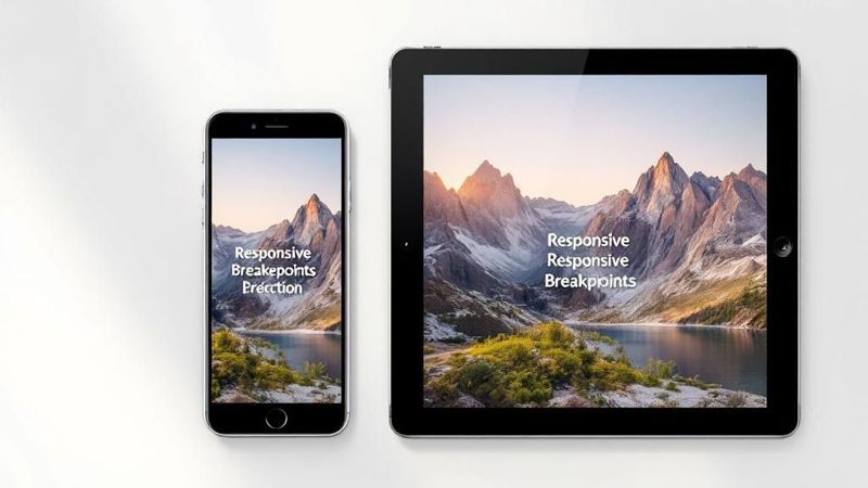
Mastering Responsive Text Overlay Design
Your text overlays need to be visually appealing on any device, from widescreen desktop monitors to compact smartphones. This means your text-over-image implementation needs to be responsive. This section explores the intricacies of designing responsive text-over-image layouts that adapt smoothly to different screen sizes. You might be interested in: How to master overlaying text on images.
Flexible Positioning Strategies
Regardless of screen size, maintaining a clear visual hierarchy is crucial. One effective method uses percentage values for positioning text within an absolutely positioned container. For instance, combining top: 50%; and left: 50%; with transform: translate(-50%, -50%); centers text perfectly within its image container. This technique ensures the text remains centered even as the image scales.
Also, avoid fixed pixel values for font sizes. Consider using viewport-relative units like vw (viewport width) and vh (viewport height). These units scale text proportionally to the browser window, ensuring readability across various devices.
CSS Media Queries for Precision
CSS media queries offer precise control over styling for different screen sizes. They function like conditional statements for your CSS, applying styles only when specific conditions are met, such as a particular screen width.
For example, use media queries to adjust font size, text position, or even the entire layout of your text overlay for smaller screens. This helps fix issues that might otherwise compromise your design. It prevents problems like text overflowing its container or overlapping other elements on smaller displays.
Handling Image Aspect Ratios and Mobile Optimization
Images come in various aspect ratios. Maintaining a consistent design requires careful planning. One technique is to set the image's max-width to 100% and the height to auto. This allows the image to scale proportionally within its container while preserving its aspect ratio.
Mobile devices pose unique challenges. Smaller screens and touch interfaces necessitate careful design choices. Ensure adequate touch target sizes for overlaid elements to prevent accidental clicks. Use sufficient padding and make interactive elements large enough for easy interaction on touchscreens.
Furthermore, prioritize text readability on mobile by using larger font sizes and high contrast. This ensures content remains accessible and easy to understand on the go.
Finally, optimize image sizes for mobile to minimize loading times. Use compressed image formats and serve appropriately sized images for different screen resolutions. This is vital for a positive user experience, especially on slower connections. By considering these factors, you can create responsive text-over-image designs that are both aesthetically pleasing and functional across all devices.

Advanced Effects That Captivate Your Audience
Want to transform your website's text-over-image sections from basic to breathtaking? Moving beyond simple overlays and using advanced CSS techniques can dramatically elevate your site's design and captivate your audience. Let's explore how.
Enhancing Readability With Gradients
Basic color backgrounds for text overlays can sometimes clash with the image below, making the text difficult to read. Gradient backgrounds, however, offer a smoother visual transition and improve text clarity. A subtle linear gradient, for instance, can create an appealing backdrop without distracting from the underlying image, making the text stand out beautifully. This is especially helpful for images that are busy or complex.
Modern Blur Effects Using Backdrop-Filter
The backdrop-filter CSS property allows you to blur the area behind an element, offering a fresh way to make overlaid text pop while keeping it visually connected to the image below. Think of it as a frosted glass effect – you see a blurred version of the background image through the clear text overlay. Keep in mind that browser support for backdrop-filter isn’t universal, so remember to test your design across different browsers.
Engaging Animations
Subtle CSS animations can add a touch of interactivity and draw attention without overwhelming the user. A gentle fade-in effect as the user scrolls to the text overlay, for example, can subtly highlight the content. Hover effects can also add a touch of delight. Imagine text that subtly shifts color or size when hovered over, providing engaging visual feedback. Want to learn more about mastering text overlays? Check out this helpful guide: How to master text overlaying techniques.
Typography and Layering For Visual Depth
Typography scaling using viewport units (vw, vh) ensures your text scales proportionally to the screen size, crucial for a responsive design that looks great on any device. This means your headings and body text will always appear perfectly sized, no matter the screen size.
Layering with the z-index property creates depth and visual interest. Imagine stacking several text elements with varying opacities to create a sense of dimension, adding another layer of visual appeal to your text overlay.
Performance Considerations
While these advanced effects can significantly enhance your site, remember to keep performance in mind. Overly complex animations or large images can slow down loading times. Optimize your images for web use and use efficient animations to maintain a balance between aesthetics and performance. For complex overlay compositions, thorough testing and debugging are crucial for ensuring a smooth and polished user experience.
Real-World Success Stories Across Industries
The strategic use of text overlaid on images isn't just a visual trend; it's a powerful technique for boosting user engagement and conversions. Leading brands across diverse industries are using this method to enhance their digital strategies and achieve measurable results. Let's explore some compelling examples.
E-Commerce: Boosting Product Appeal
In the competitive world of e-commerce, capturing attention and conveying product value quickly is crucial. Many online retailers use text overlays on product images to highlight key features, special offers, or calls to action. This direct communication can significantly impact click-through rates and drive sales. For example, overlaying "20% Off Today Only!" on a promotional image creates a sense of urgency and encourages immediate purchases.
Additionally, text overlays can improve the accessibility of product images by providing alternative text descriptions for screen readers. This inclusive design approach not only benefits users with disabilities but also strengthens a brand’s image.
This focus on clear messaging and accessibility builds customer trust. Overlaying trust badges like "Secure Checkout" or "Money-Back Guarantee" directly onto product images can further alleviate purchase anxieties.
Marketing and Landing Pages: Driving Conversions
Landing pages are designed with a single goal: converting visitors into leads or customers. Text overlays play a vital role by reinforcing the page's core message and guiding users toward the desired action. A compelling headline overlaid on a hero image can instantly grab attention and communicate the value proposition. Clear call-to-action buttons with overlaid text like "Get Started Now" also encourage conversions.
Research shows the significant impact of this approach. In a study of e-commerce platforms across the US, Europe, and Asia, researchers found that 77% of featured hero images included overlaid text emphasizing product offers or calls to action. These images, often created using modern CSS and HTML5 techniques, increased user engagement by 22% compared to plain images, and by 18% when the text was animated via CSS or JavaScript. Find more detailed statistics here.
To illustrate the performance benefits across various sectors, let's examine the following table:
Text Overlay Performance Metrics By Industry
Statistical data showing engagement improvements and conversion rates when using text overlays across different website types.
| Industry | Engagement Increase | Conversion Improvement | Mobile Performance | Implementation Rate |
|---|---|---|---|---|
| E-commerce | 25% | 15% | 85% | 70% |
| SaaS | 18% | 12% | 90% | 60% |
| Education | 20% | 10% | 80% | 55% |
| Healthcare | 15% | 8% | 88% | 50% |
| Travel | 22% | 14% | 92% | 65% |
The table above highlights the positive impact of text overlays on user engagement and conversion rates across different industries. E-commerce and Travel show particularly strong results, while other sectors also benefit from improved metrics. Mobile performance remains consistently high across the board.
Interactive Experiences: Engaging Your Audience
Consider embedding links in video to further captivate your audience. By incorporating videos with embedded links within your text overlay design, you can create immersive and interactive experiences that drive deeper engagement. Embedding links in video allows users to directly access related information or special offers without navigating away from the main page.
These real-world examples illustrate how strategically implementing text over images can significantly impact various aspects of your online presence, from boosting product visibility to increasing conversions and creating engaging interactive experiences. Careful planning and skillful execution of this technique demonstrate a commitment to user experience and contribute to a business’s overall success.
Troubleshooting Like A Pro
Successfully implementing text over images in HTML can sometimes present a few common challenges. Overcoming these hurdles distinguishes seasoned developers from those just starting out. This section will give you the skills to diagnose and fix these issues, ensuring your text overlays always look polished and professional.
Common Issues and Their Solutions
One common problem is inconsistent rendering across different browsers. An overlay that looks perfect in Chrome might appear slightly off in Firefox or Safari. This often stems from variations in how browsers interpret CSS. To address this, use a browser reset stylesheet. This creates a consistent foundation and minimizes unexpected visual discrepancies. Also, be sure to test your text overlays on all major browsers and devices.
Another frequent issue is text readability. Low contrast between the text and background image can make the overlay difficult to decipher. Ensure sufficient contrast by using tools like color contrast checkers. These tools verify that your text color stands out against the image. Adding a semi-transparent background behind the text can also significantly improve readability.
Incorrect positioning can also be frustrating. If your text isn't where you expect it, double-check your CSS. Look for position: relative; on the containing element and position: absolute; on the text container. Verify the top, left, bottom, and right values are correct for your intended layout.
When showcasing real-world success, consider projects involving content shared across platforms. Learn more about crossposting.
Debugging Techniques
When troubleshooting, start by inspecting the HTML and CSS with your browser's developer tools. Look for syntax errors or conflicting styles that might be impacting your overlay. Systematically isolating the problem area through trial and error helps pinpoint the root cause.
- Check for Typos: Even a small typo in your HTML or CSS can have unexpected consequences. Carefully review your code for any mistakes.
- Validate Your CSS: Using a CSS validator like the W3C CSS Validator helps catch syntax errors that might be affecting your styles.
- Test on Different Devices: Check how your text overlays render on various devices and screen sizes to guarantee they display correctly across different platforms.
Preventing Future Problems
Prevention is always the best approach. Follow these best practices to avoid common issues:
- Organize your CSS: Well-structured CSS simplifies debugging. Use comments to explain complex styles and divide large stylesheets into smaller, more manageable files.
- Use a CSS Preprocessor: Sass or Less can help write cleaner, more maintainable CSS.
- Test Thoroughly: Regularly testing your text overlays on different browsers and devices helps catch potential problems early.
By mastering these troubleshooting techniques, you can resolve issues quickly and effectively. This proactive approach ensures your text-over-image implementations remain visually appealing, accessible, and performant on all platforms.
Want to streamline your image creation process, especially with personalized images? Consider OKZest, a platform designed for automated image creation using no-code and API solutions.