Whether you're making a quick graphic for social media, coding an overlay for your website, or running a massive personalized marketing campaign, knowing how to write text over an image is a crucial skill. You might use a simple tool like Canva, dive into HTML/CSS, or even automate the whole process with a platform like OKZest. Each approach has its place, depending on what you're trying to achieve.
Why Adding Text to Images Is a Smart Move

Putting text on an image isn't just a design trick—it’s a powerful way to communicate. When you marry a great visual with sharp, relevant text, you create something that’s both instantly engaging and incredibly easy to digest. This combo grabs attention far better than text or an image can on its own.
Just picture someone scrolling through their social media feed. An image with a bold text overlay screaming "50% OFF TODAY ONLY" delivers its message in a split second, stopping the scroll dead in its tracks. For marketers, that split second means better engagement and more clicks.
Connecting With Your Audience
This simple technique turns passive viewing into an active experience. By placing words directly on a picture, you steer the viewer's interpretation and hammer home the main point. It's a game-changer for:
- Brand Storytelling: Overlaying your mission on a powerful background image can forge an immediate emotional link.
- Making Data Clear: Highlighting a key statistic on an infographic makes complex numbers memorable and easy to understand.
- Driving Action: Putting "Shop Now" or "Learn More" right on a product shot leaves no room for confusion and boosts conversions.
To get a better sense of how this plays out in paid campaigns, it's worth exploring the different types of Facebook advertising, including image ads.
This blend of visual and text helps your message slice through the digital clutter. It makes sure that even a casual glance is enough for someone to get the gist, making your content more effective.
The technology behind this is also taking off. The market for AI image generators, which often come with tools for adding text, was valued at USD 299.295 million in 2023. It's expected to skyrocket to USD 917.448 million by 2030, which shows just how central this capability is becoming.
Creating Text Overlays with Design Tools
When you need to slap some text on an image for social media, a blog post, or an ad, turning to a dedicated design tool is usually your best bet. They give you a visual playground to work in, making the whole process feel intuitive. You get a solid mix of speed and creative freedom that works for most day-to-day marketing tasks.
On one hand, you have platforms like Canva, which are built for speed and simplicity. They're perfect for anyone who needs professional-looking graphics without spending weeks learning complex software. On the other end of the spectrum, tools like Adobe Photoshop offer incredibly deep, granular control for projects that demand pixel-perfect precision.
Getting Started Quickly with Canva
There’s a reason millions of people flock to Canva: it makes design ridiculously simple. Its massive library of templates means you almost never have to start with a blank canvas. You can find a layout for just about anything—from an Instagram story to a business presentation—and just drop in your own image and text.
For any business, this is a massive time-saver. You can even set up a Brand Kit with your company's fonts and colors, ensuring every single graphic you pump out looks consistent. That consistency really matters; studies have shown that maintaining a consistent brand presentation can boost revenue by up to 33%.

Canva's workspace is built for drag-and-drop creation, making the process of adding text over an image quick and painless.
To make sure your text actually pops, Canva offers a few simple but powerful tricks. You can add a colored background shape to your text box, apply a subtle shadow effect, or pick from pre-designed font pairings that are already proven to look great together.
Achieving Professional Results in Photoshop
When a project calls for a bit more finesse, Adobe Photoshop is the undisputed industry standard. Yes, the learning curve is steeper, but it unlocks a level of control that simpler tools just can't touch. The entire game in Photoshop revolves around understanding layers.
By placing your text on a separate layer above your image, you can edit, move, and style it without ever permanently changing the original photo. This non-destructive workflow is the foundation of professional design.
The real magic in Photoshop lies in its blending modes and layer masks. A blending mode like "Overlay" or "Soft Light" can make your text feel like it’s truly part of the image, not just sitting on top of it.
You can also use a layer mask to selectively hide parts of the text, creating the illusion that it’s wrapping behind a person or an object in the photo. It’s an advanced technique, but it creates a sense of depth that looks incredibly polished and professional.
Here are a few tips I've picked up for getting better results in Photoshop:
- Use Adjustment Layers: Don't edit your image's brightness or contrast directly. Instead, use an adjustment layer. It gives you editable, non-destructive control and makes it easier to improve text readability.
- Apply a Subtle Drop Shadow: A soft, low-opacity drop shadow can give your text just enough separation from a busy background without looking cheesy.
- Tweak Your Kerning and Tracking: Fine-tuning the spacing between individual letters (kerning) and groups of letters (tracking) can take your typography from amateur to pro.
Choosing Your Tool Canva vs Photoshop
So, how do you decide? Here’s a quick breakdown to help you pick the right tool for your project.
| Feature | Canva | Adobe Photoshop |
|---|---|---|
| Best For | Quick social media graphics, ads, and marketing materials. | High-end photo editing, complex compositions, and print design. |
| Ease of Use | Very beginner-friendly with a drag-and-drop interface. | Steep learning curve; requires understanding layers and tools. |
| Creative Control | Good, but limited to built-in effects and templates. | Nearly unlimited control over every pixel, effect, and color. |
| Collaboration | Excellent for real-time team collaboration. | Possible with Adobe Creative Cloud, but less seamless. |
| Cost | Offers a robust free plan; affordable paid subscriptions. | Requires a subscription to Adobe Creative Cloud. |
| Key Strength | Speed and simplicity. | Precision and power. |
Ultimately, the choice comes down to speed versus precision. If you need to create consistently branded graphics quickly for social media, Canva is an absolute powerhouse. But for high-stakes commercial projects where every single detail is critical, Photoshop’s depth is invaluable.
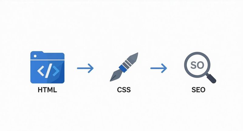
Adding Live Text Over Images with HTML and CSS
While design tools are great for static graphics, they create a huge headache for web content. When you "burn" text into a JPEG or PNG, that text becomes completely invisible to search engines and accessibility tools.
A much smarter method for websites is to write text over an image using live HTML and CSS. This approach keeps the text selectable, crawlable, and totally dynamic.
Instead of one flat graphic file, you’re actually layering standard HTML text on top of a background image using CSS. The browser combines the two elements on the fly. This separation is the secret to unlocking massive gains in SEO, accessibility, and responsiveness. The text remains real text, meaning search engines like Google can read and index it to understand your page's context. That's a massive advantage over burned-in text, which Google just sees as pixels.
Why Live Text is a Superior Choice
Beyond the obvious SEO boost, using HTML and CSS gives you incredible flexibility. Need to update a promotional banner? You can change the text in seconds without ever opening a design program or re-exporting the entire image. This is perfect for hero sections, special offers, and any content that needs to be updated regularly.
Here’s why it's the go-to method:
- SEO-Friendly: Search engines crawl and index the live text, helping your page rank for relevant keywords.
- Accessible: Screen readers can announce the text to visually impaired users, making your content inclusive and compliant with WCAG standards.
- Responsive: The text can reflow and resize independently of the image, so it always looks fantastic on any device, from a small phone to a huge desktop monitor.
- Faster Load Times: Text data is tiny. Updating a line of HTML is far more efficient than re-uploading a large image file just to change a word.
For web developers and marketers, mastering the HTML/CSS overlay isn't just a "nice-to-have" skill—it's a fundamental best practice for creating modern, performant, and search-friendly web experiences.
Practical CSS Techniques for Text Overlays
There are a few solid ways to position text over an image with CSS, and each has its moment to shine. The most common approach is to create a container element, set your image as its background, and then drop the text right inside.
The classic technique involves position: relative on the parent container and position: absolute on the text element. This gives you precise, pixel-perfect control over where the text sits.
But modern CSS has given us even better, more flexible tools. Flexbox and CSS Grid are now the preferred methods for building complex, responsive layouts. They make it unbelievably simple to center text both horizontally and vertically—a task that used to be a real pain with older CSS.
For a deeper dive into the code, our guide on how to place text on an image in CSS provides copy-and-paste examples for these modern approaches.
No matter which technique you use, the core principle is the same. By separating your content (HTML) from your presentation (CSS), you build a more robust and effective website. This method ensures your message is not only seen but also understood by both users and search engines.
Automating Personalized Images with Text at Scale
Manually adding text to one or two images is simple enough. But what happens when you need to personalize visuals for hundreds, or even thousands, of people? That's where manual work hits a wall, fast. This is the moment automation platforms shine, letting you write text over an image dynamically and at a scale you could never manage by hand.
Just imagine sending a welcome email where the main image greets the recipient by name. Or a social media campaign where every new follower gets a personalized shout-out graphic. That level of detail makes your audience feel seen and can send engagement through the roof. Tools like OKZest are built for exactly this, transforming a single template into countless unique visuals.
How Dynamic Image Personalization Works
Think of it like mail merge, but for images. You begin with a base image template and then designate specific areas for dynamic text—or even other images, like a customer's company logo. The platform then pulls data from a spreadsheet, your CRM, or a real-time API call to populate these fields for each person.
This automated approach opens up some seriously powerful applications for marketing and sales teams:
- Hyper-Personalized Email Campaigns: Go beyond
{{FirstName}}and embed images featuring the recipient's name, company, or last purchase. - Automated Social Media Content: Instantly generate custom thank-you images for new followers or event attendees.
- Dynamic Ad Creatives: Create ad variations on the fly that speak directly to different audience segments.
- Personalized Certificates and Event Passes: Automatically produce unique credentials for every participant.
The real magic here is shifting from a one-to-many broadcast to a one-to-one conversation, visually. It’s a game-changing way to cut through the noise and forge a genuine connection with each user.
This workflow breaks down the core elements of creating text overlays for the web—a concept that automation builds upon.
As you can see, live text on a website relies on HTML for structure and CSS for styling, which directly influences SEO. Image automation APIs follow a similar principle by keeping the data separate from the base visual, making it flexible and efficient.
Setting Up Your Automation Workflow
Getting started with a tool like OKZest feels a lot like using a friendly editor like Canva. First, you design a template by placing your static elements. Then, you add dynamic "merge tag" layers for the text you want to personalize. It's incredibly intuitive.
Once your template is set, the platform gives you a unique URL for each image that contains all the personalization parameters. For instance, a URL might include ?name=Alex to slot "Alex" right into the image. You can then pop these URLs into your email marketing platform, website, or anywhere else you need them.
For deeper integrations, a robust API for image generation allows your developers to create these personalized images programmatically, opening up a world of possibilities.
One absolutely critical feature you'll need is fallback rules. What happens if a contact's first name is missing from your database? Without a fallback, you'd end up with a broken or empty image. Fallbacks let you define default text, like "Friend" or "Valued Customer," ensuring every single recipient gets a polished, professional-looking visual.
The move toward AI-driven visual creation is happening now. In 2024, the AI text-to-image generator market in North America—which includes these personalization tools—hit USD 136.9 million. The U.S. alone is expected to reach USD 128.3 million this year, proving how quickly businesses are adopting automated visual content.
For those looking to push the boundaries even further, it's worth exploring advanced strategies for creating viral Reddit AI video content, which pairs compelling text-based stories with AI-generated visuals for maximum impact.
Design Principles for Clear and Engaging Text
Knowing the technical steps to write text over an image is a great start, but it's only half the job. The other half is making sure people can actually read it—and that the final result looks fantastic.
Excellent design isn't just about making things pretty; it's about clear communication. When you get these core principles right, your images transform from simple visuals into compelling messages that stop the scroll and drive action.
Master Contrast for Maximum Readability
If there's one golden rule for text on images, it's contrast. When your text color is too close to the colors in the background image, it all just blends into an unreadable mess. Your goal is to create a clean, crisp separation between your words and the visual behind them.
The good news is you don’t need to be a seasoned designer to pull this off. Here are a few simple yet powerful techniques to make your text pop:
- Use a Color Overlay: Just place a semi-transparent colored layer between the image and your text. A dark overlay, like black set to 30-60% opacity, works wonders for making white text stand out.
- Add a Background Blur: Applying a subtle blur to the entire image, or even just the area directly behind the text, can soften distracting details and push your words to the forefront.
- Employ a Scrim: This is a soft gradient overlay that’s darker on one side (where you plan to put the text) and fades to transparent on the other. It's a clever way to preserve parts of the image while guaranteeing legibility.
A quick "squint test" is my go-to trick for checking contrast. Step back from your screen, squint your eyes, and look at the design. If the text becomes hard to distinguish from the background, you definitely need more contrast.
Guide the Eye with Smart Typography
Typography is so much more than just picking a cool font. It’s about using text to create structure, emphasis, and a clear path for the reader's eye. This is what designers call visual hierarchy.
A strong hierarchy tells the viewer what to read first, second, and so on. You can create this by playing with the font's size, weight (its boldness), and style. Your main headline should always be the biggest and boldest, followed by a smaller subheading, and then the body text.
It's also a good idea to keep your font choices simple. Stick to a maximum of two complementary fonts—maybe a bold sans-serif for headlines and a clean serif for body text. Tossing too many font styles onto an image just creates visual chaos and weakens your message. Making these kinds of deliberate choices is a key part of building a strong visual branding identity.
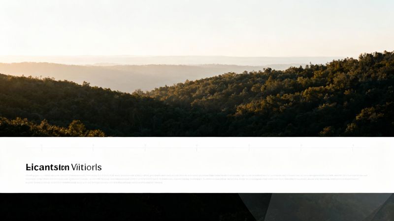
Finally, think about the composition of the image itself. Try not to place text over the most important part of the photo, like someone's face or the main product feature. Look for areas of "negative space"—like an open sky, a blurry background, or a plain wall—where your text can breathe and grab attention without fighting the image for it.
So, What's Next? Putting It All Into Practice
You've just walked through a complete toolkit for putting text over images. No matter what you're trying to accomplish—a quick social media post, a high-performance website banner, or a massive personalized marketing campaign—you now have a method that fits.
The right approach always comes down to what you're trying to achieve. Firing up Canva is perfect for a one-off graphic. Digging into HTML/CSS is the way to go for web performance and SEO. And when you need to create thousands of unique visuals at scale, automation tools like OKZest are your best friend.
The real secret? Your next project is your best teacher. The fastest way to get comfortable with any of these methods is to just dive in and build something. Choose one and try it out today. Actually doing it will teach you more than reading ever could.
This isn't just a niche skill anymore, either. The demand for dynamic, text-based visuals is exploding. The market for AI text-to-image generators is on track to hit USD 657 million by 2031. You can dig into the numbers and learn more about this rapid market expansion on verifiedmarketresearch.com.
Got Questions? We've Got Answers
After diving into all the technical methods, you probably have a few practical questions buzzing around. Let's tackle some of the most common ones that come up when you start putting text on top of an image.
What’s the Best File Format for an Image with Text?
This one really depends on how you're adding the text. If you're in a design tool like Photoshop and "burning" the text directly onto the image, your choice matters a lot.
Go with JPEG for photographs to keep the file size down. For graphics with sharp lines, logos, or solid colors, PNG is your best bet. It keeps everything crisp and even supports transparent backgrounds.
But if you’re using the HTML/CSS overlay method on a website, the text isn't actually part of the image file at all. In that case, just focus on optimizing the background image itself (as a JPEG or WebP), since the text is just live code sitting on top.
How Can I Make My Text Readable on a Busy Background?
Readability is everything. Contrast is your most reliable tool here.
The simplest, most effective trick in the book is to place a semi-transparent dark overlay between your image and your text. It’s a classic for a reason—it instantly mutes the background and makes light-colored text pop without completely obscuring the photo.
Another great option is to add a subtle drop shadow or a soft outer glow directly to the text. This gives the letters a gentle lift, creating just enough separation from a complex background.
Pro tip: Always look for the quiet spots in your photo. Positioning your text over a patch of clear sky, a blurred-out area, or a solid-colored wall gives it a natural home where it doesn’t have to fight for attention.
Is Putting Text on Images a Bad Idea for SEO?
It absolutely can be, and this is a huge one to watch out for. When you permanently embed text into a file like a JPEG, search engines can't read it. To Google, that text is just a bunch of pixels. It adds zero SEO value and is a big miss for accessibility.
The most SEO-friendly approach is always the HTML/CSS overlay. This keeps your text as live, crawlable code that search engines can easily index, which helps your page rank for relevant terms.
No matter which method you choose, always, always provide descriptive alt text for every single image. It’s a win-win, boosting both your SEO and making your content accessible to people using screen readers.
Ready to create thousands of personalized images automatically? See how OKZest can help you connect with your audience on a whole new level by visiting https://okzest.com.