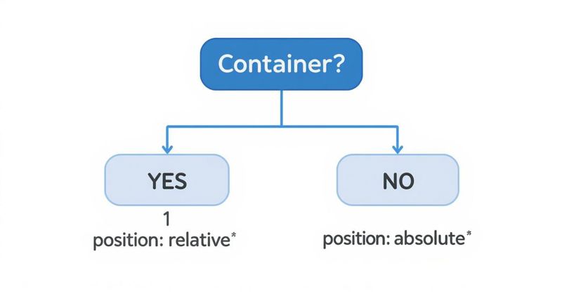
Placing text on an image in CSS is a classic design challenge, but modern CSS has made it easier than ever. The old-school method involves a container with position: relative and a text element inside with position: absolute. This gives you precise control, and it's still a rock-solid technique for hero sections and banners.
Of course, these days, we also have powerful alternatives like Flexbox and Grid that offer more flexible and responsive solutions right out of the box.
Why Placing Text on Images Matters in Web Design

Let's be honest—an image with a well-placed line of text just hits differently. It’s how you turn a simple photo into a powerful message. From stunning website headers to slick product cards, this combination is the key to grabbing a user's attention and telling a story in a single glance. It helps you build a clear visual hierarchy, pointing the user’s eye straight to a headline or a call-to-action.
But it's not as simple as just slapping words on a picture. The real craft is in making sure it’s readable and looks great on any device. A design that’s perfect on a 27-inch monitor can easily become a hot mess on a smartphone if you're not careful. That's where a deep understanding of CSS really pays off.
The Evolution of CSS for Text Overlays
The ability to elegantly overlay text on images is something we owe to decades of CSS development. This all started way back in 1994 when Håkon Wium Lie first pitched the idea of separating a webpage's structure from its presentation. The first CSS1 spec in 1996 gave us the basic positioning properties that made simple overlays possible.
Later versions like CSS2 and CSS2.1 refined those tools, introducing essentials like z-index for stacking elements. If you're interested in the deep dive, you can explore more about the evolution of Cascading Style Sheets on blogs.sparkifysolutions.com.
This evolution is why we can now do so much more than just basic positioning. Modern tools like Flexbox and Grid offer far more powerful and flexible ways to build complex, responsive layouts with text on images.
Nailing these techniques is a must for any developer or designer who wants to build modern, effective websites. In this guide, we’ll walk through the best methods out there, from the foundational approaches to some advanced styling tricks. You’ll learn how to create layouts that are not only beautiful but also accessible and SEO-friendly.
The Classic Method: Relative and Absolute Positioning
Before tools like Flexbox and Grid showed up and changed the game, there was one tried-and-true way to put text on an image with CSS: a clever combination of position: relative and position: absolute. This old-school approach is still incredibly useful today. Why? Because it just works—everywhere. It’s supported by practically every browser ever made, making it a rock-solid choice for foundational elements like hero banners.
The logic is actually quite simple when you break it down. You start with a parent container that holds both your image and your text. By giving this container position: relative, you essentially create a new coordinate system just for that box. Think of it as putting a new, smaller canvas on top of your webpage.
Once that’s done, any child element inside that container with position: absolute will be positioned relative to that parent container, not the whole page. This gives you the fine-grained control you need to stick your text exactly where you want it.
Setting Up the HTML
The HTML for this method is refreshingly clean and semantic. All you need is a wrapper—like a <div> or <section>—with an image and a text element nested inside.
For something like a travel website's hero banner, the markup would look something like this:

Explore Paradise
Your dream vacation awaits.
This structure is great because it keeps everything related bundled together, which makes your code easier to read and, more importantly, easier to maintain down the line.
Applying the CSS Positioning
Now for the magic. First, we need to tell our parent container, .hero-banner, that it's the new positioning context.
.hero-banner {
position: relative;
width: 100%; /* Or any specific size /
display: inline-block; / Helps the container wrap the image */
}
Just adding position: relative won't visually change anything on its own, but it's the crucial first step. Next up, let's make sure the image behaves itself within the container.
.hero-banner img { display: block; width: 100%; height: auto; }
With the foundation laid, we can finally position the text. Setting position: absolute unlocks the top, left, right, and bottom properties, letting us place the .hero-text element anywhere we want inside the .hero-banner.
A super common and effective trick for centering the text is to push it 50% from the top and left, and then use transform to pull it back by half of its own size.
.hero-text { position: absolute; top: 50%; left: 50%; transform: translate(-50%, -50%); color: white; text-align: center; text-shadow: 2px 2px 8px rgba(0, 0, 0, 0.7); }
This transform technique is a real lifesaver. It perfectly centers the element no matter how big or small it is, which means you don't have to worry about things breaking if the text content changes later.
Pro Tip: Always add a subtle
text-shadowto your overlay text. It's a tiny detail, but it can make a massive difference in readability, especially on busy background images. It ensures your message always comes through loud and clear.
Getting comfortable with this relative and absolute positioning duo is essential. It's the bedrock of CSS layering and gives you a solid foundation before you start tackling more modern layout techniques.
Building Responsive Layouts with Flexbox and Grid
While absolute positioning is a reliable classic, modern CSS gives us far more powerful and dynamic tools. When you need to place text on an image in css with more flexibility, Flexbox and Grid are absolute game-changers. These layout modules were literally built for creating the complex, fluid interfaces today's multi-device world demands.
Flexbox is your best friend for one-dimensional layouts—think aligning items in a single row or column. It's fantastic for things like gallery cards where text needs to sit cleanly over a background image, no matter how long the text is. Grid, on the other hand, is a beast for two-dimensional layouts, giving you precise control over both rows and columns at the same time.
This infographic can help you visualize which positioning property to reach for in different situations. It's a fundamental choice you'll make before layering anything.
The main thing to remember is that your container element is the anchor for positioning any text you want to overlay on top of it.
Comparing CSS Methods for Placing Text on Images
Choosing the right CSS technique depends heavily on what you're trying to build. Are you creating a simple hero banner or a complex, responsive gallery? This table breaks down the three main approaches to help you decide which tool is right for the job.
| Method | Best For | Complexity | Responsiveness |
|---|---|---|---|
| Position: absolute | Simple overlays, specific corner placements, and basic hero sections. | Low | Good, but can require media queries for complex adjustments. |
| CSS Grid | Complex, multi-element overlays and two-dimensional layouts. Perfect for hero sections. | Medium | Excellent. Grid offers intrinsic responsiveness with minimal code. |
| CSS Flexbox | Aligning content within one-dimensional containers like cards or banners. | Low-Medium | Excellent. Flexbox is designed for fluid, content-aware layouts. |
Each method has its strengths. Absolute positioning is straightforward for simple tasks, but for modern, responsive design, Flexbox and Grid provide a much more robust and maintainable foundation.
Mastering Overlays with CSS Grid
For hero sections or any large component where you need pinpoint control over layering, CSS Grid is my go-to. The real magic of Grid is its ability to place multiple items within the exact same grid cell, which stacks them perfectly on top of one another. This makes centering text or aligning it to a corner almost trivial.
First, you just define a container as a grid and create a single column and row. It sounds simple, because it is.
.grid-container { display: grid; grid-template-columns: 1fr; grid-template-rows: 1fr; position: relative; /* Good for any fallback positioning */ }
Next, you tell both the image and the text to live in that very same cell.
.grid-container > * { grid-column: 1 / -1; grid-row: 1 / -1; }
With both elements layered in the same space, you can use handy grid properties like place-items on the container or align-self on the text to get perfect alignment effortlessly. If you want to dive deeper into alignment, our guide on how to center an image in HTML has some great techniques that work well with this method.
By defining a single grid area, you essentially create a perfect canvas for layering. This technique is exceptionally clean and avoids the potential quirks of using transform properties with absolute positioning.
Leveraging Flexbox for Dynamic Content
Flexbox really comes alive when you're working with components that need to be, well, flexible. Picture a series of product cards where the text content might change from one card to the next. Flexbox makes it incredibly easy to vertically and horizontally center an overlay on an image without any fuss.
Here's a classic scenario: a card with a background image and a text overlay that appears when you hover over it. The card's container becomes a flex container.
.flex-card { display: flex; justify-content: center; /* Center horizontally / align-items: center; / Center vertically */ min-height: 300px; background-image: url('your-image.jpg'); background-size: cover; background-position: center; color: white; text-align: center; } This is a super-efficient approach for components that are part of a larger, one-dimensional layout, like a row of feature cards. It adapts beautifully to different screen sizes, which is a non-negotiable part of modern web development.
To really get good at this, you have to understand the core responsive web design principles. Both Flexbox and Grid are the foundational tools that let you put those principles into practice, ensuring your designs look fantastic everywhere.
Techniques for Better Readability and Visual Appeal
Just dropping text on an image is the easy part. The real challenge—and where good design shines—is making sure people can actually read it. If your message gets lost, the whole design has failed.
The trick is to create enough contrast between your text and the background image without totally hiding the photo. It’s a balancing act, but a few CSS techniques can turn a hard-to-read mess into a sharp, professional design element.
Using Color Overlays for Contrast
One of the most reliable methods I turn to is a simple color overlay. By layering a semi-transparent color over the image, you can instantly mute the background just enough for your text to pop. My go-to for this is the ::before pseudo-element in CSS.
This approach is great because it keeps your HTML clean. You can add a colored layer that sits right between the image and the text, all from within your stylesheet.
Here's a quick look at how to apply a dark, semi-transparent overlay:
.image-container { position: relative; color: white; }
.image-container::before { content: ''; position: absolute; top: 0; left: 0; width: 100%; height: 100%; background-color: rgba(0, 0, 0, 0.5); /* Black with 50% opacity / z-index: 1; / Sits above the image */ }
.overlay-text { position: relative; z-index: 2; /* Sits above the overlay */ } With this setup, you get a consistent, dark backdrop for your text, which drastically boosts readability no matter what image you use.
Enhancing Text with Shadows and Fonts
Sometimes a full overlay is overkill, especially if you want the background image to stay bright and vibrant. This is where the text-shadow property becomes your best friend. A subtle shadow can lift text off a busy background, creating just enough separation to make it legible.
A simple text-shadow: 2px 2px 8px rgba(0, 0, 0, 0.7); can work wonders. The key is subtlety—you're aiming for readability, not a cheesy graphic from the 90s.
Your font choice is just as critical.
- Font Weight: Bolder fonts (like
font-weight: 700;) are much easier to read against a complex image than thin or light weights. - Font Color: Pick a color with high contrast against the image's main colors. White is a popular choice, but it can easily get lost in bright areas of a photo.
The ultimate goal here is to guide the user's eye and make your content effortless to read. To learn more about creating user-friendly interfaces, it's worth exploring the user experience design fundamentals.
The widespread adoption of CSS for these exact tasks shows just how crucial it is. In fact, CSS is used by over 98% of all websites to handle styling. Well-executed text on an image in CSS has a real impact, too—studies show it can improve user engagement by up to 40% on landing pages.
Exploring Modern CSS Blending Effects
If you're after a more artistic or creative look, you can play around with the mix-blend-mode property. This is a powerful CSS feature that controls how an element's content blends with its parent element and background.
For example, using mix-blend-mode: overlay; or mix-blend-mode: screen; can create some stunning visual effects where the text seems to interact with the image's colors and textures. Browser support is quite good these days, but it's definitely a more advanced technique best saved for stylistic flair.
For more foundational tips on getting your text and images aligned perfectly, check out our guide on how to place https://okzest.com/blog/text-on-background-image.
How to Ensure Your Text Overlays are Accessible and SEO-Friendly
Making a design look great is only half the job. If your text overlays aren't accessible and tuned for search engines, you’re shutting the door on a massive part of your potential audience. It's a detail many developers unfortunately gloss over, but it's an absolutely essential part of professional web design.
The golden rule is simple: always use real HTML text. Never, ever embed your important words directly into an image file like a JPG or PNG. Why? Because search engine crawlers can't read text that’s just a bunch of pixels. By wrapping your text in standard elements like <h1> or <p>, you make sure your crucial headings and keywords are indexable—a huge win for your SEO.
Prioritizing Accessibility and Readability
Accessibility is all about making sure your content works for everyone, including people who rely on screen readers or have visual impairments. This isn't just some "nice-to-have" checkbox; it's a fundamental part of creating a good, user-friendly experience.
A big piece of this puzzle is color contrast. Your text absolutely must stand out clearly from the image behind it. The official Web Content Accessibility Guidelines (WCAG) recommend a minimum contrast ratio of 4.5:1 for normal-sized text. There are tons of free online tools that can check your color pairings in a heartbeat, so there's really no excuse to skip this.
Remember, accessible design is just better design for everyone. High-contrast text isn't just for users with low vision; it helps someone read your site on their phone in the bright sunlight, too.
And don't forget your alt text. Every single image that adds meaning to the page needs a descriptive alt attribute. So, while your visible overlay text might scream "Summer Sale," the image's alt text should describe the actual picture, like "Smiling woman holding a colorful beach bag." This gives vital context to screen reader users who can't see the image.
Boosting SEO with Crawlable Content
From an SEO point of view, text that’s baked into an image might as well be invisible. But when you place text on an image in CSS using real HTML, you're giving Google and other search engines a feast of valuable content to crawl and index.
This pays off in a few key ways:
- Keyword Ranking: The headlines and sentences in your overlays can start ranking for relevant search terms.
- Rich Snippets: If you use structured data, that text can be pulled into special search result formats.
- Social Sharing: When someone shares your page, social platforms pull the HTML text to create those nice-looking link previews. We dive deeper into this in our guide to the Open Graph preview.
Ultimately, it all comes down to treating your overlay text as real content, not just a decorative flourish. It's a strategy that makes your website more inclusive, dramatically improves your search visibility, and helps your message connect with the widest possible audience.
Common Questions About Text on Images
When you start layering text over images with CSS, you'll inevitably run into a few tricky situations. These are the kinds of practical problems that pop up once you move past the basics and start thinking about making your design truly responsive and readable.
A big one I see all the time is how to handle responsive font sizes. How do you get your text to scale smoothly with the browser window without writing a mountain of media queries? It’s a classic challenge, but thankfully, modern CSS has a slick solution.
Another common point of confusion is centering. There are a dozen ways to do it, so which one is actually the simplest and most reliable for getting text perfectly centered, both vertically and horizontally?
How Can I Make Font Sizes Responsive?
The best tool for the job here is the CSS clamp() function. It's a game-changer for fluid typography, letting you set a minimum size, a preferred scalable size, and a maximum size—all in a single line of code.
Here's how it looks:
font-size: clamp(1rem, 2.5vw, 2rem);
This one declaration gives the browser three clear instructions:
- The font size should never be smaller than
1rem. - Ideally, it should be 2.5% of the viewport's width (
2.5vw), allowing it to grow and shrink. - But, it should never get any larger than
2rem.
This approach gives you that smooth, fluid scaling you're after. It keeps text from getting tiny and unreadable on small screens or comically oversized on massive displays. It's a much cleaner alternative to juggling multiple media queries.
What Is the Easiest Way to Center Text?
For dead-simple, perfect centering, my go-to is almost always CSS Grid. By making the parent container a single-cell grid, you can use its powerful alignment properties to do the heavy lifting for you.
All it takes is two lines:
display: grid; and place-items: center;
.container { display: grid; place-items: center; }
This tiny snippet will align any child element—in our case, the text block—right in the middle of its container. It's more straightforward than Flexbox for this specific task and far more reliable than the old-school position: absolute; and transform hack, especially when your layout gets complicated.
Here's a pro-tip: If your text is still hard to read on certain parts of an image, don't just crank up the font weight. Try adding a subtle gradient overlay. You can make it darker just behind the text and fade it to transparent elsewhere. This trick boosts contrast locally without dimming the whole photo, keeping your image vibrant while making sure your message comes through loud and clear.
Ready to create stunning, personalized images for your marketing campaigns? OKZest lets you automate image creation with merge tags, making it easy to add unique visuals to emails, newsletters, and websites. Engage your audience on a personal level and watch your conversions climb. Discover what OKZest can do for you.