Trying to get an image perfectly centered on your web page? It's a classic headache for developers, but modern CSS has some incredibly clean and powerful solutions that leave old, clunky tags in the dust.
The trick is to stop thinking about centering the image itself. Instead, you need to control its alignment within a parent container. This little shift in mindset gives you way more flexibility and makes your layouts predictable and responsive on any device.
For a long time, we were stuck with less-than-ideal methods. The history of centering an image in HTML has come a long way. Back in the early 2000s, many of us reached for the <center> tag, which first appeared in 1995 but was officially kicked to the curb with HTML5 in 2014. Today, we have far better tools like Flexbox, which got broad browser support around 2017 and lets you center content with just a couple of lines of CSS.
Your Quick Guide to Centering Images
To give you a clearer picture, this visual shows just how simple modern methods like Flexbox make image centering.
This image really highlights the clean, efficient code that makes Flexbox a go-to for developers who want pixel-perfect layouts. Getting a handle on image centering is a fundamental skill, and it's a big part of following best practices for web development.
Comparing Modern Image Centering Techniques
So, which modern CSS technique should you use? While Flexbox is a fantastic all-rounder, there are a few solid options depending on your specific layout needs.
Here’s a quick breakdown of the three main approaches you'll encounter today.
| Method | Best For | Key CSS Properties | Complexity |
|---|---|---|---|
| Flexbox | Both horizontal and vertical centering within a container. Ideal for single items or rows/columns. | display: flex, justify-content: center, align-items: center |
Low |
| Grid | Centering within a two-dimensional layout or a specific grid cell. | display: grid, place-items: center |
Low |
| Margin Auto | Simple horizontal centering of block-level elements. | display: block, margin: 0 auto |
Low |
Each of these methods is low-complexity and far more reliable than the outdated techniques of the past. Choosing the right one just comes down to the context of your layout.
The Classic Approach Using Margin Auto
Long before Flexbox and Grid became our go-to layout tools, we had a simple, reliable trick for horizontal centering: margin: 0 auto;. This classic technique is still a foundational skill for anyone working with HTML and CSS, and it remains incredibly useful for straightforward layouts.
But there's a catch, and it trips up developers all the time.
By default, an <img> tag is an inline element. It behaves like a word in a sentence, sitting in the flow of text and only taking up as much space as the image itself. The margin: auto trick, however, only works on block-level elements—those that occupy the full available width of their parent container. That’s the secret sauce right there.
So, to make this work, you have to first change the image from an inline element to a block element. It’s a quick fix: just set its display property to block.
Putting It Into Practice
Once you flip the image’s display property, you're telling the browser to treat it as a standalone block. From there, margin: 0 auto; instructs the browser to automatically calculate the leftover horizontal space and split it evenly between the left and right sides. Voila, your image is pushed right into the center.
Here’s what that looks like as a quick-and-dirty inline style:
 Of course, it’s much better practice to keep your styles separate in a CSS file. It just makes your code cleaner and easier to manage down the road. Here's how you'd set that up using a class:
HTML:
Key Takeaway: The
margin: 0 auto;technique is a powerful one-liner for horizontal centering, but it’s completely dependent on the element havingdisplay: block;. Forgetting this step is the most common reason this method fails.
While this method is fantastic for simple horizontal centering, it has one major limitation: it does absolutely nothing for vertical alignment. For that, you’ll need to reach for more modern tools like Flexbox or Grid.
Mastering Full Centering with Flexbox
When you need to go beyond simple horizontal alignment, Flexbox is the modern CSS solution that handles both horizontal and vertical centering with surprising ease. It’s a layout model built for arranging elements predictably, which is why it's my go-to for responsive components like headers, footers, and hero sections.
The whole concept boils down to a parent-child relationship. You just wrap your image in a container, turning it into a "flex container." This simple step gives you a powerful set of alignment properties to control everything inside it.

This is a fundamentally different way of thinking compared to older methods. Instead of manipulating the image itself, you're giving instructions to the container. It's a game-changer for control and flexibility.
How Flexbox Achieves Perfect Centering
Getting started is as simple as applying display: flex; to the parent container. That one line unlocks all the alignment magic you need.
From there, two properties do all the heavy lifting:
justify-content: center;handles the horizontal alignment, pushing your image to the middle.align-items: center;takes care of the vertical alignment, positioning it perfectly up and down.
Put them together, and you get true, pixel-perfect centering. It’s an elegant and reliable fix for one of web design's oldest headaches.
Pro Tip: For Flexbox's vertical centering (
align-items: center;) to actually work, its container needs a defined height. If the container is only as tall as the image inside it, there’s no extra space to center it in! Try giving it a specific height, likeheight: 100vh;, to see it snap into place.
A Practical Code Example
Let's say you're building a website header and need your logo centered. This is the perfect real-world scenario for Flexbox. No more wrestling with weird margins or positioning hacks—the code is clean and makes perfect sense.
Here’s what your HTML and CSS would look like:
HTML Structure
CSS Styling
.header-container {
display: flex;
justify-content: center;
align-items: center;
height: 150px; /* Essential for vertical centering */
background-color: #f4f4f4;
}
In this setup, .header-container is our flex container. The CSS rules tell the browser to place its child—the logo image—smack dab in the middle. This approach isn't just concise; it's incredibly robust and adapts beautifully to different image sizes and screens.
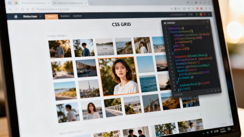
Advanced Image Centering with CSS Grid
While Flexbox is brilliant for arranging items along a single axis, CSS Grid is what you reach for when you need control over a two-dimensional layout—both rows and columns at the same time. This makes it a beast for more complex designs where you need to place an image with pinpoint precision.
Think of it like this: Flexbox is for lining things up in a single file, but Grid is for arranging them on a chessboard.
Grid’s approach to centering is ridiculously efficient. Just like with Flexbox, you start by defining a parent element as a grid container by setting display: grid;. After that, one single property can do all the heavy lifting.
The Power of place-items
The real magic of centering with CSS Grid comes down to the place-items property. It's a shorthand that handles both horizontal alignment (align-items) and vertical alignment (justify-items) in one go.
By simply setting place-items: center;, you're telling the browser to perfectly center any direct children within their assigned grid cell. No fuss, no extra code.
Here’s a quick look at how clean this is:
HTML Structure

CSS Styling .grid-container { display: grid; place-items: center; height: 400px; /* You need height to see vertical centering */ border: 1px solid #ccc; } This method is clean, easy to read, and works like a charm for single items.
When Grid Outshines Flexbox
So, when should you grab Grid instead of Flexbox? Grid is the undisputed champion for more intricate layouts. It's perfect for photo galleries, complex dashboards, or any design where an element has to align perfectly within a specific row and column.
Imagine you're building a three-column gallery and want a featured image to sit perfectly centered in that middle cell. Grid makes this dead simple. Trying the same thing with Flexbox would likely involve some frustrating nesting and creative workarounds.
You can even combine Grid for the main layout with other techniques for more creative control. For instance, after setting up your grid, you might want to learn how to put text on a background image to layer your content effectively.
Key Insight: Use Flexbox for one-dimensional layouts (rows or columns) and CSS Grid for two-dimensional layouts (rows and columns). For simple centering, either will do, but Grid's
place-items: center;is arguably the most concise solution out there.
Troubleshooting Common Centering Problems
Even when you know the right techniques for how to center an image in HTML, things can still go sideways. You write what looks like perfect code, refresh the page, and… nothing. It’s a common frustration, but the fix is usually simpler than you think.
Often, the issue isn't with your centering property but with the setup around it.
One of the most frequent culprits is the classic margin: 0 auto; method. If it’s not working, the first thing to check is the image’s display property. Remember, margin: auto only works on block-level elements, and images are inline by default. You have to add display: block; to your image's CSS for it to work.
When Flexbox and Grid Fail
What if you're using modern methods like Flexbox or Grid and your image still won't center vertically? This is another common headache, and the problem almost always lies with the parent container.
For align-items: center (Flexbox) or place-items: center (Grid) to have any effect, the container needs vertical space. If the parent container is only as tall as the image inside it, there’s no room for the browser to move the image.
Here are the usual suspects to investigate:
- Missing Height: The container has no defined height, so it collapses to fit its content. Give it a specific height (e.g.,
height: 300px;ormin-height: 50vh;) to create that necessary space. - Conflicting Styles: Another CSS rule somewhere in your stylesheet might be overriding your flex or grid properties. Use your browser's developer tools to inspect the container and check for any conflicting styles.
Troubleshooting Tip: Think of the container as a room and the image as a picture you want to hang in the center of a wall. If the "room" (container) has no height, you can't center the picture vertically.
Fixing these layout issues is a core skill. As you get more advanced, you might also explore more complex designs, like figuring out how to add text over images using HTML and CSS, which relies on similar container-based principles. Mastering the fundamentals of element positioning is key to solving these problems quickly.
Frequently Asked Questions About Centering Images
When you're trying to get an image perfectly centered, a few common questions always seem to pop up. It doesn't matter if you've been coding for years or are just getting your feet wet; these little sticking points can be a real headache. Let's clear up some of the most frequent queries developers have about centering images in HTML and CSS.
One of the oldest questions is whether you can just use HTML to handle centering. While the <center> tag is still technically around, it's a relic from a different era of the web. Modern standards strongly advise against using it because it blurs the line between your page's structure (HTML) and its style (CSS), which is a big no-no in today's development world. Stick with CSS—it's the right tool for the job.
Key Technical Questions Answered
"Why isn't Flexbox vertically centering my image?" This one trips up a lot of people. The most common culprit is that the parent container doesn't have a defined height. For align-items: center; to do its magic, the container needs some vertical space to work with. If the container is only as tall as the image itself, there's nowhere for the image to move.
To fix this, you have a few options:
- Give it a specific height, like
height: 400px;. - Make it fill the screen with viewport units, like
height: 100vh;. - Set a
min-heightto guarantee it has at least some room to breathe.
Another classic debate is Flexbox vs. Grid for responsive design. Honestly, both are fantastic. Flexbox is usually simpler for one-dimensional layouts (like a single row of items), which makes it a quick and efficient choice for centering one image. CSS Grid shines when you're dealing with two-dimensional layouts, giving you more control over aligning items in both rows and columns at the same time. For most simple image-centering tasks, Flexbox will get you there faster.
Impact on SEO and Performance
Does the CSS method you use to center an image impact SEO? The short answer is no. Search engines are far more concerned with your image's alt text, file name, and how it relates to the content on the page.
Your choice between
display: flexanddisplay: gridis all about user experience, not a direct SEO ranking signal. If you want to see real SEO benefits, focus on writing descriptive alt text and optimizing your image file sizes.
Of course, visual styling is a huge part of user engagement, especially in email marketing. Perfectly centered images make your campaigns look professional and polished. If you’re diving into the technical side of email design, understanding how to handle things like sending emails in HTML can give you the context needed to build templates that really work.
At OKZest, we help you create thousands of personalized images automatically, perfect for making your email campaigns, social media messages, and website content more engaging. Talk to your audience as individuals and watch your engagement soar. Learn more about our no-code and API solutions at okzest.com.