When you're creating a post for LinkedIn, the two best image sizes to use are 1080 x 1080 pixels for a classic square or 1080 x 1350 pixels for a taller, portrait-style image. Getting these dimensions right from the start ensures your visuals look crisp and professional, avoiding any awkward cropping when they show up in the feed.
Your Quick Reference for LinkedIn Image Sizes
Nailing your image dimensions is the first, simplest step to building a polished presence on LinkedIn. While the platform is pretty flexible, knowing the ideal size for each specific placement will save you a ton of hassle and make sure your visuals are actually working for you, not against you. Think of this section as your go-to cheat sheet for all the essential specs.
This infographic breaks down the two most effective sizes for your standard feed posts.
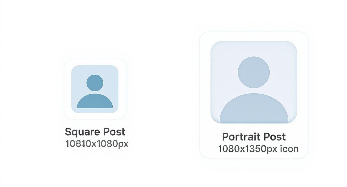
As you can see, both the square and portrait formats are designed to grab attention. The big advantage of the vertical option is that it takes up significantly more screen space on mobile, which is where most people are scrolling.
A Complete Cheat Sheet for All Formats
Of course, LinkedIn is more than just feed posts. The platform has very specific requirements for everything from your profile photo to your Company Page banner and all the different ad formats. Each one is tailored for its specific job, whether it’s building your personal brand or promoting a product launch.
To really get it right, you need to understand the nuances of all the different LinkedIn graphic sizes. The table below is your quick reference guide for the most common placements, covering everything from pixel dimensions to file size limits.
Complete LinkedIn Image Size Cheat Sheet
Here's a quick summary of the key image dimensions you'll need for a professional and consistent LinkedIn presence.
| Image Type | Recommended Dimensions (Pixels) | Aspect Ratio | Max File Size |
|---|---|---|---|
| Profile Photo | 400 x 400 | 1:1 | 8 MB |
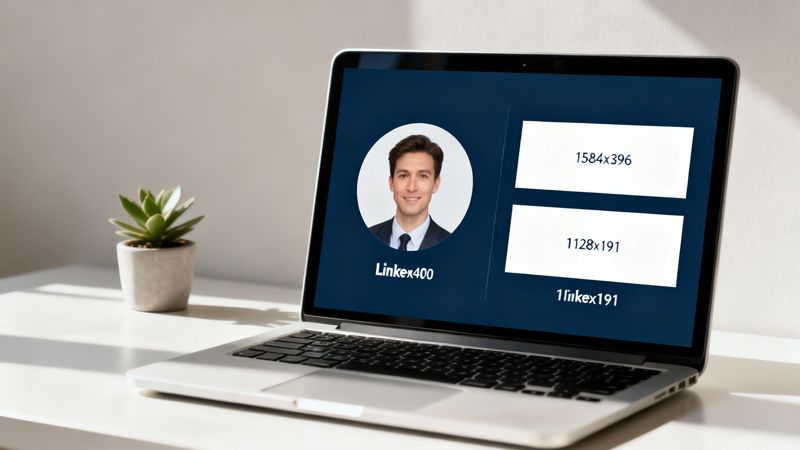
| Personal Banner | 1584 x 396 | 4:1 | 8 MB |
| Company Logo | 400 x 400 | 1:1 | 3 MB |
| Company Cover | 1128 x 191 | 5.9:1 | 3 MB |
| Feed Post (Square) | 1080 x 1080 | 1:1 | 5 MB |
| Feed Post (Link) | 1200 x 627 | 1.91:1 | 5 MB |
Bookmark this page so you can quickly refer back to these specs whenever you're creating new visuals for the platform.
Why Getting LinkedIn Image Dimensions Right Matters
Let’s be honest: getting your image sizes right for LinkedIn is more than just a technical chore. It's a cornerstone of your professional brand. When your images are blurry, stretched, or awkwardly cropped, it instantly chips away at your credibility. That small mistake sends a signal—a lack of attention to detail—that can sour how potential clients, employers, and partners see you.
First impressions happen in a blink, and on a professional network, how you present yourself visually is everything. A perfectly sized image guarantees your content looks exactly as you intended, whether someone’s viewing it on a massive desktop monitor or a vertical mobile screen. This consistency creates a seamless, trustworthy experience for your audience and reinforces the quality of your work.
Drive Engagement and Visibility
Beyond just looking good, properly sized images have a direct impact on your content's performance. The LinkedIn algorithm is smart; it favors posts that give users a good experience. Distorted or badly cropped visuals often lead to lower engagement, which tells the algorithm your content isn't hitting the mark and, in turn, reduces its overall reach.
Correctly formatted visuals don’t just look better; they perform better. Posts with images get far more comments and shares, but only when they’re crystal clear and optimized to make an impact.
Optimize for Link Sharing and Previews
This is especially critical when you're sharing links. An incorrectly sized featured image can create a sloppy-looking preview that completely fails to grab anyone's attention. To make sure your shared content always looks professional, you need to understand how these thumbnails are generated.
The best way to get this right is by exploring how an Open Graph preview works, as this standard controls how your links appear on social networks like LinkedIn. Nail this, and you'll see higher click-through rates and more traffic heading your way.
Optimizing Your Personal Profile and Company Page Images
Think of your LinkedIn presence as your digital storefront. Before anyone reads a single post or dives into your experience, they see your profile picture and cover photo. These images are your first impression, and getting them right is absolutely crucial. They set the tone for your professionalism and brand identity.
For your personal profile, it all comes down to two key visuals: your profile picture and your background banner. Each one plays a unique role in telling your professional story.
Crafting Your Personal Brand Identity
Your profile picture is your digital handshake. It needs to be a high-quality, professional, and approachable headshot. A clear, well-lit photo builds instant trust and helps your connections recognize you.
- LinkedIn Profile Picture Size: You’ll want to upload an image that’s 400 x 400 pixels. This perfect 1:1 ratio ensures your photo displays as a clean circle without any weird stretching or cropping. Keep the file size under 8 MB.
- LinkedIn Background Banner Size: For the banner, go with 1584 x 396 pixels. This wide 4:1 aspect ratio gives you a great canvas to show off your professional brand, your industry, or even a key tagline.
Pro Tip: When you're designing that background banner, be careful about putting important text or logos right in the bottom center. Your profile picture sits on top of that area, especially on desktop, and it can easily cover up something important.
Establishing Your Company Page Presence
It’s the same story for your Company Page. A polished logo and a sharp cover image are non-negotiable for establishing credibility and keeping your branding consistent. For more great advice on this, check out this guide on optimizing your profile picture on social media.
A crisp, easily recognizable logo is essential for building brand recall. It’s everywhere—in search results, on your employees' profiles, and next to every single update your company shares.
- Company Logo Size: The recommended size here is 400 x 400 pixels, sticking with that clean 1:1 aspect ratio.
- Company Cover Image Size: Use 1128 x 191 pixels for your cover image. This space is perfect for highlighting a new campaign, showing off your company culture, or promoting your key services.
A Complete Guide To LinkedIn Feed Post Image Sizes
Your LinkedIn feed is where your brand’s story unfolds. Picking the right image dimensions isn’t just about aesthetics—it’s about ensuring your content lands exactly as you intend, whether on desktop or mobile.
Choosing the correct format can boost clicks, likes, and shares. A square image at 1080 x 1080 pixels often wins for its consistent display. To understand why dimensions matter so much, check out more insights at UseVisuals.
Quick Lookup: Feed Post Sizes
| Format | Dimensions | Aspect Ratio | When To Use |
|---|---|---|---|
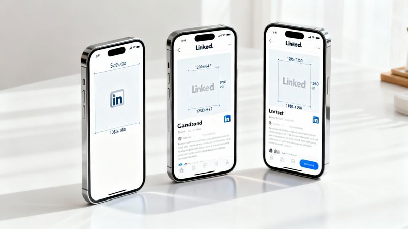
| Square | 1080 x 1080 px | 1:1 | Balanced display on desktop and mobile |
| Portrait | 1080 x 1350 px | 4:5 | Mobile-first posts that stand out in a scroll |
| Landscape | 1200 x 627 px | 1.91:1 | Link previews, wide shots, and detailed infographics |
Three Key Formats For Feed Posts
Understanding these three layouts helps you match your visuals to your goal. Whether you’re driving traffic or reinforcing brand identity, pick the format that complements your message.
Square Posts (1080 x 1080 pixels)
• Aspect Ratio: 1:1
• Advantage: Reliable framing on all devices.
• Pro Tip: Use for simple quotes, announcements, or product showcases.Portrait Posts (1080 x 1350 pixels)
• Aspect Ratio: 4:5
• Advantage: Grabs attention by filling more vertical space.
• Pro Tip: Ideal for step-by-step tutorials or before-and-after reveals.Landscape Posts (1200 x 627 pixels)
• Aspect Ratio: 1.91:1
• Advantage: Mimics LinkedIn’s default link preview size.
• Pro Tip: Great for banners, panoramic shots, and detailed infographics.
Mastering Multi-Image Carousel Posts
Carousel posts let you weave a story slide by slide. For a polished swipe experience, stick with one consistent size—1080 x 1080 pixels for every image. This uniformity keeps the flow smooth and the focus on your content, not awkward cropping.
Getting Your LinkedIn Ad Image Specs Right
When you're running paid campaigns on LinkedIn, getting the ad specs right is non-negotiable. Unlike organic posts where you have a bit more wiggle room, ads have strict guidelines. The wrong size can get your creative rejected, burn through your budget, and tank your engagement before you even get started.
You have to know the difference between a Single Image ad and a Carousel ad. Each format is built for a specific marketing goal, and matching the correct image size ensures your ad shows up perfectly on every device—no weird cropping or blurry visuals. That precision is what drives higher click-through rates and makes your campaign a success.
Key Ad Format Dimensions
Let's break down the essential dimensions you need to know. Getting these right is the first step to getting your ads approved and performing well.
- Single Image Ads: This is your workhorse format. For a crisp, clean look in the feed, stick to 1200 x 627 pixels (a 1.91:1 ratio). It's incredibly versatile for driving traffic or capturing leads.
- Carousel Ads: Perfect for telling a story or showing off a few different products or features. Each card in the carousel needs to be 1080 x 1080 pixels (a 1:1 square ratio) to keep things looking sharp and consistent as people swipe.
- Event Ads: When you're promoting a webinar or conference, the event banner image is your main visual. This should be 1776 x 444 pixels (a 4:1 ratio), which creates a wide, immersive header on your event page.
You'll notice that LinkedIn's image sizes have shifted over time to better fit how we share content. That 1200 x 627 pixel landscape size, for example, is now the standard for any post that includes a link because it generates an attractive, clickable preview.
Of course, dimensions are just one piece of the puzzle. Your creative also has to follow all of LinkedIn's ad policies. To see how these visuals fit into a larger, winning strategy, check out this Ultimate Guide to Winning at LinkedIn Advertising. It's a great resource for putting it all together.
Common LinkedIn Image Sizing Mistakes to Avoid
Knowing the right dimensions is only half the battle. It's surprisingly easy to make small mistakes that can undermine your professional look on LinkedIn. Understanding these common pitfalls is the final step to making sure every visual you post is sharp, professional, and effective.
From blurry uploads to awkward, automatic crops, a few quick checks can make a world of difference.
One of the most frequent errors we see is uploading a low-resolution image. When LinkedIn has to stretch a small photo to fill a larger space, you get that dreaded blurry, pixelated look. It immediately signals a lack of attention to detail.
Forgetting the Aspect Ratio
Another classic mistake is ignoring the aspect ratio. You might have a beautiful, high-resolution photo, but if its proportions don't match what LinkedIn expects, the platform will crop it for you. More often than not, it cuts off key information or creates a weirdly framed image—a real problem if your image includes text.
The impact of correct sizing goes beyond just looks; it directly affects how people engage with your content. Sticking to images that are at least 1080 pixels wide ensures they look crisp and clear on any device, from a desktop monitor to a smartphone. You can find more great tips on social media image sizing in HeyOrca's detailed guide.
Key Takeaway: Always, always preview your post before you hit publish. What looks perfect in your design tool can get awkwardly cropped by LinkedIn’s algorithm, especially on mobile, where every pixel of screen space counts.
Finally, a crucial mistake is placing text too close to the edges of your image. If you're overlaying text on an image, be sure to leave a generous margin around the borders. This "safe zone" prevents your important words from getting cut off on different screen sizes.
Got Questions About LinkedIn Images?
You're not alone. Digging into the nitty-gritty of LinkedIn's image requirements always brings up a few common questions. Getting these details right is key to making sure your profile and posts look sharp and professional—after all, the right image size for LinkedIn posts can make a huge difference in how many people stop scrolling.
One of the most frequent questions I get is about the best image size for mobile. You absolutely want to optimize for phones. Vertical images are your best friend here, specifically a 4:5 aspect ratio (1080 x 1350 pixels). They take up way more of the screen on a mobile device, which is exactly what you need to grab someone's attention.
PNG vs. JPG: Which One Should I Use?
The classic file format debate. The answer really depends on what’s in your image.
- Go with PNG when you're working with graphics that have sharp lines, text overlays, or logos. It keeps everything looking crisp and clean without any weird compression fuzziness.
- Stick with JPG for photographs and other complex images. You'll get a much smaller file size, which is great for loading speeds, and the slight quality loss is usually unnoticeable for this type of visual.
What If My Image Is Too Big?
So, what happens if you just upload a huge image and hope for the best? LinkedIn will step in and automatically compress or crop it to make it fit.
While that sounds helpful, it often leads to blurry images or, even worse, your main subject getting awkwardly chopped out of the frame. To keep full control over how your images look, always take a minute to resize them to the recommended specs before you upload.
Want to make your outreach even more impactful? Personalized images are a game-changer for engagement. With OKZest, you can create unique visuals for every single person in your audience automatically. Learn how to create personalized images with OKZest today.